“Components” in web design are a hot topic with Bricks Builder’s release of beta components in version 1.12.
Bricks isn’t the first builder to introduce components, though. Webflow has had them for a while, Cwicly had them, and Builderius has them. Of course, Etch will have them as well.
Component functionality is something I’ve been talking about for years as a big missing feature in most page builders. I was a strong advocate for components in Bricks and had some back and forth email discussions with Thomas that I’m fairly certain were responsible for pushing them to the top of the roadmap.
From the perspective of a typical user, though, components can be a bit of a head-scratcher.
- What is a component?
- How do components work?
- What should be a component and what shouldn’t be?
- What’s the difference between a template and a component?
- Can’t we just do this stuff with CSS?
The questions are endless.
That’s why you have me! By the end of this article you’ll have answers to every single pressing questions you have about components. You’ll understand how they work, why they’re important, when to use them, and when to avoid them.
The problem that components solve
We don’t need to jump into web design philosophy to understand the importance of components. All we have to do is look squarely at the problem they solve.
Here are some fundamental truths:
- Our goal as professionals is to build websites that are both scalable and maintainable.
- Proper CSS (organized, frameworked, tokenized, element-based CSS) handles the scalability and maintainability of DESIGN.
- PHP templating handles the scalability and maintainability of large chunks of site structure.
- Components handle the scalability and maintainability of element-based HTML, conditional logic, and Javascript interactions.
When you use a page builder that doesn’t have components, you have tools for scaling and maintaining design and large chunks of structure, but you lack scalability and maintainability in localized HTML, conditional logic, and Javascript.
The “Atom” in Atomic Design
Atomic Design is a design methodology based on modularity, reusability, maintainability, scalability, and consistency. It’s a perfect construct for web developers who want to build websites according to the same philosophy! And it’s a perfect use for components, which enable us to follow through with this from a technical perspective!
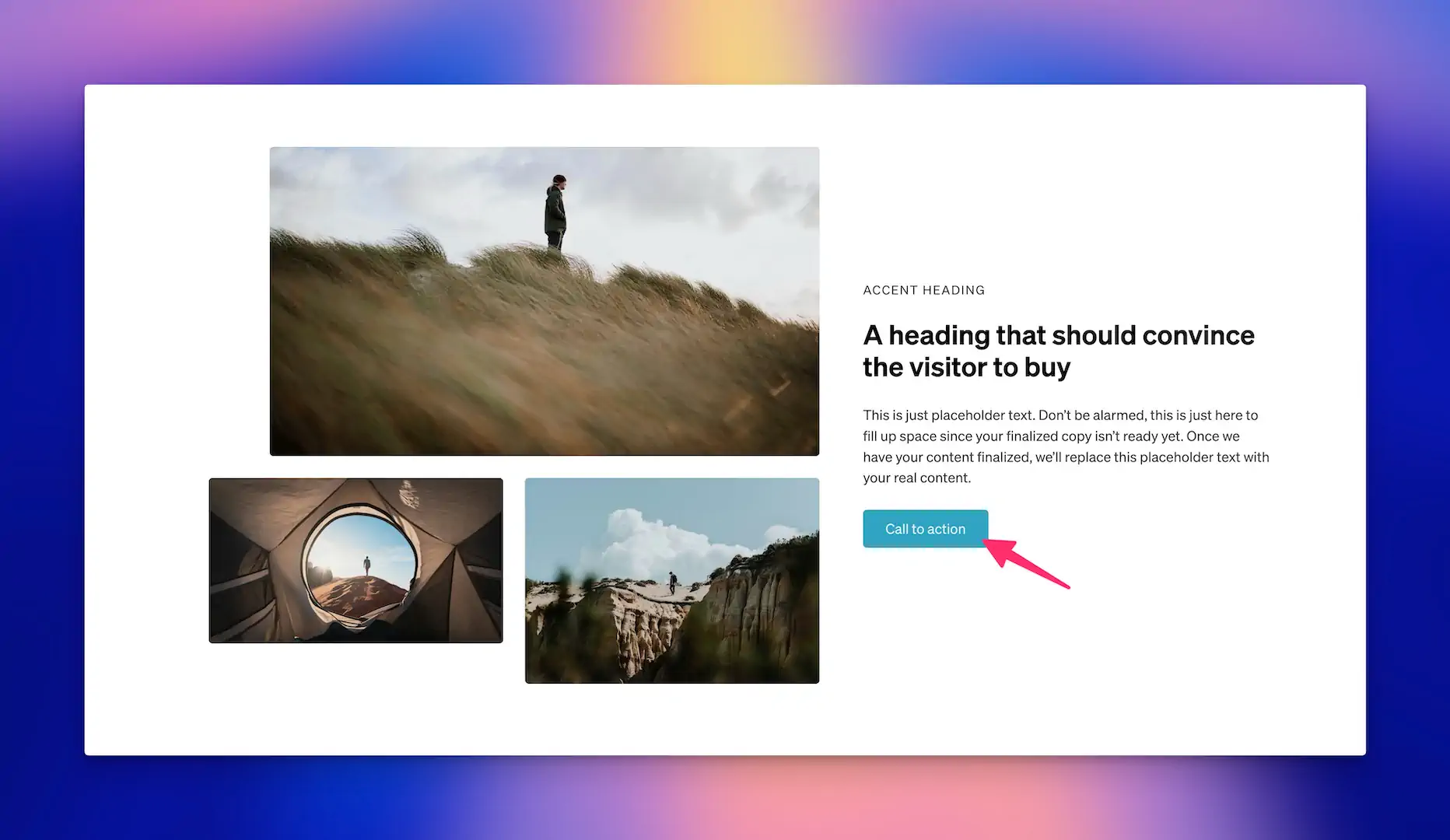
The simplest place to start with both Atomic Design and components is with the humble button element.
Whether it’s a link or an actual button, it’s a single element at its most basic level:
<a class="btn" href="<https://etchwp.com>">Etch is awesome.</a>It’s one line of HTML, styled with CSS. Simple!
In Atomic Design, this is referred to as an “Atom.”
An atom is the smallest piece of an overall design – an indivisible element that can’t be broken down into smaller parts.
Here are some examples of atoms:
- Button
- Form field label
- Accent heading
- Link
- Icon
- Image
- Divider
- Paragraph
Let’s stick with button for now, though.
When you turn a button into a component, you’re seizing control over all instances of that button’s styling, structure, logic, and general behavior.
If you decide not to turn a button into a component and just raw-dog the HTML code over and over again, the only thing you have control over is the styling (assuming you used a CSS class to style it).
The question is pretty simple. If you care about scalability and maintainability, would you rather have control over all parts of the buttons on your site, or just one small part of the buttons on your site?
Don’t think too hard. The answer is, “I want control over all parts of my buttons.”
You need to create a button component, then.
But should every atom be a component? Should a divider be a component? Should a paragraph be a component?
No, not everything should be a component.
What we need is a method of determining whether something should be a component or not.
Determining whether something should be a component or not
Creating components from things that don’t need to be components isn’t the end of the world, but it might be the end of a lot of your profitability and sanity.
Components require extra time, extra effort, extra thinking, and extra steps in your interactions with them.
To protect your profitability and to maintain an efficient workflow, you need a measuring stick for what should be a component and what shouldn’t be.
Here’s a good test:
- Are you going to use the thing over and over again, repeatedly?
- Do you need global control over one of the following:
- The HTML / layout / structure of all instances? This includes applied classes, aria labels, data attributes, and so on.
- Conditional logic associated with all instances?
- Javascript interactions associated with all instances?
- Is it plausible that one more child elements will get added to this thing in the future?
Let’s go through each one:
Test #1: Are you going to use the thing over and over again, repeatedly?
If the answer to this question is, “Yes,” then we’re already leaning heavily toward “component.”
It’s not a given, but it’s a heavy lean!
Using something repeatedly means that if you underestimate what might need to happen to this thing in the future, you might find yourself in a nightmare scenario where you have to locate every individual instance of that thing and make a manual change.
We call this place in life, “Chumpville” – a town where shame thrives and profits and pride both go to die.
Test #2: Do you need global control over one of the following?
And the options were:
- The HTML / layout / structure of all instances? This includes applied classes, aria labels, data attributes, and so on.
- Conditional logic associated with all instances?
- Javascript interactions associated with all instances?
If we use the button example:
Yes, you need control over the HTML of all instances.
Yes, there could be conditional logic associated with all instances.
Yes, there could be javascript interactions associated with all instances.
Test #3: Is it plausible that one more child elements will get added to this thing in the future?
The simplest, most plausible change that you might need to make to buttons is the addition of an icon.
This requires a change to the HTML:
<a class="btn" href="<https://etchwp.com>">
  Etch is awesome
  <svg />
</a>
Any time the HTML plausibly has to change, assuming the other two tests indicated the necessity of a component, then you definitely need a component.
What doesn’t need to be a component?
A divider, also an atom like a button, is either a single HTML element or a pseudo element.
Visually speaking, a divider is just a visual thing. And any logic for whether it exists or doesn’t exist can be handled either by CSS or by a parent component or template that it lives within.
A paragraph is another example of an element that doesn’t need to be a component. What are you going to do to paragraphs in the future that you’re not already capable of doing? Global styling and instance styling are both handled by CSS and conditional logic and JS are not at play here from a global vs instance perspective.
Images? Page builders already handle the base level HTML that you’d need to concern yourself with from a global standpoint. The actual instances of images don’t need to be components in your workflow.
There are also “preference” examples, like section introduction groupings, where you might have a collection of things: an accent heading, a heading, and a lede paragraph. This content collection is used to introduce the rest of the content in a section.
CSS can typically handle everything important about section introductions, especially if you’re using BEM and modifiers. So, should you forego making it a component?
These cases are up to you! Making an introduction a component requires extra work, for sure. However, there are payoffs beyond the stuff we’ve talked about so far:
- If the component supports “variants,” creating different types of introductions (left, right, center, with/without buttons, etc.) within a self-contained component could make your workflow more efficient.
- If there’s a good workflow for quickly adding components to a page, having a “Section Intro” component could speed up your workflow.
- If multiple people are working on a project, having more things componentized will make it easier for people to know what to use and how to use it when assembling pages.
Notice that these factors are not technical requirements. They’re simple preferences. If you prefer such things, you’ll use components more frequently than someone who doesn’t prefer them or who doesn’t feel that the juice is worth the extra squeeze.
Thinking beyond “atoms.”
Atoms aren’t the only thing in Atomic Design. We now have to talk about Molecules, Organisms, Templates, and Pages.
Atoms can combine, to form “Molecules,” which are a small collection of atoms.
Atoms and molecules, then, can combine to form “Organisms.”
“Organisms are relatively complex UI components composed of groups of molecules and/or atoms and/or other organisms. These organisms form distinct sections of an interface.” – Brad Frost
Next is “Templates,” which are page-level objects that “articulate content structure” via a visual layout.
Last is “Pages,” which are complete URL instances, which can be generated by a template or exist as a static instance.
A small collection of atoms is a “molecule.”
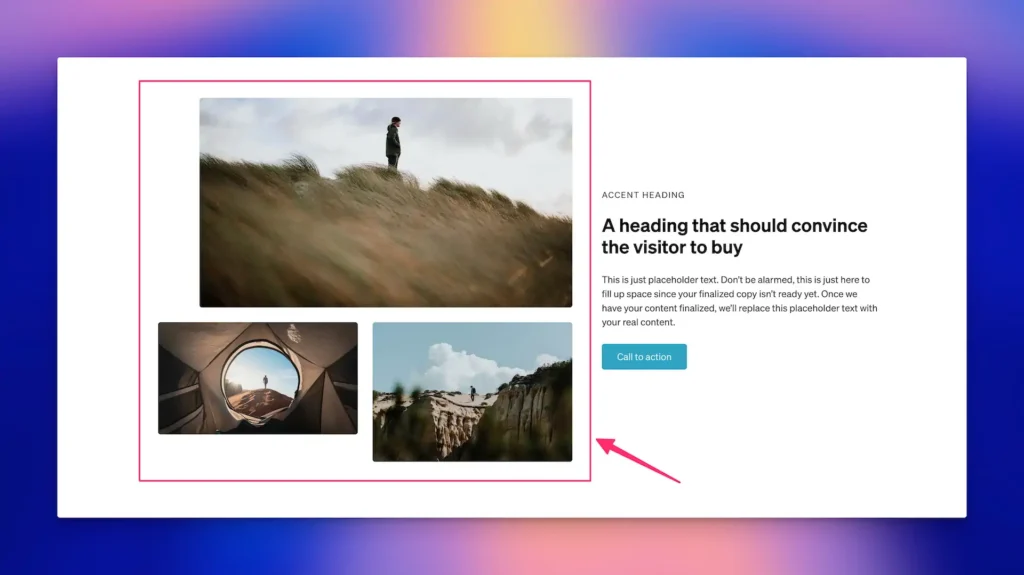
Once you start grouping some atoms together, you have a molecule.
Here are some examples of molecules:
- Card header
- Card body
- Card footer
- Alert box
- Button group
- Search bar with submit button
- Introduction
See how a molecule is basically a collection of atoms that really really seem like they belong together.
Should these things be components?
For the card header, card body, and card footer, the answer is, “No.” Their behavior is handled by a higher level Card component (we’ll talk about “Organisms” in a moment).
For an alert box, the answer is, “Yes.”
For a search bar with a button, the answer is, “Yes.”
What about organisms?
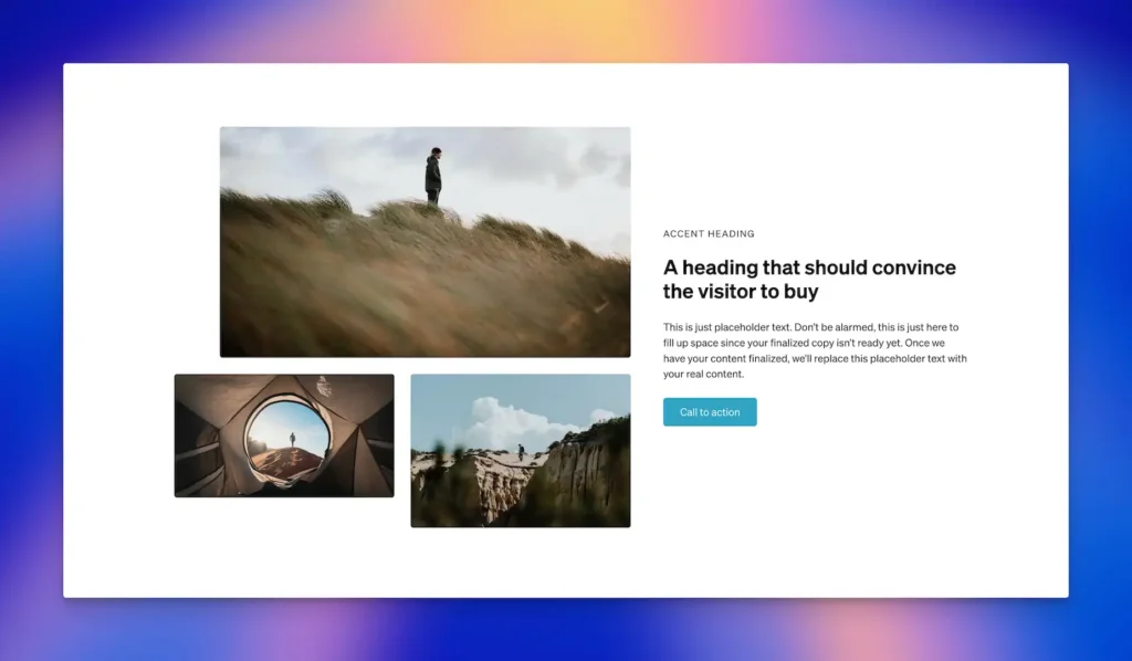
An organism is a group of atoms and molecules. Here are some examples:
- Header
- Comment Section
- Card
- Form
- Footer
- Hero Section
If you haven’t noticed by now, it’s common and perfectly acceptable for components to live inside of other components.
A header component could have a search form component, a button component, and a nav component.
A card component can have a button component and an icon component.
This is why Atomic Design thinking is critical. You have to decide, from smallest to largest, how things are going to live together and which things need to be components and which don’t.
A card is a perfect example:
<article class="card">
    <div class="card__header">
        <i class="card__icon" data-icon></i>
        <h3 class="card__title">Card Title</h3>
    </div>

    <div class="card__body">
        <p class="card__text">This is the main content of the card. You can put any text or other content here. The card body can contain multiple paragraphs or other elements.</p>
    </div>

    <div class="card__footer">
        <button class="btn card__button">Learn More</button>
    </div>
</article>
The card itself is an organism. The header, body, and footer are molecules. The icon, heading, text, and button are atoms.
The card needs to be a component. The header, body, and footer do not. The icon and button should be components as well (because they have utility and instances that exist outside of the card). The heading and text do not need to be components.
Are you starting to see how this works? It’s a question of relationships, re-use, and modularity.
Now Extend this logic to “Templates.”
Here’s where things are most confusing, due to how page builders have used this term starting back in Era 2.
In Atomic Design, a “template” is a page-level layout. It’s a collection of atoms, molecules, and organisms organized in a specific way.
In web development, however, templates also come with assignment-based conditional logic functionality. In other words, something is a “template” when you’re able to say, “This layout is used for rendering our blog posts,” for example.
The article you’re reading right now is rendered with a template.
In web design, it’s not helpful to call anything else a template. The problem is, we’re not all on the same page about this.
In Bricks, many things are referred to as templates that aren’t actually templates. There’s a “template library,” which is just a collection of static layouts.
Even worse, you can save atoms, molecules, and organisms all to the same place and they’re all referred to as “templates.” Insanity!
If you’re saving a static layout for re-use, but it has no real logic functionality, that’s best described as a “Pattern” or “Layout.” Molecules, organisms, and pages can all be “patterns” but they can’t all be “templates.”
The Frames Library, for example, is a pattern library. It would be confusing to refer to it as a “template library.”
Bricks and other page builders must work to fix these terminology issues or they’re going to continue generating mass confusion.
Last but not least, there are “Pages.”
We’re at the end of the road with Atomic Design! Congratulations.
A Page is a single URL instance of a template. Or, in the real world, it could also just be a static URL that contains atoms, molecules, and organisms, but isn’t dynamically generated from a template.
The easiest way to understand this is to compare a blog post template with single instance of an actual blog post. The post you’re reading is rendered by the template, but it’s not the template itself. Thus, this blog post is referred to as a “Page.”
Or, I can create an “About Page” statically using the builder. This page will be constructed with organisms, molecules, and atoms, but it’s not generated dynamically from a template.
Do you still have questions?
Its’ quite possible you still have questions because this subject is rife with grey areas. Here are some questions I’m assuming you might still have, even if they’re for clarification purposes. If you have questions beyond these, comment below and I’ll add them to the post.
Why do you consider a card component to be an organism and not a molecule?
A card is considered an organism because it’s a self-contained, complex component that typically combines multiple molecules and atoms to create a complete, functional unit. While a molecule represents a simple group of atoms working together (like a form label group), a card often contains multiple such groupings along with its own layout structure, styling rules, and potentially interactive elements. The complexity and completeness of a card’s functionality pushes it into the organism category.
How do you decide if a molecule should be a standalone component or part of an organism component?
This decision comes down to reusability and independence. If a molecule has functionality that could be useful in multiple contexts outside of its parent organism, it should be a standalone component. For example, a search bar might appear in a header organism, but it could also be useful elsewhere on the site, so it should be its own component. However, if the molecule’s functionality is tightly coupled with its parent organism and wouldn’t make sense to use elsewhere, it should remain part of the organism component.
Can components contain other components?
Yes, components can and often should contain other components. This is a fundamental aspect of component architecture and follows the natural hierarchy of Atomic Design. For example, a header component (organism) might contain a navigation menu component (molecule) which in turn contains multiple button components (atoms). This nesting of components allows for modular, reusable, and maintainable site structures.
What’s the difference between a pattern/layout and a template?
A pattern or layout is a static, pre-designed arrangement of elements that can be reused across different pages, but lacks the dynamic functionality of a template. While templates are designed to handle dynamic content and have built-in logic for rendering specific types of content (like blog posts or product pages), patterns are more like blueprints or starting points that can be customized for each use case. Think of patterns as reusable design solutions, while templates are functional systems for content delivery.
How do you handle components that might fit into multiple categories of Atomic Design?
Some components can blur the lines between Atomic Design categories, and that’s okay. The key is to focus on the component’s primary purpose and complexity level. For example, a navigation menu could be viewed as either a molecule (group of button atoms) or an organism (complex, self-contained unit). In such cases, evaluate the component’s complexity, reusability, and relationship with other components to make the most practical categorization decision. You’re not giving these things official labels that are being checked some Atomic Design oversight committee — don’t sweat the grey areas.
Should we still use BEM with CSS classes when creating components?
While components are capable of handling much of the style scoping that BEM provides, it’s still advisable to use classes to style components. There are two reasons for this: (1) workflow consistency (2) specificity and (3) insurance.
Changing your workflow every time you create a component is nonsensical for efficiency. This is especially true when you have tools like Automatic.css and its “Auto-BEM” functionality that adds all the appropriate classes in half a second.
Additionally, there are times when you may need to “detach” a component instance. This effectively turns that instance into a static pattern with no connection to the source component. There are also times where you may need to override the styling of a specific instance. Custom classes will save the day in these situations over other techniques like utility classes or ID styling.
Drop any additional questions below and I’ll add the best ones to this article.

