Incremental numbers are a popular naming convention for shades in design systems. You’ve probably seen something like this: primary-100, primary-200, primary-300, etc. Similar systems like primary-10, primary-20, and primary-1, primary-2 are also popular.
Moving this system into development asks the developer to tokenize these colors similarly. Thus, we might end up with something like this:
:root {
    --primary-100: #f7fafc;
    --primary-200: #edf2f7;
    --primary-300: #e2e8f0;
    --primary-400: #cbd5e0;
    --primary-500: #a0aec0;
    --primary-600: #718096;
    --primary-700: #4a5568;
    --primary-800: #2d3748;
    --primary-900: #1a202c;
}
That’s an overly simplified version, of course. You’d want to avoid hex codes and use HSL partials (or something like oklch()) to make everything truly flexible and easily maintainable.
That’s beyond the scope of this article, though. Today, the goal is to explore the negative aspects of this numbering syntax. So, let’s get to it.
Argument #1: Specificity in variable names breaks mutability
The 100-900 system often maps to specific lightness values. In HSL, this would be 10% lightness to 90% lightness. And this is a big problem.
Variable: not consistent or having a fixed pattern; liable to change.
Variables are called variables for a reason: they’re placeholders for values that might need to change. So, why would we want the variable’s name to reference some sort of fixed value?
Almost everyone can agree that var(--red) is bad because we’re now stuck with a variable that must have a red value, or else we introduce chaos into the design system.
So, instead of red, we use a name like “primary” because it describes the context in which the color is used and not its actual value.
Much better! Right? Right?
If you agree that’s better, then you can’t immediately propose appending a number value syntax for the shade system. That introduces a very similar problem.
Let’s say I’m using a numbered shade system, and I use var(--primary-200) about 75 times before I realize that it’s not actually light enough. I need a lighter shade, which proponents of the numbered system would suggest I switch to var(--primary-100).
Assuming that var(--primary-100) actually works for what I need, I now have to replace all instances of var(--primary-200) with var(--primary-100), which isn’t a trivial task in a page builder. And even if I accomplish that, I’m still left with a var(--primary-200) that we just decided isn’t really applicable to this project.
We can explore half a dozen tangents here, but the main point is this: if I have to replace the variable instead of changing its value, didn’t I name it poorly?
Once again, the point of a variable is that its value may change. If a variable can’t support a value change because of its name, hasn’t the train run off the tracks at that point?
Argument #2: What’s the variable name for the actual color (versus random shades)?
Let’s say that we have three brand colors for our project: Primary, Secondary, and Base.
You need to deploy each main color. Which variable do you use?
Would you guess:
var(--primary-500)var(--secondary-500)var(--base-500)
If so, you’d be wrong.

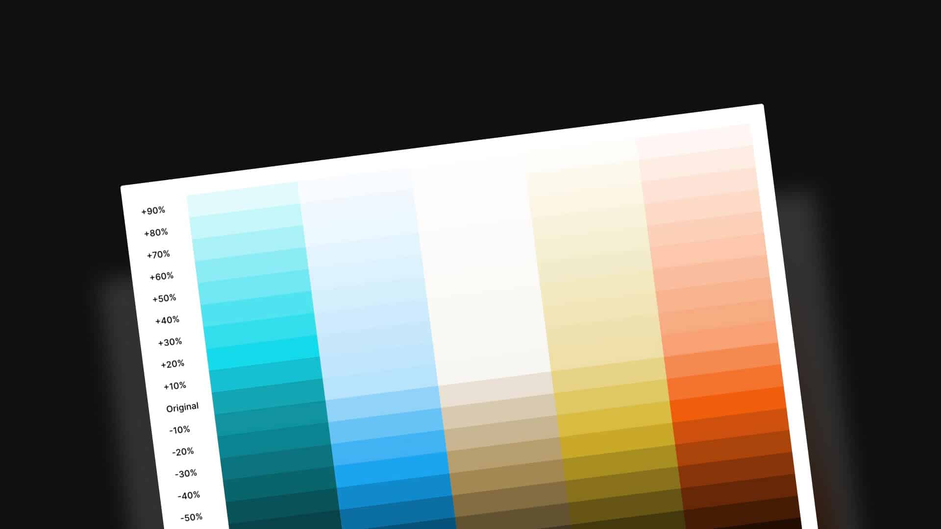
The circles in the above graphic represent the actual chosen brand color.
For example, if you want to use the actual primary color, you need var(--primary-500), and if you want to use the actual secondary color, you need var(--secondary-100).
This is presumably because the secondary color is already very light. Thus, it’s deemed to live at the bottom of the scale. But, there are two major problems with this:
- You can’t possibly know what variable you should reference in development without first referencing and studying each project’s color setup. That’s time-consuming and doesn’t scale.
- If the secondary color changes, the entire scale and all the variables you’ve used immediately become invalid unless the new color shares a similar lightness value.
Once again, inherent limitations exist due to the specificity of the variable names. But the issues do not end there.
Argument #3: Once the numbered system gets too granular, it becomes absurdly disorganized
I was pretty lenient on the numbered system in the first argument. It was assumed that when 200 didn’t work, 100 would. Often, though, that’s not the case.
What if I need a value between 100 and 200? This is where proponents of the numbered system would suggest adding a “150.” The same is true when you need something lighter than 100 or darker than 900. “Go with ’50’ or ‘950’,” they say.
But this begs the question, “Does it have to be exactly between 100 and 200 to qualify as 150? Or, if it leans more toward 200, should it be 175? I don’t know if there’s an official protocol, but I do know it’s always confusing.
I’ve seen these systems in practice plenty of times, and they often end up with 150 here, 450 there, 750 elsewhere, and so on. And guess what? These “tweener” shades only apply to one color, not the entire design system!
What ends up happening is that you can’t mentally keep track of which tweener shades exist for which colors. Not today, not tomorrow, and certainly not three months from now when you must revisit the project to add new stuff.
Not only can you not keep track of which tweener shades are available, you easily lose track of which shades are being used and which aren’t.
And, once again, if the color value changes completely, all your tweener shades are rendered obsolete and likely need to be found and replaced because they only made sense relative to the old color values.
It’s an absolute mess.
I guess this leads us into argument four.
Argument #4: Big chunks of the numbered system are wasted and potentially inaccessible.
You start out with nine variants of each color in a 100-900 system.
OK. Let’s start with the fact that you hardly ever need nine different shades of color in a project. Given this fact, you’re immediately rendering a bunch of those options obsolete.
Which ones? We don’t know. The obsolete variants will be different for each color, so that’s something else you’ll need to keep track of.
Now, let’s talk about “usable ranges.”
I was reading Color in Design Systems and came across this section and graphic:
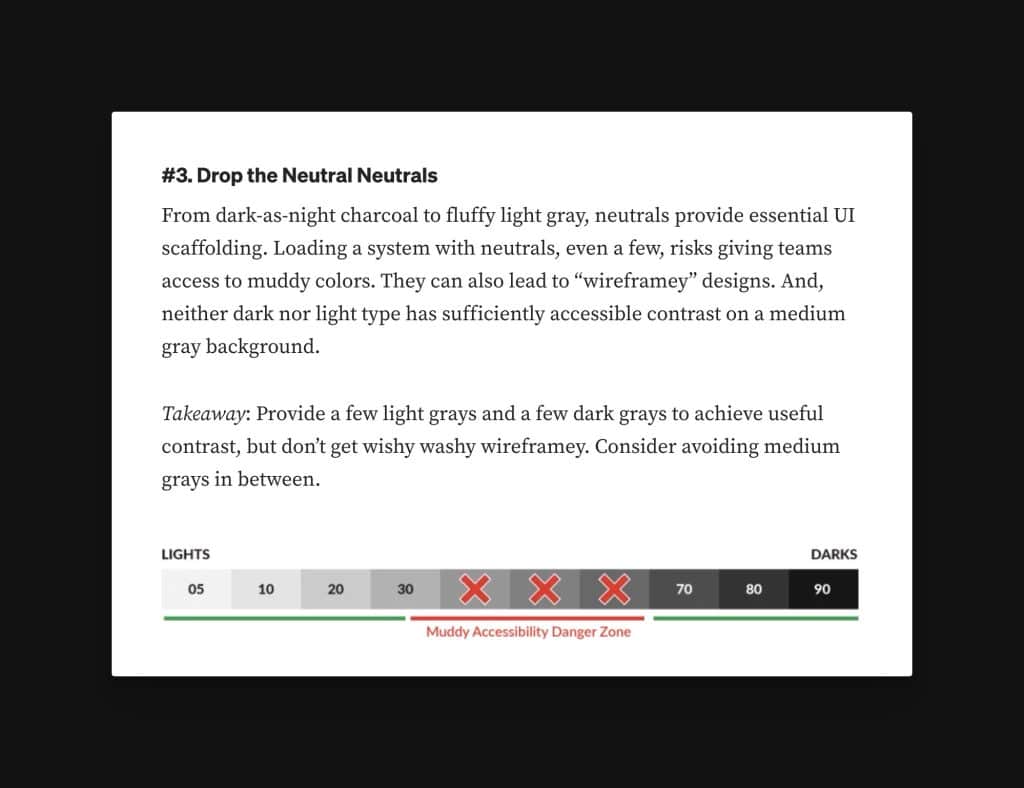
It says:
From dark-as-night charcoal to fluffy light gray, neutrals provide essential UI scaffolding. Loading a system with neutrals, even a few, risks giving teams access to muddy colors. They can also lead to “wireframey” designs. And, neither dark nor light type has sufficiently accessible contrast on a medium gray background.
Takeaway: Provide a few light grays and a few dark grays to achieve useful contrast, but don’t get wishy washy wireframey. Consider avoiding medium grays in between.
Color in Design Systems
This fact is true for many colors, not just neutrals. There will be a group of shades within each color that are irrelevant to the project or create inaccessible outcomes. So, why do they exist?
The suggestion, of course, is not to offer them:
At the core of a good system is choice without endless options, a stable aesthetic to serve as a starting point. Odds are, you aren’t Material Design, intended to serve countless products. In most cases, a design system need not offer boundless choices. The more choices you provide, the tougher it’ll be to control harmonic combinations and a consistent feel across applications.
Takeaway: Offer a handful of options and avoid tedious variety. Empower system users with just enough choice: more than a single option, but only up to a few intentional choices.
Color in Design Systems
The suggestion is only to provide variables for the usable shades, like this: var(--primary-400), var(--primary-700), and var(--primary-800).
That keeps the stylesheet and workflow nice and clean, but problems still exist:
- If the color ever changes, everything is broken. This is a problem that’s unavoidable with this system, which makes it a non-starter.
- When you’re deploying colors during development, you constantly have to reference which values are available and which aren’t.
- We still have all the other issues we’ve already discussed.
Remember, the goal of a design system is to introduce order and maintainability and eliminate chaos. This numbered approach does not do that to the degree we need. Whatever it solves, it can’t help but create new issues.
Descriptive Names Are a Better Approach
Given the limitations of a numbered shade system, I decided to use descriptive names for shades in Automatic.css. More specifically, there are three light shades and three dark shades, which puts the main color right in the middle.
- ultra-dark
- dark
- semi-dark
- main color
- semi-light
- light
- ultra-light
A seventh variant, “hover,” also exists, which is a shade specific to the hover value.
We can grade this against the limitations of the numbered system to see the advantages:
- Are they mutable? Yes, you can change the value of the shade at any time, and its name will still make sense. In fact, you can also change shade values in relation to each other without breaking the context. The shade’s name doesn’t attempt to describe any specific value, range, or difference range.
- Do you know the variable for the actual color without referencing it? Yes. The variable is simply the name of the color (e.g.
var(--primary)). - Are all shades relevant? Yep. The shade names are relative to the chosen color. A light color can still have three lighter shades and three darker shades, all with usable values (since their value can be whatever is needed and is not specifically tied in any way to the name of the shade).
- Do you need tweener shades? In most cases, no. Tweener shades are necessary in a numbered system because the whole numbers are already set and describe a specific value but aren’t the needed value. In a descriptive system, the shades are programmed to be the exact needed value, and most designs call for less than seven shades of any color.
- Can it be expanded, though? Of course. I’ve considered the possibility of an “extra-dark” and “extra-light,” which would be the system’s bookends, but they haven’t been needed so far. Adding them manually is very easy if they’re needed on a project.
The Next Step is Contextual Abstraction
The best way to assign color to areas of a UI is through contextual abstraction. Context abstraction is important whether you use a numbered or a descriptive system.
A basic example of this is link color. Instead of this:
a {
  color: var(--primary);
}
Do this:
a {
  color: var(--link-color);
}
Then, --link-color is mapped to var(--primary).
This assignment of colors to specific contexts brings additional order, organization, and maintainability to the UI and the development process. Of course, this is easier to do when shades have descriptive names and don’t have all the downsides of the numbered approach.
I’ll discuss contextual abstraction in more detail in future articles and videos. But what do you think about numbered systems versus descriptive systems now? Are you convinced?