This is one of those tutorials that will 100% change how you develop websites, so don't sleep on it!
Too many sites out there are "good looking," but when you look at the underlying page and component structure, CSS, etc. you realize that it's actually a nightmare in terms of scalability and maintainability.
Styling is just haphazardly tossed around to achieve an initial objective with zero thought put into future-proofing the design and layout.
This is a huge failure. It doesn't matter how pretty a website is, if it can't be easily maintained and scaled, you've failed as a developer.
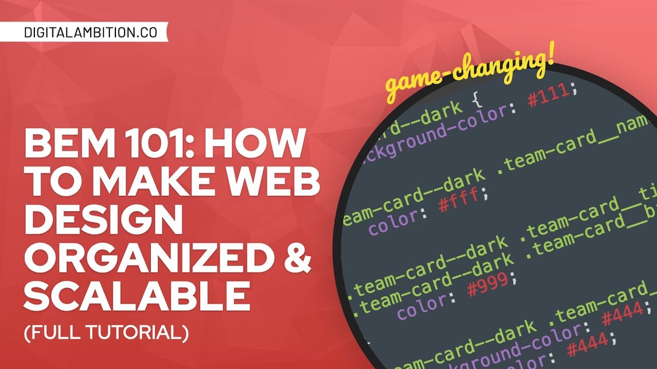
In this training you'll learn a specific methodology called BEM (Block, Element, Modifier) for organizing your website's styling. The benefits of BEM are enormous:
• Organization
• Scalability
• Semantic accuracy & readability
• Avoiding class name collisions
• Easier writing
• Easier debugging
• Easier modification
• Avoid specificity issues
• Faster rendering
• "Self-documenting code"
Never again will your sites fail what I call the 3-month or 6-month rule. Never again will you develop a pretty website that has a horrific styling architecture underneath.
Not enough people take pride in building sites with a clean, efficient, concise, organized structure. In my opinion, this should be one of the main goals because scalability and maintainability is everything.
Want to go deeper? Join my Inner Circle: https://digitalambition.co/inner-circle/
00:00 Context & Black Belt Development
05:20 Why BEM?
08:38 Examples of Bad Dev
23:34 How BEM Works (Structure)
35:05 Example CSS
36:22 Real-World Example
39:07 Adding the HTML Elements
41:03 Adding the BEM Classes
43:36 Styling the Component
54:24 Adding a Modifier (Dark Component)
1:00:00 Final Thoughts