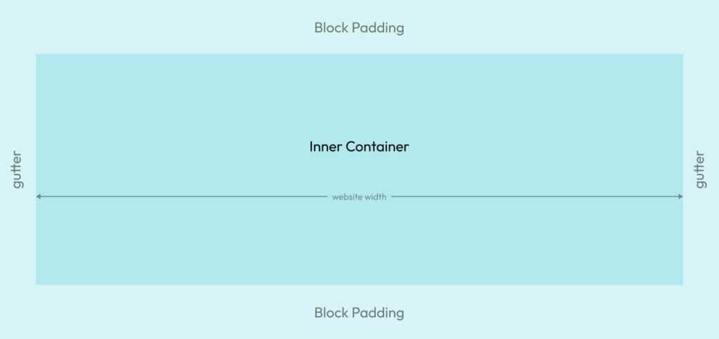
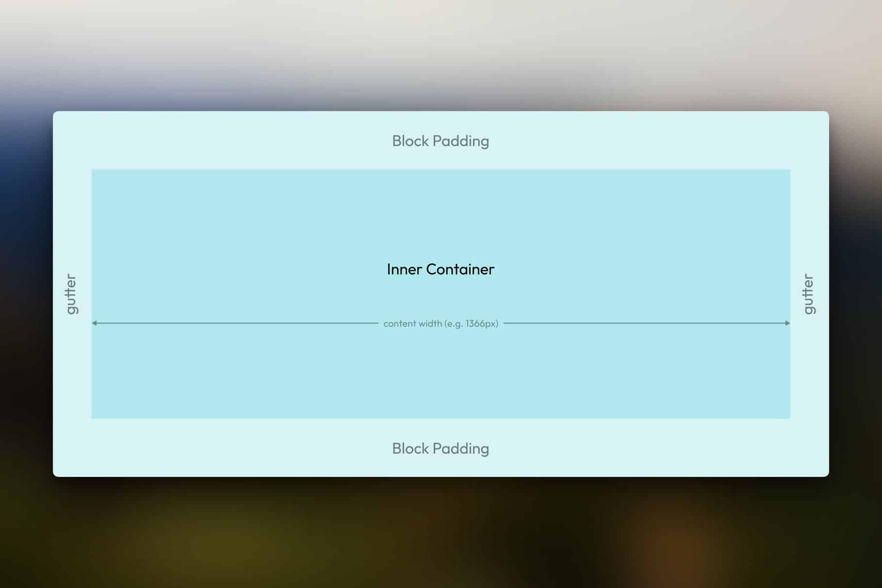
The section element in HTML is one of web design’s most fundamental and mission-critical elements. It groups content by topic, helps establish a gutter, helps establish a vertical spacing rhythm, and helps establish and maintain the content width of a website.
The big question is: why is such a fundamental, essential, and often-used element missing or improperly structured in most website builders?
Now, to be fair, there’s no such thing as a “section element” in HTML land. Basically, everything is a box in HTML. If you change the tag on a box, you can change its meaning and purpose.
But website builders are not “HTML land.” Website builders exist to help make our lives easier and our workflow faster (we hope).
Let’s discuss the desirable section structure and why every page builder should have a dedicated Section element.
Desirable section structure

When I talk about a “section element,” it’s really two elements in one. This is because, in HTML, you’ll typically see a section created like this:
<section>
  <div class="container">
    {content}
  </div>
</section>
The section tag denotes the section, but in order to do anything relevant with it, you need an inner container for the actual content.
Here are some more specifics on this setup:
- The inner container should be centered on the inline axis.
- The inner container should default to the website’s content width.
- The inner container should be selectable in the website builder.
- A section should be able to have more than one inner container for grouping associated content.
- Block padding should be used on the
sectionto establish a vertical spacing rhythm for the content. - A consistent gutter for the website should be established using inline padding on the
section. Alternatively, amin()function can be used on the container to establish a gutter.
What appears to be a relatively simple section setup is more complex under the hood. But the why behind all this is essential:
- Sections group page content semantically
- Containers within sections group associated content for easier spacing, patterning, and maneuverability.
- Containers establish a consistent content width.
- Sections establish a consistent gutter.
- Consistent padding values in sections establish a vertical spacing rhythm.
Here’s a Codepen version:
See the Pen Desirable Section Structure by Kevin Geary (@geary-co) on CodePen.
Why website builders should have a single drag-and-drop element that does all this automatically
In WordPress’ block editor, which has no section element, here are the steps required to reproduce the desirable section structure:
- Add a Group element to the canvas (2 clicks).
- Change the Group element’s semantic tag to section (3 clicks)
- Add another Group element inside the original one (3 clicks)
- Add a .container class to the inner Group element (2 clicks)
In order for this to work, you have to write global CSS to add styling instructions:
section {
	display: flex;
	flex-direction: column;
}

:where(main > section) {
  padding-block: var(--section-space);
  padding-inline: var(--gutter);
  gap: var(--container-gap);
}

.container {
  display: flex;
  flex-direction: column;
  margin-inline: auto;
  width: 100%;
  max-width: var(--content-width);
}
See! When using a website builder that doesn’t have the foresight to create a section element with sensible defaults, the user has to write global CSS and then spend 10 clicks *per section* to lay their page out.
Now, let’s contrast the WordPress Block Editor experience with the experience a user will have in a capable website builder like Bricks Builder:
- Add a Section element to the canvas (2 clicks)
- Move on with life
Default section styling can be applied in Bricks’ global theme styles without writing a single line of CSS.
So, not only does the user not have to write CSS, but adding a section to the page only costs two clicks. If a page has five sections, that’s ten total clicks (it’s actually only six because you don’t have to click the “add element” icon every time).
In WordPress’ Block Editor, Adding five Sections to a page costs 50 clicks. This is the type of inefficiency that should make any proper front-end developer want to jump off a bridge face first.
Isn’t this the exact scenario where we expect a website builder to step in and save us from all this hassle?
Not to mention, having a section element that does all this automatically ensures that semantic accuracy is applied more consistently across websites. When the user has to manually change the semantic tag on every generic “group” element or wrapper, there’s a much higher chance that they’ll forget a few here and there (or just never do it).
This is why you see so many Elementor sites without proper section tags. The user *can* manually set a section tag on a container acting as a section, but most don’t know they’re supposed to. It creates a fundamental semantic failure, not to mention all the other issues with spacing that arise from using generic containers.
Which popular website builders are failing users when it comes to providing a semantic Section element?
The answer is, “way too many!”
Popular website builders with *no* Section element
The following website builders don’t offer a drag-and-drop section element of any kind.
- Elementor –
sectiontag must be set manually on a generic container, and inner wrappers aren’t selectable. - Divi – No
sectionelement and no ability to set the tag manually. - WordPress (Gutenberg / Block Editor) – the
sectiontag must be set manually on a generic container, and the inner wrapper must be added manually. - Generate Blocks – the
sectiontag must be set manually. - Beaver Builder – the
sectiontag must be set manually, and inner wrappers aren’t selectable. - Duda – the
sectiontag must be set manually (a plan with “dev mode” is required), and inner wrappers aren’t selectable. - Webflow – Has a
sectionelement but doesn’t provide an inner container.
Website builders with a poorly structured Section element
The following website builders offer a drag-and-drop section element, but it has one or more vulnerabilities.
- Wix – Has a
sectionelement, but doesn’t give the user access to the inner container. Also uses far too many nested wrappers. - Squarespace – Has a
sectionelement, but doesn’t provide the user access to the inner container. Also uses far too many nested wrappers. - Oxygen – Has a
sectionelement but doesn’t give the user access to the inner container. - Breakdance – Has a
sectionelement but doesn’t give the user access to the inner container. - Kadence Blocks – Has a
sectionelement but doesn’t give the user access to the inner container and fails to set the semantic tag automatically. - Cornerstone – Has a
sectionelement but doesn’t provide an inner container as part of it and doesn’t automatically set the semantic HTML tag. Useless.
Note: Not providing access to inner wrappers is a much bigger problem than most people think. It causes “deal breaker” type issues with styling, framework compatibility, CSS targeting, etc.
Website builders with a correct Section element
The following website builders have a proper drag-and-drop section element.
How can website builders improve?
A proper Section element isn’t just a “nice to have” feature. For me, it’s mandatory. I refuse to use a website builder that lacks a Section element or has a poorly structured Section element. I’ve spent enough time with those builders, and they’re not worth the hassle.
If you’re using one of the many website builders that fail in this regard and you want them to make improvements, feel free to send them this article. Developers will only make improvements in this area when users demand it.

