Page builder developers have been pretty bad at naming things for the last decade. It makes for a frustrating experience for advanced users and a much steeper learning curve for beginners.
As we develop Etch, a next-era visual development environment for WordPress, we’re putting a lot of thought into how things have been named and how they should be named going forward.
Bringing clarity to naming conventions shouldn’t just be an Etch thing, though. There’s room for improvement across the board.
Unification of terminology:
- Improves data liberation and translation.
- Makes it easier for users to adopt new tools and new workflows.
- Makes it easier for agencies and freelancers to manage sites they didn’t build.
- Reduces the learning curve for beginners.
Below is a list of confusing terms, an explanation for why the term is confusing, and a proposal for better terms.
“Block”
Perhaps the most widespread term with the most confusion is “block.”
- WordPress’s Gutenberg editor identifies as a “block editor” and all the elements are called “blocks.” But, other page builders don’t identify as block editors.
- Some builders refer to elements as “blocks,” others as “modules,” and some as “elements.” There’s even the throwback term, “widgets.”
- In Bricks Builder, there is a “block” element, which is just a div set to display flex by default.
- In fundamental web development, elements can be “block level” or have their display set to “block,” which is a description of how the element is rendered.
This is all quite confusing for no reason. As a general principle, we shouldn’t casually repurpose terms. The term “block” is already reserved for the display property in web design. It can’t just be hijacked and used to describe every element in a specific type of editor.
Proposal: The fundamentals of web design already decided that divs, headings, links, images, etc. are HTML “elements.” In CSS, you can select these things via an “element selector.” This is a done deal. There’s no need to rename these things. They’re called elements, they’ve always been called elements, so let’s keep calling them elements.
Proposal 2: There’s a definite use case for a div that’s set to display flex/column and 100% width by default. This is what Bricks refers to as a “Block” element. This should be renamed to “Flex Div” because that’s exactly what it is. “Block” is actually the exact opposite of what this is, since display: flex; is definitively not display: block;.
Section
The section element is a very important grouping element in web design. Unfortunately, most visual builders don’t offer this element and the ones that do, often offer it incorrectly.
Whether the section uses a traditional container and gutter structure, a content grid structure, or a safe-content-width structure is up to each environment, but the section element should exist, should be structured properly, and should have a semantic section tag by default.
Examples of builders that don’t offer this element: Elementor, Gutenberg, Beaver Builder, etc. all use generic “container” (definitely wrong – see below), “group,” or box elements to make a section.
Examples of builders that do this wrong: Oxygen Builder and Breakdance put the “gutter” and section padding in the container element instead of the section element. This is objectively wrong, since it interferes with the chosen content width of the website and destroys the usefulness of the box model of the container.
Container
The direct child of a section element, or any box that establishes “content width” and center alignment, is often referred to as a “container.” Many page builders offer a “container” element that is a shortcut for adding this behavior.
However, some page builders (Elementor, for example) use “container” for literally everything structural. They call every box a container with zero differentiation between the semantic tag being used (section, div, list, etc.) or its behavior (page-width and centered). This is chaos!
The problem with both of these situations is that “container” creates confusion with container queries.
When you add a container query in CSS, you establish a “container.” This is the only time that a browser inspector will actually refer-to and label something as a container. But, this container is clearly different from a content-width container or any other generic box.
Once again, we’re trying to repurpose terms and we’re creating mass confusion in the process.
In this case, there’s no official term for a box that establishes content-width and center alignment. We’re free to name it, but we should avoid using names that are already in use.
Proposal: This is an element that I’m not 100% sold on a name for. I’m leaning toward “shell” because it’s a good structural and containment term. I’m open to suggestions as long as they’re short, concise, and make sense.
Proposal: Multiple people have voted for “Inner.” This is a common nomenclature for section inner wrappers.
Proposal 2: Stop calling every box a container. A “container” is not a multi-purpose term. Everything can’t be a container – that’s madness.
Gutter
In Automatic.css, we’ve been using “Gutter” as the name of the inline space that protects content from touching the edge of the screen.
A big problem with existing visual builders is that they fail to establish a consistent gutter and seemingly fail to recognize its tremendous importance.
Since most builders don’t have a section element, users end up adding group blocks, containers, boxes, or divs and then must add padding or manually establish a gutter on a section by section basis.
This requires the user to remember and manually match their inline space value on every section manually while creating a ton of room for inconsistencies. And since this value is rarely tokenized, the user has no global control over it later.
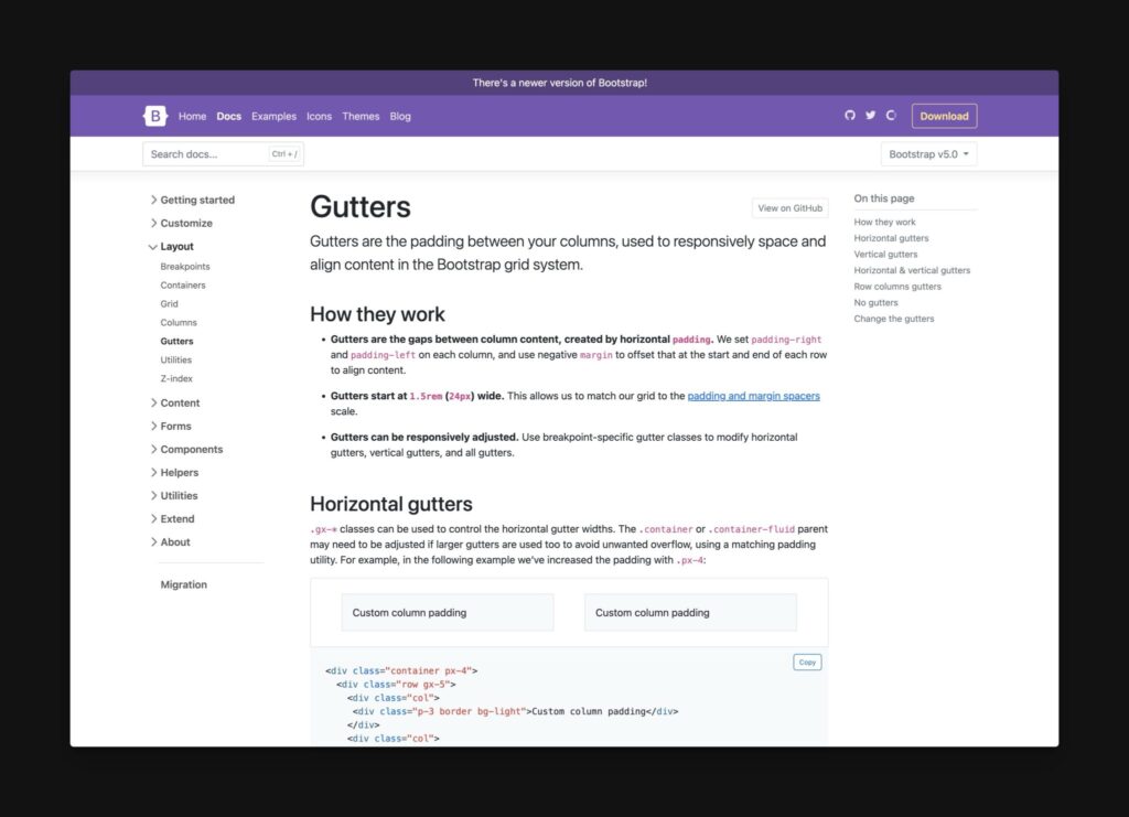
To make matters worse, we discovered that Bootstrap was already using the term Gutter, but inappropriately.
From Bootstrap: “Gutters are the padding between your columns, used to responsively space and align content in the Bootstrap grid system.”
This is completely nonsensical and confusing for two reasons:
- There’s already a term for this space. It’s called “gap.”
- “Gutters” don’t run between things. The gutters on a bowling alley are exclusively on the outside of the lane. The gutters on a street are exclusively on the outside of the street. The gutters on houses are exclusively on the outside of the house.
It should come as no surprise that Bootstrap is inappropriately using this term, though, because confusion is their favorite hobby. After all, this is the framework that has a “grid system” built with Flexbox. Stop the madness!
Proposal: “Gutter” is the term exclusively reserved for the inline space between the farthest edge of your content (content-width) and the viewport (viewport-width). It should be tokenized with var(--gutter) so the value is consistent and easily referenceable.
Columns
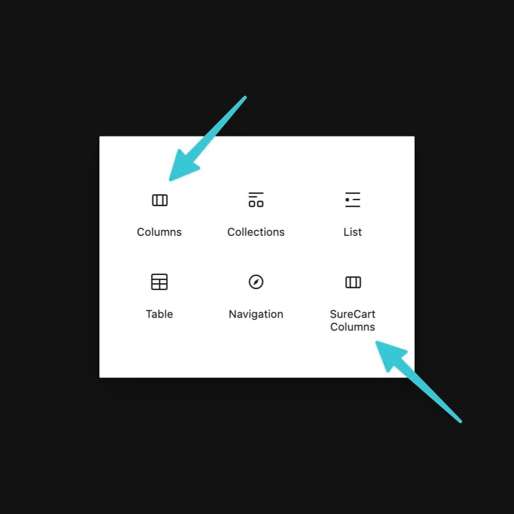
Bricks, Gutenberg, Elementor, Divi, Beaver Builder and many other page builders have a “columns” element. The problem is that “columns” is a very poor description of how these elements behave and it conflicts with how “columns” is used elsewhere in web design.
What these “columns” elements all do is create a multi-column flex layout, but there’s no way to know how that’s being done from the term itself, and the method used is of critical importance.
“Columns” in CSS describe a multi-column layout where content can flow freely from column to column. This is a very specific type of layout that is completely different from the flex and grid layouts being used by the “Columns” element in page builders.
Another issue is that columns are also established by CSS Grid. But the “columns” element doesn’t tell us whether or not our columns will be established by flex or grid. And…
The final issue here is that creating structural “columns” with Flexbox is usually the worst way to create columnized content. For structural layouts, grid is far superior to flex.
Proposal: This element should be called “Flex Columns” to differentiate from the CSS columns property and its use should be extremely limited. I’d even argue that there’s no real reason for this element to exist as grid is almost always a better choice. In the instances you’d need Flex (e.g. Flex Grids), the page builder is usually not advanced enough to provide this as an element.
Proposal 2: End the offering of a “row” element. There’s no such thing. A Flex Div is already a row or has the ability to be a row. Grids have rows by default. Block level elements align themselves in rows by default. The concept of a “row” is established by the parent’s display property and can’t be offered as an element by itself without creating tremendous confusion.
Text/Basic Text/Rich Text
When I add text in Bricks Builder, it adds a div with text inside (head scratcher).
In Gutenberg, there’s no text element. It’s a paragraph element that adds a paragraph tag. But there’s no “rich text” element like we have in Elementor, Bricks, Divi, etc.
The rich text element in these page builders allow the user to freely write long-form content while including things like lists, images, and formatted text.
This is all very confusing, though, and the rich text element is one of the most problematic elements in page builders because the things inside the rich text interface typically can’t be styled independently with the builder’s inputs.
Proposal: We should offer a “paragraph” element that adds a single paragraph with an editable HTML tag so that it can transmute into a div or span if necessary.
Proposal 2: Rich text is okay to offer as long as the interface allows for granular control of rich text children. Offering rich text without this granular control is extremely problematic for users.
Button
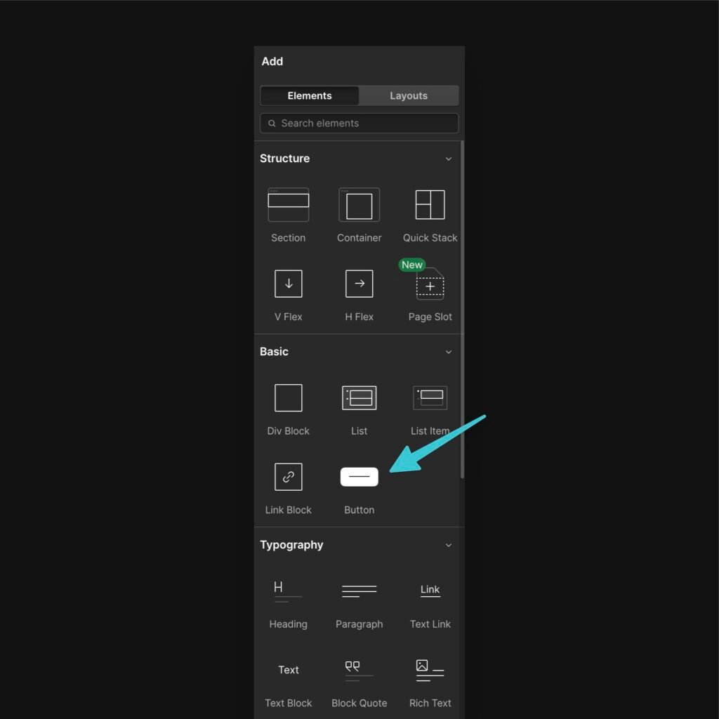
In almost every page builder, the “button” element adds a link that’s pre-styled to look like a button. The problem, obviously, is that there is a <button> element in HTML and this is not the element being used by the builder.
The general rule here is that links are for navigation and buttons are for triggering on-page events. This rule speaks to the HTML element used, not what the element looks like.
Unfortunately, the word “button” is used to describe a visual appearance where the semantics of HTML actually say nothing about visual appearance.
This is one of those areas that essentially proves that you can’t build websites without proper requisite knowledge. If the button element actually adds a <button>, beginners will always use the wrong element.
It’s tempting to try to step in to rescue the beginner user, but this is precisely what we should avoid. All of these terminology problems exist because builders are trying to coddle beginner users instead of building the tool the right way.
In the long run, it’s disempowering to beginners and highly frustrating for people who actually know the language of web design.
Proposal: Builders should provide a Link element that adds an <a> and a Button element that adds <button>. It’s up to the user to style their link to look like a button, which can be done automatically with builder options or with a single utility class. We should also make it clear which HTML tag is being used by an element at all times and make it easily editable.
Menu
Who is responsible for originally calling the navigation element a “menu?” We know clients call them “tabs,” but who came up with menu? Was it WordPress, as shown above?
The proper term is “Navigation.” Why? Because that’s what the HTML element actually is.
Here’s the structure of a basic navigation:
<nav>
  <ul>
    <li></li>
    <li></li>
    <li></li>
  </ul>
</nav>
Not this:
<menu>
  <ul>
    <li></li>
    <li></li>
    <li></li>
  </ul>
</menu>
Why? Because if you did see that, you’d be looking at a semantic toolbar element and not a website navigation. That’s what the <menu> element is for, by the way.
Yep, they’re two completely separate things! That’s why it’s baffling that someone took the name of an existing element and just willy-nilly repurposed it for something else.
Be honest, did you even know there was a <menu> element used for something completely different? No?
This is why naming things and sticking to those names is so important!
Not to mention, have you ever built a restaurant website? Have you ever tried to have conversations with the client about “the menu?” It’s like a “who’s on first” situation.
All these problems are easily avoided. The element is a <nav> element, and it permits you to easily navigate the website, so let’s just call it a “navigation!”
“Navigation menu” is fine if you insist on using the word “menu,” but “Menu” by itself is not OK because it creates confusion and lacks accuracy.
Templates
The term “templates” in modern web design is diabolical. It’s an absolute free-for-all.
Every builder/platform seems to have a different take on what a template is and some have even branched off to define various types of templates.
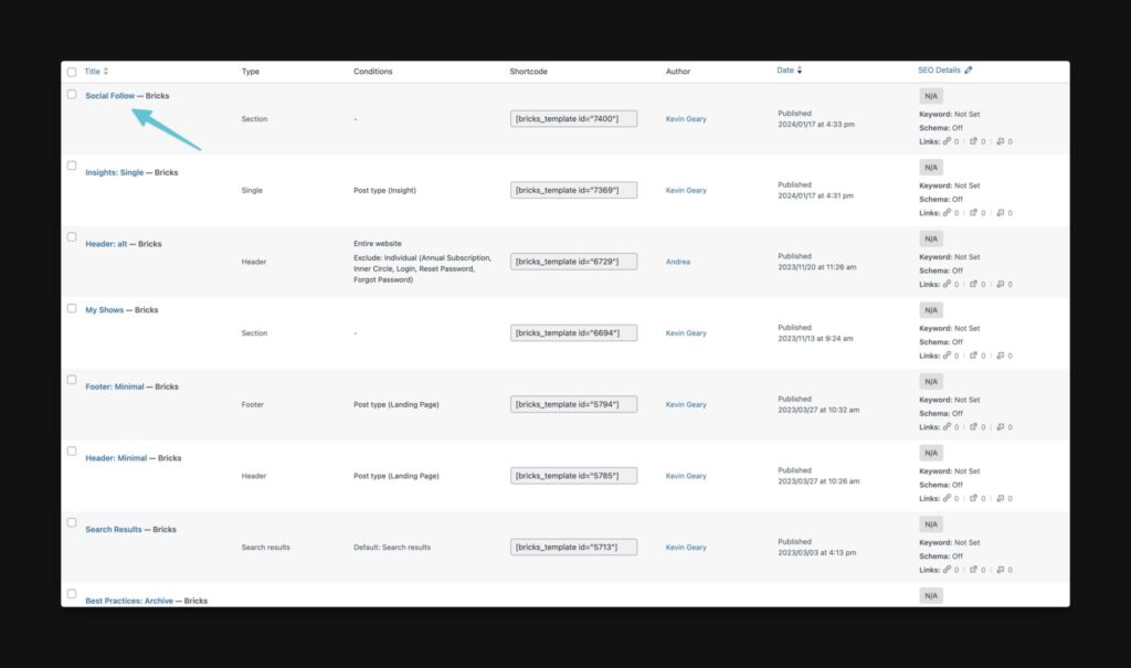
In the screenshot above, every template in the Bricks Builder templates list is actually a template, except the first one. And if you were able to keep scrolling, you’d see more non-templates listed in the templates area.
This is because Bricks refers to almost everything as a template. Save a button to the “template library,” that’s a template! Save a hero section, that’s a template! Save a full page with conditional logic that uses dynamic data to display content as a single source of truth for unlimited instances – also a template!
Webflow has an entire library of themes that they refer to as “templates.” Elementor says the same thing.
WordPress foregoes the term templates, choosing instead to use “themes.” Except, their use of the word “theme” goes far beyond design and layout and deep into architecture, which is a huge issue we’ll tackle shortly.
The problem is that we need to avoid conflating design, layout, architecture, and functionality. A hero section can’t be a “template” if a full blog post layout with conditional logic and dynamic data is also a “template.” These are not the same!
Terms are important because they’re supposed to consistently convey specific information. This is what makes communication functional and effective.
Examples of actual templates:
- Blog post template
- Post type template
- Archive template
- Search results template
- Etc.
Not a template:
- Header
- Footer
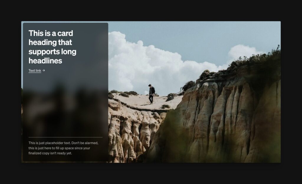
- Hero Section
- Card
- Etc.
Proposal: The term “template” should be reserved for single-source, page-level renderings using conditional logic and dynamic data. This is in alignment with atomic design principles and ensures that we’re all on the same page with what a template is and isn’t. If the content is static and not assigned with conditional logic, it’s not a template – it’s functionally something else (hint: we have a name for it! Keep reading.).
Components
Another diabolical term in modern web design!
But why? Why the confusion? Why are we pretending like there’s no existing spec for components?
Builders often refer to things like sliders, modals, accordions, etc. as components. Hell, when we created Frames we became guilty of the same thing (but we’re committed to fixing this!).
Another twist in this story is that builders came up with the concept of “global components.” This refers to an element that can be used in duplication where both the style and content are locked to the original instance.
Guess what? None of these things are components!
The “global component” in most page builders is a neutered form of component functionality. It’s mostly useless in the context of actual components.
Static duplications of pre-configured dynamic elements like sliders, accordions, etc. are not components at all.
Proposal: Components in web design are encapsulated elements whose style and content are controlled from a single source of truth, with defined content properties to ensure that content is interchangeable without losing control of the component’s HTML and JS. If that definition isn’t met, you can’t call it a component.
Proposal 2: Accordions, modals, sliders, carousels, etc. are “Dynamic Elements.” This is a differentiation from a standard Element like a div, section, heading, etc.
Proposal 3: Headers & footers are/should be components. Stop calling them templates.
Patterns
We need a term to describe specific layout instances that are static and typically contained in a library of dozens, hundreds, or even thousands of options.
In terms of atomic design, we might have atom patterns (button), molecule patterns (cards), and organism patterns (hero section).
In some cases, we could have a full template or page layout pattern, but the use of the term pattern over template would convey to the user exactly what’s going on with the functionality.
See, patterns are static. You can turn a pattern into a component or a template, but if you’re inserting a “pattern” from a “pattern library,” you know that you’re inserting a static thing with no pre-configured component-based functionality, dynamic data, or conditional logic.
Frames, for example, is a pattern library and Dynamic Element library (we’re gonna fix that name). Etch will have a pattern library.
Proposal: Patterns and pattern libraries are for common/saved patterns that users can insert anywhere. It’s then up to the user if they want to componentize or templatetize these things.
Themes
Designers should perfectly understand what “theming” is.
So do event planners. “What’s the theme of the party?”
Here’s a question: Can you throw many different themed parties in the same venue? Of course!
Theming just describes the skin of something, essentially.
Webflow has one single architecture that you can build infinite different designs with. Just pick an industry like plumbing. We can create 100 different plumbing websites that all look completely different, but that are built on the same architecture.
What should we call these things? Themes!
But WordPress, which powers 43% of the internet, screwed everyone by insisting that the word “theme” describes design, layout, AND architecture!
If you’re choosing between plumbing themes on WordPress, you can’t just choose the one that you like the look and feel of, because the decision you’re making also determines the architecture that’s available to you!
To make matters worse, there are now “classic themes,” “hybrid themes,” and “block themes.”
Block themes have a completely different architecture and are designed to work with the name-fail “block editor” in conjunction with their “Full Site Editor” which is some weird hybrid of a neutered component editor and template management system (nobody really knows because they struggle to communicate all this themselves).
And since the architecture is intertwined with the theme, you can’t just swap themes without breaking a lot of stuff.
By the way, WordPress is coming out with components, but they’re not calling them components. They prefer the cute term, “partially synced patterns.”
Chaos!
Proposal: “Theme” (noun) describes the design and pre-configured layouts of a website within a shared architecture. You can also edit “theme styles” (colors, spacing, etc.) separately from the layout and architecture, preferably with a styling framework.
Proposal: “Theme” (verb) describes the act of styling something consistently, hopefully with a styling framework like Automatic.css.
Wrap Up
Are you on the same page with the importance of using consistent terminology?
Do you see the current level of confusion in the industry?
I’m going to treat this article like a living, breathing document. It’ll get updated as needed and you’re welcome to drop your thoughts and suggestions below.