“Bold headline, Cotton.”
Relax. Don’t get all up in your feelings right away. Could you give me a second to explain?
Page Builders are great. My web design agency uses them exclusively. I teach people how to use them. My favorite is Bricks Builder.
This article isn’t paragraph after paragraph of me shitting on page builders. But I’m not going to thoroughly kiss their ass, either, because there *is* a big problem with them.
And yes, this problem exists even if you’re using a professional page builder rather than one of the Fisher Price builders like Elementor, Divi, or Beaver Builder. And it exists in non-WordPress page builders like Webflow (but I don’t care much about those).
You should agree with me by the end of this article. Or, perhaps not. Either way, you’re free to sound off, and we can still be friends.
Why WordPress page builders are great
Page builders exist to make building websites simpler. They provide a GUI for a situation that typically requires writing line after line of code.
What kind of code? HTML, PHP, and CSS, for the most part.
Professional options like Bricks and Oxygen do a great job writing HTML and PHP. You drag elements onto your page, configure loops, nest things, add attributes, and you can even change the semantic tags.
How do we know these builders are good at this? Because the code output is clean, accurate, and flexible. That’s a massive problem with those kiddie builders I mentioned earlier. The code they produce is a pile of **** an HTML landfill.
The professional builders don’t limit you like the others, either. You can drop in any custom code you want without issue. You more or less have complete control.
If you don’t know how to write HTML (or you find it as tedious as I do), and PHP has you all confused (that’s even me sometimes), then page builders are easily worth their weight in kilobytes.
They also dramatically speed up workflow over the option of writing the code yourself. Accomplishing things you can’t do is one thing, but doing it even faster than someone who *can* do it is another.
Where page builders fall on their face is with the CSS side of things.
<page builder marketing department enters the chat>
All you have to do to style an element in a page builder is click on the element, find the style you want to edit, adjust the value, and save the changes! No CSS knowledge is necessary!
<page builder marketing department exits the chat>
Sounds easy enough. And it is.
The code output is sound, too. Page builders can write A LOT of CSS for you.
If you don’t know CSS, this is a clear benefit. But, unlike with HTML and PHP, this is where the benefits end.
Styling elements in a page builder isn’t faster, cleaner, or more efficient than if you could write the CSS on your own. There are some significant limitations when using a page builder…
Scattered styles
When you write CSS by hand, especially if you use BEM, and even more so if you use Sass, the CSS for any given element is all in one place.
.my-block {
  display: flex;
  flex-direction: column;
  background-color: var(--base);
  font-size: var(--text-s);
  padding: var(--space-m);
  gap: var(--card-gap);
}

.my-block__heading {
  color: var(--base-ultra-light);
  font-size: var(--h2);
}

.my-block__heading::after {
  content: '';
  display: flex;
  background-color: var(--base-ultra-light);
  width: 100%;
  height: 1px;
  padding-top: var(--card-gap);
}
I can see exactly what’s going on by looking at one area, and any changes I need to make can all be completed in one place. And that’s without sass.
In a page builder, though, I cannot see the styling at a glance. Not only do you have to click into panel after panel and accordion after accordion to set the styles in the first place, but you also have to repeat that dance any time you want to make a change.
A simple card with a heading, paragraph, and button means multiple panels across multiple elements. And that assumes everything in the page builder canvas is even clickable. For example, pseudo-elements are typically in a different location and not accessible from the structure panel where all your other elements are.
This is an efficiency nightmare. Something that should take seconds takes minutes and dozens of clicks. Repeat ad nauseam for days on end.
Deciphering styling
Another issue with scattered styling is that it makes styling hard to decipher. If you’re working on a team or with a design set like Frames, it means you’re working with elements you didn’t build yourself.
Any time you’re working with an element someone else built, you first need to figure out how they structured it and styled it to the point it’s currently at.
Determining structure in a page builder is easy, thanks to the structure panel. Determining styling instructions? Not so much.
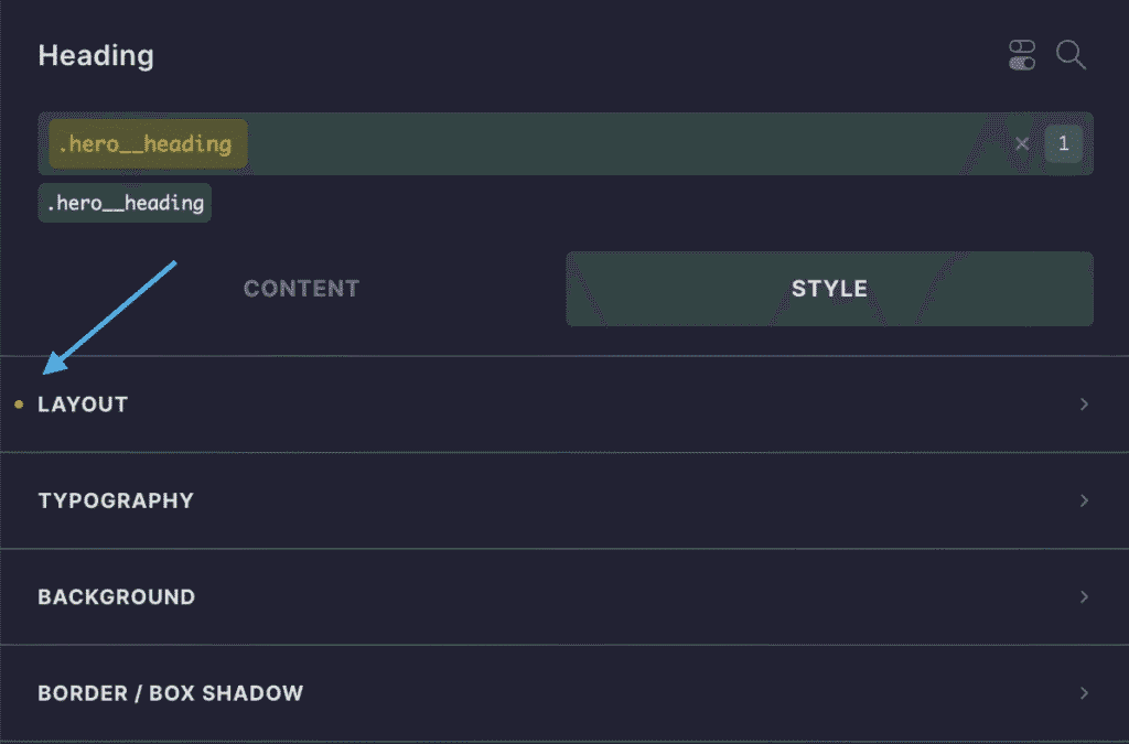
Sure, most builders have these styling indicators:

But first, that requires that you click the class. And maybe before you click the class, you have to note anything done at the ID level.
Once you see that styling was done to the “layout” tab at the class level, you still need to open that tab and see what’s happening. And guess what? Other nested panels may very well live inside that tab.
Oh, there’s a pseudo-element in play? Well, that’s not accessible from the structure panel or these class tabs. That lives somewhere else entirely (in its own set of panels)!
Now you can scroll back up to that block of sample code I posted earlier. See how everything is in one place? And since I use BEM, you can tell how a block is structured by looking at the CSS class names.
Speaking of BEM…
Page builders aren’t really BEM or compound selector compatible

I know. I teach BEM. In page builders! And here I am saying page builders aren’t fully compatible with BEM.
First, let me clarify that they’re “compatible enough.” It’s not a total lost cause. They could be better, though (and I’m lobbying hard for Bricks to be better at it).
See, page builders really only work with primary selectors:
.my-card {
  background-color: var(--base-light);
}
They can’t handle compound selectors:
.my-card--dark .my-card__heading {
  background-color: var(--base-light);
}
This is a common scenario in BEM. When you modify a block, you often create compound selectors to modify that block’s elements.
Can you do this in a page builder? Nope, you have to write CSS for it. And guess what? The minute you write CSS, you’ve made the “scattered styles” problem even worse. Now there’s a third or fourth place you or others may need to look to understand how a component was styled.
It’s not just BEM, either. Complex selectors are tremendously important in CSS, and page builders can’t handle them *at all* (other than writing your own CSS).
Need to select all direct children of an element (.selector > *)? Can’t do that.
Need to do a lot of :nth-child work? Can’t do that, either.
Need to use powerful new features like :where()? Nope.
Need to style siblings? Good luck.
Need to style adjacent siblings? Why are you so needy?
Target attributes (in any capacity)? Nah.
Style children on hover? Pfff. Calm down fancy pants!
There’s no native support for locally scoped variables
A locally scoped variable is a variable whose value is only accessible to the element that defines it as well as that element’s children.
.custom-block {
   --local-variable: value;
}
When a variable is locally scoped, it can only be used within that specific element or within its children.
One significant advantage of locally scoped variables is that you can name them whatever you want. You can even use very generic names that might get repeated elsewhere.
Why use locally scoped variables?
- DRY methodology. As a principle, any time you’re about to repeat a style instruction, consider using a variable instead. This is just good practice in general for efficiency and maintainability purposes.
- Style & behavior editing from a central location (efficiency). By placing locally scoped variables in a parent, you can establish a single source of control for that element and all its children.
- Simplification of complex styling/behavior (simplicity & efficiency). Providing variables allows anyone to quickly change style values without deciphering complex CSS code.
- Simplification of mobile adjustments (simplicity & maintainability). When adjusting elements on mobile, locally scoped variables can be redefined at a different breakpoint rather than re-writing the full styling instructions over again.
There are more benefits, of course, but this is an article on something other than locally scoped variables. The bottom line is that you can’t create locally scoped variables in page builders without writing CSS. In some page builders, this is a complete no-go.
Don’t even get me started on the fact that many page builders still don’t support variables at all. The Fisher-Price builders don’t support variables, nor does Gutenberg, WordPress’ native dumpster fire. It’s shameful.
Okay, enough. What’s the takeaway?
As I said in the beginning, I love page builders. They’re great for many reasons.
I clearly don’t love the CSS/styling limitations and issues.
What’s the solution? What should we do about it?
Well, for those of you who are comfortable writing CSS, I’m going to propose a question:
Should we use page builders exclusively for HTML and PHP efficiency and then do ALL styling by hand in a tool like WPCodeBox?
Let me ask that again after reminding you that my fifth argument (which I spared you from having to read) was going to be the lack of Sass support in page builders. A tool like WPCodeBox has the benefit of letting you write Sass for maximum power and efficiency. Does this influence your answer in any way?
I’m seriously considering doing this for my next build. No styling whatsoever in the page builder.
What say you?

