Adding a border between columns and rows in a CSS grid layout is a typical design pattern. While it’s easy to achieve in a design tool like Figma, it comes with a lot of challenges in a development environment.
Sure, there are a lot of manual, non-scalable ways to achieve this look. In fact, every time I’ve seen it done, the approach was very messy, inflexible, and hard to manage.
In this article, I’m going to explain my approach to solving the challenge of internal borders between rows and columns in a grid layout. While it might not be the only great approach, it’s both efficient and resilient.
Goals & Requirements
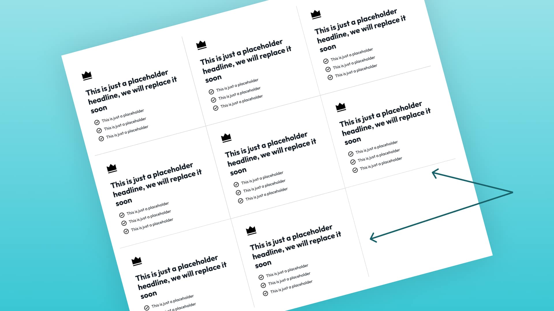
Here’s what we’re trying to achieve:
If we’re going to do this right, a few things need to be accounted for:
- We need the freedom to change the number of grid columns without breaking the borders.
- A grid with a missing grid item should not break the borders.
- The borders should degrade gracefully from breakpoint to breakpoint – we must avoid changing our instructions at various breakpoints if possible.
- We want to avoid crazy
:nth()selector tactics. If we’re forced to try and programmatically select items in the grid based on counting, we will lose our flexibility to change column counts.
Full Video Tutorial
There’s a complete write-up below, but if you’re the kind of person who prefers to watch a video, here you go:
Step #1: Basic HTML
We’re going to start with a basic 3-column grid:
<div class="grid">
   <div class="grid__item"></div>
   <div class="grid__item"></div>
   <div class="grid__item"></div>
   <div class="grid__item"></div>
   <div class="grid__item"></div>
   <div class="grid__item"></div>
</div>
Step #1: Establish a Grid with CSS & Hide Any Overflow
Let’s make this a basic, 3-column grid:
.grid {
   display: grid;
   grid-template-columns: repeat(3, minmax(0, 1fr));
   overflow: hidden;
   gap: var(--gap);
}
We need to hide all overflow in this grid because it’s going to singlehandedly solve a bunch of challenges that this design goal presents. In fact, hiding overflow allows us to avoid using :nth() selectors altogether.
Don’t mind the var(--gap) situation here. I’ll explain that in a moment.
Step #2: Relative Positioning for Grid Items
Contrary to most popular approaches, we’re not going to use borders. We’re going to use pseudo-elements for almost everything. Why? Because borders will have too many limitations for what we want to achieve and will force us to use :nth() selectors and media queries.
Since we need to position the pseudo-elements absolutely, we need to set the parents to position relative. We can do this on all grid items.
.grid__item {
   position: relative;
}
Now, our parent elements are ready to have pseudo-elements attached. Before we do that, though, let’s create some locally scoped variables…
Step #3: Locally Scoped Variables
We want to make this situation as easy as possible to manipulate and maintain. Locally scoped variables will make our lives a lot easier.
.grid {
   --gap: 2em;
   --line-offset: calc(var(--gap) / 2);
   --line-thickness: 2px;
   --line-color: red;
}
Our grid needs a gap, which we define with the --gap variable. When I do this IRL, I map this to the --grid-gap contextual variable from Automatic.css. For the sake of this example, though, I’m just using 2em.
When we position the “borders” in the grid, we need to position them dead center in the middle of the grid gaps. In order to do that, we need a token that represents half the value of the grid-gap. This is mapped to a token called --line-offset. I didn’t call it border-offset because we’re not actually using borders.
Next is the thickness of the lines, which is mapped to a token called --line-thickness. Pretty straightforward.
Last, we need to decide what color we want our lines to be. This is controlled via a --line-color token.
Now that our tokens are locked and loaded, we can move forward.
Step #4: Establish Base CSS for Pseudo Elements
We’re going to use both ::before and ::after elements for this technique. Both will share some styling, so in the interest of efficiency and not repeating ourself (DRY development), we’ll establish shared styles first:
.grid__item::before,
.grid__item::after {
   content: '';
   position: absolute;
   background-color: var(--line-color);
   z-index: 1;
}
This effectively creates a ::before and ::after pseudo-element attached to every single grid item that is absolutely positioned.
Notice that there are no inset coordinates or dimensions for these elements. That’s because those instructions are specific to either the ::before or ::after element and need to be declared separately.
Step #5: Row Lines
The row lines are pretty straightforward. We’ll use the ::after elements that we created earlier for this.
.grid__item::after {
  inline-size: 100vw;
  block-size: var(--line-thickness);
  inset-inline-start: 0;
  inset-block-start: calc(var(--line-offset) * -1);
}
Width (inline-size) of 100% would make the bottom line only the width of each grid item and would fail to account for the gap. It also causes issues when there are uneven items in the grid.
What we need is a width that is guaranteed to span the entire width of the grid container. 100vw will span the entire width of the grid parent in all situations since it is actually designed to span the entire width of the viewport.
The fact that 100vw causes these elements to overflow the container was solved earlier when we told the grid to hide all overflow.
Now that the width is taken care of, we need to set a height (block-size). This is done with the --line-thickness token, which has a value of 2px.
We’ll just set the left (inset-inline-start) position to 0 and the top (the inset-block-start) position to our --line-offset. The only issue is that we need our offset to be a negative number to move it away from the grid item and into the gap space. That’s easy to do with a calc() function. Just multiply any value by -1 and it makes the value negative.
Like magic, we have a “border” within every row of the grid.
Why isn’t there a border on top of the grid since these are positioned to the top of every item?
Good question! That’s solved by the overflow hidden we set earlier. There’s no need to exclude the first row of items in the grid. Since the pseudo-elements are offset, the elements across the top all appear outside of the grid, which is a hidden area.
Step #6: Column Lines

Now that rows are taken care of, let’s do columns. We’re going to use a very similar technique. The only difference is that we need to use the ::before elements since the ::after elements have already been put to use.
.grid__item::before {
  inline-size: var(--line-thickness);
  block-size: 100vh;
  inset-block-start: 0;
  inset-inline-start: calc(var(--line-offset) * -1);
}
Now, since these elements are tall and skinny, the inline-size (width) is equal to our line thickness and block-size is equal to 100vh (viewport height instead of viewport width).
Next, we have to position these lines. Remember, we want to position them on the left side of the grid items to ensure that every grid item has a left “border” regardless of how many columns there are.
We can’t just set the left value (inset-inline-start) to 0, though. We need to position it perfectly in the center of the gap. This is where our --line-offset token comes in handy again. Dropping into a calc and multiplying it by -1 moves it right into the center of the gap for us.
Now add an inset-block-start (top) value of 0 to make sure it always starts at the top of the grid item.
Why isn’t there a border on the left of the grid since these are positioned to the left of every item?
Hopefully, you’re catching on by now. The overflow is set to hidden, which ensures these lines aren’t seen because they exist outside the grid container’s edge. All this crazy stuff that people try and do with :nth() selectors and media queries is entirely unnecessary when you hide the overflow junk.
That’s it! Simple, Efficient, Flexible, Elegant, & Maintainable
We’ve accomplished our goal!
Here’s the full code:
.grid {

  // Locally scoped variables
  --gap: 2rem;
  --line-offset: calc(var(--gap) / 2);
  --line-thickness: 2px;
  --line-color: red;

  // Grid layout (Can be anything)
   display: grid;
   grid-template-columns: repeat(3, minmax(0, 1fr));
   overflow: hidden;
   gap: var(--gap);
}

// Make Grid Items Control Absolute Pseudo Positioning
.grid__item {
   position: relative;
}

// Pseudo Element Shared Styling
.grid__item::before,
.grid__item::after {
   content: '';
   position: absolute;
   background-color: var(--line-color);
   z-index: 1;
}

// Row Borders
.grid__item::after {
  inline-size: 100vw;
  block-size: var(--line-thickness);
  inset-inline-start: 0;
  inset-block-start: calc(var(--line-offset) * -1);
}

// Column Borders
.grid__item::before {
  inline-size: var(--line-thickness);
  block-size: 100vh;
  inset-inline-start: calc(var(--line-offset) * -1);
}
And here’s a CodePen:
See the Pen Internal Grid "Borders" With CSS Grid by Kevin Geary (@geary-co) on CodePen.
I’ve seen many people attempt to achieve this design, and I’m pretty confident that the above approach is the most elegant and flexible. In fact, it’s almost so simple that it feels like cheating.
Go ahead, try to break it!
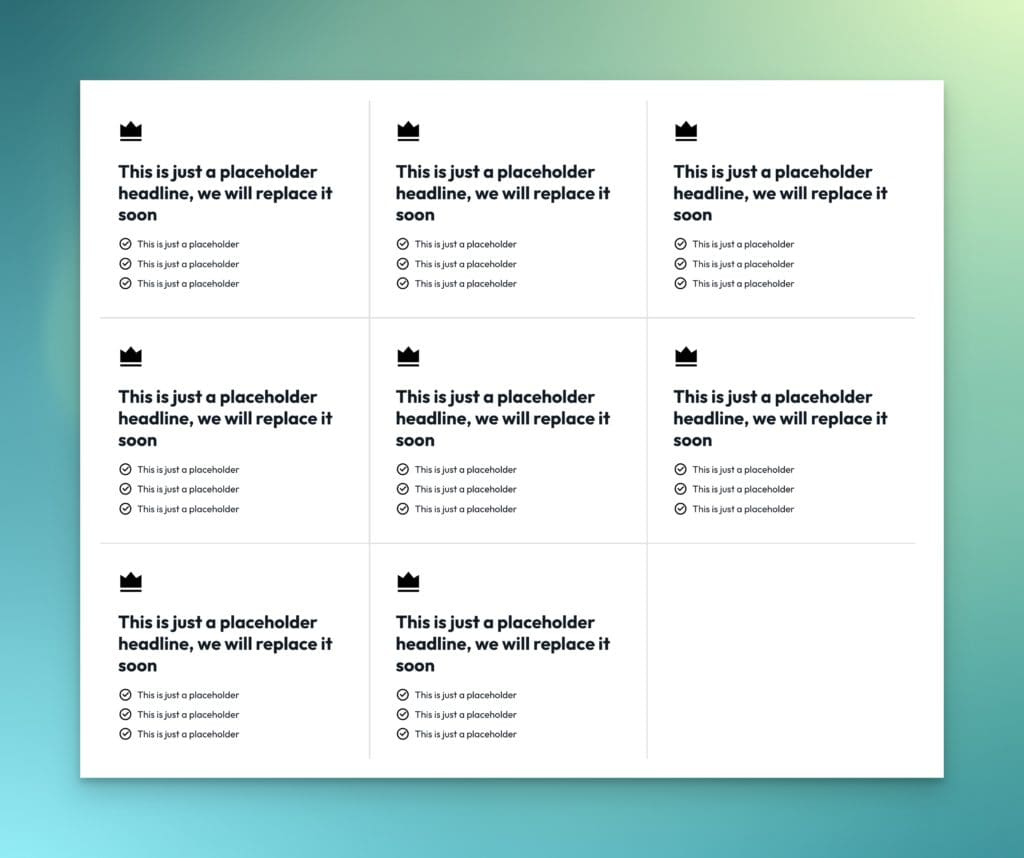
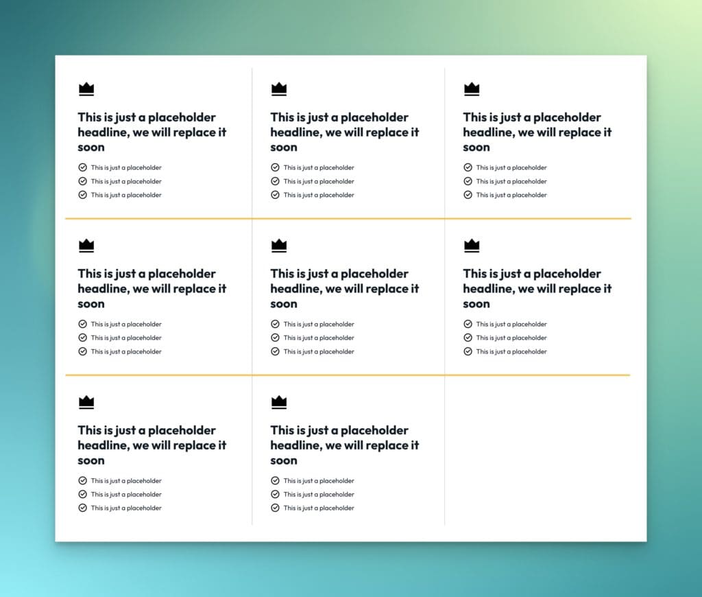
- Use an uneven number of grid items (don’t fill the grid). Still works!
- Change the number of grid columns. Still works!
- Check your breakpoints. Still works! No adjustments are needed.
What if I don’t want grid borders on mobile?
No problem! Just wrap all the pseudo-element stuff in a min-width media query.
Any questions?