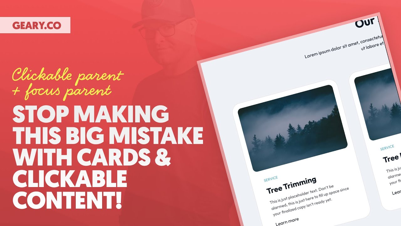
Hey, what’s up, my friends, listen, we need to talk about clickable cards and clickable groups of elements because 90% of web designers and developers are building these things wrong. There’s a big, big, big mistake that they are making.
It’s a mistake I see all the time constantly. And I want to show you why it’s a mistake. The implications of the mistake for which there are SEO implications, accessibility implications, just a fundamental violation of like basic HTML principles happening here and I want to teach you the two techniques that you need to know to fix this mistake and avoid this mistake going forward on All of your projects, so let’s just go ahead and hop right in we are looking at a section of services cards Below that is another identical section of services cards.
Well seemingly identical, visually identical, but in terms of HTML structure, in terms of how we are going to go about linking these cards, there is going to be big big big differences. Okay, by the way the two techniques that we’re going to be covering I’ve talked about on this channel in the past, automatic CSS has features for these two techniques, but I’ve never done a dedicated video. The technique number one is clickable parent You may have heard that and technique number two is called focus parent You may or may not have heard of that and so I don’t have a dedicated video on this topic This is the dedicated video That’s why we’re covering it again for those of you who have seen it before But I wanted a dedicated video that I could link people to and say hey just watch this if you want to understand Clickable parent and focus parent.
Okay, so here we are. What you’re gonna notice about this first section, this first section was built the way that nine out of 10 web designers and developers would build it. It’s built wrong.
But what you will notice, the good thing about this is that the card is clickable. The entire card is clickable. The bad thing about the, oh, the entire card, by the way, is focusable, ignore that thing that’s going on there.
The entire card is focusable. See that? I can focus on all the cards.
The focus border is where I want it to be. And that’s all out of the box. I didn’t even do that.
It’s just when you do the technique wrong, that’s what you end up with. Which you’re probably thinking like, Kevin, that’s, how, okay. So we’re ending up with the desirable result.
We can click the entire card, we can focus the entire card, those are the desired, and you’re still telling me that this is wrong? Yes, I’m still telling you that this is wrong. Wrong from a fundamental HTML standpoint, wrong from an SEO standpoint, wrong from an accessibility standpoint.
Three big implications, okay? We’re gonna inspect and see what’s going on. Okay, so what we see is a grid of three cards right here.
Let me go ahead and put this, I’m gonna dock this to the left, all right? So we have a grid of three cards. Here’s card number one.
Well, not really card number two card number three, but again, not really. Because what are these three things? These three things are links.
They’re a tags, their links. And what’s inside of those links? Well, the bad news is everything.
Everything is inside of those links. Now, why do people put a link around the entire card? Very, very, very simple.
They want to link to tree trimming. They want to link to tree removal. They want to link to stump removal.
But if they put the link on the text like they’re supposed to, right? If you were creating a navigation and you wanted to link to tree trimming, how would you do it? A, and then put tree trimming inside of the link and you would be done, right?
If you’re creating a blog post, how would you do it? Well, you link the anchor text. That’s kind of how links are supposed to work, by the way.
What you wouldn’t do is take images about the thing and descriptions about the thing and a label and some other things and stuff them all in the link. That’s what you would not want to do. However, if you put the text on tree trimming or tree removal or stump removal, only the word would be clickable.
The entire card would not be clickable. And in modern web design, it’s very cool, it’s very current, modern, to have the entire card be clickable and the entire card be focusable. There’s a gap here.
What the gap is, is between what we know how to do and what we want to see. It’s like, alright, if I put the link on the word, I don’t know how to make the entire card clickable at that point. I don’t know how to make the entire card focusable at that point and everything look right and behave right.
And we’re gonna talk about how hover effects go into this and of course the focus styling goes into this because it is a challenge. But just because it’s a challenge doesn’t mean we should just take the easy road and be like, oh, hey, hey, just wrap the whole thing in a link. Just put the link around the whole thing.
And let me show you in terms of accessibility, right? This is horrible. Absolutely horrific in terms of accessibility.
Let’s take a listen, okay, at how Apple VoiceOver announces these cards. Remember, these cards have everything inside, nested 0:05:08
inside of a link. Here we go. Link heading level 3.
Tree trimming. This is just placeholder text. Don’t be alarmed.
This is just here to fill up space since your finalized copy isn’t ready yet Learn more service forest at night with fog main link link heading level 3 tree removal. This is just placeholder text Don’t be alarmed. This is just here to fill up space since your finalized copy isn’t ready yet service
0:05:28 Learn more forest at night with fog voiceover off. Okay, so what’s happening?
It’s announcing literally everything because literally everything is inside of the link. The image alt text is being announced, the description of the service is being announced, the label that it’s a service is being announced, the learn more is being announced, and this is number one it’s repetitive, it’s way too much information. People with assistive technology absolutely hate this, they can’t quickly go through a list of services and just understand what the services are and where the links are going to take them without hearing all of this other nonsense going on.
So this is not accessible. It’s not good for SEO because Google is trying to understand where a link is going to take them and what is that page about? What is the main topic of that page?
If you link just the text tree trimming, Google is very clear. Oh, this is taking me to a page that is dedicated to tree trimming. Got it.
Okay. And now we can go off and index and all of this other stuff and it can actually go crawl that page and verify that that’s the actual topic and yada, yada, yada, make sure everything that checks out. But when you throw all of this content into the link, it’s just more things for Google to process and figure out what does learn more have to do with tree trimming?
What is this service keyword? What if there’s a date in here? There’s gonna be a random date inside of the link.
There’s gonna be maybe an icon inside of the link, anything else that’s added into this card that is pretty much irrelevant to the fact that we’re taking somebody to a tree trimming page, that’s all gonna get stuffed inside of there. And Google’s crawling, looking for clean HTML by the way, looking for clear anchor text by the way, and you’re feeding it all of this nonsense. And so in terms of accessibility, not good.
In terms of SEO, not good. Just fundamental HTML, you would never do this anywhere else. You’re only doing it because you need to make the entire car clickable and you don’t know any other way.
And so you’re just stuffing everything inside of this link. I am going to show you a better way, my friends, okay? So let’s scroll down.
Here is the our services. And the thing is, this isn’t even difficult. It’s once you learn it, it’s not difficult.
It is going to expand your skill set a little bit and that’s a good thing. That’s not a bad thing, that’s a good thing. And you can make utilities for just pop a utility on and it’s done.
In fact, we’ve already done that in Automatic CSS. Automatic CSS has a clickable parent utility class and it has a focus parent utility class. And there’s some variables that go along with this as well to ensure that all of your focus styling stays true to your global website focus styling if that’s all over your head just follow along as we work our way through this okay so what I’m going to do first here here is our second section right here which by the way I want to show you another big difference for bonus points if you want bonus points I’ve covered this before but here we go with bonus points.
This is a list of Services therefore we are going to create in HTML an unordered list. You see it right here You L. Let me zoom in a little bit Okay, there is the you L the unordered list and when I open that up What should I see list items not links not links like we saw above I see I should see list items And then when I open a list item, that’s when I should see the contents of the item.
I see a figure element wrapping my image. I see a lot of semantic important HTML. I see an H3.
I see a paragraph tag. Okay. So what I don’t see yet is a link because there is no link, but I’m going to go ahead and I’m going to zoom out a little bit.
Oh gosh, we don’t want to zoom out that much. I’m going to click this little accessibility guy right here, the little scarecrow, okay? Accessibility people are probably like, don’t ever call that a scarecrow again.
So we click this and we see, look, when a assistive technology is trying to understand what’s going on on the page, and by the way, Google kind of treats this the exact same way, it’s trying to understand what’s going on on the page. So we have our section with a heading called our services. I mean, look at how nice and accurate this is.
We have a paragraph and you can see the paragraph text in there. Hey, look what we have. We have a list with list items in it, three list items.
So I know, hey, there’s going to be a list of services and there’s going to be three of them. I already know that before I start tabbing through, I already know there’s going to be three items or five items or seven items or nine items. How do I know that?
Because the assistive technology announces it. In the section above, okay, right here, we did not have, look, we just have, look, there’s just links in here. There’s no list, there’s no, there’s no nothing.
And so we don’t know how many links there are going to be when we get started. And then remember it’s reading everything inside of those links, so that that’s going to take like five minutes per link. This is just, it’s so bad, it’s just really bad.
Look at the organization down here, section, heading, paragraph, list, list, item, inside the list item. There’s where you have all relevant information. Hey, look, there’s a figure with an image and it’s got alt texts and okay.
Everything is going on here. It’s got a heading tree trimming. So we know exactly what it’s about.
What we want to do now is we want to add the link to these cards in the right place. Where is the right place? Well the most meaningful anchor text which is the heading.
Okay so I’m going to take this h3 and we are going to turn this into a heading by going to link to external URL pound sign. Alright pound sign is just like the current page that we’re on. I’m going to do that for all of these so link to external URL pound sign, link to external URL pound sign, save.
Let’s go refresh on the front end. Now what you see is I can click the actual words, okay? And if we look at the structure here, let’s go ahead and inspect.
We see there’s the H3 with an A, a link, wrapping the actual text, okay? And this is a true anchor link. Look, it’s very clean.
Nobody is gonna, no assistive technology is gonna get confused. Google’s bots are not going to get confused. It’s very clean.
Okay. So exactly what is going on here. The problem is, oh, let’s look at the accessibility as well.
So I’m going to click on that. Let’s open that up. Let’s actually just click on this guy right here.
So here’s our list, our list item, our heading, our paragraph. Okay. Inside the paragraph, look at that.
There is our link right there with the text tree trimming, this is fantastic. And it says focusable true, okay. Now, problem, I can’t click on the card, okay.
And when I focus, I am getting a focus style, but it’s only on the anchor text. And this is where people are like, visually that’s not what I want. Visually, I want people to click on the entire card.
So I can’t put the link here. Stop. Yes, yes you are going to leave the link here where it belongs.
What we’re going to do is take the clickable area of the link and we’re going to use a technique called clickable parent to expand that clickable area to the entire card. Now I’m going to teach you this technique. Let me go back in the builder.
I’m going to teach you this technique from scratch. But first I want to show you the automatic CSS utility class that just does this for you. So if I click on the heading where the link is and I just apply the class clickable parent and then I go to the actual card itself make sure that this card is positioned relative okay I’m gonna refresh and it’s done for me.
Look the entire card is clickable but if we inspect, where is the link? The link is still sitting right there. Okay?
Now, what you’re going to notice though, even though the entire card is clickable, is that when I focus, it still only focuses on the heading. And it’s doing that in all of them, right? And I have to go through and I have to put the clickable parent on this one and this one.
You have to do these things from scratch. There’s another utility class that fixes the focus issue. So when I go to the parent, which is example card, I’m going to say focus parent.
That’s a utility class from automatic CSS. I’m going to save. That’s all I have to do.
Very easy. And now when I focus, look what happens. The heading no longer has the focus style.
The entire card has the focus style. What about when I do this up here? Ah, same exact effect.
Clickable card, focusable card. Look down here, clickable card, focusable card. But the big difference is the link is in the right place.
Now, let me do that for all of these. So I’m gonna say, hey, clickable parent, and then I’m gonna click on the actual parent up here, and I’m gonna say focus parent and then on this one I’m gonna say focus parent and I’m gonna click on the link and I’m gonna say clickable parent. Alright and then we’re gonna save, refresh, all three cards are clickable, all three cards are focusable, all three cards have a link in the right spot with the right anchor.
Okay now let’s see how this announces? Let’s listen Voiceover entering cards blueprint web content link tree trimming list three items three items three Okay, it says you’re in a list of three items. Okay, and it told you what the first one is tree trimming Let’s listen to the next one link tree removal.
You are currently on a heading level three That’s it. It’s not reading everything. It’s just saying hey tree removal that’s the link you’re on.
Link stump removal link tree removal link tree trimming link tree removal link stump removal voiceover off. You see how clean that is it tells them hey you’re in a list of three items in the services section here and it’s gonna read them the three items it’s not gonna read them a bunch of other nonsense to go along with it so we get we’re getting proper accessibility we have proper HTML nice clean HTML and we have proper anchors for SEO. All right, that’s all very, very, very important.
And we have the visual effects that we want, a clickable card and a focusable card. Now, let me teach you the techniques from scratch in case you don’t have automatic CSS, which you should, you should own automatic CSS. But if you’re not, if you wanna know how to do this from scratch, even if you are using automatic CSS, I don’t want a utility class on every single item, right?
If I’m using a loop, that’s one thing, because there’s just one item and everything else is dynamically generated. But if they are statically there, I don’t want to put utility classes on every single item if I don’t have to. It would be nice if I knew how to do this technique from scratch.
And if I knew what was going on, because by the way, I want to know what’s going on behind the scenes because I want to be a professional. I don’t want to just be somebody who assembles pages and doesn’t really understand what’s going on, right? Okay, so let’s talk about how to do it from scratch.
I’m gonna take off The focus parent utility class. Okay off of all three of these cards. Let’s remove Remove it from this one.
All right, let’s go to the heading. Let’s remove clickable parent from each one So we’ll go to this heading right here remove and let’s go to this heading right here, remove. And so we’re back to square one.
We don’t have clickable cards. We don’t have focusable cards. We do have links on the actual headings themselves, okay?
Let’s apply the clickable parent technique first. And I’m gonna apply this at the class level so that this applies to every card with this class, all right? So I’m gonna go choose example card, activate the class, I’m gonna go down to the CSS tab.
Okay, and actually I’m just gonna write custom for custom CSS, and that’s gonna bring it up here. So I’m gonna write root to reference the parent class, which is example card, all right? What I wanna do is I wanna select the H3, and I wanna select the A inside of the H3, okay?
Now, before I do that I want to just select the entire card by itself. So I have a class selecting the entire card and I have a selector selecting the H3 and the A inside of it. Here’s what I’m going to do on the parent class.
Okay on example card position relative. This is very important because we’re going to be using absolute positioning on our link to expand it to the entire card. And we want the card itself to be the boundary of that element.
Like the absolutely positioned link is not allowed to go outside of that. All right, so root H3A, what are we gonna do here? Well, we’re actually going to assign a before pseudo element to that link.
And we always know you have to have blank content at least. You have to have some kind of content to have a pseudo element. We’re gonna position this absolute and we’re gonna position it with an inset of zero, which means it’s going to fill the entire card.
We’re also gonna give it a Z index of one just for safe keeping, okay? And we’re gonna hit save and we’re gonna refresh and guys, it’s that simple. We have a clickable card.
It’s basically taking, let’s go ahead and inspect the DOM right here. Okay, we can see that we have an H3 and an A, but now look inside of the A there’s the pseudo element and look when I hover what it’s doing with the pseudo element. It’s covering everything.
Everything is being covered by the pseudo element. It’s fantastic, which means I can click anywhere on here. Now, can I also, even though the link is down here, Hoverable?
Why yes we can. We can say root, that’s the example card, hover. What do we want to do?
Well let’s say we’re going to translate it. We’re going to translate it 0 and then minus 0. 25 M.
Alright so that is going to translate it vertically just a little bit right and then we can even add a transition to that. We can transition the translate 0. 3 seconds ease in out if I can type and then we’ll go refresh and now we have a nice little hover style as well not interfering with the clickable nature of this card not interfering with the focus nature of this card but we are seeing another problem right we have achieved the hover style that we want we’ve achieved the entire card being clickable.
What we haven’t achieved is the fact that it still only focuses on the actual link. So we’re going to go one step further and apply the focus parent technique. Not the utility class, the underlying technique.
I want you to understand it and learn it. Okay. So here’s what we’re going to do now.
We’re going to select the parent example card and we’re going to use the pseudo class focus within and what that is basically saying is hey if this has a focusable child we’re going to do something so if this element has a focusable child we’re going to do something well what are we going to do my friends let me zoom in a little bit we’re going to add a focus style to this thing all right what is the focus style box shadow now you can do whatever you want here, right? I’m just gonna do 00010px black to show you, alright? So let’s go, look at that.
Ugly as sin, alright? But we are focused on the card. You do see another problem here.
The link is still being focused. Even though the card is being focused, the link is still being focused. Now, I don’t want a big, I don’t want that.
I want this style right here to match. I want all my focus styles to match. This is where variables come in and automatic CSS already gives you these variables out of the box.
If you don’t have automatic CSS, you’re probably going to want to create them on your own. So this is called focus width, right? And then this is called focus color.
Imagine that focus width and focus color is basically referencing the focus style that I use on everything across my website. And I just apply a box shadow to that, all right? Because I’m using a box shadow focus style everywhere on my website.
So I’ve achieved the focus style on the parent now, right? What I haven’t done is removed it from the link down here. The link down here is still receiving the focus style.
I don’t want them both to have the focus style that doesn’t look good. And that’s not what was happening up here. So I wanna mimic what was happening up there by removing the focus style.
How do we do that? Well, once again, we select the root when it has a focusable child using focus within, and then we just target the focus style of that child element. And then we just say, hey, box shadow, none.
And just in case we can do outline none as well in case an outline focus style is being used and then we refresh and now guys we have a focusable parent that’s the focus parent technique the child element is no longer focusable we can click the entire thing the only what’s the only thing we’re still seeing wrong with this when I focus it’s not giving me the hover style right that vertical little movement that little transition very easy to fix. When I set my hover I need to also set this on focus as well. Let’s go ahead and save, refresh.
Now when I focus, oh I’m sorry, it’s you don’t set the focus style of the parent it’s focus within. Remember if it has a focusable, if it has a focusable child that’s when we want to apply the transition. Okay?
Now it moves up when I focus, just like when I hover, okay? And now everything is great. We have a semantic list.
Okay, let’s go back and inspect. Let’s go click on the little guy right here. We have a section with a heading called our services and a paragraph.
We have a list with three items. Here’s our list items right here. We open this up.
We have tree trimming which houses our link, right? And so everything is proper in terms of that. Also, the cards are clickable.
Also, the cards are focusable. Also, they have the hover style. Also, they have the hover style on focus.
Okay, we’ve crossed every T and dotted every I. This is the proper way to create clickable groups of elements whether it be a card or anything else that is a group of items you don’t want to stuff all of those items into a link. Alright you want the actual anchor text to be the link and then you want to expand that link to fill the entire group.
It’s an effect it’s like it looks like everything’s clickable, even though it’s just this one link, and I’m just expanding its clickable area to everything else, and then I’m doing some stuff with focus styles to make it seem like this whole group is clickable, when really I’m just clicking the link itself, okay? All right, let’s talk about one more thing. When do you not need clickable parent?
When is clickable parent overkill? When do we want to avoid it? So let’s pretend like we’re building a little social icon link or something.
So what we would do is add a div, and we’ll call this social link, just like that. And we are gonna make this div a link. So we’re gonna use the HTML tag a link, and we are going to external URL pound sign.
Or we could just say, hey, this is gonna go to twitter. com, whatever. All right, so I’ve created a link wrapper effectively.
And now what I’m gonna do is I’m gonna put the icon, and I’ll just do an SVG. So let’s just put an SVG, SVG, thank you. Let’s put an SVG in there.
Let’s select the SVG that we want, so it’s Twitter icon right here. And then I am going to go with, what is this called social link all right so this would be social link double underscore icon and then we would have text right and our text would be right here this would be social link double underscore label or something like that all right so it’s the label which is going to be Twitter this is going to be a span all right now I’m going to take my social link and I’m going to set it to display of flex where are we display display this here we go display flex and it’s going to be horizontal right I’m going to align everything vertically to the center I’m going to add a 0. 5 M little column gap here I’m gonna make all of our text large alright so nice large text there and then the icon itself height is going to be 1.
5 M so it’s a little bit bigger than my text. I want to remove my underline style from my links. Text transform none.
Text decoration none. I want to make sure that my base color is being used for my link text. Okay and then we’re going to refresh and see this on the front end.
There we go. Now I actually want to give this a little bit of a backgrounds color. We’re gonna make it like a little box.
It’s almost like a mini tiny little card, right? So we’re gonna go with a background color of neutral ultra light something like that We’ll drop a little bit of padding in here. Maybe 0.
75 M top and bottom Maybe 1. 5 M left and right and then we’re gonna have like a boxed card. There we go Okay.
Now the question is and look because I made the link It’s like a link wrapper technique. The entire box is focusable. The entire box is clickable.
This is exactly what most people want and the way that they would do this. And the question is, did I just do it wrong? Or is this okay?
And the answer is, this is actually okay. Now I would take one additional step. This icon is for decoration purposes.
We all know the link, the anchor text is Twitter, and that’s where this link is going to take us, right? We actually, for full-on proper accessibility, wanna come down here to attributes and say, and let me show you before I do this, let me show you on the front end. We’re gonna inspect, okay, and we are going to click the little accessibility man up here, and you’re gonna see that this announces as a link to Twitter, okay?
And we’ll do that in just a second. But look at this image blank. It’s seeing that SVG, but it doesn’t know what it is.
Okay. And it doesn’t even really need to know what it is. People just need to know that this link is going to take them to Twitter, right?
The fact that there’s a Twitter icon there, it’s just for decoration purposes, honestly. So what we can do to just make this a little bit better is we can say aria hidden equals true and now I’m going to save and I’m going to refresh and we’re going to inspect this click the little man okay where’d my little man go where is he where is he oh he’s up here okay link to Twitter and look there’s no blank image in there anymore it’s not reading it it’s not seeing it because it’s aria hidden is equal to true and so let’s see how it announces. Let’s do the next test.
0:28:52 VoiceOver entering cards, blueprint web content, visited link, Twitter, main, menu, visited link, Twitter, main, visited link, Twitter, main, you are VoiceOver off. 0:29:03
So it announces it as a link we’ve already visited, and it announces it as a link to Twitter. And that’s all that needs to happen. That is 100% just fine.
Now why is it okay to stuff those two things inside of a link when it wasn’t okay to stuff all these things inside? Here’s the big reason, okay? This is the distinction.
This is a meaningful image with alt text. That’s gonna get announced. This is a kind of meaningless label.
This is a meaningless label right here. And then there’s a full on description of this. We’re stuffing way too much into the link, right?
So in terms of anchor text here, what’s our anchor text for this link? Twitter. That’s it.
That’s it. So it doesn’t really matter. I don’t need to go through the work of all right, create a box, put an icon, put Twitter linked only the word Twitter, and then expand the link using clickable parent and focus parent to the entire little box here.
That’s overkill. That my friends is, Oh, it’s just not necessary. You already have a proper thing going on here.
You have a link with more or less anchor text and an icon. But the icon we’ve set to ARIA hidden, so it’s like that doesn’t even exist, it’s just there for decoration purposes. So what we’re left with is just the anchor text.
That is a situation where it is okay to wrap the two things in a link wrapper. In other situations where you are literally stuffing tons of things like in a card into a link, that’s not okay. You need to use clickable parent and you need to use focus parent in those scenarios.
All right, let me go back to camera. I hope this cleared things up for you. If you were wondering how these techniques work, how to do them from scratch without needing utility classes, if you are wondering the why behind them, why should we do this?
What are the negative implications of doing it the way that most people do it? If you have any follow-up questions, if there’s something I missed, if there’s something that wasn’t clear, drop your comments and questions down below. Make sure you give a thumbs up on this video.
It’s free, fantastic content, right? Pay with a like, pay with a comment. That’s all I ask.
I don’t even run ads on this channel. I don’t even run ads on this channel. You can watch this ad free.
Pay with a like. Pay with a comment. I’ll be back very, very soon with more best practices trainings.
I’ll be back very, very soon with more best practices trainings. Until next time, peace.