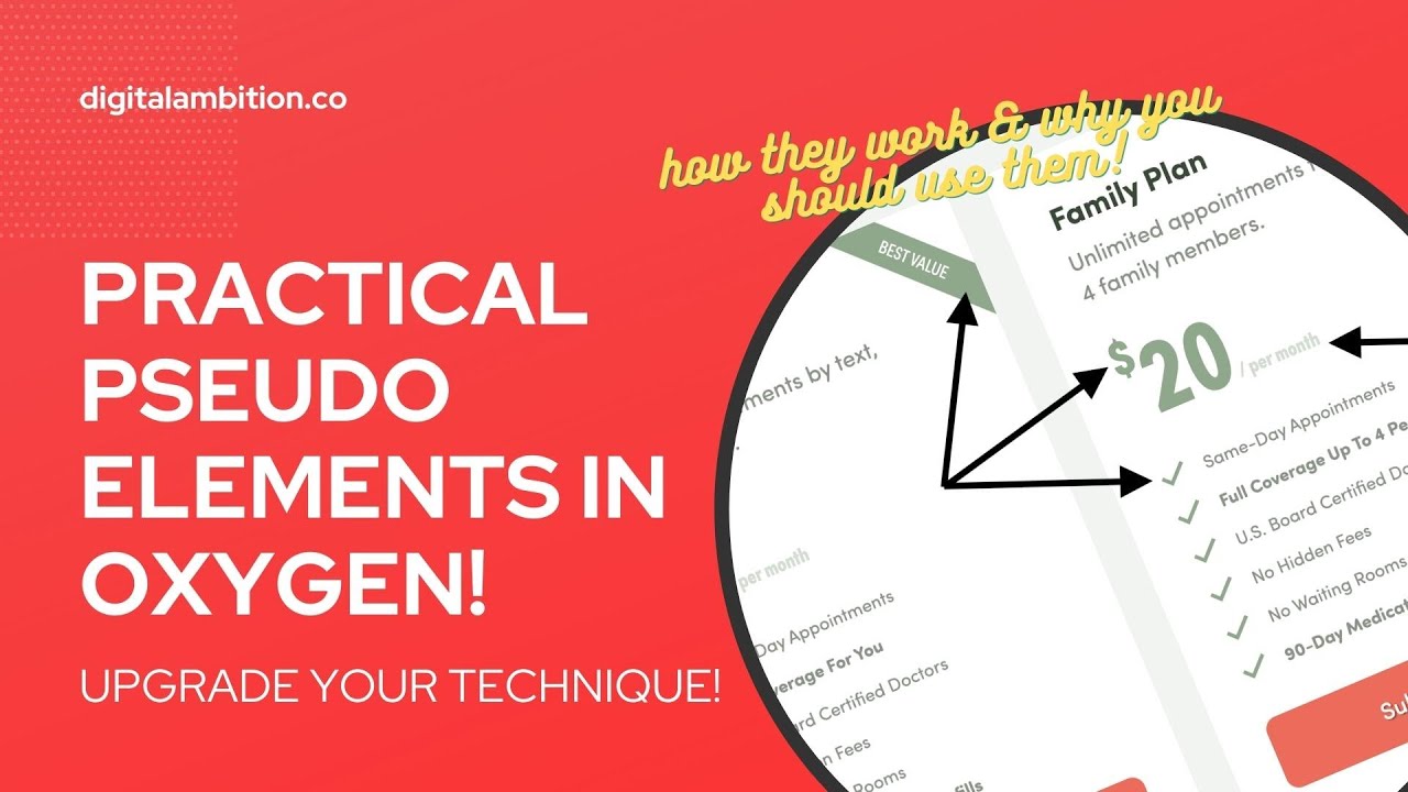
PRACTICAL Pseudo Elements in Oxygen (::before & ::after)

More about this video

Join the waiting list for Automatic.css at https://automaticcss.com

Time to up your game and get confident with pseudo elements!

In this video you’ll learn:

– What is a pseudo element?
– How do pseudo elements work?
– How to get pseudo elements to show up?
– Content vs no content
– How to position pseudo elements
– How to assign pseudo elements to custom classes
– A super practical use case for pseudo elements
– How to make a checklist with pseudo elements
– How to make a ribbon for a card
– And more!

0:00 Intro
0:56 Automatic.css LTD Update
2:21 Practical Example
3:22 How Pseudo Elements Work
14:29 Real-World Use Case
19:22 Price With Before & After
26:26 Check List & X List With Before
33:32 Creating a Ribbon with After
40:53 Wrap Up

Interested in joining my Inner Circle? https://digitalambition.co/inner-circle/

Video Transcript

0:00:00
What’s up everybody welcome back to the channel today. We’re going to talk about pseudo elements That’s before and after elements because they’re extremely powerful. There’s a lot of really practical use cases for them But a lot of people don’t even know they exist or don’t even know how to get started with them or can’t even get them to show up when they start trying to work with them and even the people that know they exist and and like know how to use them They’re not using them enough. I don’t think so I just want to do an official video on before and after pseudo elements So that you feel confident enough to start using them appropriately throughout your project So we’re going to do a little crash course on what pseudo elements are how they work and then I’m going to show you a really practical real world Way to use them based on something that I did for a client and that I do a lot of times for clients Something that’s very very common. So it’s going to be very valuable training for you now before we get there a lot of people I’ve been I’ve been getting blown up man on social media email every channel people can find me on they want to know When automatic that CSS is going to be available and I can tell you right now It is very very close. It’s right around the corner the plug in is working the dashboard is working the licensing is working Version 1.0 of the framework is solidified the fallbacks are in place the fallbacks are working everything is Pretty much ready to go. We’re just making the dashboard of the plug in look a little bit nicer and then it’s going to be Go time there is going to be a limited time lifetime deal for automatic.css Limited like very limited. I don’t like LTDs. They’re not sustainable. So it’s going to be a very limited time LTD I know y’all like your LTDs So what I would advise you to do is go to automatic CSS.com I’ll put a link below Get on the waiting list. There’s an official waiting list for automatic.css if you have any interest in the system if you have any interest in the LTD You’re going to be you’re going to want to be on the waiting list So that’s all I’m going to say about that go get on it if you miss it you miss it and that’s that okay?

0:02:12
All right, let’s dive into our pseudo elements training all right, so I’m going to start by adding a section and Let’s talk for a second here’s the practical use case and I feel like this is a a really good kind of real-world thing to kind of model our Training off of it’s a pricing page that I built for Doc ready and if you look closely You’re going to see that a lot of these things are pseudo elements So this price right here the the dollar sign is actually a pseudo element that does not exist inside the oxygen builder The per month tag and the each appointment tag are assigned to classes those are not real elements in the oxygen builder Those are pseudo elements this best value tag that is a pseudo element and the check marks on the features Items those are pseudo elements and you can actually switch the classes so that if you want to check it It’ll be a check if you want to x it’ll be an x You don’t have to worry about actual check marks and x’s and dollar signs and labels Inside of the oxygen builder not necessary and not practical and not efficient Which is why you need to follow this training and know how to do this stuff all right So I’m going to go to the builder I added a section just for the purposes of showing you like what a pseudo element is and how it works I’m just going to add a text element. We’re going to make this a 79 it’s going to look like a price I’m going to go to a typography. I’m going to make it really big 12 rim I’m going to use a center all class from automatic to get this thing centered in the middle here And then we’re just going to save and look at the front end So this is what we have so far and I’m going to be pulling up the HTML so you guys can see that so we have our little div and It is a 79 cool pseudo elements if you and oh Really cool for those of you who are afraid of writing CSS don’t like writing CSS Don’t know how to write CSS the great things about pseudo elements are you can do them all inside the oxygen builder and That’s what I’m going to do for this tutorial So I want to make it a caveat that you can write the CSS if you want I write the CSS for pseudo elements because it’s easier It’s faster. It’s easier to keep organized But if you need to use the builder to do it you can use the builder to do it You do not have to know how to write CSS That’s all I’m going to say about that, okay?

0:04:29
So the way you do it inside the builder is you click this little state button and Then you choose one of the pseudo elements. There’s two of them There’s a before and there’s an after we’re going to use both so you can see how this works so I’m going to do before and the most important thing that you need to know about pseudo elements is that they don’t exist Until you make them exist so by selecting the before obviously I haven’t done anything So you’re not going to see anything, but you can start doing a whole bunch of stuff like you can change it It’s with you can change it’s height you can change its color you’re not going to see it unless two things happen Number one, you put something in the content box, okay? So if I put a dollar sign, I will see it right off the bat But what if I don’t want actual written content? What if I want a shape? What if I want an image? What if I want something else? You will not see it until you set a display property So what I would recommend is whenever you’re creating a pseudo element the minute you click before you go right to layout You go right to this display area and choose a display flex is probably the easiest one So just click on the flex button that way when you start doing stuff like if I went to size and spacing and said two pixels Heights Hundred pixels and then I said a color on that like a back any background color. I actually see the pseudo element All right, let me go to the front end There it is I can see it right But if I did not have that display property. Let’s go to the before let’s go to layout Let’s turn off the display flex the entire element disappears You will not know regardless of how much height how much width like it doesn’t matter if there’s no display Properly property you’re not going to see it so and a lot of people forget that and they’re like where is it?

0:06:23
I can’t even get it to show up so go immediately to the display property and set a display and like I said flex is easy You can do inline flex you can do block inline block Sometimes works depending on what it is in line sometimes works depending on what it is and then obviously you have display none Which could be valuable if you wanted to make your pseudo element go away at a certain breakpoint right or on hover or something like that Okay, but I’m just gonna set this to flex and I’m also going to go to background take that out and go to size Take that out take that out because we’re not going to be working with shapes today We’re going to be working with and there’s just a ton of stuff you can do with pseudo elements So I’m only going to cover like a practical use case to get your feet wet and And then it’s up to you from there and I’ll show you other stuff in other tutorials, but this will get you started All right, so I want a dollar sign there it is cool now because I set this to flex we’re getting some weird alignment now The pseudo element is attached to this element right here your main element So if you set a display property on your main element you can affect how the pseudo element behaves or where it’s positioned So for example, I can go choose my text block Uh text block which is not choosing the before not choosing the after I’m just choosing the 79 and I can set that to flex and look What happens when I set that to flex which the default is row it puts them in line with each other That’s kind of what I want if we are going for something like this the question now is how do I get it smaller and how do I get it up there?

0:08:01
Well, it is a real even though it’s called a pseudo element you can do pretty much anything to it that you can do to a real element So for example, I have my before selected I can go to my typography tab set a font size of 40% of and that’s relative to the element it’s attached to 40% of that font size which the dollar sign is You know around that maybe we’ll go with half so 50% and there it is now one thing was spacing and I’ll show you this with the after So there is a second pseudo element that you have access to it is the after I’m going to choose that and I’m going to make it say like Per month or something like that so I’m going to do per month Awesome you can even put the little dash in there and now you have a situation where if I make that smaller So I’m going to go to my typography and do the exact same thing so we’re going to go with like 30% It’s way up there and it’s like okay, how do I get it down there and then you’re going to see a problem when we get it down there The easiest way to get something from the top to the bottom of a container is auto margin there’s a bunch of ways to accomplish this stuff but for this purpose Auto margins probably your easiest bet so if I go to size and spacing margin top auto If you put auto margin on the top it forces it away from the top if I put it on the bottom and force it away from the bottom if I put it on the right it forces it away from the right So auto margin forces the thing away from the side that’s auto All right, so I wanted away from the top I put auto on the top and it goes to the bottom but you can see it’s completely misaligned And this is another area where people get really really tripped up So first let’s look at how this is structured in the HTML Here’s my div I want you to notice here’s your before element here’s your after It’s not before the div and after the div it’s before what’s inside the div that 79 and what’s after the 79 That’s where the pseudo elements are attaching The div is actually if we look at this see that outline I’m like pointing with my finger like y’all can see my finger in the screen It’s obviously the div is much bigger than the 79 and the reason is there is hidden spacing in this element And it’s hidden spacing that a lot of people forget about and that hidden spacing is caused by line height So remember we put a 79 in here and on typography we said make that thing gigantic 120 pixels 12 rim So obviously line height is attached to that by default we need to take the line height away and there goes our ghost spacing that was causing all these problems All right, so I’m going to hit save go back to the front end now you see we have pretty solid alignment The other thing I want you to see is that remember what I said you can do pretty much anything to a pseudo element that you can do to a regular element So if I wanted to make this background color and we’ll use a variable from automatic that CSS Let’s choose shade medium Okay, oh that’s background color we don’t want that let’s go to typography we’re going to do that on color And let’s use shade light there you go cool, and then let’s go to our before and let’s do the exact same thing So we’re going to typography var shade light so now I have styled my pseudo elements differently from my main element Which is really important to understand that these behave completely independent even though they’re based on that thing and attached to that thing So if you want the main element to be one color or have a background color but you want your pseudo elements to look completely different it’s totally totally possible All right, so that is kind of like the just crash course in pseudo elements like we got them to appear we can see that we can style them Let me show you one other thing before we get to our real world tutorial You can absolutely position these pseudo elements and the reason I am and when I say absolutely position them I’m talking about an actual CSS absolute positioning The reason I’m covering this is because it’s another thing that trips a lot of people up and I’ll show you what happens So they go to the before and they’re like you know what I want to put that kind of in a funky place related to my 79 So what they do is they go to lay out and they go to absolute and then when you put in a position the top and the left which you’re supposed to do like zero zero It fires it all the way over to the edge of the container and if I did that on my after and I did absolute and I said zero from the top zero on the right Which feels like it should be zero around the 79 it almost feels unrelated to the 79 it’s actually related to the section that the 79 is in It’s like why is it related to the section because absolutely positioned elements Attach themselves to a relative parent and if the parent is not relative it looks for the next relative parent Alright so if we want to contain those pseudo elements to our thing with absolute positioning our main element our 79 needs to be the relative parent So we go to lay out set it to relative and suddenly you can see our pseudo elements are attached to our 79 instead of attaching themselves to the section That trips a lot of people up so now what I can do with my top and my left if I did percentages I can do like minus 20 and I can do percent over here minus 20 It’s kind of there let’s do minus minus 30 and I can do minus 30 here and now you can see I’ve properly positioned using absolute positioning my dollar sign But my per month is acting up because that’s still set to zero zero but I just wanted to show you if you want to absolutely position these things you can But if you don’t make the main thing relative then the main thing is not going to be the thing that those pseudo elements are attached to If that makes any sense okay I think it does alright so let’s clear this out and let’s tackle something practical let’s create one of these cards So I’m going to create another section and we’re going to do bg shade light okay I’ll just do shade ultra light on this So we’ll do bg shade ultra light these are automatic CSS classes by the way I’m going to add a div we’re going to do grid 3 on this We’re going to do grid m1 on that and we’re going to do div div div this is an editorial on automatic so I’m just going to move quickly we’re going to do gap m and we’re ready to go with our cards I’m also going to do pad section and we’ll do excel make this a really big section will put heading in here drag it don’t do that never do that let’s try that again Yeah oxygen with these like dragon you know drag my padding nonsense always church me up when I’m moving fast okay so I’m going to drag that up there Okay choose a price great and again I am going to center all of this and I’m going to margin top my pricing grid I’m going to make a video on why I’m loving margin top More than margin bottom lately a lot more I’m liking it a lot more and I’m going to I’m going to create a whole video on why I like margin top versus margin bottom will do margin top L All right so I’m going to hit save on this and we’re going to pop a class on to here so this is going to be our price card so we’re going to do price card bang save and refresh okay so we obviously don’t see anything let’s put a background on the price card So we’re going to do var shade white and that’s going to give us a white background I’m going to go to borders radius and I’m doing a custom class by the way I’m still using automatic CSS but I’m doing it in a custom class because automatic CSS is one of the only utility frameworks for oxygen that gives you hooks using variables all right so very very powerful stuff So I’m going to do var this is going to be radius M that’s going to hook into the radius system in oxygen and it’s going to sign that radius to this custom class and then I’m going to do some padding in here let’s do none var and you know what this set it set up a little thinner than I like we’re going to tackle that in just a minute so this is going to be var pad or sorry space M and I’m going to copy that basically apply that to all okay and then I just need to throw like a let’s see what this looks like so yeah let’s just throw a heading in there add heading please thank you all right and then I will make this in H2 and then our price card needs to be aligning everything to the left and then we’re going to do price card and I do double underscore if you I do need to make a whole video on on BIM but this is going to be our heading for our price card so that’s the way we do the class naming convention to keep everything nice and organized I’m going to go to typography our line height on this is going to be like 1.2 there’s a whole training thing that’s just set up from scratch I don’t have all my normal stuff in it so we just have to do a little bit more customization than normal and let’s actually make this in H3 perfect and I’m going to look at our reference is going to say single appointment awesome and then there’s some text after that so that’s going to be like our description so this is going to be price card double underscore description and on the heading I can do margin bottom and I can do another hook space S for small spacing and then I’ll save okay I want to come to just really quickly because I hate a squished kind of website why are my global styles not available settings okay I don’t have global styles I guess we won’t be changing that let’s do a double price card instead then because I want these cards to be a little bit bigger so I’m going to change that grid 3 to a grid 2 I don’t know why that’s broken this is the beta so I don’t know of oxygen maybe running into an issue there I’m also going to do stretch on here so these can be the same size and I’m not I’m just going to leave this blank for now because I want to eventually duplicate this card so single appointment I can actually just steal our text from over here to speed things up okay and I promise we’re about to get to pseudo elements because we’re going to tackle the price now all right so we are going to add a text element and this is going to be called price not rice price card double underscore price okay and I’m going to go to typography and I am just going to go straight up rims here we’re going to make it big like we have it wow that’s super big let’s go with eight line height is going to be one we don’t want any of that ghost padding in there and then I’m going to make this the price and I think that was 29 let’s not put a dollar sign in there so just put 29 in there I think that’s about yeah it’s about the right size and we’ll go to typography font weights like 800 oh just make it super bold and then let’s use a color we’ll do var primary let’s do var I’m in code of the colors in here yet like what the accent look like now that’s no good secondary that okay we’ll just roll with that yes all right so on our little description here actually on our price card let’s go spacing margin top we’re going to use a variable space M and then probably on the bottom as well just a space it away from everything else that’s going on okay let’s tackle our pseudo elements now so we’re going to typography actually want this to be a little bit bigger awesome so we need a dollar sign and we need a per month but here’s what I’m going to show you okay really cool stuff here so let’s say you were going to make a switcher between like USD and pounds so dollars and pounds right actually don’t know how to how do you make a pound sign so pound sign a pound dollar sign I don’t even know how to how do you search for that probably there it is okay awesome so watch how we do this right so we have our price card price I’m going to make a price card I’m just trying to show you like how practical this stuff can really be so price card price double dash USD boom so on that class I’m going to do a before and then I’m going to make a dollar sign and then I am going to go to typography font size 50% and then I’m going to do let’s see let me let me go to my main class price card price USD and I’m going to go to layout flex all right so that’s going to get my thing up to the top there and that’s all I’m going to do that’s really all I’m going to do now I’m going to do price card double underscore price double dash G what is it BP I think it’s GPP let’s look everybody in the UK is like this guy GPP all right so on the GPB I’m actually going to just copy my USD styling over to GPB and now I’m going to delete the USD and now I’m going to go to my GPB and I’m going to just change the content where we in the before to that little symbol look at that so if you had a switcher imagine you had a switcher and you had two grids and you wanted one to be USD or one to be this the pound right so I can take that off I can type in USD not used USD choose the USD class and I got a dollar sign if I choose the GPP GPP I get that sign okay so that’s a good practical use case right and I’m showing you how it doesn’t like I just made a class and through the class on that element and now I have new pseudo elements available on that class I can do the same thing watch this price card double underscore price and I’m going to do double dash monthly and then on that one I have two new pseudo classes on there right I can go to the after and I can say this is per month and then we obviously need to style that so I’m going to go to typography font size 30% okay and then I’m going to go do my margin auto trick on the top to get it down there so now it says per month that’s still a little bit big for me so I’m going to go 20% and I’m also going to go typography letter spacing and let’s do M minus 0.025 okay probably needs to be bigger than more squish than that awesome and then I’ll go to just so you guys can see other things happening opacity 0.7 and I’ll go to my before as well which is on my USD before opacity 0.7 there as well now that looks so great we’ll leave it like that okay I can also by the way go to margin if I want to bump that over a little bit and I can do margin M let’s you like 0.25 and that’ll just bump it away a little bit maybe 0.15 just give it a little bit more breathing room right so it’s not on top of the number so there’s my $29 per month but I still need a maybe per year right so I’m going to make my class price card double underscore well I misspelled it let’s try again not ice price it’s lagging like crazy right now price card double underscore and we’re going to do annual no sorry I need to add the price the lag kills me and it’s throwing me off price double dash annual and then I’m going to take the monthly design I’m going to copy that those styles and add it to annual so I don’t have to redo on my work again delete monthly go to the go to the after and change this to per year so if you have one price that’s per year and one price that’s per month you don’t have to create new elements you just pop a class on or pop a class off right so there you go we just did practically speaking to pseudo elements if I were to duplicate that card and so I make this say single appointment let’s say subscription something like that and I’ll say this is going to be $29 no it’s going to be $290 right and I have the per year the 29 is going to be per month so I’m going to take off the annual class and I’m going to pop on the monthly class and now that one says per month this one says per year they both look the same right they’re both pseudo elements so very very easy all right so the next thing we’re going to do is tackle these actual features right so I’m just I’m not going to add a div and an icon and text and try to align them and then duplicate duplicate duplicate and all of that stuff I’m literally just going to write for the text module in just like that and we’re going to make it say some stuff like this same day appointments I’m going to add a class this is going to be price card double underscore feature enter and now that I have a class I can feel free to duplicate and I just don’t want to say the same thing so I’m just going to copy this out real quick grab that one and grab the last one we’ll just rock and roll with for right now all right cool and because this is a class I can grab it I can grab it I can grab it oh gosh beta beta is giving us problems y’all beta’s heart mess right now let me go to structure let me go in here let me go in here now it’s this card let me see if I can grab that here oh gosh gonna have to refresh okay man I love betas right it didn’t remember anything I just did so I’m going to go ahead and put a text box in again and hopefully this time it doesn’t die all right price card double underscore and this is going to be feature remember the class all right duplicate duplicate duplicate duplicate and I’m going to add a margin to the bottom and we’ll do var space xs perfect and that’s looking pretty good I kind of want more spacing here all right the beta is really all right where we at price card price okay so m is good there is good there let’s change this to l let’s just make a lot of breathing room here okay that’s better all right so now I can just copy these in okay so I’ve got the content in there I’ve got a class on there and then what I’m going to do is I’m going to create two new classes so we’re going to do price card double underscore feature double dash included excuse me this is where I’m going to attach my little icon to okay so what I’m going to do first is I’m going to go to background actually sorry layout make sure that that is set to flex just your main class then what I’m going to do is go to my before and we’re going to start styling our pseudo element or creating our pseudo element so we need a background image so I’m going to browse for that image it’s going to be the check mark now this is complicated by the fact that I don’t have sdg support on here so I put png’s in from the now project and actually a padding around them so we might tackle how to solve that it does create some complication if you’re using an sbg with no extra padding it’s going to work a lot smoother than this but I’m going to go ahead and select my check and select image thank you awesome you don’t see it yet because it needs some size and spacing so with I’m going to do rim three now you see that there’s like a placeholder for it and I’m going to do background and I’ve already got that there I need to position this left 50% top 50% I need to make sure that does not repeat and then I need to set a manual background size and come in here with a rim of like three and then height we can do that as well all right so and actually I don’t even think we need to height so I now have a check on my feature included class I also want to feature excluded class so we’re going to do price card feature double dash excluded and then I’m going to copy all that work that I just did on included over to excluded but now when I take off my included I can go change my before background image to an X and now my excluded class makes an X instead of a check see what I mean about the padding in there so let’s see if we can fix that real quick so I’m going to go to before that’s holding my icon I’m going to go to layout relative and left side I’m going to do zero it’s going to actually need to be negative I’m going to change this to rim let’s try minus one oh just like right off the bat just guessed perfectly okay and then on the on the margin right I kind of need to pull some of that back in so minus point five like to pull the same day appointments back in a little bit again this is just because I’m having to fix that padding issue that was in there before now the easiest way to do this is to add the included class back copy my excluded style over to included and then I get rid of the excluded class go to my before sorry this is this is just you don’t have to do this a lot of times just if you run into this problem showing you how to fix it and then switch this back to my check so that’s the same styling all right so look at this if this is included I literally come down I type included and I say it’s included and I get a check mark and if I say this one’s included I get a check mark like I don’t have to worry about putting physical check marks in there included now this one let’s say it’s excluded and you can also do other things with your excluded class you could say hey if it’s included then I want to go to effects opacity point five so it’s great at the whole thing is great out I didn’t do that on my pseudo element I did it on my main class I’ve excluded but the whole thing is great out now that is a super easy and practical way to deal with this kind of stuff because look what happens when I duplicate my card and I come over here and I say well on the yearly that’s actually included so I move that class I type included it’s included save boom I didn’t have to move checks around replace checks with X’s I just it’s classes control everything on mobile let’s say on mobile we don’t want these check marks and X’s I don’t want to go in but you could now come down to like 768 and or let’s say 480 and you can say well there’s just not enough room in here for those icons okay cool so you go to price card included you go to the before you go to lay out display none now you don’t have any icons on mobile devices for things that are included right you can maybe leave the one you can do whatever you want to do because the infrastructure that you built was all built properly with pseudo classes last thing I want to show you is these little badges all right so I’m going to not put I’m not going to put an element inside this card at all we’re going to put a class on the price card and we’re going to call it price card double dash featured or we can say let’s say best value will this a best so price card double dash best all right I got pseudo elements to work with so I’m going to use the after in this case and I am going to put content in the content box it’s going to say best value look where that shows up way down here that’s obviously not where we want it so I’m going to say that this needs to be first let’s say a little bit more so we’re going to say background color we’ll do var primary okay and then on the text color typography color we’ll do var shade white so this is me white text and then let’s do some padding so we’ll do M let’s do two two that’s left and right padding on the top oh I also like to go to typography always just clear the line hide out on the lines of things because it gives you ghost padding that you don’t realize you’re dealing with so we’ll do one on one that might be a little aggressive we’ll do 75 5 okay 0.75 there and then this might be like 4 and 4 we’re going to kind of we’ll see how big we need to make it in a minute we’re also going to typography well I love that that’s cool oxygen like leaving the pink padding thing there typography let’s go uppercase on this and let’s go with font size needs to be a little smaller let’s hook in let’s go var text there we go perfect okay size and spacing I think we’re good let’s go to layout absolute bam so I’ve pops it up to here but when I try to position it it’s probably going to fly away see how it flew away we’ve already talked about how to solve this problem I go to my main thing price card best not my pseudo element just the best class and I set that to relative and now it’s attached itself to the card now I can say right 0 and we are going to have to wait I need to go to my both my after that’s the thing I’m trying to position so right needs to be 0 I can take left out of there now it’s off to the right now I can just transform it so let’s see how we’re going to do this we’re going to go to I think it’s under effects transform rotate 45 bam look at that now I do need to position it a little bit better I’m probably going to need to translate it now so I can go to again effects transform add transform let’s do a translate okay so translate on the x axis I always have to like just play around with this stuff let’s do 10 20 25 that do it oh yeah that’s perfect duh okay what am I thinking now we’re going to translate it why we need it up into that corner more so I’m going to do like minus 5% minus 15% minus let’s just make it a little bit bigger so I actually don’t need anymore padding let’s do with rim I don’t need I didn’t even need to do it with padding in the first place let’s do 15 we can take some of this padding off just like one and one okay and then let’s typography center it it’s kind of weird because you’re looking at a tilted thing trying to try to play with it sizing let’s do 20 and it doesn’t matter it just needs to be like big enough to go off the edges now I need to translate it a little bit more I think so we’ll go to effects transform translate minus 20 on the y okay that’s good now you’re like Kevin that looks really awful you’re right so we’re going to go to price card best layout and now I’m I remember I put this class on the card but it’s only the best class right it’s not my main price card so I can do a lot of things that I’m not doing on my actual price card like make the overflow hidden right so remember I put this class on the card I can effectively say don’t let that pseudo element that I’m also attaching to this class go outside of the card which the class is attached to if you’re a beginner you’re like which has happened right but if you’re not a beginner you’re realizing kind of what’s going on here that I’ve just made this not be able to go outside the bounds of the card so that overflow is visible that’s what you get if the overflow is hidden that’s what you get so you don’t need like you don’t need to measure I’m pointing at my screen like you guys can see my finger again you don’t need to measure like the distance between the top and the right side of the card and get it perfect and like cut things off and figure out ways to do that no no no you just put a big ugly ass block there and then be like I don’t know just hide everything else like that’s that’s how I do it anyway but no that’s that’s legit how you do it so let’s look at it bam there we go because it’s all pseudo elements like it doesn’t matter what happens on mobile like we’re getting it to be nice now you might run into a problem right there see that little overlap action there so all we need to do is make sure that we’re protecting that text over there so the best way to do that make sure that that text doesn’t get anywhere near the right hand side is a bunch of ways to do that you could do padding over here on the card or you could just assign like a max width to that text so we can do rim let’s try 24 that’s going to be too big no that’s perfect okay so now it’ll never get over there boom and that’s a little extreme right we can we can say let’s see what’s 32 do okay that’s good it’s just breaks away but basically that thing can get all the way over here and it’s not going to touch safe all right boom now we come in and we’re good like it almost touched but it didn’t all right so we’re pretty good you could finagle that on mobile devices whatever you want to do the whole point of this we’re not trying to make this perfect we’re trying to teach you how to use pseudo elements so we used a pseudo element for our dollar sign which we also saw we can use pounds and dollars just based on changing the class per year or per month just on basing the changing the class by the way we didn’t need to do this per month we never did that so I take off my annual class I drop in my monthly class now it says the correct thing so let me go the front ends boom 29 hours per month or $290 per year we saw how we can do checks and x’s by adding or removing classes we got a little best value tag going on here this is the power of pseudo elements if you love this video hit like drop a comment below if you have any questions if you feel like this really helped you understand pseudo elements better in a more practical way drop a comment and let everybody know like let when people are looking at videos are like did this help anybody and they read the comments and if everybody’s like man this helped me this helped me they know to watch the video if there’s no comments they don’t know if they should take the time all right so just help them out drop a comment drop a like make sure subscribe to the channel I’ll be back very soon peace


My Cart
0
Add Coupon Code
Subtotal