Hey, what’s up? It’s Kevin Geary. Welcome back to the channel. In today’s training,
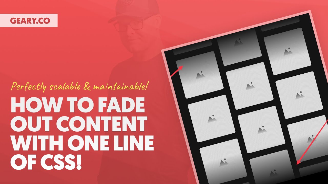
I’m going to teach you how to do a really cool content fade out effect. And this is very useful
whenever you want content to look like it’s fading into the background. And what’s great
about this technique is that it’s independent of the background. So any background color,
any background image, any background texture will work. It will work seamlessly. It will work
without you having to micromanage it. It’s fantastic. So let’s go ahead and get into it.
I’m going to show you the two examples we’re working with. First is the slider right here.
This is a slider on the front end. And I don’t want the content of the slider to look like it’s
disappearing into some invisible threshold. I want it to look like it’s fading out into the background
on both the top and the bottom. And then down here with these images, I’m going to use a radial fade
out effect. And it’s going to create a nice framing for these images that just adds a lot of visual
interest. All right, let’s go ahead and just dive in. So I’ve got the structure opened over here.
You see, there’s a slider wrapper, there’s a slider, and then there’s a link. I’m going to do this on
the slider itself. Now you can easily move this technique. That’s what’s great about it. So if you
do it on a box and it’s like, that’s the wrong box, you can just move it to a different box. Okay.
So here’s what we’re going to do. I’m going to open my CSS right here. I’m on the slider itself.
I’m going to go in and create a new root statement. We’re going to leave everything else
alone. That’s, that’s up there. This is, and we can actually comment this so we can say,
this is going to be our fade out right here. Okay. So here’s our fade out effect. What do we do first?
Well, here’s what we’re going to do to kind of learn about this technique a little bit.
We are just going to create a background gradient. Okay. So I’m just going to say background,
background, and I’m going to use the linear gradient function in CSS, and I can say to bottom,
red, blue, and I just want to get started with something. That’s all I want to do is get something
on the screen. And actually I recommend you do it this way because this is a great way to visualize
your gradient. Okay. You can’t visualize transparencies and all this other stuff that’s going on.
And we are going to be using a mask image technique for this. You can’t really visualize much when
you’re doing a mask image. So linear gradient on the background really is going to help you visualize.
So I actually want to do a little bit different of a gradient. I want to do red, blue, blue, red. Okay.
Which gives me a bit more surface area for the blue part. You see that? So I’ve repeated the blue,
giving me essentially more blue in this gradient. The blue is going to be the area that I’m going to
keep around. The red is going to be the area that I make into the gradient disappearing into nothingness.
It’s going to be transparent essentially. Okay. And what I want to do is I want to get my ratios down
and I want to see exactly what I want my ratios to be. I also want to tokenize my ratio so that I can
easily control it after the fact. And then we’re going to transition this into the mask. Okay.
So two bottom, red, blue, blue, red. What I want to do is get my ratios of blue down. I’m going to do
25% on this blue and 75% on this blue. Now these are not magic. No, they kind of are just magic numbers.
Like you can make up whatever you want. Any numbers, any values will work. It depends on the
effect of the fade out that you were going for. But what I will tell you is if you want that perfect,
like perfectly symmetrical fade out, the, this number and this number have to be opposites from each other.
And I’m going to show you exactly the, like the easiest way to do this is with tokenization. Okay.
So I’m going to create a token and we’re going to call this a fade amount. Okay. Fade amount. And I’m
going to say the fade amount is 25%. And so I’m going to take this 25% right here and I’m going to replace
it with my token. And the way I make the other value, the exact opposite of this amount is I take it away
and I calc it 100% minus fade amount. All right. So now we have essentially, if I make it 25%,
the other value is going to be 75%. If I make it 20%, the other value is going to be 80%. But I only have
one value that I need to manage now. Very, very easy. Okay. So, and you can just watch, this is why I did
the red and the blue. Very easy to visualize the change. And you can see, I can take away or increase
the amount of blue, which by default affects the edges. So where the fading out is actually happening.
That’s why it’s called the fade amount. Okay. Now, all we have to do is transition this to a mask.
And instead of background, we’re going to say mask image. Okay. Mask image, same linear gradient function.
Now you’ll notice I don’t see anything. That’s because we have to change our color values.
So the reds were the outside of that linear gradient. Those are going to become transparent.
So I’m going to change the red to transparent. You see, we’re getting a fade out effect. And then
technically, instead of blue here, we should use black and black is essentially saying black is see-through
in a mask. So you can see the content that we’re seeing through that layer into the content.
And the edges are transparent and voila, we have our fade out effect. It’s done.
And as you’re going to notice, I can, I’m free to change the color. In fact, let’s go to the front end.
Let’s just see how we’re doing on the front end here. There we go. I’ve got the slider turned off for right now, but like, you know, you can see the slider.
Actually, I think once I, and now it’s, I think it’s turned off, but I can, I can scroll through it with my mouse and it’s all dummy content right now, but you can see the fade out effect is working perfectly.
Now, what happens if I change the background color? So I’m going to go to BG and I’m going to choose an ultra dark. And I mean, there’s nothing I have to do.
I don’t have to babysit the gradients and the fade outs when I’m using this technique. It just seamlessly works perfectly. Okay. So that’s number one.
Now what we’re going to do is the radial gradient. This one’s going to work a little bit differently. Uh, I’m not going to bother tokenizing this.
This is going to be completely dependent on the effect that you want to achieve. Okay. Which means you’re going to use random values and just make it, make it happen, make it work. Okay.
Let’s scroll down. I’m going to do this on the wrapper image group Atlanta right here. And I, but I’m going to start the exact same way. In fact, what I’m going to do is I’m going to select all images inside of here.
And I’m going to say display none. I’m also going to say, we need some height on our container while we work on this.
And I’m going to say background linear and I’m sorry. I don’t want linear. I don’t want linear. I want radial gradient.
And I’m going to say, it’s going to be a circular gradient. So I’m going to say circle and I’m going to say red, blue, blue.
And in this case, uh, notice what I’m doing, uh, I’m actually going to do red, red, blue. I’m trying to expand the surface area to, to, to, I can get to like, uh, an effect that I want that, that looks good. Right.
So I can do red, red, blue, blue here, just like that. Okay. Now what I might want to start doing is playing with the numbers here, the values. All right.
25%, 35, 45, let’s go 85, 95. I think I actually have an extra blue. I don’t need that much blue. Okay. 65%. There we go. Okay.
So now I’m getting the strength down. So it’s a little bit different. It’s red, red, blue. That’s it. And this is why we’re doing a normal radial gradient on a background.
Cause I get the visual feedback. I can see exactly what I’m doing. You can’t see what you’re doing when you do the mask image straight out of the, out of the gate.
The cool thing is the mask image uses the same gradient functions that background does. So you can just do it on the background, visualize, and then move it to a mask. It’s, it’s, it’s fantastic.
So red is 65, blue is 85%. Let’s just go with that. Okay. So now what we’re going to do is we’re going to bring our images back. We can get rid of the height on here.
Now that the images are back, we have height on our container. We’re good, we’re good to go. Uh, and then I am going to change the red.
Remember the red was the middle part. That was the surface area. That’s the part we want to see. So that’s going to go black.
That’s going to go black. And then the blue is going to be transparent. That was the outside. That’s going to be the fade out effect.
And then if I go from background to mask image, I get, I’m just done. I’m just done. And then once again, I’m going to go BG.
I’m going to change this to black. And you’re going to notice, I, again, I don’t have to babysit the technique.
Just works. It’s a really, really nice fade out effect. And you can continue to play with those ratios and get whatever look that you want to go for.
Now, one last thing that you need to know about implementing this, you do need to prefix it.
Okay. So I’m going to add a duplicate and I’m going to say web kit mask image.
We’re going to add this prefix to make sure that our browser support is good to go. I’m going to go back up to this one up here.
I’m going to find the mask image and I’m going to add a duplicate of it and just web kit mask image.
And we’re done. We’re done.
This is by far the easiest, the most scalable, the most maintainable way to create a content fade out effect.
You can do it on the top only. You can do it on the left only. Check this out.
To left. Okay.
To left. Do it on both of them.
Now I have an inline fade out effect.
And then again, you could do it only on the top.
If you want to only on the bottom, if you want to only on the left, only on the right, complete block access, complete inline access.
If you’re an automatic CSS user, this is coming to automatic CSS in the form of utility classes, a mix in and recipes.
All right. This is going to be easily implementable in mere seconds with automatic CSS.
You’re not going to have to remember how to do any of this. So that’ll be great for ACSS users.
But for everybody else, I just taught you the technique. Now go and use it.
And before you do that, subscribe to the channel, hit like, drop a comment below.
Hope you like this video. I’ll be back very soon with another one. Peace.