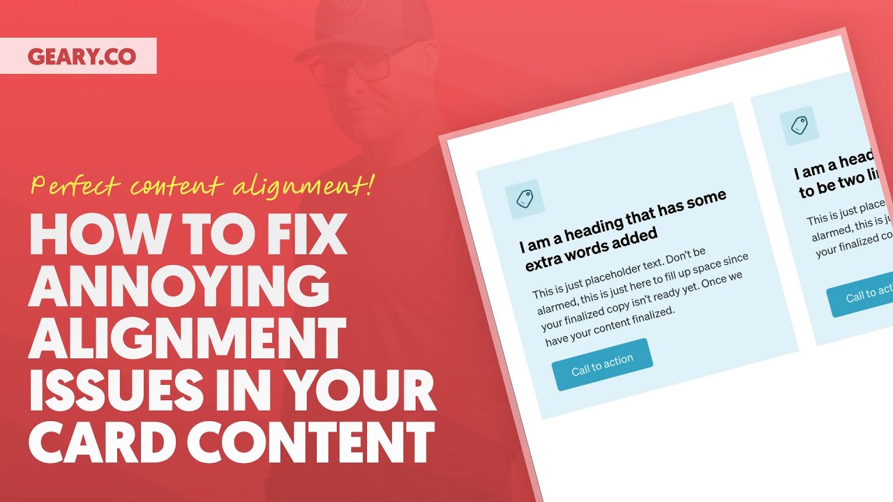
Let me know if this has happened to you.
You design the perfect card.
It’s absolutely beautiful.
You put it in a nice symmetrical grid and everything looks absolutely fantastic until you start to put real content in because real content is not all the same length.
And the minute the headline, like one card has a single line headline and another card has a headline that goes two lines and one paragraph inside the card is bigger than another paragraph inside of the card.
Your button is all out of alignment.
Your paragraphs are out of alignment.
Your headings are out of alignment.
You’re fighting with flex.
You’re fighting with grid.
You’re fighting with gaps.
You don’t know what’s going on.
You don’t know how to fix it.
Very, very common situation in web design.
And I’m going to show you exactly how to handle it in this video using two different techniques.
One kind of philosophy for how to construct your cards and one fundamental truth about cards and content length that you really need to adhere to if you don’t want your life to be miserable.
So let’s go ahead and get into it.
I’m going to share my screen.
We are, like I said, going to use two different techniques.
We are going to start with flex.
And then I’m going to show you a technique that uses subgrid, which you may not be familiar with, but you will be after this video.
And it’s an important thing that you need to know.
So make sure you stick around for the subgrid portion of this training.
Okay.
Let’s start right here.
We are going to build a very basic icon card and we are going to follow this kind of methodology for constructing our cards.
We are going to start with flex alignment.
Then we are going to move into the wrappers phase.
And then we are going to handle padding and gap.
And then, and only if it’s absolutely necessary, are we going to add margin?
Because here’s the thing that a lot of people do as a mistake.
A lot of people make this basic mistake.
They start with margin.
And that is an absolute no, no, don’t do that.
Okay.
All right.
Let’s go ahead and get into it.
So I’m going to add a div and I’m going to add a div for a reason because by default, a div is display block.
Okay.
And so this is alerting us to the fact that, Hey, we need to be starting with flex.
Okay.
Now, what I’m going to do on this card is I am going to call this a, um, let’s call it a flex card, a flex card.
Okay.
And we’ll call this one down here, a grid card.
All right.
Perfect.
So what I’m going to do is I’m going to start with flex.
So I’m going to say this card is going to use display flex.
Now the default for flex, if you remember back to page building one Oh one, everything goes in a row.
We don’t want everything in a row for this particular card.
We want everything to just stack like normal.
So I’m going to switch the direction to vertical.
And this is going to put everything in a vertical column.
Okay.
The next thing that I’m going to do is I’m going to move on to my, my next part of my philosophy, which is rappers.
And I’m going to group associated content.
This is also a fundamental thing that was taught in page building one Oh one.
You group associated content.
So in this card, I’m going to have an icon, a heading text and a button.
It’s very, very basic, but I’m going to create rappers for these items and I can call the rappers, whatever I want to call them.
I’m going to stick to like kind of web design fundamentals.
We’re going to have a header, a body and a footer for this card.
Okay.
And again, you do have to do it exactly like this.
No, you don’t.
You can do it however you want, but we’re following the fundamental, uh, like philosophy of wrapping and grouping associated content.
So let me show you how this works.
And I’m going to use blocks for these because blocks are display flex automatically.
Um, so I’m just going to go block, block, block, right?
And this first block right here, what we’re going to call this a flex card.
This first block is going to be our header.
The second block is going to be our body.
And then this is going to be our footer right here.
Now what’s going to go in my header?
Well, we’re going to do an icon because this is an icon card and we are also going to do a heading.
Okay.
And I’m going to make sure this heading is an H3.
I’m going to choose an icon that I like better.
Uh, cause I don’t like these default icons.
We’re going to just use a tag.
And because I’m using the icon framework and automatic CSS, I can use the data attribute of data icon and it’s going to style my icon for me.
Okay.
The next thing I’m going to do is put in my rich text.
This is automatically going to support bold and italic, and it’s going to automatically give you a paragraph tag.
Okay.
And then I’m going to put some lorem ipsum in here.
So we’ll do ipsum short and that’s going to fill in our, uh, content.
And then in my footer, I’m going to add my button.
Okay.
And this is going to be a, we’ll say call to action.
Very, very traditional kind of icon card.
Nothing really fancy going on here.
Um, now what I want to do is I want to zero out my row gap.
I’m using automatic CSS and it’s automatically giving me some gaps.
And I actually want these gaps, but for the purpose of this tutorial, if you’re not using automatic CSS, you’re not going to have them and your, your thing is not going to look like my thing.
Um, so I want to make sure, and actually let me go to, we need to do that, uh, on the class and, uh, okay.
Yeah, I was on the class there, but I need to have a class on this container in order to zero it out here.
So the next thing I’m going to do, I’m going to add classes to everything.
I’m going to use BIM methodology.
You can watch my video on BIM.
If you don’t know what BIM is, and I’m actually going to use auto BIM in automatic CSS to add these classes.
So I’m going to click BIM over here and it’s going to add all of these classes to all of the elements so that I can safely style them and maintain control over all instances of these cards using these classes.
So I’m just going to hit apply classes.
And now everything has a class.
See flex card header.
Now I can zero out.
And this is essentially what you’re going to see.
If you’re following along at home and you don’t have automatic CSS, you’re going to see everything in the card and everything is kind of stuck together.
There’s no spacing between anything.
Okay.
Now, the next thing I’m going to do is I’m going to go ahead and duplicate this card two more times.
And in this container, I’m actually going to create our flex.
Uh, let’s say, let’s say, um, we’ll, we’ll just say grid.
Okay.
Uh, we’ll, we’ll say our example grid example grid right here, uh, class found and trash.
Oh, I’ve already used it on this development site.
Okay.
Uh, new example grid.
How about that?
Okay.
Perfect.
And I’m going to say, this is a grid and I’m going to do a grid three.
We’re going to do grid one on the template rows and we’re going to do grid gap right here.
Okay.
So perfect.
I’ve got three cards in a grid and I’m ready to do the next step.
What is the next step?
Well, we did our wrappers.
The next step is padding and gap.
So what I’m going to do is I’m going to select my flex card and I’m going to add padding first.
I’m going to get padding to go on the outside because I want to add a background color and I don’t want the content touching the edge of the card.
All right.
So we’re going to right click here and we’re just going to say, um, space M.
How about that?
Okay, perfect.
I’ve got some padding around the outside.
Let’s go ahead and add our background color.
I think I want to do primary ultra light.
Now I’ve got padding.
Uh, my content’s not touching the outside of the card.
That’s great.
But still there’s no spacing between the items inside the card.
Would I move to margin here?
No.
This is why it says padding and gap, padding and gap.
Now what I wouldn’t want to do is keep going with padding.
You don’t want to do this.
You don’t want to come in and start doing padding here.
Right.
I can do padding in this container and now it’s starting to space my content out, but this is not an appropriate use of padding for what I am trying to accomplish.
So I want to remove that.
What I really am looking for is gap.
So I’m going to go down and for row gap, I’m going to use card gap.
Okay.
Which is just a token that is a placeholder for the spacing that I like inside of my cards.
I also have one for padding, by the way, like I could do a card padding here.
Right.
Uh, which would work just as well.
So, but if you don’t have these tokens already, you’re going to have to come up with either your own tokens or your own values for what these things should be.
But the principle is the same.
We’re adding padding and we are adding gap.
Now you can see, I have spacing between my content, except for the things in this group right here.
And this is where I’m going to add either card gap or, and I want to show you why we’re doing wrappers because wrappers give you additional flexibility for how you’re laying out content and how you are spacing out your content.
See, because this wrapper exists, because I have something called a header, I can actually choose a different value here.
Like I could choose large spacing and this is going to move everything away from that icon without the use of margins, without any crazy flex tricks or anything like that, or grid tricks.
I can just easily continue to use gap, but I have more options for how I’m using gap.
And I can now make inconsistent spacing in my cards, which actually is more visually pleasing a lot of times.
Okay.
We don’t always want perfect spacing inside of things.
And you can start with perfect spacing with your general gap.
But then when you have wrappers, you can add additional spacing.
You can also add additional spacing with margin, which I can show you at the end.
Okay.
We don’t need to tackle that right now.
Let me just go with space M right here.
So we have normal gap and then we have a little bit extra, just a little bit of extra spacing between the icon and the rest of the content down here.
And guys and girls, this is starting to look really good.
You’re used to seeing this kind of stuff.
You’re like, ah, that’s a great card right there.
That is a absolutely fantastic card.
But then the client or the copywriter, or even you, whoever comes along, you start putting in content and you are going to see where we start to run into problems.
Okay.
So what I’m going to do to illustrate this is I’m just going to remove some content from this card and I am going to remove a little content from this card, but not as much.
And now we have three different cards that look different now.
And the only reason they look different is because we have a content length discrepancy.
The content is not the same length in all three of these cards.
Now, the only thing that is messed up right now, and I’m going to use this, I’m going to do my best to freehand draw a straight line.
Okay.
You can see the alignment of the top of this content is still correct.
Right.
You can see the alignment of these headings is still equal.
Right.
Everything is in proper alignment here.
I am really terrible at freehand drawing straight lines, but you get the point.
All of that content is in alignment.
What’s not in alignment is the buttons.
Okay.
So we have this, this, and then this.
Those are three different alignments for these buttons.
And that is not desirable.
That is visually incorrect.
What we want to do is figure out how to fix this, but I’m going to make the problem even worse.
So what I’m going to do is I’m going to come in here and say, I am a heading that happens to be two lines.
Okay.
And now you see, okay, not only do we have button alignment issues where the tops of the buttons are in different places.
We now have text alignment issues where the top of the text is in different places.
So even though our icons are good and our headings appear to be pretty good, we have alignment issues in two other places.
And this is where people really struggle to get things fixed up.
So what I’m going to do, I’m going to grab flex card button right here.
And I’m going to show you one technique that is often very useful for getting these buttons to at least just go to the bottom of the card and all be in perfect alignment at the bottom of the card.
And that is auto top margin.
Now you’re going to see here that there’s a problem because of the wrappers, it’s auto margin is not necessarily working the way you might expect, because remember, this is in a footer.
This is actually not a problem.
This is desirable.
And I’m going to show you why in just a minute.
Okay.
But I’m going to take off auto margin on the button and I’m going to simply put that on the footer instead.
See, when you use wrappers, you just remember those wrappers are there and you can do the same things with the wrappers that you would have done with the elements inside.
You just have added flexibility.
Okay.
So I’m going to do a margin of, I can’t select it from there.
So I’m just going to type it in margin of auto on the footer.
And now our footer, which contains our button is shoved all the way to the bottom of the card.
And now we still have text alignment issues, but we don’t have button alignment issues.
So one big problem is fixed.
Now, a lot of people actually consider this to be done.
Like they consider this to be 100% fixed.
They’re okay with the top of this, the top of this, and the top of this not being in perfect alignment.
And I actually somewhat agree in most situations and many situations, this is okay.
Actually, I would fix it, but I would fix it a different way that we’re going to talk about at the very end.
Okay.
Um, it doesn’t involve flex.
It doesn’t involve grid.
It involves you fighting with the copywriters and the client.
Um, and the designer will be on your side.
Most likely the designer will be on your side.
Okay.
But you have to fight with the client and you have to fight with the copywriter to get what you want at the end.
And we’ll talk about it at the end.
It is an important step.
And I do it all the time.
Uh, but we’ll talk about it at the end because it’s not technical.
Okay.
All right.
So if you want to now continue on to solve this problem right here, I will just give you a hint.
You are never going to solve this problem with flex.
You must move to a more advanced technique.
We are going to use subgrid to solve that problem right there.
Okay.
Now, before we move on to subgrid, I do want to mention one other thing about these wrappers.
Okay.
Um, I can take this body wrapper and let’s go ahead.
Yeah.
We’ll just select the body wrapper right here.
And because we’re using flex, uh, I can grow this wrapper.
I can say, Hey, wrapper, you should take up all available space inside of this card that is possible to be taken up.
And you can do this with any of your wrappers, the header wrapper, the body wrapper, uh, the footer wrapper.
Okay.
I’m going to do this with the body wrapper.
So I’m going to say flex grow one.
And you’re going to notice that wrapper gets a little bit bigger because it has space to do so.
Now this wrapper over here did not because it’s already all the space is taken up.
This is the biggest card right here.
But if we look over here, uh, in this card, let’s go ahead and select the body right here.
Hold on.
Did I do that at the, I might’ve done that at the ID level.
I did.
That was a mistake.
I need to make sure the class is active and I can do it here.
And now it’s going to do it in this card and this card.
And now what you actually have is the ability inside this body wrapper to use flex to align.
Look at how I can maneuver this content inside the container.
Okay.
So you can get the bottoms of the content to align, but you’re, you’re not going to be able to get the tops of the content to align.
Check out, um, this one, right?
Actually, let’s see if we can, I’m just, let’s just demonstrate it.
Okay.
So instead of flex growing the body, let’s flex grow the header and make the header nice and big.
All right.
So that’s going to take up all available space here, but you’re still going to see what we’re going to have alignment issues.
Right.
Um, let’s see this flex grow one.
Okay.
Yeah.
It’s just, these flex grows are not going to get the job done, even though they do give you, uh, in certain card layouts, additional flexibility that comes from having these wrappers.
Um, and it is helpful in certain cases, but it’s not going to solve the problem we happen to be looking at right now.
And I just wanted to illustrate that.
And that’s why we need to move on to sub grid.
Okay.
So let me go ahead and grab this flex card right here.
I’m going to copy it to my clipboard and I’m going to paste it except bricks is not allowing me to paste right now.
So let’s just grab it and let’s move it down into here and perfect.
Okay.
Now, before we manipulate this, I don’t want to actually do this.
I want to preserve these cards up here.
So what I’m going to do, and let me go ahead and collapse this and collapse this.
I’m going to take this flex card right here and I’m going to read them it.
And I’m going to call this a grid card.
And instead of renaming the classes, I’m going to say, create new and remove old.
And I am going to copy the styles so we don’t have to do all of our work all over again.
So I’m going to go ahead and apply classes.
And now they’re called grid card, right?
And everything is grid card, grid card, grid card, instead of flex card, which I preserved up here.
Okay.
All right.
So in our grid card right here, we’re going to be doing some, maybe a couple little minor different things.
But first, what I want to do is rename this grid card right here.
And I’m going to duplicate and I’m going to duplicate.
And then once again, we need to have our example, our new example grid right here.
Okay, guys, we are ready to rock and roll.
Let’s go ahead and grab this heading that happens to be two lines.
And let’s go ahead and chop some of this content so we can create some issues.
Let’s go ahead and grab this one and put it in this final card down here.
Okay.
Do we have our alignment issues?
It looks like we do.
Okay.
And I already, I want to take off the margin auto on the footer.
So let’s create the button misalignment issue again.
So we have both of our alignment issues restored.
Okay.
We have button alignment issues.
We have text alignment issues.
So how do we go with subgrid now?
First of all, what is subgrid?
Subgrid is a new grid technique.
I think it’s around, let me, let me actually go.
Can I use, and we’re going to go subgrid and we’re going to look at, look at this browser support.
I tend to like 92, 93%.
This is right on the cusp of that.
I think you could safely use it in situations like this where it’s kind of inconsequential.
It’s just, it’s just going to create, again, visual discrepancy and alignment and things like that if it’s not working.
And as you’re going to see, normal grid actually kind of gets us pretty close.
Okay.
But I, it’s safe to use.
It’s safe to use and it’s going to get even safer in the coming month or two.
Okay.
All right.
Let’s get started simply by changing the display from flex to grid.
Notice that the philosophy of building the cards is exactly the same, but we’re starting with grid instead of flex.
Okay.
So what I’m going to do is go display grid.
Now immediately things are going to happen.
Okay.
So let’s just pause here and let’s actually go to the front end and take a look on the front end.
So here’s our flex cards up here that we were trying to work with.
Here’s our grid cards down here.
And look at this.
Our buttons are actually much closer to being in alignment.
Okay.
And just the visual discrepancy is not quite as bad when we’re using grid, but we’re not done.
I mean, that is not, that’s not the first, that’s the first step.
That’s not the final step.
I should say.
Okay.
Let’s go ahead and do the next step.
And we’re going to talk about this.
Okay.
So we have a new example grid, which is using grid.
When you’re going to use subgrid, you have to be using grid on a, and in this case, the grandparent element.
All right.
Subgrid is a way for children and grandchildren to align themselves with a top level grid.
And so right here, we have grid template rows repeating one FR, which is actually all we need.
But essentially we can think of it as, and we’ll use the visualizer in just a minute, but this is going to be on a grid row.
This is going to be on a grid row.
And this is going to be on a grid row.
And if they all start on the same grid row, they are all going to be in perfect alignment.
Okay.
That’s essentially what we’re doing.
Okay.
So now what we’re going to do is because we have this example grid right here, which is using CSS grid and it’s creating these even rows.
We’re going to go to our grid card and we are going to say grid template rows sub grid.
And immediately things are going to blow up.
They’re going to collapse.
They’re going to, this looks like a disaster.
What Kevin, what is going on here?
Now I will also be the first to tell you, uh, this comes with some downsides.
Okay.
There are advantages to what we’re doing here and there are disadvantages to what we’re doing here.
And I’m teaching you both techniques because ultimately you need to decide one, which technique you prefer and which one you visually like.
Okay.
Cause neither of them are perfect.
I’ll just tell you that right now.
Neither of them are perfect, but there are some OCD people in this world who love the sub grid alignment technique.
Uh, but there are others who don’t.
And then there are some situations where you should absolutely stick with flex.
And there are some situations where you should absolutely deploy sub grid and you’re going to have to be able to make those decisions.
That’s part of being a professional is knowing what my options are, knowing what my pros are, knowing what my cons are and making the decision as the professional on how we want to move forward.
All right.
Okay.
Let’s talk about cleaning this sub grid card up right here.
So what we want to do is we want to take this card.
We’re not doing anything to the children.
Okay.
We’re taking this card and we are now going to span it across a certain number of rows.
And that’s going to give all the items their own row.
Remember sub grid is giving the things inside here their own row.
And so how many rows do we need?
Well, we have one, two, three, four things that need to be a lot in alignment, except pause, timeout, timeout.
Do we really have four things?
No, we actually have three things.
Why?
Because we have the wrappers, right?
So let’s go back.
I’m going to collapse this, right?
So you can see my card.
Let’s, let’s just get, we just need to see one of them.
There is a header, a body and a footer.
There are three main things that we need to give their own row.
So we need to span the card three.
So under grid row, we’re going to say span three.
And immediately we’re going to see exactly what happens here.
Okay.
Now we are going to, let’s see, grid card header, heading, heading.
Okay.
I think what I did is I didn’t take this align main access off.
Remember we were playing with our flex stuff inside of our wrappers.
I forgot to take that off when I duplicated the card.
This is what you’re going to get out of the box.
I’m going to save.
I’m going to go to the front end.
Okay.
This is what you’re going to get out of the box with sub grid.
Now I will tell you, I’ll be the first one to tell you.
I don’t prefer this technique in certain situations.
I don’t like this extra spacing here.
Now, why is that extra spacing there?
It’s there because this and this and this are in perfect alignment.
This, this, this are in perfect alignment.
This, this, this perfect alignment.
Icons are in perfect alignment.
Everything is in perfect alignment.
And some OCD people love this.
They love this technique.
Even though visually I don’t like the spacing gaps that it creates, namely right here.
And this is caused by two lines, two lines.
Now I will say this all with a caveat, big caveat to all of this, because we still haven’t talked about the number one magical technique for completely fixing all of these issues.
And you got to stay tuned for it.
In fact, you should like the video right now.
If you’ve gotten value so far, go ahead and like the video.
Make sure you’re subscribed to the channel because there’s so much more to come.
But I’m going to show you the number one magical technique that is not technical and fixes all of these problems.
But I do want you to notice that with subgrid, and I’m going to go ahead and inspect this so you guys can see what’s happening.
All right.
So we are going to click grid and we’re going to see, look at what’s happening here with our grid.
And I’m going to click our subgrid as well.
In fact, let’s turn off the parent grid.
Here is the subgrid.
Here is one, two, three.
And then it ends on four.
You can see how everything is in its own grid row.
Okay.
And everything is in obviously perfect alignment.
And if we turn on our main grid, we can see that it’s following.
Look, the subgrid is following to perfection the parent grid.
That’s fantastic.
That’s awesome.
Subgrid is super, super, super powerful for this kind of stuff.
Okay.
Now you have to decide if you like the visual effect.
Some people do.
Some people don’t.
But now it’s time to move on to the number one technique.
And this is, I will say, what is the most appropriate thing to do here?
I think subgrid is the more appropriate thing when combined with the technique that I’m about to show you.
Okay.
So what we’re going to do, and I’m going to do this on the subgrid cards that you can see.
You are going, now you can’t always a hundred percent control this.
Okay.
But you’re going to fight for it.
You’re going to fight for it.
And in certain situations, like an icon card or a feature card or something like that, you can absolutely accomplish it in something like a blog post card.
You probably can’t.
Okay.
But we’re doing feature cards right now.
Icon cards.
It can absolutely be accomplished.
You are going to fight for what is called content sculpting.
You must sculpt the content.
Now you can’t destroy the copywriting when you’re sculpting content.
You can’t destroy the readability.
You can’t destroy any SEO implications.
So content sculpting is a skill.
You have to have the skill to sculpt content.
But what it looks like is this.
Okay.
I’m going to write all three of these headings over again.
And we are going to decide as a team that the headings need to be two lines.
And the way you analyze this is you say, okay, we’ve got some things that we cannot make them.
We cannot make these headings more brief than they already are.
So what we have to do is take shorter ones that are too brief or briefer.
And we have to make them have more words without destroying the effect.
And the reason we’re doing this is to sculpt the content to create symmetry in the design.
All right.
So this heading is too brief.
This heading is the good one.
This heading and this heading are too brief.
Now I’m going to write them two different ways on the fly just so you can see how this works.
Okay.
I am a heading that has some extra words added.
Extra words added.
Okay.
And then I’m going to go over here and say a completely different heading is written.
Bang.
Right there.
All right.
I have sculpted the content.
Now you can also do this in reverse.
You can make things all brief to where they all fit on one line.
All right.
If that’s a possibility, then do that.
It’s fine.
But look what I have now.
Let’s go ahead and save by sculpting the content.
I have removed alignment issues.
Now I’ve got a backup plan in place.
I have subgrid on this card.
So if something does happen, that’s where the content does get to be a different length.
And it’s still, by the way, a different length on the paragraphs down here.
But notice, like I still have perfect alignment at the top.
And then I only have spaces here, which is actually visually fine.
That’s visually pleasing.
But I would still say this is four.
This is three.
This is three.
I would say, hey, if possible, this is actually not bad.
I would not do a two line gap.
Like if this was five, I would absolutely sculpt it down to four.
Okay.
You can, you make a rule that says all the headings are going to be two lines and the body can only have a one line discrepancy.
Okay.
So they can be three or they can be four.
They can’t be two.
They can’t be five.
And so you’re sculpting content to create this visual symmetry.
And you’re not relying on this 100%.
You’re doing this in combination with one of the other techniques, either flex or subgrid.
Now, again, subgrid technically creates perfect content alignment.
When you combine it with sculpting, it almost always is a really good option.
Flex doesn’t always create perfection, but it will be suitable.
Let’s say, especially if you are doing content sculpting.
Now, let’s talk about before we close this out, one of the downsides of subgrid.
Okay.
And I don’t want you to be caught off guard by this, but if for some reason you needed to add something into a subgrid situation.
Okay.
And it actually wouldn’t be inside of a wrapper.
It would, and this is again, wrappers save you.
Look at this.
I’m actually able to add things inside of this, even though we’re using subgrid.
And that’s only because of the wrappers.
The wrappers, once again, they add more flexibility.
They save you in certain situations.
In fact, let me just, before I forget, let me just come up here and let’s show you how I can do something like this, where not that, this right here.
Okay.
And we would have to sculpt this headline.
I’m another heading.
We can do something like this, where we put our heading next to our icon.
That’s a complete, that’s a different design pattern.
I’m able to do that like that on a whim because of the wrappers.
If I did not have the wrappers, I would not have the flexibility to do that change that I just showed you right now.
Okay.
I would have to reconstruct the card.
I would have to add a wrapper, add classes to the wrapper, find every instance of the card and make sure the wrapper exists in all of those cards.
That’s very difficult to do after the fact.
The fact that I have the wrappers at the ready is tremendous, tremendously helpful.
Okay.
And down here with subgrid, it saved me from the cards breaking.
Okay.
I’m going to show you what happens if you’re not using wrappers or you add something outside of the wrapper.
Okay.
So let’s add a, let’s add a link, a text link outside of the, where is it?
Where?
Well, I just added it.
Let me add it again.
Oh, look at it.
Oh, there, there’s one.
It’s floating.
It’s floating on my, let me, let me collapse this.
Actually, I think it only, okay.
It only added one in the first place, but I’m going to duplicate it.
I don’t see two of them.
Okay.
Let’s say maybe, maybe the builder is wrong.
Right.
Let’s refresh.
Let’s see what’s going on here.
No, it’s still there.
I still only see one of them, but there’s two of them in the structure, but this is a sub grid situation on your hands.
Okay.
And you got to know that this situation is going to exist.
We actually only need one of these.
Remember when I did the card grid card, I did this span three because there were three items, three groups, three wrappers in my card, but now there’s four.
This grid, this card is being instructed to only map to three rows and we have four items now.
So you would have to remember that this is happening.
Okay.
You got to know your grid.
You got to know your sub grid, come back and span this to four.
Now, the minute you span it to four, all is well in the world.
Cause you’re saying, Hey, there’s four items here.
We need four rows.
So you’re, you’re good to go.
Right.
But you have to remember that that’s happening and you have to understand, Hey, why is my card breaking right now?
Okay.
When, when you try to add something to it, again, it’s not a big deal.
You just have to know that it’s happening and know that that is kind of one of the downsides of, of using the sub grid technique.
But again, well, let’s, let’s just close this out.
I’m going to go back to camera.
Let’s close this thing out.
Am I, am I on the right screen?
Okay.
I am my, my, this thing’s going haywire over here.
Okay.
We talked about a lot.
We did a lot.
Somewhere in here, you are going to be able to solve your alignment problems.
Okay.
Using that formula, start with flexor grid, then move on to wrappers, then do padding or gap.
Usually both, depending on the kind of card you’re creating, you’re going to need some padding somewhere.
You’re going to need some gaps somewhere.
And then, and then, and then do you go to margin.
And you can use margin typically for that margin auto thing that I showed you, or bumping things down or up a little bit just to create some unevenness and some difference in the symmetry.
That’s really what margin is used for.
Never start with margin.
Okay.
Never go heavy on margin.
Don’t use padding in inappropriate places.
All right.
Just follow the formula.
Like I showed you here and your card situation is going to get far more under your control and everything is going to look far better.
I understand it’s a little bit technical in some ways.
You’re going to have to maybe rewatch the video a couple of times.
That’s why it’s great.
You can rewind.
You can rewatch.
You can practice.
You can do whatever you want to do.
And then as your cards get more involved, things might get a little, but you’re going to get more experience.
You’re going to get more practice.
And if you need help figuring it out, come to the inner circle.
Okay.
Geary.co slash inner circle.
Perfect place for you to be like, Hey guys, I’m trying to get this card.
I’m stuck on this card.
I can’t get the alignment.
Right.
Can you guys help me?
Yeah.
We all jump in and we help you.
All right.
But hopefully somewhere in here, there is solutions to your card alignment problems.
Go ahead and like the video.
Make sure you’re subscribed to the channel.
Drop a comment below if you found this helpful, or if you have any questions that need to be clarified, I am more than happy to help.
And I will see you guys again very, very soon.