FIRST LOOK at CSS GRID controls in Bricks Builder – Fire or Flop?

More about this video

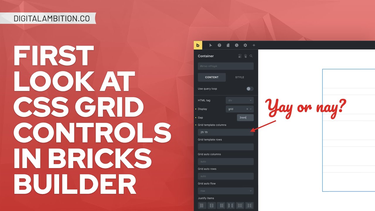
Bricks 1.6.1 is now available and includes CSS Grid controls.

Unfortunately, it’s not via a beautiful Weblow-style UI as we had hoped. Rather, it’s a fairly raw implementation that *seems* to require users to learn/know CSS Grid (unless you have the cheat code I’m going to show you in this video).

Turn that frown upside down, though, because this still an IMPORTANT and VALUABLE update. And if you’re an ACSS user, you’ll be able to use these new grid controls immediately without any learning curve whatsoever!

In this video I’ll do a quick overview of the grid controls without ACSS, point out two major bugs in this initial implementation, and then demonstrate how you can use ACSS inside of these new grid controls right away (via ACSS 2.2).

The most important aspect of this release is that you can now assign grid structures, including ACSS grid structures, to custom classes. This dramatically improves scalability and maintainability of grids that appear in multiple locations on a site and is a much better practice than defining grids with utility classes in many cases.

Video Transcript

0:00:00
What’s up everybody, welcome back to the channel. This is a really important and exciting day. Bricks 1.6.1 has been officially released and with it comes CSS grid controls. Very important for any builder to have CSS grid controls. It was a big missing piece of bricks for a very long time. Now it’s here. However, I will say this. It’s not the beautiful web flow style UI implementation that I think we were all hoping for. However, it is still a very important development and personally, I want to kind of like I know there’s a lot of people kind of complaining about this release. Here’s what I’ll say. I’m CSS grid first of all is very complex. Okay, it’s more complex than Flexbox. It’s not just easy to whip up a beautiful, amazing UI for CSS Grid.

0:00:52
There is a lot to think about and a lot to consider. And so what I think is happening is that Bricks wants a beautiful Webflow style UI inside of the builder. However, it’s gonna take a while. And they kind of have been thinking to themselves, you know what, Bricks needs CSS Grid. Like it has to have some CSS Grid controls and we need to get those out as soon as possible. So this was like their 1.0, just let’s check the box, let’s make sure that people can say yes Bricks supports CSS grid and then once that box is checked we can actually start to implement our vision for what we want the grid builder to look like.

0:01:35
But because that’s going to take a long time, they wanted to get something out and into our hands so that we can actually use Grid in Brics without writing custom CSS. And that’s what they’ve done with this release. And that may be a bummer to you. However, however, listen to me. And by the way, I will say, if you don’t know CSS Grid or you’re a beginner, you’re going to go into BricsBuilder, which we’re going to do in just a second. We’re going to walk through this together. You’re going to turn a container into a grid layout and then you are going to just immediately start scratching your head.

0:02:06
You’re like, I have no idea what to do. And then if you go to the documentation, you’re going to be even more depressed because when you read the documentation, it’s a lot of words, but I’ll sum it up for you. It basically says, go learn CSS grid and then you’ll be able to implement grid in Brics with these new controls. If you are an automatic CSS user You are gonna need to know any of that right you you have a cheat code as always you’ve always had a cheat code With automatic CSS and with this particular implementation of grid I had nothing to do with this people are gonna think I had something to do with it I had nothing to do with it because this particular implementation of CSS grid in bricks is like a It’s just an amazing Christmas gift to all automatic CSS users, because you are going to now be able to jump in and use ACSS grid structures at the class level, the custom class level inside of Brics.

0:03:00
I’m going to show you exactly what I’m talking about, but you are absolutely going to love this. And unlike everybody else who’s just going to be scratching their head like, how do we use this? Automatic CSS users are going to know exactly how to use this. Okay, so let’s go ahead and share my screen. So I’m in Bricks 1.6.1. I’m going to add a section. First thing you need to know, you can assign a grid to any container pretty much inside of Bricks. You want to define it at the section level? You can do that. It’s right here, display grid. You want to define it at the container level? It’s right here, display grid. You want to add a block inside there and define it at the block level, which could be very, very powerful, you can do that as well.

0:03:41
So really any container can be turned into a grid. Now what I’m going to do in this container is I’m going to add three blocks. Oh, well, we don’t want to do that. We want to actually type correctly. So we’re going to add block and then hit enter three times. There we go. So there’s our three blocks right there. We’re going to create a three column grid using the new grid controls in bricks So what I’m going to do is I’m going to display Grid now you’re going to notice when you change the display to grid nothing happens visually right here However, you do get these boxes And if you read these boxes just start reading them grid template columns grid template rows grid auto columns grid auto rows grid auto flow.

0:04:26
This is where the beginners, this is where people who don’t know CSS grid are just gonna be like, what do I do with this? I don’t, I have no idea. And then you go to the documentation, you’re like, please documentation, tell me how to use this. And the documentation is basically saying, here’s some links, go learn CSS grid, and then you’ll be able to use this, all right?

0:04:47
Now I’m gonna give you the basics. If you’re a beginner, if you don’t know CSS Grid, don’t worry. You actually don’t have to be scared of all of these things right here. This box right here, see this grid template columns? Have you guys ever seen the movie Hitch when he’s like teaching them how to dance and he’s like, look, it’s one move. You just stick with this move. That’s The Q-Tip. Q-Tip. Q-Tip. Throw it away. That’s not working. Hit it with this. Don’t. Ever. Do that again. Do you hear me?

0:05:22
Just expressing myself. New, new, mm-mm, not like that you’re not. All right? ♪ She got heavy, she had this feeling like she’s ready to blow ♪ This is where you live. Right here. You live right here, okay? This is home. This is your move, guys. I’m your hitch, this is your move, all right?

0:05:57
Grid template columns, this is the box you live in, and you just stay in this box, and you don’t worry about any of these other boxes. Okay. So biggest thing you want to understand with grid is there’s a unit. It’s a special unit that only deals with grid and it’s called the fractional unit, F R. And so if you define, uh, you want to define a three column grid, watch how easy it is. One F R one F R one F R if I can type properly 1fr. Okay. So now I’m getting a three column grid just by typing those three things Here’s column one, which is equal to one fractional unit Here’s column two, which is equal to one fractional unit Here is column three, which is equal to one fractional unit since they’re all equal to one fractional unit They’ll all be equal size. If I change the second one to 2fr. It’s easy guys, it’ll be double the size of the other two columns.

0:06:54
If I change it to 3, gosh I cannot type this morning, it’s very early, okay. If I change it to 3, it’s going to be 3 times the size of the other columns. If you did 2 and then 3 and then 1, it’s going to give you a different structure, okay. It’s just in parts, you’re defining the parts of the grid, right. What are the ratios and things like that. If I added another FR then it’s going to create a fourth column. Okay so very very simple. Now that’s like the super beginner like introduction to defining CSS grid columns. There’s more advanced things you can do like a repeat function. I can repeat three one FR. So repeat three columns over and over and over again every column one FR in length. Now I can also do a min-max function where I can say I’m repeating 3 and I want them all to be a minimum of 100 pixels and then at their maximum they can be 1fr. So they’re going to take up 1fr however wide that grid happens to be and this is why grid is so powerful, much more powerful than flexbox. Because flexbox you have to go to each item and define its size right with grid you’re defining the Items the children at the container level the parent Controls all of the children for the most part we’re gonna look at an like I said grid is it’s it’s pretty involved And I’m gonna be doing more in-depth tutorials guys. Don’t worry I am gonna show you exactly how to use all of these features, okay?

0:08:24
So you’re gonna know exactly you’re gonna know grid. By the time I’m done with you, you’re going to know grid. But we’re not, that’s not what this tutorial is about. Just giving you a basic rundown. Okay, so we have repeat three, min, max, 100 pixels, 1fr. So at the max it’ll be 1fr and at the min it’ll be 100 pixels, which means these cells will never be squished to less than 100 pixels. Now the problem with this is it can create some overflow issues. You want to be very careful when you define grids like this. There’s also ways to create auto grids using auto flow and all of that to where you don’t even have to worry about the break points.

0:09:03
Because here’s the thing, if I do 1fr 1fr 1fr, remember that very basic grid structure that we had, three columns all equal columns. Well it’s going to stay that way and don’t mind the overlay, there’s a little lag in the overlay issue. There’s this new overlay feature that they’ve added here and it allows you to kind of see how the grid is structured. It’s not, you know, I turn it off, it’s really not all that important but it’s there if you want that. I’m going to also put a gap in here of just, you know, two rim for right now. So that’s going to put a little gap between these cells. But check this out. You go down, down, down. It’s staying three columns all the way. So if you want this to be like one column here, then you would have to redefine the grid to just one FR and now you get one column at this breakpoint. There are ways to create automatic grids where you don’t need any breakpoint controls. However, again, that’s much more advanced. Now let me show you something about this grid implementation, something else you’re going to want to know, and then I want to talk about some major bugs that are in this release. They’re going to fix these very soon, but I want to point them out, okay? So I’m going to duplicate these blocks. And so now what we have is we have six blocks, two rows, and let’s actually keep going.

0:10:25
Let’s go block, block, block. Let’s get to nine. So the question is, in this new bricks control of grid, can we play with the children? Oh, that sounds awful. Don’t scratch that out. Can we manipulate a child element and make it stretch? Can we make it go across columns? Can we make it go across rows? Let’s check that out.

0:10:48
So I’m gonna grab this child right here. These are all cells of the grid basically or what are called grid items All right, but they’re also children of the parent grid and When you click on a child what you’re gonna notice right here is these two new controls for grid items And it says grid column and grid row and yet again the beginners the people who don’t understand. So there’s a couple ways that you can do this. Number one, if you just slap a number in here, you’re going to notice I slapped grid column two in there. It jumped that cell to column two and it actually left a hole where column one was, right? Well that’s how you can take this cell and say I want you to appear in a specific column. Here’s I want you to appear in column 3. Now obviously this kind of breaks your grid doesn’t it? You can also use this exact same input to span children across columns okay? So check this out. You define where you want it to start, then you put, it’s like a fraction right? So it’s 1 over something. So I want it to start in 1 and I want it to end in three.

0:12:02
And that’s gonna go here. Now you’re like, why didn’t it end, there’s three columns, you wanted to end at three, why didn’t it end, why didn’t it take up the entire first row? Because in CSS Grid, the way the columns are counted, if you wanted to span all three rows, you actually have to span it to four, because it’s where four would begin, is the end of three. You get it? Right? So you got to span it all the way through the third column to the fourth column. So watch if I put four it’s gonna span all the way across. Alright? Now there’s a shortcut for doing this. If you know you want to take up all the columns you can simply say minus one.

0:12:45
And now it doesn’t matter how many columns it’ll always span every column. Now again, we’re getting into more advanced, like how is this actually done, how does CSS Grid work, but I wanna show you that these controls are possible and it is possible to create some really cool grids very easily if you know what you’re doing. And if you don’t know what you’re doing, you need to stick around because I’m gonna show you how automatic CSS gives you a cheat code. Okay, alright so what we’re going to do is we’re going to say that this goes back to one and three and then I want to test out can I span this across rows.

0:13:22
So what I’m going to say is hey I want you to start on row one but I want you to go to row three. Now check out what we’ve done. So we’re manipulating this cell and yeah this is I mean this is for people who know CSS Grid this is fantastic control. Now, I want to point out two major bugs. You’re gonna notice that I’m doing this at the ID level. Why am I doing this at the ID level? Well, because when you define grids at the class level in Bricks 1.6.1, before they fix the bugs, you lose two major controls.

0:13:55
Number one, you lose this thing right here, this visualization of your grid. And you also lose these grid item controls. Okay, I’m gonna demonstrate this. So I’m gonna delete this section and we’re gonna start over. All right, so here’s our container right here. Now I’m gonna say, we’re gonna define a custom grid. And here’s one reason why this is so important in Brics. If you’re gonna create something like a services grid, and I’ve gone over this many, many times before.

0:14:26
And let me show you an example, okay? If you had ACSS, what you had to do before, if you didn’t have ACSS, you probably weren’t using Grid, unless you were writing your own custom CSS in Brics, in which point you’re probably good to go. But if you were using ACSS, you would define a grid like this, grid three, and then you would put your gap on there, gap m, and then you would say at the m breakpoint, I want it to be one column, so that’s grid m one.

0:14:49
And now check this out. If I put in my blocks, there’s my three blocks, okay, right there, and you can see the grid. At the L breakpoint I still have three columns, at the M breakpoint I have one column. Those utility classes in just seconds have defined a three column responsive grid. The challenge here is, and I’ve said this in all my videos, when possible you want to define things at a custom class level and use utility classes as little as possible. And the reason being is, let’s say I have a services grid and it’s got nine cards in it. It’s every service that I have. I have nine services.

0:15:26
I have a card for each service. They’re in a three-column grid. So I create the grid with utility classes. And then I come along and I decide, ooh, I want that services grid on this other page as well. And then as my site grows, I actually end up in a scenario where, oh, I want that services grid on this other page. So now I have three instances of this services grid. Now let’s say I add another service. So I now have 10 services. Well, three column grid doesn’t work so well with 10 services because it leaves a little dangler down there, a little dangling child, right? And so I need to redefine the grid structure. This would look better if it was two columns instead of three columns. Well, I have three instances of this grid and because they’re defined with utility classes, in order for me to change the structure from grid three to grid two, I have to go to every instance of that grid and change the utility class. That’s not very maintainable. That’s a waste of time. And so when we’re doing pro development, right, we know that, hey, if I’m creating a services grid, very likely in the future I could want to change this grid structure, and it’s very likely that we’re gonna be using this grid in multiple areas on the website.

0:16:35
So I should actually define the grid with a custom class called like services grid. So what I’m gonna do is we’re gonna delete that container, and we’re gonna add another container, and well, come on Bricks, add it in the section, thank you. Now I’m gonna do services grid. And when I pop that on, you can see that I can define the grid at the class level. And now I’m going to add my blocks. So we’re going to do block, block, block. And let’s just do all nine, right? So I’ll duplicate three, four, five, six. Okay. So there’s our nine grids. Now I’m at the services grid class level. I’m going to define my grid. We’re going to do a repeat.

0:17:13
And we’re going to do three, one FR. We’ll just keep it nice and simple. And then I can do my gap here. Let’s say like two rim, awesome. So here’s my services grid. Then I can come here and say at the end break point, I actually want this to be just one FR, just stack those bad boys on top of each other. And now I have my three column responsive grid. The difference is I have not used those utility classes. I’ve defined this at the class level.

0:17:40
And this was much more difficult than Bricks before because you would have to write all of the custom CSS yourself to do this. Now you simply fill out the values in the fields. But we’re not done yet guys. We’re not done yet. I haven’t showed you the secret sauce yet. I haven’t showed you the cheat code that you get with automatic CSS. But you guys can see here that if I ever add a tenth service to this services grid and then I’m like you know what I’d love to change that from a three column to a two column. Well watch this.

0:18:09
One place I change the grid structure every instance of that grid has now updated to be a two column grid instead of a three column grid and I know it’s responsive and I know it looks good because it’s using the same controls that I’m using because they all share the same class. Okay. So absolutely fantastic, phenomenal. Unfortunately, you still need to know what you’re doing with this. Unless, unless, unless you use automatic CSS. And guys, with automatic CSS, you’ve always had a cheat code. ACSS has always been a cheat code for grid since the beginning of time. Everybody complained, Bricks doesn’t have grid. Well, if you had ACSS this entire time, you’ve always had grid at your fingertips.

0:18:52
And you don’t even really need to know how to use grid in order to create grids with automatic CSS. That’s the beauty of it. Okay? So let me show you how this implementation right here, where everybody else is going to be, oh, what do I do with these fields? I don’t know what to do with these fields. I don’t know CSS grid. All the ACSS users are going to go, I know exactly what I need to do with these fields. Check this out.

0:19:16
So I’m going to delete this. I’m going to delete this. Okay. Now grid template columns. Guys, I want a three column grid. What’s the utility class for three column grids? It’s grid three. Check this out. Grid up grid three, right? Now three, there’s my three column grid using ACSS structure.

0:19:36
Oh no, it’s supposed to be a two column grid. Okay, check this out change it to two columns now It’s a two column grid. Oh my gap. What do I want that to be? Well, I want that to be space M right which is our medium spacing same thing as gap M But I’m just using space because that’s the variable. There’s no gap variable. It’s all spacing. So there’s my space M There’s my grid to check that out guys now You can go one step further because now if I wanted it to be one column here, well I’ve already defined it with one FR, I could do, for sure, grid one, right? I could do grid one here, same kind of variable structure, I still get my stack, but check this out.

0:20:15
If you love ACSS auto grids, and you don’t know how to write the CSS for an automatic grid, ACSS has done a lot of work behind the scenes to make auto grids very powerful and there’s a lot of math involved, there’s a lot of complication involved. Guess what? You don’t have to worry about any of it because you can simply define with grid auto 2 a 2 column auto grid and you don’t have to touch this at any break point guys. It’s going to be automatically responsive. If I want that to be grid auto 4, check this out.

0:20:48
Four column grid here, oh no it’s three, oh, oh no now it’s two, oh now it’s one. Have I defined anything at break points? No, it’s all doing this based on automatic math according to the width of your website and standard widths of these children elements. Now again if you want full control, you don’t want to use the auto grids, that’s fine. Here’s a four column manual grid, it’ll stay four columns until you decide to change it. So right here, I can simply go grid three, and right here, I can simply go grid one if I want to. You get to choose exactly what breakpoints the grid structure changes. You can change the gaps at various breakpoints now.

0:21:31
And you can define all of this at the class level. Automatic CSS gives you this tremendous cheat code with this particular implementation of Bricks. Now, I want to reiterate that this is not, in my estimation, the final implementation of CSS Grid and Bricks. I believe that they are going to be working on a beautiful Webflow style UI, okay? But it’s going to be a while, most likely. It is a very technical and complex thing to build. And so I like this implementation as a first step. I definitely don’t like it as a final step. But what I will also say is, I hope that they leave these controls in even when they introduce the UI. Don’t force us to use the UI. Okay. Oh, let me show you one other thing. Because I defined this grid with a class, here’s the bug that I wanted to show you.

0:22:28
Look, I don’t have that little grid overlay icon, and when I go to the children, womp, womp, I don’t have those grid child controls for spanning columns and rows and things like that. So I’ve already reported these bugs. I’m pretty sure that they’re gonna get fixed ASAP, so it’s not a big deal. But I did want you to be aware of that because you will get confused if you try to follow my video and you create a custom class and you start defining a grid and then you go to children and you’re like where are the controls it’s a bug okay and so I’ve already reported the bug it’ll get fixed soon.

0:23:03
I wanted to show you a general kind of overview of how this works inside of Bricks 1.6.1. I am not going to leave you hanging okay if you don’t have automatic CSS if you don’t want automatic CSS for whatever reason you’re crazy You’re this you’re that I don’t know. I don’t know but let’s say you don’t want automatic CSS You’re not going to use automatic CSS. Can you still learn from me? Yes I am going to teach you about CSS grid in Bricks builder using this Implementation and but like I said before by the time I’m done with you you will be comfortable defining grids with just writing instructions. You’re not going to need the beautiful web flow UI. I also want to say this, learning grid is worth it. It is absolutely worth it.

0:23:51
Do not be the person who’s like, well, they didn’t give me a beautiful UI, so I’m not even going to use it. I’m not even going to learn it. Look, you need to learn it. Grid is so immensely powerful. So I will teach it to you in layman’s terms. I want you to take the time to watch the videos. By the time I’m done with you, you’ll be able to implement grid confidently even if you’re not using automatic CSS. But if you want the cheat codes, automaticcss.com. Cheers.