We're working in Figma today!
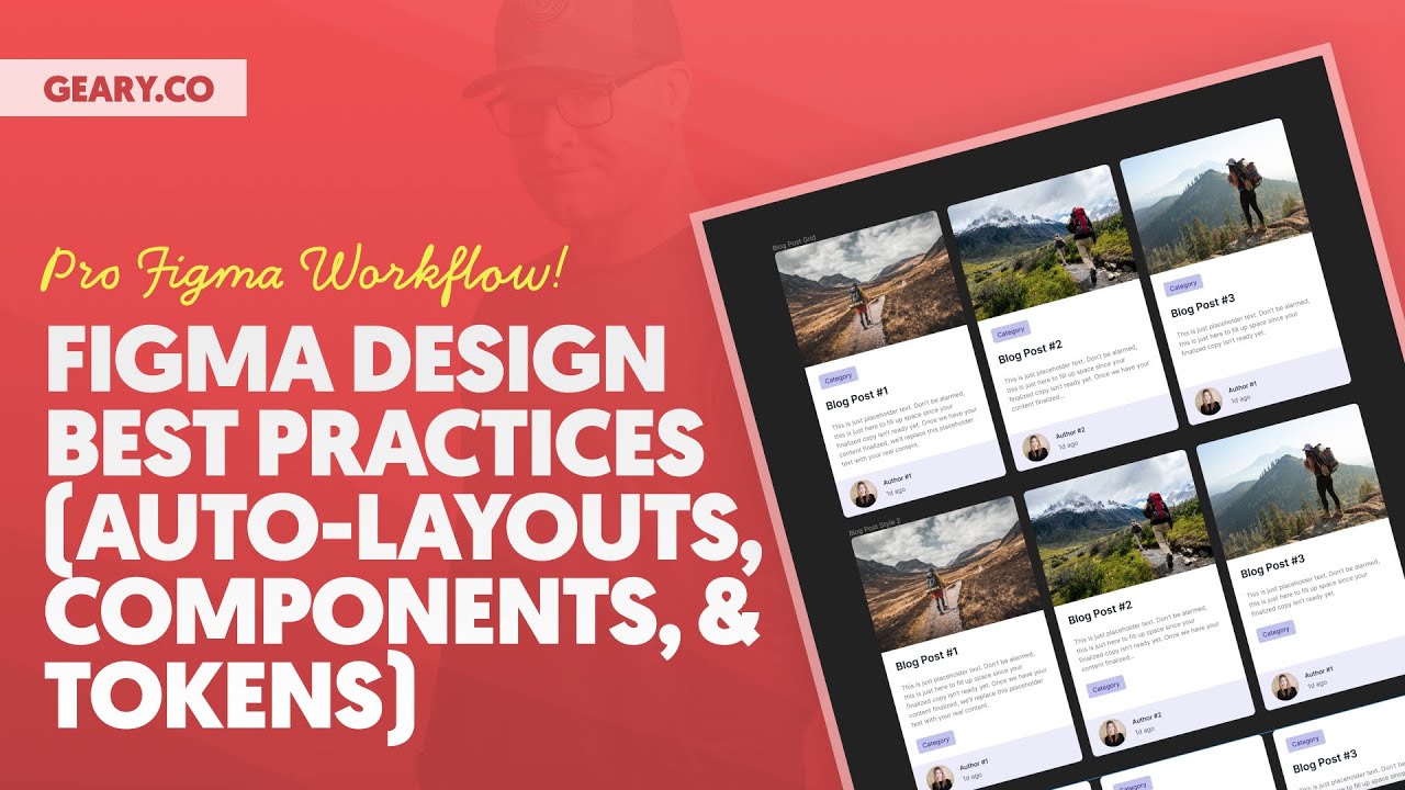
In this video, you'll learn about the fundamentals of scalable, maintainable design in Figma using auto layouts, components, and tokens (ACSS Tokens via Tokens Studio).
We'll look at a simple blog post grid example as we work from scratch so you can see every single step of the process. As always, lots of golden nuggets along the way!
*** MY TOOLS ***
🔥 AutomaticCSS (ACSS) – https://automaticcss.com
🔥 Frames – https://getframes.io
See all my recommended tools here: https://geary.co/tools/
*** INNER CIRCLE ***
Step your design/dev game up, make more money, and get the full scoop on scaling your digital agency! When it comes to the Inner Circle, I don't hold back.
⭕ In-depth design & dev trainings
⭕ Business, sales, & marketing trainings
⭕ Agency resources & downloadables
⭕ Vibrant, quality community with zero toxicity
⭕ …and much more!
Learn more and join here: https://geary.co/inner-circle/
*** SOCIAL ***
👉 FB – https://www.facebook.com/marketingkev/
👉 LinkedIn – https://www.linkedin.com/in/kevingeary/
*** CHAPTERS ***
0:00 Intro
0:48 What We'll Build
2:19 Getting Started
4:00 Installing ACSS Tokens
5:30 The Basic Auto-Layout Workflow
16:43 Styling With ACSS Tokens
33:06 Component Functionality
44:51 Token Tweaking
49:20 Persistent Design Iteration
54:10 Wrap-up