EASY Text Columns Without Flex or Grid (PLUS Utility Classes vs Custom Classes Best Practices)

More about this video

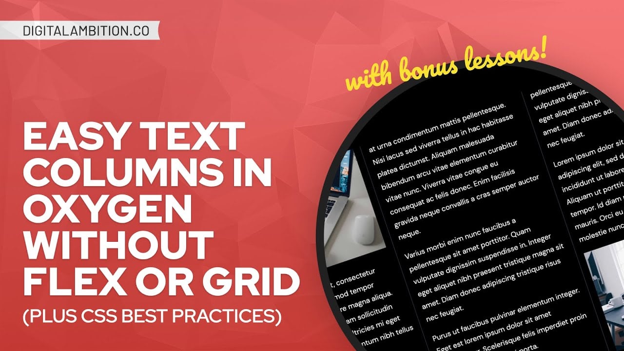
Have you ever wanted to break text or lists into columns without losing automatic content flow between columns?

In this tutorial, I’ll show you how to break text content into columns WITHOUT Flexbox or GRID.

BUT WAIT! THERE’S MORE!

Because this technique is actually so simple and easy, I want to spend some extra time and attention on a few things.

I’m gonna go slow and make sure you grasp some key concepts related to best practices, workflow, style organization, future-proofing, etc.

For those of you who are new or beginner-level at CSS, I’ll take my time writing the code and explain each step.

And I’ll throw in whatever other tricks and value bombs I can think of.

Spend the hour with me and you’ll learn a lot more than the title of the training.

And if you want even more, you’re welcome to join me and over 800 developers, designers, freelancers, and agency owners in my Inner Circle: https://digitalambition.co/inner-circle/

Interested in Automatic.css? Check out https://automaticcss.com

0:00 Intro
01:10 Page Overview
02:50 IDs VS Classes VS Utility Classes
06:40 BEM & Custom Class Naming
13:05 Where to Put Custom Styling
14:23 Splitting a List Into 2 Columns
17:32 How to Inspect Styling Issues
23:51 Automatic Responsiveness
26:09 Adaptive Behavior
26:58 Easily Styling Markers
29:38 Custom CSS Scalability Example
32:12 Creating Utility Classes
46:51 Creating Ruled Columns
53:38 Final Thoughts

Video Transcript

0:00:00
What’s up everybody welcome back to the channel and today’s training we’re going to take a look at how you can break text into multiple columns without the use of flexbox or CSS grid. This is a really useful very powerful technique and it’s actually very easy to implement. Now because it is so easy look I’ve put time aside to record a tutorial for you. I don’t want it to be a five minute tutorial. So I want to take some extra time I want to go into detail on things like workflow and best practices when implementing a technique like this because we need to talk about scalability of a full website build that just taking an isolated technique and here’s how you slap it on to a paragraph of text. Let’s talk about how you would implement a technique like this on a full website build to ensure scalability and future proofing so we need to talk about some of the concepts related to CSS utility classes custom classes name and conventions things like that we’re going to go a little bit slower in this tutorial. We’re going to make sure that all of the beginners out there can follow along but I truly think that everybody is going to get tremendous value from this episode. So let’s go ahead and dive in I’m going to screen share with you before we do anything I wanted to take a look at the sample page that I’ve put together here that we’re going to be working with. It’s like a pretty decent looking page but it’s not finished yet it would actually look a lot better I mean this section for sure is not finished. It would look a lot better if for example this giant wall of text was broken into two easy to read paragraphs that are side by side we’re not two paragraphs but two columns that are side by side. It would be nice if for example this list was two columns side by side and I really want to see what it would be like if this was broken into three columns and I think that would improve readability a lot. And just the general structure and layout of the page now one thing is we don’t want to use flex box and we don’t want to use grid because when you use flex box or grid you have you actually have to physically break these elements into multiple elements and then they become somewhat unmanageable whenever you have long text like this you want the text to naturally flow from one column to the next column. And if you break them physically and use flex box or grid to structure them they won’t naturally flow from one to the other if you add content to one column you’re going to have to subtract some and move it and it’s just it becomes a nightmare for actually managing the content on the page but if you use a technique like what I’m going to show you you don’t run into this issue. Now let’s talk about workflow let’s talk about scalability let’s talk about CSS and applying techniques like this if you’re not going to use the exact same style or the exact same design of an element over and over and over again then implementing a technique like this would best be done with utility classes I’m pretty much again styling these things at the ID level. I would recommend you’re either going to use utility classes which are classes created for one specific purpose and you can just quickly drop them onto elements and get the effect that you’re looking for and then move on or global control is with custom classes you create custom classes so that you have global control now that happens when you have an element that you are going to be reusing over and over and over again and you need the styling to be identical and you need one source of truth for that styling. So if we scroll down to this section as an example and let’s say that this is a component basically it’s like a product card and this product card has a heading and it has a description and then it has this list of features and let’s say we’re going to use this product card on multiple pages across the website so we might end up having by the time a website build is done.

0:04:00
There could be 30 40 50 of these little product feature cards and they all have one of these little lists in them and I need to be able to make sure that all of those lists are styled exactly the same and if that styling ever needs to change I have one source of truth where I can make those changes and then those changes apply to everywhere I’ve used that card that is very very important when you’re doing website builds. Now if we come down here this is another example of just a one off hey I want three columns of text I’m not going to use this exact same styling somewhere else I just need three columns of text for this particular section then popping on some utility classes would be really good here. So I’m going to show you both methods I’m going to show you the method of creating a custom class and applying this type of styling and then I’m going to show you what it actually takes if we were going to develop some utility classes for these other areas up here. Now yes for sure it’s the fastest method to just take on the ID here to go to advanced and custom CSS and write some custom CSS and break this into two columns and then move on with your life but it’s not really scalable and it’s not it’s not quick if you have utility classes already prepared for you maybe you’re using a framework like automatic CSS or you prepared your own utility classes if you’ve already have utility classes at your disposal then absolutely it’s easy. It’s easier it’s faster to just use utility classes so instead of doing and again scalability future proofing think about what you’re doing here with building websites if you’re going to build more websites if this is the only website that you’re building then it be who’s you it’s a huge benefit to have utility classes at your disposal whether you create those or you get them inside of a framework like automatic CSS because even though you can style it quickly at the ID level right here. And now you’re going to have to do that same exact work again and again and again and again and again on every site that you need to do this technique with right better to just have utility classes that are always at your disposal so you can do them so yes utility classes take a little bit more work upfront but over the long run they make your life faster easier more consistent simpler and so on and so forth. Especially if those utility classes are just given to you in a framework like ACSS so we’re not going to do anything at the ID level here we’re either going to create utility classes or we’re going to create a custom class for the styling we’re going to start with the custom class because that is the probably the easiest most straightforward way to begin and it’s the way that we’ll get to the technique the quickest OK. So let’s take a look at my structure here we’ve got a section and then inside of that section we have a card that’s a fairly large card it’s got a lot going on right but nevertheless it’s a card that I want to be able to use everywhere and we’re going to call this a product feature card it is giving us the feature the features related to a specific product so I’m going to go up here and I’m going to create a custom class on this entire thing not just on the list that I want to style but the entire. Because what I want to introduce to you is a concept called them and I’ll probably do an entire video on them it’s B E M it stands for block element modifier and it’s basically a philosophy for creating custom classes one thing I see huge error and issue that I see with beginners is they create custom classes right they know not to style at the ID level but they create custom classes that have no semantic meaning or improper semantic. For example if they wanted to break this into two columns they would come up with some sort of class like intro text right and then they would apply the styling to intro text they would break break this into two columns and then when they come down here they’re like well you know what I actually want the same two columns maybe they don’t want three columns like I mentioned earlier they just want to and they’re like oh I already have a class for that and they pop on the intro text class I’m not going to actually do it but they pop on the same intro text class because they know that’s where I’m going to do that. They know that’s where they put their styling for two columns but guys this is not intro text right you’re using a semantically inaccurate class right here in fact nobody knows what intro text means they don’t know that breaks things into two columns right that doesn’t make any sense. So think about this and I know if you’re not working with a team you’re like well who cares what other people think because it’s just me Kevin there’s a six month rule it actually could be a three month rule depends on your your your brain and your memory but let’s say this you build a site for sure you have this happens to you you build a site and then you’re finished with it you move on to the next project you’re working on another project then you’re working on another project six months goes by old client comes up like hey we want to make some changes some additions to our website come on back do some more work for us you’re like hey no problem you go in you load up that old site and then you need to break something to columns and you’re like what was that class again or you look at the the class it’s on something you’re like intro text what does that even do what this isn’t even intro text what does that even mean what was I doing what was I thinking right you get into those situations all the time there are massive waste of time there are massive waste of brain power and they’re just it’s just wrong it’s just bad right some things are just wrong and some things are just bad. Don’t do that as a practice use semantically accurate names if you follow the BIM methodology which automatic CSS follows by the way you are able to keep your classes insanely organized and they’re all semantically accurate which means and check this out because it’s BIM block element modifier you can actually look at a class name and know exactly what block it belongs to and what element belongs to and how it’s going to be. And how it’s being modified and pretty much you know exactly what’s going on just by looking at the name of a class so that’s what I want to show you right here very very important technique for you to start implementing if you’re not implementing it already so here’s your product feature card we’re going to that’s what we’re going to call it so we’re going to say product feature card this is the block okay now the block has elements inside of it one element is a heading another element is a body text and another element is our list and of course we have a button as well buttons are less important because they tend to be the same across the website no matter what.

0:10:33
But what you would want to do even though we’re not going to style these at all right now you would want to come in and you would want to apply custom classes to these elements to this gives you control global control over all elements of this block right you might think well I don’t need to do anything to it right now but right now doesn’t matter the future is what matters because once you duplicate this 700 times you can’t then decide oh now I need global control over those things right you got to know this ahead of time and you have to plan accordingly so I know that I need global control over this at some point so I’m going to go ahead and type product feature card and then in then in BIM the way you do this element side of it is a double underscore so all of these things are nested basically under product feature card so this is just going to be a heading so it’s product feature card heading right and then I come down here and this is going to be product feature card double underscore body right since the body of the card and then this is going to be the list so product feature card list and again guys I’m going into this detail because I want you to learn best practices I don’t want you to try to whip things up as fast as possible I want you to be thinking about the future and scalability and organization and becoming a better dev right becoming a better developer so here’s product feature card list and then here’s another trick for you and I’ll go into this more detail when I get to the actual BIM training later on in the future but you can do product feature card button even though you’re not even going to do anything with it right but that gives you some fallback power which I’ll explain in a different tutorial okay so we’ve set up our structure oh wait I miss something right this image right here product feature card image see how everything is super organized and I know what goes with what it’s all great all right so now I’m going to come down and we’re going to actually do this technique on the list and we’re going to split this list into two columns and then you’re going to see that the design the layout of this list actually breaks because this have default styling on them they have default margin default padding I’m going to show you how to inspect elements so that you can figure out what’s going wrong with them in order to then go and fix them and I’m going to take my time on the CSS part I’m going to write it very slowly so for those of you who are scared of CSS or you don’t really understand how CSS works yet you’re going to be able to pick up some things as well all right so what I’m going to do first thing is we’re going to talk about where to put this code here’s where you should not put the code you should not go into advanced custom CSS and write it here in fact you’ve probably seen me do that in some of my tutorials and I’ve actually gone back on this technique and I’ve decided I’m not going to do this anymore going forwards and I’ve actually informed my team we’ve updated our SOPs that if you’re going to write custom code you don’t nest them inside of individual elements in oxygen surely you can see where there might be a problem with this when somebody comes back six months from now let’s go to the six month rule and they’re like where’s that code right well they got to look in style sheets or they got to look here or they got to look in the actual builder fields or they got to look in custom selectors there’s four different places that code can live all right that’s a problem because people are just spending all they poking around trying to find things I pulled my team look we’re not creating we’re not going to go up and create custom selectors just so we can style things in oxygen we’re not doing that we’re not going to nest code inside of the custom CSS in a module if you’re writing custom CSS it goes in a style sheet period it’s actually five ways you can actually put custom CSS in a code block on a page okay so we’re doing everything in style sheets so I’m going to go over here to style sheets and I’m going to open my style sheets and what’s great about the style sheets area is that you can keep everything super organized right you can create a style sheet for pretty much everything it all gets combined at the end of the day it’s good to go so I’m going to add a style sheet and you can call this products you can call it product card you can call whatever you want to right if you want to put all of your product styling together you can you can do that there I’m just going to do product card well I can’t type today okay so products card just like that and then another best practice I would recommend me zoom way in here is I would create a little comment put your name and then put your agency as well so everybody knows who wrote this CSS and if it goes wrong who they need to contact and you know to figure it out if there are if they have any questions about it what not okay so now what we’re doing we’re looking at this little list over here which I know everything is gigantic because I zoomed in a lot but we are going to target that list and because I don’t have some erroneous class name right I know exactly how to target it it’s product feature card double underscore list it’s the list inside of the product feature card and then what I’m going to do is I’m going to open the curly braces so all I’m doing here is targeting a class with CSS the class is sitting right here on this list so now what I’m going to do is the actual technique that you’ve been waiting for that you’ve been dying for you’re like Kevin get to the technique already quit talking best practices are important all right we got to cover them but anyway product feature card list it’s so easy guys this is so easy all right so we’re going to create columns yes so we’re going to say column count and then we get to put a number to look you can see right away it is broken into two columns you can also control the gap between columns with column gap we’re going to do a column gap of maybe two m on this or we can do 1.5 m now let’s talk about m’s versus rims versus clamps versus VH and VW and CH and all these different units when you’re doing something small like this relative to text size I prefer to use m units if you’re not using clamps I wouldn’t use clamp here unless I was using utility class that already had clamp in it like a gap class from automatic CSS or something because they’re hard to manage and they require fallbacks but right here like this I just need a little spacing like 1.5 and relative to the text size 1.5 m is a perfect unit to use here if that text ever got bigger the gap would get a little bit bigger because the m units are relative to the font size versus rim is not relative to the font size it would stay 1.5 regardless okay so there you go with the technique column count to column gap 1.5 m now don’t abandon the video here like oh I got the technique there’s more to cover we’re going to talk about how how to rule these columns how to make sure that they’re automatically responsive which we’re going to talk about in just a second but first what I want to do is I want to fix this styling problem so I’m going to go ahead and hit save we’re going to go to the front end we’re going to take a look at what the problem actually is I’m going to exit the front end and I’m going to scroll down everything’s gigantic because we’re zoomed in all right I’m going to right click whenever you have something going wrong and you’re like what is happening you have to inspect it so you’re going to right click it you’re going to click on the inspect right here now sometimes it’s difficult to find out what’s going on if you’re just looking at this list over here the first thing I would do is look visually let me make sure that those aren’t highlighted by just hovering over one of the elements this is the L.I. right here and you’re going to see when I hover over it I can’t like point at my ring because you can’t see my finger but you see it highlights it and notice it highlights it with one highlight color that let you know there’s really no styling happening here that you need to be aware of so if I go up one element to its parent which is the unordered list I can now see three colors so I can see the text is one color the markers the bullets are in purple and there’s a lot of space being highlighted there and then the yellow is showing me above and I list those are margins and paddings and so basically what you’re being told here is there’s margin and padding at the UL level the UL has this margin and padding that’s throwing off your design it’s indenting the bullets and then it’s bringing the paragraphs spacing down at the at the very beginning which is throwing off our alignment here so what we have to do it’s you need to target the unordered list target the UL and remove that extra spacing so what we’re going to do is in our style sheet me zoom all the way back in here in our style sheet we’re going to target the UL here’s how you target the UL remember the UL is part of your product feature card list so we’re going to write product feature card double underscore list space UL and that targets the unordered list that is inside of that class all right so now what we’re going to do is just right away we know let’s just get rid of all margin I don’t need any margins on this list so I’m going to hit margin zero and you see right there it’s gone that first initial margin the last initial margin gone all of my things all my elements my items in my list line up perfectly now but I don’t like the fact that they’re indented so that is being done by padding so I’m going to show you two different ways to do this one is padding zero and that takes all padding away and you might start here but you’re going to notice another problem so if I say even go back to the front end take a look at this refresh you’re going to see that oh look at this the text is actually in line with the text up here but the marker is not the bullet is actually offset to the left I want the bullets to be in line with this text up here so what I’m going to do is add some padding back or not take as much away so what I’m going to do is actually the the long hand version of padding which is four units like this okay so the top it’s always goes clockwise the top is where always starts so this first number is the top the next one is the right side the next one is the bottom and the next one is the left hand side so I want the top to be zero don’t want any padding top or bottom I don’t want any padding on the right I don’t want any padding on the bottom on the left we know zero doesn’t work is that shifts it over too much I want to try one in here and then if I save we’re going to go back to the front end and you should see that all of this stuff is in alignment now look at that perfect alignment all the way down with my bullets but we’re not done yet there’s a problem we need to look at this on mobile let me zoom out go to mobile view and start to collapse this in and let’s see what happens right there you see it so notice here we have a line height issue it looks like performance because this spacing of the line height is exactly equal to the margin that’s on the bottom of these are really there is no margin it’s line height controlling all of the spacing therefore it almost looks like performance should be its own bullet item right and performance here should be its own bullet item but they shouldn’t be but it looks like visually they should be it’s very hard to decipher which lines go with which bullets right so what we have to do is tighten up our line heights so that’s easy to do we’re going to go back and we’re going to see if we can do it at the UL level right here let me zoom back in that’s too much so we’re going to do line height one and it actually can be targeted here at the UL but you see we immediately have another problem so now we’re going to save we’re going to go back to the front end and refresh and let’s take a look at what our new problem is everything is really jumbled together because now that the line height is pretty much gone we don’t have any spacing between our bullets anymore so what we need to do is on an L.I. every L.I. which is a list item inside of your unordered list every list item needs some margin on the bottom in order to space it out so that’s no problem very easy to do but I can’t do it by targeting the unordered list I have to target a list item so what I’m going to do is paste that line right there did it not copy let’s try that again copy paste okay and then I’m going to add one more targeting thing which is an L.I. okay so now I’m targeting an L.I. inside of a UL inside of a product feature card list and all I have to do here is margin bottom so I don’t have to do the whole long hand of margin I know I just need margin on the bottom and I’m going to do one in just like that and then I’m going to hit save and now we should have the spacing we had earlier except we don’t have a line height problem so I refresh and there you go and let me take a look at our line height maybe like 1.2 would be a little bit better you can dial this in so we’re going to go back to the front refresh and there we go so we have decent line height now like the the two lines aren’t squished together they have some spacing but there’s more spacing between list items so visually I can actually see what’s going on here all right so now we need to talk about responsiveness of these this technique this column count to technique all right so there’s another part of this called column width right so column width if I can type today and you get to determine what a minimum width for every column of of text should be and if it goes below if it starts to squish a column below this minimum width it will automatically break the columns into into like one like or if it’s three it goes to two if it’s two it goes to one it becomes automatically responsive when you do this so what I’m going to do is I’m going to play around with some widths so we’re going to try 35 rim here and I would not suggest using pixels have gone into this many times before pixels are not accessible do your best to use relative units rims that kind of stuff okay I can see that if I do 35 rim it’s automatically going to break this to one column so we don’t want to do that maybe we’re going to try 25 rim and then let’s see how this actually behaves let’s go to save let’s go to our front end refresh okay and let’s get out of mobile and let’s not zoom in so there we are we’re going to jump into mobile view but I want to come out here to desktop and I want to see exactly where this breaks so I’m going to come down oh it broke a little early let me see how once the columns actually break now it’s back to two and then it goes to one that’s actually not bad that’s actually not bad at all I can maybe do like 20 rim on here I don’t know how much that’s actually going to matter let’s just go ahead and take a look so you guys see that my minimum width if I go out here my minimum width is not taking effect but as I come in yeah okay there we go so it actually left it as two columns which I don’t I don’t mind that I don’t there’s really no problem there let’s see when it actually decides to break it there it is so like on a on a basically a phone view like that would be the S break point slightly maybe the m break point probably the S break point it decides to break it to one column maybe we’ll go in the middle there we’ll go like 22 rim and we’ll just leave it at that okay so I have broken this text and here’s here’s the greatest thing about this look guys this is a rich text element I can now add doesn’t matter how many more bullets I add and I hit save it maintains this two column layout I don’t have to get from one column to another and play with the grids and play with flex box and all that stuff it simply takes one element of text like this and breaks if I remove things breaks them into two equal basically equal columns right now it looks like I have an odd number of items but if I had an even number of items saving close it would be perfectly even columns but it keeps things regardless of how many items there are nice and balanced for you and we’ve just done this on a custom class so let me show you why we’re doing this at a custom class level actually let me pop one more technique in there for you so you get some extra value in this training so look at this I’m going to go back to my product card I would actually like those markers to be my sites primary color because they look better that way all right so what I’m going to do is on this lie I’m actually going to highlight this line let me zoom in everybody else me when I forget to zoom in so let me zoom in I’m going to come down here product feature L.I. double colon marker and this is going to allow you to quickly and easily style the markers the bullets okay and I’m just going to do color and then I’m going to do var primary which is a variable from automatic CSS for my website’s primary color and I want to take another minute to talk about ease and scalability here right you can absolutely do this in a number of ways you could say red you could use a hex code maybe you know the hex code in your head I don’t know you’re like a dev genius you memorize all your clients hex codes so you put a hex code in here and it changes the color of the marker or you’re like nah I got these variables and you know that in oxygen there’s global colors and you’re like why can access those global colors by using the color function and I just put in the ID of the color and then I’m going to get it the problem is this is not semantically accurate there’s actually no semantic data here whatsoever what is a color one there’s no such like what what does that mean to anybody six month rule six month rule you come back in six months you’re going to know what colors you need to use no you’re going to have to waste time popping out of here going into oxygen global settings looking at the idea of the color that you need coming back here referencing the color and then when you need another color you’re going to have to do it again you’re going to go have to go back to global settings find the other color you need reference the ID come back put it in a color function use it again yada yada yada yada right or you use semantically accurate names and like an automatic CSS I know hey if I need my website’s primary color it’s var primary I’m done I move on with my life there’s no referencing anything it’s semantically accurate it’s exactly what it says if I want the light version of primary I add light to it if I want the medium version of primary I add medium to it if I want my hover version I add hover to it there’s nothing I have to look up or remember like it’s the same from site to site to site and it’s also manically accurate so that just another little tidbit for you so product feature card list you LLI marker is now the primary color let’s go check out how that looks and I think you’re going to agree probably looks a lot better yeah it does right it looks better when the markers not the same color as the text and when you get the brand color working in there it looks a lot better all right so let’s talk about this scalability issue so now what I’m going to do is I’m going to copy this section right here let’s copy this let me zoom out I’m going to come down all the way to the end and well let’s delete this one I was doing another tutorial and it failed because my screen capture failed and that was from that so I’m going to go ahead and paste this new one in I want you to pretend for a minute pretend that this is on a different page pretend that there are 500 of these cards right that we’ve used all throughout this gigantic website and then the client comes along that are like Kevin I hate to break this to you man I know how hard you’ve worked on this site I know we already went over this we looked at wire frames we looked at a UI we approved everything but unfortunately we’ve decided that we don’t want this to be two columns anymore and we want that marker to be our website accent color man I hope this isn’t too much work for you I know like I just know how many times you’ve used this card all throughout our website but please make it happen and you’re in the back of your mind you’re like well shit I designed all this for scalability right this is all future proof so you’re like all right let me go let me go fix it up so what do they want they want the marker color to be the websites accent color done they want the gap or the I’m sorry they want the columns to be one instead of a new problem remove save and then look at this I’m going to refresh and there it is accent color let me let me get out of mobile mode here and let me zoom back to normal oh hold on trying to open things oh what’s going on all right I’m already zoomed out.

0:31:22
All right, anyway, here’s that card. Look, one column accent color on your markers. Now I scroll down and check the other one. It’s exactly the same, right? Because I gave myself the opportunity to have global control over this component. And it doesn’t matter if there’s one of these, two of these, or 5,000 of these cards across the website, I can control all of them from one source of truth. That’s that you have to be doing this stuff. You have to be thinking about this stuff, or you’re gonna be living an absolute nightmare when clients come back and say that they need to be changing things. And you’ve done it 700 times manually, and there’s no global control.

0:32:05
There’s no source of truth for that component. All right, just wanted to make that point. All right, so now let’s take a look. Whoo, that was a lot. But now we’re gonna take a look at this section, and this section, and I also wanna show you how to rule the columns, and you can control gaps, but we need to talk about utility classes now. And by the way, three columns, right? So if we’re gonna create utility classes, utility classes are only helpful if they’re created properly, and if you kind of think about all scenarios, and if you create them with like true granular control. So we’re gonna tackle this up here first, because this is probably gonna be the easier one.

0:32:45
And there’s a lot of people that say, oh, well, I make my own utility classes, right? Or I don’t understand the benefit of utility classes. Why would somebody use utility classes? Well, you’re gonna see two things here as we go through this. One, you’re gonna see the tremendous benefit of them, and how they make life so much faster and easier, and more consistent. But two, you’re gonna see the actual work, and thought that has to go into them to create them properly, and make them truly scalable, and functional, and granular. So let’s do this, let’s first come up with a naming convention for our utility classes. The technique is called columns, right?

0:33:22
You’re creating text columns. So it makes sense to me to use the word columns for our utility class. So I’m going to start with the first utility class, which is columns double dash two, and this goes, why are we using the double dash? This goes back to BIM. So if I write columns and then do double dash two, I’m not gonna hit enter yet, basically what I’m saying is I want columns, and then I want to modify the columns, remember block, element, modifier? I wanna modify the columns by making two of them. Sometimes I wanna modify the columns by making three of them, or four of them, or five of them, or six of them, right?

0:33:59
Or I wanna modify the gap, or I wanna modify the rule, right? We gotta get into all of that. But this is the basics, this is where we start, columns two. All right, so I’m gonna add that class, columns two to this. Now the class doesn’t exist yet. We’ve gotta make the class. Now you can make the classes slowly over time as you need them, or you can just decide, I am gonna make them all up front so that they’re all accessible to me, and I don’t really have to think about it again. Either way is up to you, or you can just get a framework. Like ACSS, it’s handed to you on a silver platter, everything already exists, and you don’t have to think about it. It’s just there when you need it, okay?

0:34:33
So we’re gonna take a look at what this requires to create these manually. I’m gonna hit add style sheet, and I’m gonna create a style sheet called utility. And then I am going to do what I did on my other style sheet, which is I’m going to put Kevin Geary, and I’m gonna put digital gravy, and then I’m gonna come down here, and I’m gonna write that these are columns utility classes. Now I’m ready to go. So I’ve denoted what’s going on here, it’s not just adding random CSS, and I wanna start by adding the first one that we’ve added, which is columns two. Now here’s the thing with utility classes, if you’re gonna create your own, don’t combine styles into the same utility classes, not utility.

0:35:12
Utility is one class for one style, okay? So I would do column count two on here, and you can see right away my paragraph just broke into two columns. But what if I want to control the gap, okay? Well, I gotta come down here, and oftentimes what I’ll do now is I’ll say, well, this is a big section, so I’ll put three in here, and then I’ll come down, and I can do two or one, but I’ll do column gaps. And then all the gaps go under here. So what do I wanna do here? I’m gonna do columns. So I don’t wanna use gap, because I’ve already got for flex box, gap for grid, fun facts, gap does, I’m just gonna put this here for a second, so you can see it.

0:35:56
The just the same gap from flex and grid works on columns, kind of, okay? Check this out, two M, it just changed the gap over there, but I want you to see something, can I use.com? I was looking at this earlier, and I was like, gap. And if you look at gap property for flex box, you have 87% support, which is by the way, why I don’t use that very much at all yet. Gap property in grid layout, ooh, better support, 91 point, it’s actually 91.82 if you use some browser prefixes. There’s another, there’s flex layout, right, which is the same, but here you go. Gap supported in multi column layout, 74%, so yeah, it works in my browser, because I have a latest version of Firefox or whatever, but this is not good global support at all.

0:36:50
So it would probably be a mistake to just use gap to control your columns, because then a lot of browsers appear, it appears, they’re not gonna see the gap that you’re trying to put on there. So we really need to use the column gap properly, which means we need different, do I say properly, the column gap property, which probably means we need column gap classes. So I’m gonna say column gap, and you could even do columns gap if you wanted it to like equally match this. I think I might do that, even though it’s like, oh, see, these decisions, right, these decisions are tough, these are tough decisions to make. So now I can’t use numbers here either, I’m gonna have to decide like what’s gonna be small, what’s gonna be medium, what’s gonna be large, what’s gonna be extra large, and so on.

0:37:35
So I can start with an excess gap, right, and then I’m gonna need, and we’re gonna do, here’s another question that you’re gonna have, right, so we’ll do column gap here, and what’s my excess gonna be, and am I gonna use M’s, am I gonna use RIMS, am I gonna use CLAMP, am I gonna use some other relative, like a min max, what am I gonna use? These are decisions that you have to come up with if you’re creating your own utility classes, and then how am I gonna decide how much gap there is from one size to the next, am I gonna follow some sort of mathematical scale, am I gonna make it random, if I follow the mathematical scale, how do I actually compute them, how do I make this all scalable, and easy to maintain, so a lot of decisions that go into this stuff.

0:38:21
So maybe excess is 0.25M, or something, I really don’t know, we’re just kinda doing random shit here. So S is gonna be 0.5M is gonna be one, which I believe is the default anyway, and then we’re gonna copy and paste again, and by the way, you see I’m doing a lot of copy paste, a lot of room for error here, maybe this is 1.5M, I would not recommend if you’re gonna create your own utility classes, I would not recommend creating them in CSS. If you’re gonna do utility classes, you should learn SAS, SAS is beast mode for utility classes.

0:38:58
It really, really is a game changer, so you wanna consider that as well. This is very, very hard to maintain in just raw CSS. All right, so I’ve created a bunch of columns, gap classes, and now I’m free to come over here and say columns, gap, double dash, and let’s try Excel, and you see that we get an XL gap in between. Now, I’m gonna go ahead and hit save, you’re gonna see a problem here. What about mobile responsiveness? Because we’re creating utility classes. In utility classes, I can’t do the trick of saying column width, and then choosing what my column width is going to be. So what I would actually rather do is kind of manually determine, because you’ve gotta think of all use cases here, manually determine when columns break from one set to the next.

0:39:51
And in order to do that, we would need additional classes for our break points, and we would need to use media queries. So it would look like this. First, we would decide that we’re gonna have three available to us. So I’m gonna make three here as well, and I’m gonna make four available to us, and that’s it. We’re just gonna, because to keep things simple, we’re gonna say two, three, and four. But now what we need to do is come down here and say, we’re gonna say Excel break point, right? So with the Excel break point, we need to write a media query. This is gonna be at media, and we’re gonna do max width, and it’s gonna be equal to this first break point, which is 1,280 pixels.

0:40:33
Then I’m going to copy all of these, and paste them. I’ve gotta fix my spacing. This is why you should not manage this stuff in CSS. This should be done in SAS, but I’m just showing you, because the people are like, I create my own utility classes. Well, there’s a little bit that goes into it, you know? So this is gonna be columns XL2, and I’ll show you exactly what happens here. XL3, and XL4, perfect. Now I’m not done. I’ve gotta do the next break point down. So I’m gonna copy this, and I’m gonna do the L break point, and this is gonna be L2, L3, and L4, and this is gonna be the next one down, which is 992.

0:41:17
And then I’m going to do an M break point, and I’m gonna do M2, M3, M4, and then I’m gonna do 768, okay? And then I’m gonna do an S break point. And this is gonna give me control over the number of columns at every single break point that exists. Of course, you also run into a scalability here, issue here with your framework in general when you’re not using SAS, because you can’t put variables in the break point. So if your break points ever change, you gotta find all your media queries, and you gotta change them all manually. Except when you’re using SAS, you can use variables in your break points.

0:42:00
So that’s another little tidbit there. All right, so at the S break point, we want that to be 480. All right, perfect. We got S2, S3, S4. Oh, we’re missing something huge. We’re missing a one. We can never break this to one, because we don’t have a one. So here we go, columns, Excel, one, and then we’re gonna do column count is one. I’m gonna copy that. I’m gonna come down, and here we’re gonna have L1, and then here we’re gonna have M1, and then there’s guys, there’s a lot of room for error when you’re doing stuff like this.

0:42:40
S1, you gotta really kind of pay attention to what you’re doing. All right, so now I should have the ability to control my gaps, but I can’t control my gaps at break points, because we would have to do all of that break point stuff again for the gaps, but that’s fine. That’s probably not that important. I’m gonna go ahead and hit save, and then what I’m gonna do is come here, and I’m gonna say that at the M break point, I want columns M, that’s a double dash, by the way, columns M1. So I have columns two, and columns M1, which means that the M break point this should break to one column.

0:43:21
And it does not, what is going on? Did we make a mistake in our utility classes? So now what we have to do is we have to figure this out. So we’re gonna come here, we zoom all the way out. So we have two, are we ever breaking to one? We’re never breaking to one. So something is absolutely wrong. So we’re gonna go look at our M. We have columns two, it sets column counted two. M break point at 768, columns M1. Ah, look at that, we did. There you go, there’s no double dash there. Now it’s working. So now I have to come in and make sure I’ve double dashed all my one classes.

0:44:04
See, see, you start copying and pasting, you’re trying to do a lot of things with this utility framework you’re trying to build out. Make a little typo mistake, suddenly things are not working. Okay, so now we’ve got this working. Now some of you are like, man, this is a lot of work, but think about this. Number one, it can be handed to you on a silver platter, you buy a framework, or two, you create this once for the one site you’re working on, and then you use this on all your next sites in the future. And so next time you load a site, it’s already there, it’s available to you. Now with this framework like ACSS, you’re gonna have the ability to turn on and off certain things that you don’t wanna ever use.

0:44:42
If you’re like, ah, I’m never gonna use these column things, just turn them off, and then they don’t show up in your code, and you don’t have the bloat, so you’re good to go. All right, so if we did not have those classes on here, this is what we started with. Now for those of you who are like, okay, let me make sure we’re still zoomed in correctly. All right, we are. So for those of you who are like, what is the benefit of utility classes? Like how do they make your life easier? How do you, how do they make your life faster? Well, check this. You’re designing a page, the classes are already available to you, you hit this, and you say, you know what, I need two columns here, bam, and then on a mobile break point, like, I want one column, and then you move on with your life.

0:45:23
It’s done. You see how fast that was? It’s done. And if you didn’t know how to do this technique, but you knew the classes existed, you can still do it, right? It’s not unavailable to you. Same thing with like grid. If you wanted to create a grid, and you don’t know how to write CSS grid, but you know the utility classes exist? Well, you could just pop the utility classes on and you’re good to go, you’re done. You got a grid. So very, very useful, very powerful, and very quick.

0:45:48
Now I come down here. And we’re going to see if it works for us down here. Remember, they should be available to me. Columns three? Look at that. Columns gap. Let’s do Excel again. Bam, there’s my Excel gap. Look how fast I’m moving, because I have the utility classes available to me. But there’s one thing that’s not available to me. Oh, by the way, let’s do mobile real quick. So on L, I want it to be two. So I’m going to do columns, L2. And then I’m going to do columns, L, no, not L, M, 1.

0:46:25
Perfect. All right. So now that it should be perfectly responsive, but we need to add something. But we can check on our responsiveness real quick, just to see if we are good to go. So there’s our three. There’s our two. And there’s our one. So bam, pop three utility classes on there. We’ve got three columns with a gap that we like. And it’s all perfectly responsive right out of the box. OK. We want to add one more feature. We want column rule.

0:46:55
Check this out. So we’re going to go to utility. And we’re going to check on our just for now, because this is three columns, and we can see it. I’m going to add this. Column rule, and we’re going to do one, let’s do 0.15 rim. White. OK. Solid white. There you go. So now we have, look at what it just did. Let me look on the front ends, you guys, and see? And refresh. Perfect. Look, I’ve got ruled columns now.

0:47:27
And it respects my gap. It puts those rules right in the center of my gap. And what’s amazing about this, even more amazing, the rule disappears as the column breaks down. Look, there’s only one rule now. It knows when there’s no third column, I don’t need that extra rule. If you were trying to use borders or pseudo elements or something like that, you would have to manually add and then manually remove at different breakpoints, the ruler. But the ruler in this technique is automatic. And it just shows up, and it leaves when it’s supposed to. It’s awesome. But obviously, we don’t want this giant white one here, right?

0:48:08
So we really got to think about how we’re going to do this with utility classes. So I’m going to do, hmm. And this is actually really tough. And I haven’t added this to automatic CSS yet. How are we going to do this? Because if you look at column rule, oops, first of all, let me zoom back in, column rule. So let’s play around with this. And let’s just see if we could actually layer. I don’t even know this. Honestly, I’m doing this like live with you. I don’t even know if we can layer these. So let’s see if we can. So we would have something like columns rule.

0:48:42
And then let’s try primary. And just see if we can have a, all right. So you do column rule. And then let’s just see if we can add a color by itself. And then we would also need, all right. So we’ll need column rule colors. And then we’ll need, or actually, they can all use, oh, oh, OK. OK. Let’s do something like this where we do root. And then we create a variable called rule width. And then we do something like 1m or no. Let’s just do, let’s do 0.15 rim to start out with. And then we can do var. So column rule, we always use the same rule width, right?

0:49:27
We do rule width. And then the color, oh, OK. This is where we’re going to see if we can layer things. OK. Var primary. So we have the rule width of 0.15 rim. And the color is primary. So if we just do columns rule primary, let’s see if we get anything. And we don’t. It doesn’t look like we do. OK. No, I’m not seeing anything in there. So what if I change this to, oh, OK. There’s this got to be the type of rule, right?

0:50:08
OK. So we could do something like rule type and do solid. And then in here, we would always need to choose up front. It’s always going to be solid. And it’s always going to be this width. So you wouldn’t be able to change it per columns, per set of columns. But at least this is getting us started in the right direction. So we would need rule type right here. And so you see it’s working. OK. Perfect. So now if I ever wanted to change this to dotted, all my rules would become dotted, right? Which is cool.

0:50:41
If I ever wanted to change it to 0.1 rim, they would all become 0.1 rim. Pretty cool. So I have like global control somewhat over my rule width and my rule type. And then I’m just changing the color based on what I’m using here. So I could do columns rule. And then I could do base light, something like this. It would help if I added a class here. And then I can do column rule. And then same thing, actually, let me just copy all this. And then I’m going to paste it. And I’m going to say that this is going to be base light. And then if I remove my primary class over here, so I might be moving a little fast now, columns rule base light.

0:51:27
It helps when they’re available in the drop down. Look at that. But I don’t know. Base light is not the way I want to go. I was trying to make a, so I was thinking in the wrong direction. It really needs to be based dark, probably. So let’s do columns rule base dark. And that’s going to give us our base dark color. So I’m going to grab this and make a new one. Right now, there’s no organization to this. But I’m just getting things that works. So you guys can see how this, now we have a subtle columns ruler. And these are just, I’m using variables from Automatic CSS. So you guys can see, right?

0:52:03
So now I have a very subtle ruler, which actually looks really good. Now, if I wanted to create all the classes for all my colors, I would need my primary for all my shades, my secondary, my accent, my base, and then all of the normal black white shades, right? So I would have to do a lot of additional work. I want you guys to see what goes into creating my own framework, right? And this guys is for one technique. It’s not for an entire framework that’s logically and intelligently laid out with mathematical typography and spacing and clamps and fallbacks and everything else that’s going on. It’s a lot of work, right?

0:52:45
Not saying you can’t do it, or that you shouldn’t do it, I mean, more power to you. One thing you have to weigh is like the cost. Automatic CSS is $99 a year. I spent more than $99 doing this one training for you guys. And we ain’t anywhere with a framework, right? We’re haphazardly creating some column shit. Like we’re not even like, well, this is not anywhere near like a comprehensive utility classes of any sort. So, and it’s all done in vanilla CSS, which is awful. So there’s just a lot to think about. I want you guys to see what goes into it. So any time you can have something so powerful like this handed to you on a silver platter, to me, it’s a no-brainer.

0:53:25
And to a lot of other people, it’s a no-brainer too. But I want you guys to actually see what goes into it. Because I think that is helpful for you. But yeah, you get the gist now of like, when to use custom classes. Let me go back to camera here. When to use custom classes? How to name your custom classes? Why we use custom classes? Utility classes, when to use those? How to create them if you want to start to create them on your own? What really goes into it? All the things that you have to think about. There’s a lot here.

0:53:57
Please don’t look at tutorials and think, oh, I’m just going to steal this quick concept. And I’m going to throw it in on the ID level. And I’m going to move on with my life. Like, you’re not doing dev. You’re doing copy and paste nonsense. Dev is thinking about the future, thinking about scalability, thinking about being organized, thinking about workflow, thinking about working in teams, OK? Thinking about making stuff as future proof and it’s tightened up as you can possibly get it. That is getting better at dev. And that’s why in my tutorials, you’re going to see that I don’t just teach the technique, right?

0:54:32
Sometimes I teach the wrong technique then I show you the right technique. Sometimes I talk a lot about best practices and scalability and future proofing and IDs for as custom classes and all this other stuff. And some people comment and they’re like, Kevin, stop talking so much. Just show us the technique. But it’s like, I don’t want to just give you fish. I want to teach you how to fish because then you can go off and actually do really good work. And you’re not going to get in a situation. Here’s the thing. I never want you to get into a situation where you follow one of my tutorials and you’re built an entire website with one of my tutorials.

0:55:07
And then the client comes along and they’re like, oh, we got to change some things. And you’re like, oh my god, I can’t. I just copied and pasted code that I saw on YouTube. And things have gone wrong. I wish somebody had told me, right? I wish somebody had told me to do it this way instead of that way. I wish somebody had told me to use this instead of that. And so I think that is very, very important. I never want to get you in a situation where you’re like, Kevin, you should have told me. Now sometimes that’s going to be inevitable because I’m not perfect, right? I don’t know everything.

0:55:38
So I might teach something and then I might change my mind six months later. And I might decide, hey, there’s a better way to do this. What I can promise you is that six months later, if I find a better way to do it, I’ll do another video. And I’ll say, hey, six months ago, I taught it this way. Now I would recommend to do it this way. And here’s why. And trust me, there’s parts of my websites that I’d say, God, what was I thinking? What was I thinking? This is not done the way that I would do it now because we all get better. We all grow, right? And that’s just part of the process.

0:56:10
By the way, CSS is always changing. These techniques are evolving. And so there’s just naturally, you’ve got to get comfortable with this stuff happening. But don’t blatantly just be going around copying and pasting techniques that you saw and not thinking at all about IDs and classes and custom classes and utility classes and scalability and future proofing and workflow and best practices. Please, please, the most important thing to be thinking about at all times during these things is workflow and best practices and scalability and future proofing, OK? All right, I’m getting off my soapbox now. Thank you for coming to my TED Talk.

0:56:48
If you found this helpful, hit the like button, hit subscribe, hit the bell, notification, drop comments below. And I know this is going to get on your nerves. It’s going to get on your nerves. You start to watch other tutorials. And they’re just like, pixel this, pixel that, drag and drop. Do do do do do. And there’s no talk about like, whoa, whoa, whoa. What, wait, that’s not going to be equal to anything else you’re doing on the website. There’s no consistency there. There’s no future proofing there. There’s no scalability there. I want those red flags to start popping into your mind because that means you’re getting it.

0:57:20
You’re getting it. And when you’re building your own sites, as you’re building, those red flags are going to pop into your own mind like, ah, shit. I got to stop and I got to make this scalable. I got to make this future proof. I got to do better with my workflow and my organization. OK? All right, that’s it. I’m out. Drop comments, drop likes. I’ll see you guys back very, very soon. You’ll dig your own sound as you know.


My Cart
0
Add Coupon Code
Subtotal