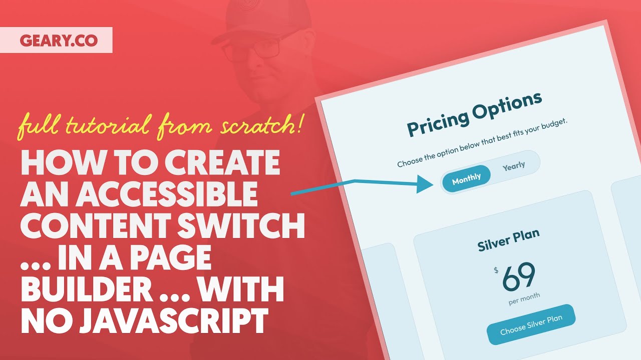
Create an Accessible Content Switch … From Scratch … In a Page Builder … With NO Javascript!

More about this video

This is PART 1, which covers the layout, styling, and general functionality. In PART 2, I’ll cover the accessibility details.

This is one of those tutorials that you should watch even if you don’t want to build a switchable pricing grid. Why? Because the techniques and skills you’ll learn in this tutorial are extremely useful across a wide range of layouts and projects.

If you’re a beginner or intermediate user, I encourage you to fire up a dev site and build with me step-by-step.

Video Transcript

1
0:00:00
What’s up everybody, welcome back to the channel. Today’s video is going to be absolutely fantastic. It’s going to be for beginners, for intermediate, for advanced. I am going to teach you how to build an accessible toggle-based pricing grid from scratch in a page builder with no JavaScript. Let’s go ahead and take a look at what we’re going to be building. So we have the pricing options here. We have a monthly and yearly switcher.

1
0:00:25
You can see the plans switch as I make my choices. And what’s great about this is I can select that switcher with the keyboard. I can navigate between the two options on keyboard. I can go right into my options down below. It’s fully accessible. If we were listening to this announce on like a screen reader or Apple voiceover, the switcher would be announcing the options properly. The cards would be announcing properly. The buttons would be announcing properly.

1
0:00:55
We’re gonna do this in two parts. Part one is gonna be what you see here, visual, structural, functionality, and then part two is gonna be all the accessibility details. Even if you don’t wanna know how to build this exact thing, I would watch this tutorial 100%. What you are gonna learn in this tutorial can be used in a wide array of

1
0:01:15
layouts and projects and use cases so you should watch just for those details and those techniques and tactics even if you don’t actually want to replicate a pricing grid like this okay so with that said let’s go ahead and get started I said we were going to be building from scratch so I’m in bricks I have a blank canvas. The only thing I’m going to be using to assist me is automatic CSS just so I have all my tokens available to me. I have my workflow enhancements available to me. Everything else you can follow along from scratch.

1
0:01:50
When I use variables from automatic CSS, you just come up with your own values for those things. But the concepts, the techniques, the tactics, the fundamentals, all of that is the same. Okay, you just have to do extra work if you’re not using automatic CSS. All right, with that said, I’ve got my iced coffee right here. We’re going to, there’s a lot involved in this training. There’s a lot involved. I’m going to try to make sure we don’t leave beginners behind.

1
0:02:17
Okay, so I’m going to explain things as I go. I’m going to take my time. If you want to go faster, speed it up. Okay, or fast forward and do whatever you need to do. But I wanna make sure that beginners don’t get left behind, intermediate people don’t get left behind, and I’m gonna be bouncing around a little bit because frankly, there’s a lot of stuff to account for.

1
0:02:37
I’m gonna do my best to keep it orderly and streamlines, but it is what it is. This is like, this is real building, this is what it looks like. So I’m gonna start by building a section or adding a section to this page and if we see here we have like you know a group okay what I call an intro so there’s an intro here which also by the way has the switcher element in it and then there’s another group down here

1
0:03:03
which is the actual grid of pricing cards okay so I need two groups and the way that I teach people to think about this is think in elements and groupings. So before you do any classes or styling or anything like that, get everything onto the page in terms of elements and then think about elements in terms of groupings. How are you grouping associated elements? Because that is going to be critical

1
0:03:30
to how your styling ends up taking shape and how all of this works seamlessly. So for example, in this first group, what I need is a heading and I need a paragraph and I need my switcher element or at least the start of my switcher element right so in this first group right here I’m gonna add my heading I’m gonna add my paragraph which is just a text element and then I’m going to add a div which is going to become my switcher element now this is not a paragraph by default so

1
0:03:59
I’m gonna switch that to a paragraph I’ll go ahead and grab the text. It looks like it’s missing an E because it’s a free tutorial and you get what you pay for. And this is going to be my switcher element. This is going to be my heading which is supposed to say pricing options. Since this is a section heading I’m going to go ahead and make this an H2. And then I am going to give this a class. This is going to be lead. I’m actually going to organize everything in my structure panel as I go as well. So this is going to be called pricing switch. Great. Okay. And I’m gonna auto BIM all of this. This is gonna be an intro centered. And I’m gonna use a tool called auto BIM which is gonna apply

1
0:04:40
classes to all of these things. So I have my intro centered, my intro centered heading, lead, and pricing switch. Actually I’m gonna leave that out because that’s actually it’s its own component basically, right? It’s not part of the intro even though it’s contained within the intro. So I’m just gonna apply classes here and now I’ve got my classes so I can style them. So I’m gonna take my intro centered.

1
0:05:04
I’m going to center everything. I will center the text. I’m gonna come down to this break point and then go back to the left with everything because that’s what I like to do. I like on mobile everything to be left aligned for the most part. Okay so my intro is more or less done. What I’m going to come down here and and do is my pricing grid. So I’m going to call this pricing grid. It’s very important to

1
0:05:26
keep everything organized in your structure panel and then if you’re using Auto BIM or something like that it’s essential for getting all of your correct as well. Inside of my pricing grid, I need a pricing card. So I’m going to add a div and this is going to be my pricing card. Now again, we need to think in elements and groupings. So if I look inside this pricing card right here, I see I have a heading. I have a group of elements, which is actually technically just a paragraph with some elements inside the paragraph in spans. Okay, we’ll talk about this more in a second.

1
0:06:05
And then we have a button, right? So I have a heading, I have a group, which we’re gonna use a div, but we’re gonna turn it into a paragraph because we’re in a page builder and the page builder workflow is a little bit different. So again, let’s look at this and say heading, div, that’s my group, and then button.

1
0:06:23
So I have a heading, a div, and a button. This div is going to be called the price. Actually I’m going to call this price wrapper because there’s more than just the price in there. Remember there’s also the term in there, per month. So we’ll call that price wrapper. And then this is button, we can call it CTA. I’m just going to leave it as button.

1
0:06:45
I’m also going to put a class of button action on there. And that’s going to style it like a button. Okay. Next thing we’re going to do is inside of our price wrapper, we’re going to see that we need another group, another group, because I need to be able to put this and this side by side while putting this term, we’ll call it per month underneath. Okay. So I need another group and then another text element. So I’m going to say div, that’s going to be my other group

1
0:07:16
inside of that. And then under that we’re going to put a text element. This is going to be that term that says per month. Okay and I’m going to make this a span because these things like I said are all part of the same paragraph. Right? Okay this is going to be the currency symbol. We’re just going to call that currency. So let’s say currency. And then the other one is the price, we’ll say the value. Because we already said price here. So this would be the currency, this will be the value, and this would be something like 49. So without the currency symbol. Okay. Now what are these things?

1
0:08:04
Semantically? They’re not divs. They are spans. So you’re going to have a span here. You’re going to have a span here is the 49 and look, those two things go in line with each other. And then this is going to be a span as well. The price is actually going to be like we mentioned a paragraph. So I’m going to say custom and I’m going to say P actually, I’m sorry, that is not, that is also a span.

1
0:08:29
We’re gonna put that as a span, sometimes you can choose it, sometimes you can’t, so I’m gonna choose span there as custom. The price wrapper is the paragraph, okay? So we’re gonna go custom, and we’re gonna say P. Notice it’s all in a line, right, like this, okay? And the reason is because when we add classes and style this, we need to go display flex on this,

1
0:08:53
we need to treat it like it’s a div, okay? But semantically, it’s just a paragraph, all right? So we’re gonna go ahead and refresh, and I wanna show you what we’ve got so far. So we have a div, which is my card, then I have an H3 inside of here, we have a paragraph inside of that with a span, with a couple more spans, and then a span here

1
0:09:15
because really if you’re just reading this, it’s $49 per month. It’s like we put a paragraph that says, this thing is $49 per month. Structurally though, like visually, we need to break all of that up. But semantically, it’s just a paragraph that says $49 per month.

1
0:09:32
That’s all it is. So that’s what we’re doing with it. And then down here, this is actually needs to be an A, not a span. And the reason it’s an A is because I haven’t linked it yet. So the minute I add a link of some sort to it, then it’s going to be an A. So we will refresh here. Let me go back into our card and we see here’s our link, our A, right? So we have H3PA. So that semantically is actually really good. What’s not really good semantically is the div

1
0:09:58
for the card and the div for the container. So let’s go back to here. What we actually have is a list of pricing options. Semantically we have a list of pricing options. So we need this to be a list. Specifically there are three options and they go in order bronze, silver, gold. Okay we should probably use an So I am going to switch my pricing grid over to ordered list now You’re probably wondering Kevin you you’re doing all this, but you haven’t added any classes yet. That’s okay I don’t need to add classes because everything I’m doing right now is to the HTML I’m not doing anything to the CSS when I start doing stuff to the CSS the styling Then that needs to be done at the class level, but everything I’m doing right now is just to get the HTML semantics correct. So this is an

1
0:10:52
ordered list which means my pricing card, this needs to say pricing card, my pricing card inside of here is a list item. So I’m going to choose li for list item. Now we’re going to go ahead and refresh. Notice it’s put a 1 in front of it because it is a ordered list item. We’re going to get rid of that in just a minute, it’s okay. But semantically, look what we’ve achieved. We have achieved an ordered list with a list item, and then you have your H3, your P, your A inside of that.

1
0:11:24
Now, this is looking really, really good semantically. You might be wondering why this is important. When we get to accessibility, I’ll show you exactly why this is so important for accessibility. Okay. Um, next thing that we’re going to do because I’ve pretty much got the HTML all situated, I’m going to go ahead and add classes to all of these elements in here.

1
0:11:48
Now I don’t like to go one by one, adding classes manually, typing them all in manually. I already organized everything in my structure panel and this is why I said I I’m using automatic CSS to make all of this stuff way easier and faster. Um, so I’m gonna click BIM right here And I’m just gonna let automatic CSS apply the BIM classes to all of these elements for me Automatically alright, so I hit apply classes and now they all have BIM classes right it’s fantastic Except for this one says text basic because I didn’t actually name that that should be the term

1
0:12:21
And then I can just hit auto BIM again, and I’m just gonna rename the classes. See, if I mess up the first time, it’s okay. I can make the adjustments and then just say, hey, I messed up, go ahead and rename those for me. All right, so this was the term down here, price term, this is the price value, this is the price currency, that’s the price, price wrapper, rename the classes, sync the labels, apply.

1
0:12:46
Okay, now we are good to go. So now what I’m gonna do, I have my pricing card. I am going to go ahead and start styling my pricing card. So I’m going to go add some padding. Now again, this is where I say, like you’re going to see me do this with just like, you know, grabbing some things out of a context menu and this, this is all just magically going to come into shape. You can follow along without automatic CSS,

1
0:13:09
just where I’m putting these variables using my context menus for speed and efficiency and consistency and maintainability and all of that you can just put your own values whatever you want right it’s just it’s gonna be more work you’re gonna be like scratching ahead what values do I use exactly that’s why I use automatic CSS well you don’t have to think about it okay so padding is gonna go there and then for my row gaps the first thing I need to do is switch this to flex and column now for my row gap I’m just gonna say content gap. Let’s go ahead and say that this is going to be the bronze plan Alright, excellent there. I want to add a background color. So I’m going to come in we’re gonna use action

1
0:13:52
But I’m going to use the 10% transparent version. I’m gonna go to my border I’m gonna link these sides and I’m gonna choose border M So it’s gonna give me the rounded corners. Let’s just go ahead and see what I’m, what I’m working with so far. All right. This is fantastic. Actually this section right here, I’m just going to name pricing on my pricing section and I’m going to give that a background of action trans 10 as well. I really am a big fan of using transparencies. I’m going to go to border.

1
0:14:21
I’m going to go one on every side. I’m going to go solid. And then I’m going to come in with action dark But the trans 10 version of action dark for my border color and now we refresh and we’re definitely getting somewhere Pricing card for my typography color. I’m gonna go in and say that that’s gonna be action dark for this heading That’s gonna be action dark as well Excellent. Okay. I’m noticing that my buttons on this particular install don’t have a border radius from Automatic CSS. So what I’m gonna do is I’m gonna quickly go back

1
0:14:56
to the dashboard and I’m gonna go to Automatic CSS. I’m gonna go to my buttons and links. I’m gonna go to my border styling and I’m gonna use the same radius, radius M, that I used on my cards. So now my buttons, my cards, will all have the same exact radius. See, when I refresh, now that’s all good.

1
0:15:13
I’m gonna say choose bronze plan. These are some details that we might change in the future as we go. I’m gonna refresh my builder, so my styling updates. Okay, so the next thing I need to do is probably style all of this jazz that’s going on in here. So I’m gonna take my price wrapper, okay, and I’m gonna say display this as flex display this as column. Let’s go ahead and center everything

1
0:15:42
That looks really good. Let’s take this price value And I’m just gonna go rogue here, and I’m gonna do something like six rim Five rim yeah, let’s go five rim I actually need this currency to not be a span. I need this to be superscript, okay? Which I’m going to say custom, S-U-P, and that’s going to make that superscript right there. And I’m actually going to go to my price wrapper, position this relative, because what I actually want to do is I want to position that currency, I want to position that absolute. So I’m going to say position this absolute, we’re gonna send it to the top and we’re gonna send it to the left, okay, and the price wrapper is that’s like super big, way

1
0:16:33
bigger than it needs to be. So I’m gonna go width of max content which is gonna make it basically the width of the content that’s there and that says because that went to the left when I did that that lets me know on my pricing card I probably need to just center everything in the card in general Okay, we’re getting closer. I need to take my currency here and oh, I think line height because I’m using such big text I think line height is throwing a lot of this off So I’m gonna come to price wrapper and I’m just gonna use inheritance. So I’m gonna say everything in this price wrapper Let’s go one on the line height

1
0:17:09
Okay, and that’s gonna bring everything in to be a lot more like, let’s say normal, right? OK, price currency. We want to go controlling the font size here, so I’m going to say something like L and I’m going to go back to our positioning and from the top I’m going to bring that in like 1 M maybe.5 M and then

1
0:17:34
left let’s do minus.5 M. I’m just basically positioning that where I want it to go. And then I’m going to just kind of scooting it this manual adjustments. No real rhyme or reason a little bit magic numbery, but that’s okay in a situation like this. Next thing I’m going to do is probably drop the opacity on this 0.7 0.8 somewhere in there. I want the number to to be full color and I want like the term and the, what are we calling that, the currency, I want those to be a little bit lighter,

1
0:18:09
a little bit lighter. So you can just use opacity for this. Okay, that looks really good. I wanna probably control the font size here, maybe S on the font size, yeah. And then I’m probably gonna grab this price wrapper and add a little bit of gap to it.

1
0:18:30
Maybe excess on the gap and let’s refresh. Okay, so that excess is definitely too big. I’m just going to go with like 0.25 M. I just want to bump it down like a little bit. That’s much, much, much better. I also want to take that text and I want to squeeze it together a little bit. So we’re gonna do 0.025M but I’m gonna do negative. Okay and you see how let’s do 3, 4, 5, 0.05, 0.06, actually 0.1. There you go. Okay yeah yeah sometimes it’s just a little oh you know what that’s why I’m doing it on the wrong thing. I’m doing it on the price wrapper I thought I selected let’s go line height one I

1
0:19:16
thought I selected the value okay that’s what I want to do it on letter space now see now now I was like yeah I was like not behaving the way I expected it to okay so like let’s do like minus 0.03 M and that’s gonna bring those numbers a little bit closer together kind of tightens things up a little bit and I think that’s looking really, really, really good. Okay. Um, I want to make my grid now, right? So I’m going to come in here and first of all, we need to call this pricing grid needs a class, right? Um, see the space right here. That’s from when we made this an ordered list.

1
0:19:56
So what I want to do is I want to go down here to CSS and I’m going to use the dynamic route selector. I’ll zoom in a little bit so you guys can see better. All this does, if you’re not familiar with this, it just references the the selector that I have selected right now, which happens to be the class pricing grid. And so I just don’t have to type it and then if I ever rename the classes they’ll automatically update the CSS. It’s just really nice, right? So I’m just gonna do padding of zero, get rid of all the padding. We don’t need any padding in this grid. And then just for safe practices,

1
0:20:28
I’m gonna say list style of none to make sure ones don’t ever show up. And there we go. I’ve got that, you know, my ordered list situation is no longer causing weird styling issues. Just really two lines of CSS and we are good to go. Okay, the next thing I need to do with my pricing grid

1
0:20:46
is I need to change this to display grid. And then for grid template. And actually we’re going to do something. I’m going to come back and do this later. OK, but we’re going to do something a little different here. I’m going to show you a little

4
0:20:59
golden nugget alright.

1
0:21:00
You probably haven’t seen before. It’s going to be nice, but we’re going to do that later. We’re going to come back and do it later. For now, what I’m going to say is grid 3, not 23, but grid 3. So that’s just an automatic CSS utility. You can choose it from right here as well. Create three column grid

1
0:21:15
super super quick. If you’re not familiar with this you can just do repeat 3 min max 0 1 fr here make your three column grid that way whatever you want to do but let’s go ahead and save and then we’re gonna take our pricing card and we’re just gonna duplicate it two more times and I’m gonna call this silver and I’m gonna call this gold I’m gonna make this 69 I’m gonna make this 89 And then what I’m gonna do is put a gap in our pricing grid and I’m just gonna use my contextual grid gap Utility and now when I refresh guys, we’re looking really really really good I’m just being a little bit OCD about this. I’m going to my currency here. I’m gonna go to layout

1
0:21:57
I’m gonna bring this down from the top.75 M. It’s like it felt like it was a little too high. And then I may make a different decision on my text size. I’m just going to go to M instead of L. And I think that’s a little bit better. I don’t know. I’ll probably change my mind on that again as we go. All right, sip of coffee.

1
0:22:20
We’re making good progress. This is fantastic. Iced coffee. Okay. We’re going to have, let’s talk through this. We are going to have two different pricing grids, one for monthly, one for yearly. Now, if you know anything about BEM, block element modifier B E M, right? We have what are called modifier classes. Usually those are used for modifying the styling

1
0:22:53
but not in the way that you might typically think. So what I’m going to do is I’m going to do pricing grid, see I already have a pricing grid right, but I’m going to do pricing grid double dash that’s the modifier in BIM and I’m going to say monthly. So I’m making I’m designating this as a monthly version of the pricing grid, right? And now what I’m going to do is I’m going to duplicate. Now in the structure panel, I’m also going to denote that this one is monthly and this one is yearly. Now, because I duplicated, I have to delete that class and I have to add a new one. Pricing grid double dash. What’s this one going to be called? Yearly. All right. So denoted one is monthly one is yearly see that now what I need to do is change the

1
0:23:40
Content in here. All right, so we’re gonna go 890 and then this needs to say per year All right per year and per year now, we’re gonna go ahead and save let’s look at this on the front end See just like that now because I use classes on everything. I’ve got six cards I have global control over the grids the cards everything from one single source of truth. So if I missed a step at anywhere in here, it’s okay. It’s okay because I have global control over this stuff. I do. I just noticed I need to do this.

1
0:24:15
This is the only thing you don’t really have global control over until Bricks releases components bronze. This is silver and this is gold. Okay. gold, okay. But now if I look here in the DOM, I’m gonna see that I have two ordered lists, right? And if you look on here, they’re both pricing grids,

1
0:24:37
but this one says pricing grid monthly, and this one says pricing grid yearly. See how I have a differentiator between the two? So they do have a shared class called pricing grid, but then they have unique classes called pricing grid double dash monthly, pricing grid double dash yearly. That’s gonna come in very critical, okay, as we

1
0:24:54
go through this. All right, I feel pretty good about where we’re at with the pricing cards themselves. What I want to do now is I want to focus on the switch, which is probably what most of you came here for, right? So this will be the good section. Now I will say, we are about to get into some shit right here. All right, we are going to get in the weeds, like put your boots on, make sure your coffee is, you know, it doesn’t have

1
0:25:21
to be full, but you can’t be almost out of it. Right? You know what I’m saying? You know what I’m saying? Okay.

2
0:25:26
Fantastic. Okay, we’re gonna we’re gonna we’re gonna rock

1
0:25:28
and roll with this. Let’s look and see what this situation entails. We can’t use JavaScript. So we have to use something like we use buttons. We’re going to have to go the JavaScript route. We can’t, we can’t, we don’t want to go that route. We’re avoiding JavaScript, right? And we’re going to, we’re going to use vanilla CSS because vanilla CSS in 2024, my friends,

1
0:25:51
has great superpowers that it did not used to have. We’re going to test those out. Okay. We also, I want you to look at that indicator back there, that little sliding thing. When it slides like that what that should tell you is that’s not just like a background of these actual elements it’s its own separate element that can move freely in this like channel right

1
0:26:16
here and so that’s a situation all in itself there’s a lot going on with this little switch and so let’s just go ahead and dive in now if you can guess how we’re gonna do it Like you’re ahead of the game my friends. You are ahead of the game Bonus points kudos to you if you can guess how we are going to do this So what I’m gonna start I’m and I’m gonna go slow because again, I don’t want to lose people here There’s even intermediate and advanced people that might be like, whoa, hold on. Slow down. Slow down. Slow down All right, so we will go nice and slow so I am going to change the tag on this. And again, guys,

1
0:26:51
this is why you use a good page builder because not every page builder allows you to do this. In fact, bricks is actually pissing down its own leg right now. I’m going to go ahead and refresh. It won’t let me choose custom. Now it will sometimes you just need a quick refresh. There we go. Custom. Okay. This is going to be a field set. We are going to use, if you haven’t guessed it by now, you probably never will. We’re going to use radio buttons. All right, so we’re going to make a field set, which is like a group of inputs. All right?

1
0:27:22
So this is a field set and I’m going to denote that this is a field set in the structure panel so that we can stay nice and organized. Now, we need labels and we need radio inputs. There are two ways to do this. You can go label and then input or you can go input and then label or you can go input inside of a label. All right now why would you choose one or the other? I will just give you my preference. In this kind of situation I like to put the inputs inside the labels because it’s like a cheat code. It’s like a it’s like a shortcut. It saves you from having to use like four attributes and things like that. It automatically associates the input with the label. Okay, so and to me

1
0:28:10
organizationally it just makes more sense to my brain to do it that way because I like to group associated content and when you have an input inside a label they’re naturally grouped together versus one after the other they’re not grouped and it’s like why why would you do that? Okay, so what I need is a label. Now, in page builder world, the way you do this is with a div. I’m going to add a div inside of my div. I turn one div into a field set.

1
0:28:39
Now, I’m adding another div, and this is going to be the pricing. We’ll call this the switch label. I’m going to say that this is a label element and on the HTML tag, I’m gonna come down here and I’m gonna say, yeah, you are in fact a label. Now inside of the label, what do we need? Well, we need an input.

1
0:29:01
Well, that input is made out of a div in page builder world. So I’m gonna add a div and we’re gonna call this the switch option, okay? And I’m gonna call this the input in parentheses. So this is the switch option. And then I need outside of that, a text element. And this is going to be the switch label text. Okay, so I have the switch label,

1
0:29:28
the switch option and the switch label text. This is just going to be a span, that’s it. This is going to be an input. All right, so we’re going to go custom and we’re going to go input. Just like that.

2
0:29:39
Look at this.

1
0:29:40
I mean, it’s a disaster in the, in the page builder canvas, what we’re creating right now, an absolute disaster, but it is all going to take shape very soon. Just stay with me. Don’t freak out. All right. Don’t rage quit. Okay. Now, what kind of input is this?

1
0:30:07
Well, it is a radio input. So we’re going to come over to attributes. We’re going to add two. Actually, we’re going to have three attributes. The first one is the type. So what type of input is this? It is a radio input. Then we have to give it a name. Okay,

1
0:30:30
it’s a price option. That’s what it is. Now we’re going to have more than one option. They all share the same name. That’s how they link themselves together. So that when you choose one option, the other one gets unchosen, right? Okay. So remember price option, that’s important to to remember. Then we’re going to add an ARIA label and this is going to be how do we want this option to announce itself. We’re going to say monthly pricing options. Okay perfect. I’m going to go ahead and hit save and we’re going to take a look at the front ends real quick. Okay look at that. I have a little option button and I okay let’s let’s get this label under control. So this is going to say monthly. So I’m going to go to the label text and this is going to say monthly. All right. Now let’s refresh. Look at that. We’ve got a little

1
0:31:23
monthly option. Now let’s inspect and see what is going on in our code and look how clean this is in a page builder like Bricks. I asked for a field set. I got a field set. I opened that up. I asked for a label inside my field set. That’s what I got. I didn’t get a bunch of extra divs and a bunch of nonsense. I got exactly what I asked for. I opened the label and I have an input that’s a radio and it’s got a name and it’s got an ARIA label. And then I’ve got a span that actually has the text of the label.

1
0:31:56
Very, very clean code outputs. What I love about bricks. Now I’m gonna take that switch label I’m gonna duplicate it okay and so that is our option one and this is our option two. This one is going to be called yearly. Alright so let’s go to yearly alright and then probably what I need to do pricing switch let’s before we go any further. Let’s auto BAM. Let’s get all of our classes added So I’m gonna hit BAM and I’m gonna check this out pricing switch switch label Switch options which label text which label switch options which other text apply classes. We’re all good. Okay, it took away my parentheses Which is okay We’re good. We can we can see what things are right here

1
0:32:46
But yeah, I mean now now now we’re free to style this stuff up. Look I’ve got monthly, I’ve got yearly. Look how they option themselves back and forth. You can’t like choose two at the same time. So that’s really good. One thing though, detail, I refresh the page, neither of them are chosen. That’s a problem. I need one of these to be chosen by default, monthly.

1
0:33:12
So let me show you how to do that. So we’re gonna go to switch label, switch option. This is the monthly option right here. I’m gonna go to style attributes. We’re gonna add one more attribute and this is gonna be the attribute of checked. And there’s no value for this attribute, okay? So I’m gonna go ahead and hit save.

1
0:33:27
I’m gonna refresh. Look at that, it is chosen by default. Refresh, refresh, refresh. It’s chosen by default no matter what I do. Now, what did that just do? So I go into the code here and you’re gonna see on this input look there’s the attribute right there checked with no value Because I didn’t ask for a value bricks just does what I ask

1
0:33:46
Right and that allows me to get the proper output to make these things happen guys You can’t do this in any page builder, right? You only do this in certain page builders like bricks Like oxygen probably like quickly. Okay, there’s only a handful Elementor not a not a damn chance in the world. Beaver, not a chance in the world. Divi, not a chance in hell. So it’s very select page builders. That’s why it’s important to choose the right tools for the job. Okay so now we are going to go into our switch pricing switch right here. Now you might think Kevin use Flexbox, get those things side by side.

3
0:34:26
Hmm.

1
0:34:27
I’m going to use grid because I feel it’s easier. So we’re going to go grid and I’m going to say min-max 0 1fr. That’s going to be column 1 and then I’m just going to do that again. That’s going to make two perfectly even columns for me. I’m going to do a gap of 0 and I’m going to hit save and there

2
0:34:44
we go.

1
0:34:44
Okay. Now I am going to actually leave this ugly while we tackle the functionality because I think it helps you see it happening because if I take away we’re gonna obviously when you look at the there’s no options here right there’s no little option dots and when I take those away it’s hard to understand what’s actually happening so I’m gonna leave them there we’re gonna leave it ugly while we do the functionality to help you better understand what’s going on and then we’ll make it pretty after we get the functionality working. Now the one thing I want to do, I want to refresh

1
0:35:20
our builder and I want you to notice that these inputs in the builder, because the builder is not rendering the attributes, it has no idea what’s going on here. So in the builder, I mean this is just going to look absolutely atrocious until we actually do some extra styling. So I want you to ignore what’s going on in the builder right now. And I want you to only focus on what’s going on primarily on the front end. Okay. Now, again, we we’ve got to collect our thoughts and say, what is, what needs to happen next? Okay. Well, I need to tackle the visibility.

1
0:35:59
Obviously we don’t want two pricing grids showing at the exact same time. I need to control the visibility or the display, not really the visibility, the display of these grids based on which of these is checked. And this is where people would typically jump right to JavaScript. And because we’re using option radio inputs, we don’t have to use JavaScript. We can actually leverage the checked state to control the display here. But we need something in vanilla CSS that’s new called the HasSelector. What we’re going to do is we are going

1
0:36:42
to first make an adjustment to the grid here. I’m going to go to pricing grid. Remember display grid and I said, we’re going to come back to this and we’re going to do something a little different. We’re gonna do a little golden nuggety action right here. Okay, get your pen and paper out wherever you like to take notes.

1
0:36:58
I want you to drop a comment below, right? I’ve asked people, hey, if you run into a golden nugget in a video, timestamp it in the comments and hashtag golden nugget or insight. Insight is what I call them, insights, okay? Hashtag it for everybody so we can easily get back to it so I can document it in other places. But look we’re gonna take away this grid. In Bricks you may not know this you can actually add, see this is a drop-down, you can add a custom option.

1
0:37:26
And we’re actually going to add a custom option that is a locally scoped variable with a fallback. Again you’re like what the hell is going on right now? You’re about to see, you’re about to witness, okay, the power of this. I’m going to choose or I’m going to create a variable called display which is like, Kevin, you made the value of display a variable called display. What is going on? Make it make sense, right? Watch this. I’m gonna put a comma because in variables you can actually define a variable with a fallback. And the variable you define doesn’t even need a value yet.

1
0:38:07
It just will use the fallback. So what is my fallback going to be? My fallback is going to be the word grid because when I hit enter, look, I get exactly what I had before, right? So let’s go here. Let’s inspect this. All right, we’re going to come down here.

1
0:38:23
Look at this line right here. It’s saying display var display grid. And look, the display variable is grayed out because it doesn’t have a value. It’s like, all right, well, we’ll just ignore that. And we’ll use grid, which is what it was before. But you’re like, Kevin, why would you do that? And now you’re about to see why we would do that. Okay.

1
0:38:43
Cause I can hijack that locally scoped variable for my next use case. All right. So what I’m going to do is I’m going to go up to pricing. Now the way the has selector works is it selects parents but then you can branch off that selected parent and do something to the children. Okay I know it’s it’s a very inception-y but it’s all going to start to come together. So I’m going to activate this class pricing and I’m going to go to my custom CSS area and once again these are just things you can only do in certain page builders.

1
0:39:14
You can’t really do it in every page builder. So I’m gonna reference the class pricing and I’m gonna say, hey, if this pricing section has, oh, I’m sorry, let’s back up. Remember I said we’re gonna be jumping around a little bit? I need a way to identify those inputs, right? To see if they’re checked or unchecked. So what I’m actually gonna do,

1
0:39:36
I know your mom, your grandma, right? Your best friend probably told you, yeah, you don’t need ID styling. Don’t do stuff at the ID level. Actually, this is where the IDs come in very handy. So I’m gonna go to switch option and I’m gonna go down here to the ID area. I’ll zoom in a little bit.

1
0:39:54
This is where I can create a custom ID, right? And I’m gonna call this monthly option. All right, monthly option. And then I’m gonna grab this switch and I’m going to call this yearly option. Actually I’m going to say option yearly and I’m going to go back and I’m going to say option monthly. It’s just a OCD thing. All right you can do it however you want. So there’s option monthly, option yearly. Now what did that do to the code? I want to make sure that we’re all staying with us right. So when I inspect this I go up here, all right, let’s find the input.

1
0:40:28
See the input now has an ID of option monthly. I can check the value of that ID now, okay? All right, so we’re gonna go in here. Let’s go back to our section, our pricing section, okay? And I’m gonna come down here and I’m gonna say, hey, if this has an option monthly that’s checked, right? If it has an option monthly that’s checked, I wanna do something.

1
0:40:56
Now, we start out very easy with what’s called a border check. Just border check it. See if you’re selecting the thing you think you’re selecting. So border five pixels solid red, and I’m gonna go save, and we’re gonna refresh on the front end,

1
0:41:09
and look how my section, guys, has a red border around it. That means that this has statement is working. It has found option monthly check. Now, if I’m not sure, if I’m like, now maybe it’s just doing it because it’s doing it. I’ll just say, does it have an option yearly checked? Okay, now let’s refresh.

1
0:41:30
No border, border’s gone because that statement is not true. But look at this. Oh, wow, when I select yearly, now it has one. It has a option yearly that’s checked. But monthly, no, doesn’t, right? Okay, so my has statement is working. This is what’s allowing us now to avoid JavaScript for these kinds of situations.

1
0:41:51
So I’m gonna say, if it has option monthly checked, then what do I wanna do? I wanna select my root grid, which is my pricing grid, because I named this pricing, and I named my grid pricing grid, where is, there it is, pricing grid right there. I can continue to use this dynamic root selector, which gives me the superpower of being able

1
0:42:14
to rename classes in the future. Okay, so it’s best practice. So now, what do I want to do with that? I want to display, see that locally scope variable coming back into action now. display See that locally scope variable coming back into action now. I can change its value to none Okay, so I want to select the pricing grid, but which pricing grid guys do I want to select not?

1
0:42:42
Oh, I just don’t I want to want to hide all of them. I want to hide a specific one Well if option monthly is checked that means they want to see the monthly one that means I need to hide the yearly one. So I’m going to say root grid double dash yearly. Remember we did that BIM class, that modifier class. If I go down to here, remember this pricing grid double dash yearly, that unique identifier for this particular grid. Okay, so let’s go back to section. So this is what I’m doing here.

1
0:43:10
Don’t worry, we’ll read all this out in just a second. Again, I just want to make sure it works. So now the yearly guys has disappeared but if I select yearly it’s gonna come back and then the monthly one is just gonna be there too. So what do I need to do? Very simple. Duplicate the logic and say hey if option yearly is checked then I want to target the monthly grid and hijack that locally scoped display variable and set its value to none. And I’m going to go ahead and save and look at this. Fantastic. My friends. Fantastic. Okay. All right.

1
0:43:48
We’re almost done with part one. I just need to make the switch look pretty. And then like I said, in part two, we will tackle all of the accessibility related stuff. Okay. I think we’re on a roll here. Let’s get a little let’s get a little sip of the Java. You don’t say

2
0:44:04
Hmm, okay

1
0:44:06
Fantastic What do we want what do we want to do next that’s the that’s the question here We need to get rid of the little option circle get rid of that. We need to get rid of the oh You know what? We also need to add forgot a thing. Like I said we’re gonna be we’re gonna be we’re gonna be mixing it up over here we’re gonna be doing stuff a little out of order it’s okay it’s alright it’s how the real world works. So in our pricing switch which is a field set I want to add another text element and this is going

1
0:44:43
to be called the legend the legend okay we’re gonna go custom and we’re gonna go legend a field set can have something called a legend, which is like a label for the field set. This is also going to help us with accessibility. But this is our pricing options right here, pricing options switch. Now, you can call this whatever you want. I’m going to call it pricing options switch for right now.

1
0:45:10
Based on how this announces when we get to accessibility, I might make some tweaks to it okay but if I inspect this check this out pricing option switch it is a legend and I actually need that legend to be at the top we want that to be in the top of the DOM okay perfect and while we’re here let’s just go inspect and see what’s happening with our little grid down here okay okay we’ve got grid gap display, bar display, display is not defined, but it is in our other one. Look at this, display is defined in our second one,

1
0:45:46
it is defined as none, which is overriding that initial grid instruction, okay? All right, just fantastic, I just love it. I absolutely love it. Okay, let’s make that thing pretty. So what we’re gonna do is We’re gonna come to pricing switch. We’re gonna do pretty much everything at the pricing switch level and The first thing I’m gonna do is I’m gonna get rid of the input and I’m gonna get rid of the legend

1
0:46:13
Okay, so if we do root and we say input type equals radio And I’m gonna do a comma because I want to also do root legend. So I’m going to target both of those things with the same CSS. We’re going to say position absolute. We’re going to say inset inline start, which is just like, it’s the fancy way of writing left. We’re going to do minus 9999 pixels, OK?

1
0:46:44
Which is it, we’re just sending it off the screen. We’re taking the height and setting it to 0. We’re taking the width and setting it to zero. But height guys is block size and width now is inline size. We’re just translating these into logical properties. Okay so now if we look on the front end, bang! No legend, no inputs, but the functionality is still there. In fact let me bring this back. I got to show you something. Okay don’t worry, I copied that to my clipboard so I don’t have to write it again. One little trick about radio inputs, I want you to see this. When I click on the label, it still activates the input.

1
0:47:25
It still puts it to the checked state. That is critical to know because it means we can actually get rid of the little dots and people can still just click the labels and the functionality will still be there. Okay. So put this back, save. Okay. Refresh. When I’m doing this, look, it’s still working, right? Even though you can’t see anything happening. That’s why I said it’s critical to understand that the clicking the labels still works. Now,

1
0:47:57
nobody would know you can click these labels because there’s just an arrow when you’re over them. We need what’s called a pointer cursor. All right, so that’s the next adjustment we’re going to make. We’re going to come down here and we’re going to say, hey, the pricing switch when we’re hovering over the label, it’s called a switch label, okay, switch label, we want a cursor pointer. All right, now let’s go back to the front end. Like I said, we’re going to go kind of step by step through this so that you don’t get lost. Monthly and yearly are still options, still clickable, but now I have a hand to indicate, that’s called a pointer, to indicate that I can actually click on these things. Now, you’re going to see I’ve got a lot of padding in here by default. I got this ugly default border

1
0:48:42
thing going on. That is because the user agent style sheet tries to style inputs to have some sort of default styling so that they’re actually usable even if the person doesn’t style them. We need to get rid of that because we don’t want it right? So in my main switch okay and I’m gonna add some comments to this so we can keep our CSS nice and organized. So this will be remove okay remove radio and legend. Alright perfect oops and legend just like that. All right. Now we’re going to say style the switch, style the switches. Okay. We’re going to come down here and we’re going to say style the, we’ll say global, global style. Okay. Global styling. All right. So we’ll kind of put everything in here for global style.

1
0:49:39
We’ll just say switch styling style the labels. How about that? Because that’s really what they are. They’re we’re signing the labels down here. OK. So switch styling. What we want to say for now is padding zero line height of one is where it really helps to know CSS. OK. I could go into all of these individual elements and use the builder inputs. But I prefer to keep all of my styling in a situation like this. This is already very complex. The last thing that I want is all my styling spread out and all these different input fields.

1
0:50:14
I’d rather have my styling all in one place using the dynamic root selectors so I can keep everything nice and organized. Okay. So that’s the explanation of why I’m not using the builder inputs. Okay, so line height is one, border radius, we’re gonna go with 50 VW on this, that’s gonna make it a pill shape. There you go, nice, right off the bat. Now, I want to go with a border of,

1
0:50:44
let’s do one pixel solid action dark trans 10. ActionDarkTrans10. I might make an adjustment to that, okay? But that’s what we’re going to use for right now. I’m going to go background color, ActionTrans10. All right, let’s check that out. Perfect. Let’s just go with a color.

1
0:51:06
This is going to color our text right here. We’re going to go with ActionDark. And that’s not reaching in. Oops, I refreshed the builder on accident, let’s go back to our pricing switch right here. Since that’s not reaching into the label I’m just gonna copy that and I’m gonna bring that down to the actual label and refresh. Now it’s on our label. Okay great. The next thing that we need to do is figure out why there’s still a margin somewhat, there we go. So the labels have a margin bottom

1
0:51:40
that we did not ask for. So we’re gonna go margin block end, that’s fancy way of saying margin bottom, and we’re gonna zero that out. There we go, this is what we’re trying to get to. Like no erroneous padding or styling going on, it’s just what we ask for. User agent styles are all either, you know,

1
0:52:00
getting rid of or overwritten or whatever we’ve got going on. Okay. Now we need to bring some padding back inside of our little switch pill. Okay. So the way we’re going to do this is we’re actually going to create a locally scope variable because I need to be able to reference this padding value for our little fancy indicator thingy. Okay. So we’re going to call this switch padding and I’m going to use something like 0.25 M. I actually don’t even know

1
0:52:29
how much that’s going to be yet. We’re going to take a look at it in a second and instead of padding 0 I’m going to say var switch padding. All right now we’re going to refresh that. See the padding that I got? Got a little bit of padding in there and I’ve mapped the value of that to a token. Okay awesome. I also need switch label padding which I’m going to do as 0.5 M 1 M which is the way you read that is it’s 0.5 M top and bottom on the block axis 1 M on the inline axis okay so it’s just shorthand for writing padding and I’m going to take this down to our label and say padding is var switch label padding and

1
0:53:11
And now when I refresh, aha, we’re starting to see, things are starting to take shape, right? Okay, the next thing I wanna do on our switch label is I wanna set the opacity to like 0.7 and save and refresh and see what that does. That’s good. Cause if you look on here, like, right, we need to bring in this hover opacity on hover all right and then our our text color actually

1
0:53:41
needs to change okay all right I actually think what I want to do here is another switch label color action dark I think what I want to do here is I want to do another fallback okay so we’re gonna say label color and then the fallback is going to be action dark

3
0:54:06
Okay, excellent

1
0:54:08
And then I can even do this here. I can say label Opacity I should I should keep the same convention Switch label opacity with a fallback of 0.7 Um, this should be switch label color with a far fallback of action dark. Okay, now I refresh, everything is exactly the same, but suddenly now I have some locally scoped variables that I can hijack anytime I need to or want to. Okay, yeah, this is looking really good so far.

1
0:54:41
Let’s get our little indicator going. All right, so I’m gonna come down here and I’m gonna say this is where we’re gonna style our indicator. All right, so our indicator is going to be off of our actual switch, the pricing switch. So I’m just going to say root, and I’m going to add a before element. And you should know that you need a blank content element anytime you do this. And in fact, this is actually bothering me in here.

1
0:55:07
I’m going to go to, oh yeah, let’s get rid of it. Let’s get rid of this. I thought we did get rid of it. But in the builder it didn’t get rid of it. Okay, so I think what I need to do in the builder, this is just, this is just because my OCD in the, like the builder canvas right now is offending me. Okay, so I’m just going to try to solve this problem real quick. We set width to zero, min width to zero, height to zero, min height to zero.

1
0:55:35
Yeah, get rid of all that stuff. That might be the best that we can do. Zero important. There we go. My gosh. It’s like the builder’s trying to do things by default. Maybe I put important on all these. Okay. There you go. All right. It’s still there a little bit, but my gosh, it’s a little bit better. Okay. Now they’re off tilter because the pseudo element which we’re gonna fix right now so don’t worry about that too much let’s go down to our indicator here we go we’re gonna position this absolute we’re gonna go with a background color right now just red we want to make it ugly and obvious anytime you’re working with pseudo elements make it ugly and obvious and then scale it back from there just

1
0:56:25
so you know I see people mess with pseudo elements that they don’t even realize they wouldn’t even be able to see because of how they style them. You just need to, you need it to show up before you can really make decisions about it, right? Inset inline start of zero, inset block start of zero, which we’re gonna probably change in just a minute.

1
0:56:44
That needs to actually say block. Okay, we probably need, so that’s a before pseudo element It’s probably somewhere weird on the screen because we need to go up to our global switch styling and we need to make sure that This is position Relative to catch that absolutely positioned element. Oh, this is going to need Dimensions it needs dimensions. So we’re going to go inline size for right now of a hundred percent and by gosh there it is border

1
0:57:19
radius of 50 VW to match our pill shape We’re in business guys. We’re in business, okay? We don’t want this indicator to be the same size as the outer pill right notice that it’s got a little bit of padding but this is a absolutely positioned element you cannot use padding on it it will it does not behave according to margins and paddings anymore it behaves absolute so this is why I needed to know what the value of the paddings are right especially the

1
0:57:58
switch padding right here so the way I’m gonna handle this is with calcs. So the block size needs to be calc. If I go 100% minus 2 times the padding, we should have a perfect position on this, okay? So I’m going to say 100% minus the var switch padding times 2, okay? So let’s say, let’s refresh, and that’s actually correct. I need to just position this better and then it’s good, but that’s actually what I want.

1
0:58:30
And, but now on the inline size, it can’t be exactly half. It has to be calc 50% minus the switch padding.

2
0:58:39
Okay.

1
0:58:40
That’s gonna, that’s gonna be good. And this inline start can’t be zero cause it’s gonna be touching the edge. It needs to be calc 0% plus the switch padding. You see why I needed the value of the switch padding to be a token? Because I don’t want to, number one, I don’t want to repeat raw values everywhere. But number two, I don’t want to need to remember what the value is. I just need to know what the name of the token is.

1
0:59:05
So let’s refresh this. Look how it’s bumped it over, right? And then it’s controlled the height to be perfect. It’s just in the wrong position. Okay, so how do we vertically center an absolutely positioned element? This is page building 101. If you haven’t watched my page building 101 series,

1
0:59:25
go back and watch page building 101. You go inset block start 50%, then you have to translate it back 0% minus 50%. And now, my friends, we have an indicator that is in the perfect position. Okay, the problem is when we choose yearly, the indicator doesn’t go over there. The indicator is also super ugly, okay?

1
0:59:51
So what do we need? We need it to be an action colored indicator. So our background color goes from red to action. Let’s take a look at that. Fantastic. All right. Now we need it to be able to switch. Okay. This is where you go back to coffee while your brain resets and goes, what’s the next thing we need to do? Okay. If the switch, think about what we did with the section logic. If the section had a switch that was checked, we’re going to do something to the grid. Now if the switch has a certain option that’s checked we’re gonna do something to that

1
1:00:33
indicator right. So I’m gonna say let’s go another comment and we’ll say switch logic switch indicator indicator logic okay all right I’m up against the clock too because I have a call in 20 minutes. I’ve got to finish this. Okay, switch indicator logic. So if the switch has, what does it have? It has an option monthly that’s checked. If it has an option monthly that’s checked.

1
1:01:03
Inset block start, inset inline start. I’m thinking about this for a second. Do we want to do the whole fallback thing? Do we want to do? I don’t think we need to. I think we can just override it. I don’t think we need to go that far. Okay so root has option monthly checked. Do something to the indicator. Remember the indicator is a before pseudo element right? So we attach that on, now what are we gonna do to it? Yeah, I think we’re just gonna translate it. I do wanna use some locally scoped variables here

2
1:01:44
because I need to make sure that this zero value

1
1:01:46
never gets accidentally changed, okay? Actually, that can stay zero, that can say 0%. We’re gonna make this say, indicator translate, minus 50%, that was the block. Okay, hold on. No, no, no, no, sorry. It’s the minus 50% that never changes. Sorry, I’m dyslexic.

1
1:02:24
Have I said that before? My dyslexia is in fucking overdrive right now. Okay, so it’s this one that needs to be a variableized. So we’re gonna say the indicator, we’ll say indicator position, which is gonna default to 0%, okay? But now I can come in and just say, hey, if that has an option check before,

1
1:02:47
We’re going to say indicator position is 0% which I know that seems redundant but it’s because we have to be able to switch back to it. If it has option yearly checked our indicator position needs to be a hundred percent. Let’s refresh. Look at that my friends. Don’t you just love when things work out of the box? Now, it’s jumping, it’s jumpy, right? We don’t want it to be jumpy, we want it to slide. We want it to do a little Cupid shuffle, okay? All right, so how are we gonna do that?

1
1:03:28
So we’re gonna go to our before pseudo element and we’re going to transition the translate.3 seconds ease in, maybe? in maybe okay ah do we want to ease it out see what difference that creates I kind of yeah I kind of like that okay okay all right now guys we have to make Oh gosh, okay, so If switch indicator logic, all right if the monthly option is checked Let’s do another let’s do switch

1
1:04:11
Label logic. Okay. Remember the structure the option is in the label, right? so if the pricing switch has input checked, it doesn’t even need to be a specific input. If the switch an input type equals radio that’s checked. I want to change the value of the locally scoped variable switch label color. Let’s go white. Okay what did I do wrong? So here’s the label switch label color.

2
1:05:15
Okay.

1
1:05:16
Label, pricing switch, switch label. Pricing switch, switch label has an input of type radio checked. Let’s do a border check. See that’s why we do border checks. It’s not even selecting anything. Root switch label has, does it have anything checked in it?

2
1:05:46
Like, I think you can pretty much do anything

1
1:05:48
that’s checked. That’s not doing it. Okay. Pricing switch, I just want to do this real quick. Pricing switch, switch label has checked. There it is. That, I was, yeah, that’s why I wrote it out because I was messing up the dynamic root selector.

1
1:06:19
Switch label has checked. There it is. That’s all we need. I think you don’t even need the star. There you go right there. So what do we do? We change the value of switch label color to white. Nice.

1
1:06:37
And we change the opacity of the switch label. And this is why, because I don’t have to use a lot of target, target, target, target, target. I can just change the value of the locally scoped variables here. Switch label opacity goes to one. Um switch label opacity. Did I use switch label opacity? Let’s go up here to the label. I did. Switch label opacity. Switch label opacity one. I don’t know why that would be, what is that doing to this?

1
1:07:20
Label text. That’s odd that it’s making that disappear. Oh, you know what, let’s go, maybe on our indicator we probably need to do a z-index of minus one. There we go. We were having layering issues just now. I was like, that’s not making much sense to me. Okay, we also want to go on this indicator,

1
1:07:50
no, on the label itself. See, now we’re jumping around a little bit trying to clean stuff up. We want to go font weight of 700. Okay, make that bold there we go look at that look at that we can make that go a little faster let’s go point two seconds nice very nice okay let’s zoom out and see what we’ve got here and let’s look our thing here. So I think all that looks very similar. Okay, I think our pill doesn’t have

1
1:08:33
quite as much padding, which you know is easy to fix because of all these locally still variables. Like I can come in here to padding switch label. I want to do something like.75,.125, save, refresh. Look how nothing breaks because everything is using local ESCO variables. So I’m able to make those adjustments on the fly very easily. This is really, I think we’re pretty much for the most part, we need to come up here and do text here of action dark. Okay, finish kind of styling this little section here.

2
1:09:19
Do we need to do anything else?

1
1:09:20
I think everything else guys is pretty much gonna be on the accessibility side of things. So that’s gonna be in part two. I want you to tune back in for part two. We’re gonna do some very important stuff when it comes to accessibility. Like I don’t even know right now, you can do this but there’s no indication there.

1
1:09:41
I don’t know that it’s announcing properly. Like we have a lot of stuff to continue doing on this for part two. So make sure you tune in to part two. Hope you found this valuable. Please drop comments below. Let me know if you like this stuff, Please drop comments below. Let me know if you like this stuff, if you think it’s great. And I’ll be back very, very, very soon. Peace.


My Cart
0
Add Coupon Code
Subtotal