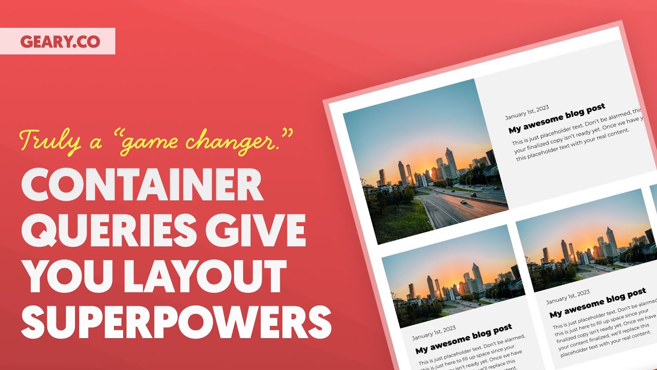
1 0:00:00 Yo, welcome back to the channel, everybody. I hope you saw the title on this video and got very, very excited. I am going to show you container queries, which are coming to production level CSS very, very, very soon.
They’re tremendously powerful. The word game changer is actually appropriate to use here because these are going to literally, in fact, change the game. They’re going to make media queries obsolete in a lot of different contexts, not in every context, calm down, not in every context, but in a lot of contexts, media queries are going to be obsolete. This is tremendously powerful for scalability, maintainability of websites, efficiency, and how we’re building elements and components. And so what I wanna do in this video is I wanna show you how container queries work I want to help you wrap your head around them because when I first learned about container queries a while back It was hard for me to wrap my head around.
I was like, oh, well, see I read all the technical documentation on it And it was just like okay. All right, whatever when I started playing with it and actually like seeing it come to life, then I was like, oh, this is how it needs to be explained, not like super technical documentation, okay? So I’m gonna give you the layman’s terms explanation for container queries, excuse me. I’m gonna show you how they work. I’m going to show you what we’re thinking about bringing to frames in this capacity.
It’s gonna be a game changer for frames as well. And then I’m gonna show you how to make them from scratch. Okay, so even if you don’t have automatic CSS, you don’t have frames, you’re still going to be able to use container queries. I make a, in the actual training in the video, I make a disclaimer not to use these on production sites yet. I’m going to make that disclaimer again, right here.
This is not ready for production because browser support is still only in the 80s. We need it to be in the 90s. And then we can probably start using this with great confidence. But with that said, no more talking. Let’s get into container queries.
All right, 2 0:02:08 guys, 1
0:02:08 let’s just get started by adding things to the page because I know as soon as you see this happening before your very eyes, you’re going to immediately understand the benefits of this and how this is in fact a game changer. So I’m going to add a section to the page and that’s a section and a container. I don’t have any tricks up my sleeve. I haven’t done anything special yet.
What I’m gonna do is go up to the library here and I’m gonna go to remote templates and this is the entire frames library. And we’re gonna use frames to help us out to speed up this process, but also because it kind of helps to show you the vision that we have for a product like automatic CSS and frames. Okay, so I’m going to do event card Bravo, and I’m going to insert that onto the page. Okay, and it actually didn’t insert it in the container I wanted. I’m going to put it inside of that container.
And that’s automatically going to make event card Bravo my website with you can see it’s perfectly aligned with my logo at the top of the page. And it looks like a nice, clean, wide, unstyled event card. If you’re, if you don’t know about frames, frames is an unopinionated library of frames and components. So we don’t add a bunch of extra styling. The styling is up to you.
We give you a really, really clean, well-coded, accessible starting point. Okay? So now what I’m going to do is I’m going to add another container to this section. And basically I want to add, why didn’t it add the container? There we go.
Okay, so it added the container. Thank you, Bricks, for adding the container on the second click. Okay, so now I’m gonna say that this is gonna be a width of L, and that’s gonna shrink that container down, and I’m just going to put another version of event card Bravo in that container. So I’m gonna duplicate this event card Bravo, and I’m gonna drag it into that new container, and you can see that it conforms to the width of that new container. That is nothing special.
Okay, that’s exactly how it would behave in every instance of Bricks ever, okay? We’re not to the magic yet. Now, what I’m gonna do is I’m going to add another container to this section, and here is where things are going to get very, very, very interesting. I’m going to make this a three column grid. We’re gonna say that the XL breakpoint, this is going to go to two columns, and then at the L breakpoint, maybe we’ll go to one column, and then I’m going to put a grid gap in there.
It’s actually I don’t even need the grid gap, it’s going to auto gap it for me. There we go. So we have a three column responsive grid. The only difference here, and this is a difference when you’re using container queries, I’m going to break container queries down for you in just a minute. But the way they work with grid is a little bit wonky.
What it’s what is this is gonna give us tremendous benefit. Okay tremendous benefit. Game-changing benefit. I will say it again because it is truly a game-changer. However, however with grids and with certain scenarios it’s gonna cost you some extra divs.
So you gotta pay the piper and a couple extra divs. Okay. But if you pay the Piper and a couple of extra divs, you have some really, really powerful functionality at your fingertips. So what I’m going to do is I’m going to put a block element inside of, instead of just putting the event card inside of the grid, I’m going to put this block inside of the grid. And then I’m going to take event card Bravo.
Let’s duplicate event card Bravo again, and I’m going to drag it into this block right here but before we do that before we do that sorry I’m not I’m not teasing you on purpose I’m not teasing you on purpose I want to show you what media queries do just as a refresher so as you probably know with media queries when the browser starts to encroach on an element’s width okay the the browser is Squishing the element in what we can say is okay. Well at that device size We’re going to shift How the element behaves these are called media queries They’ve been around for a very very very long time you you got to know how these work, okay? Yeah, if you don’t know it’s probably day one of web design if you don’t know how these work. Okay, so that is a media query Understand this though. This is very important Why are we saying that the layout of this element should change at this device size?
It’s because the device I’m trying to help you understand and wrap your mind around container queries right now the device is encroaching on your element in such a way that your element’s width, or the container that your element is in, is being squished. And so, you say at this device size, I want to shift how this element behaves. But now what you need to think about if you want to understand container queries is, when a container’s size is a certain size, then we, cause that’s ultimately what the device size is doing. It’s crushing your element down to a smaller width and then you’re having to change the behavior of that element. But shouldn’t the behavior of the element change not based on the device, but based on the container that it’s put into.
And this is probably where you’re like, isn’t that the same thing? I don’t really understand. But when you visualize it, then it clicks, okay? All right, so what we’re gonna do is we’re gonna go back and now, sorry for the little teaser, I had to tease you because I had to make that connection in your brain. I had to get those synapses firing in a certain direction.
So now I’m gonna take this event card Bravo and I want you to watch it. I’m not changing devices, my friend. We’re staying on desktop. What I’m changing is the context of where this card is placed. I’m changing the container size that it’s going to be in, but I have to do one more thing first.
I have to do one more thing. Before you see the magic, I have to come up here and I’m going to use a class from Automatic CSS called Contain. And I’m putting Contain on the grid parent. We’re going to talk about this more in a second when we break this down, okay? All right, so now I am free to drag event card Bravo into this block And are you ready guys?
Are you ready to see what happens? Watch this. I drop it in and Look at it. It clearly Looks very good guys. That is the same event card Bravo.
I just duplicated it and I dragged it That’s all I did. I didn’t do any other magic other than This little class right here called contain and there is some other little bit of magic happening under the hood. But you can do it, I’m gonna teach you how to do it. But this is, look, this is truly a game changer. Because now, before, when I wanted to use Event Card Bravo in a grid, I had to do a modifier BIM class and put a whole set of instructions on this modifier class.
And then I had to make sure every instance had the modifier class. I didn’t do a lot of juggling. I did a lot of dancing, okay, to get this to happen in the old-school CSS. And in the new-school CSS, I ain’t got to do a lot of dancing, okay. All I have to do is use a container query.
And by the way, when I use a container query to make this happen, I can forget about the media queries. Media queries don’t even really matter to me at that point anymore because what were the media queries doing? They were just changing the behavior of an element when the media size, the device size, crushed it to a certain container size. Now I’m already saying I’m just doing this based on the container size, forget the device. Because if I want to put this bad boy in a grid, I still want it to change because the grid doesn’t give it enough space to be in a wide format.
So I’m changing things based on the container now, which is far more contextually appropriate than just choosing random device sizes to try and change this container at, okay? So now what I can do is I can duplicate, duplicate, and that doesn’t matter how many times, let me go ahead and save this, let me go to the front end, doesn’t matter, look at this, this is, guys, this is the same element. This, that huge wide card right here, and this nice little tight card that’s in a grid are the same Element and it doesn’t require any modifier classes or any shenanigans or dancing around it just requires Container queries, okay, let’s let’s take a breather from the hype and excitement. Let’s break this down Let’s talk about how this works how you can do it how to approach this. 2
0:10:49 OK? 1 0:10:50 So I am going to remove everything that we just did.
I’m going to add our section back. And what I will say is this. You know, you want to design the elements. And I think this is the best way to do it. And by the way, I’m excited to see how page builders approach this.
We know how they’ve approached media queries. I think it’s going to be very interesting to see how they address this challenge of implementing container queries. Okay, I don’t think that there’s a lot a CSS framework like automatic CSS can do from this standpoint. Obviously you saw the contain class that I used from automatic CSS though, that establishes the container functionality. But a lot of container queries are just like media queries.
You’re having to write some custom instructions based on what you want the element itself to do. That’s not something you would want to do with utility classes. There’s not a lot. There is some stuff you can do with variables obviously, but those already exist, right? So let’s just let’s go ahead and build something so that you can see how to do this yourself and play around with it and experience the magic of it, okay?
Alright, so in the container I’m going to add a block. This is going to be, I think we should make like a, let’s make a blog post card, okay? And I am going to add blog post card as a class, just like that. And then I’m going to add two blocks in here. One is going to be for the media wrapper and the other is going to be for the content wrapper.
I’m not doing anything that I wouldn’t do otherwise. This is exactly the same workflow as if I was creating a normal blog post card without caring about media queries Okay, so this is going to be our media wrapper, and this is going to be our content wrapper We’re giving everything them classes as we should do for scalability and maintainability We’re going to add an image, and I’m going to select the image of Atlanta We’re not going to do the query loop and all that good stuff today. I’m just showing you what container queries do for you. So this is the actual media and then before I add anything else I want to get this card structure down. So I’m going to display this as a grid and we’re going to do a grid of one two and then I’m going to let’s stretch all items.
Yeah I’m going to stretch all the containers in here and then that way in content wrapper I can actually just align everything to the center and I’m gonna add a heading and I’m gonna add text and I can add like the date as well so I’ll add text for the date this is gonna be the date right here this is gonna be the text this is gonna be the heading we want the heading to come first we’re gonna put a date class on here and guys I’m flying through this because I’m not teaching them okay like I’ve just I’ve taught this enough you can go watch other videos on the channel of what I’m doing right now. I’m going to go to website Ipsum and I’m going to grab a little bit of our text. It’s going to be like the, let me close these out because we don’t need those anymore. This is going to be like the blurb, the excerpt, whatever it’s called. Okay?
And then we’re going to make that a paragraph tag. We’re going to make this, this would actually be a time tag, I believe time, yeah. And then we are going to just put in a raw date here. So January 1st, 2023. Great.
Fantastic. Okay. And then I want that to be the first item visually, but I don’t want it to be the first in the DOM. So I’m just going to come over here and right now I’m just being anal about this. I’m going to do, it’s just, I mean, it’s, it becomes second nature after a while.
We’re going to do something like space L probably even more than that. Actually. Maybe XL would do the trick. Yeah, I like space XL. And then we’re gonna gap this out, all right?
So our row gap is going to be content gap divided by two maybe, that looks perfect. And then I wanna give this whole thing, actually this media, we’re gonna make it a figure and we’re gonna go no caption, and then we’re gonna come down here and we’re gonna give it an aspect ratio, all right? So we’re gonna go aspect ratio one to one. I just want it to be like a little square action there. And then our blog post card needs a background color.
Okay, so we’re gonna go to background and we’re gonna go to base. Let’s do base ultra light. Okay, perfect. Let’s go look at what we’ve got on the front end. That is amazing.
We have whipped up a blog post card. Let me see. This is my awesome blog posts. Okay, so there guys is our blog post card. And I want to show you this is not responsive at all.
We do see we need to fix something right there, which is the flex grow on this image right here most likely. So if we put a little flex grow on this bad boy, we are probably going to get exactly what we want. There you go. So now we do have, you know, it’s a little bit responsive, but obviously this is not responsive anymore. It is not looking good.
We also need to object fit cover this image. So I’m seeing that as well. Object fit, go ahead and cover that so it’s not stretching or warping it at all. And now we got much better behavior here. But notice it’s not stacking the way that it should, but we don’t want it to stack yet, okay?
And what I will say is this, you design the blog post for where you want to use it primarily and then you can use a container query to change it for other contexts okay. So this is actually going to be like my featured blog post and if you’ve ever made a featured blog post before you know that you kind of it has all the same components as your other blog post cards but it has to it’s in a different format when you put it into a different area and it’s a big pain in the ass. And no longer is it actually a pain in the ass. So what I’m going to do, imagine that’s our featured blog post and it’s going to sit above all of our other blog posts. So what I’m going to do is drop in a container here and this container once again is going to be my grid of blog posts.
And I can do a grid of four, a grid of three, a grid of two, whatever I want to do. Let’s go ahead and do a grid of three, just like we did before. We’ll do a grid XL of two, and that’s going to be at the XL break point. It’s going to turn it from a three column grid to a two column grid. This is just basic ACSS stuff.
We’re going to say at L, it’s going to go to a one column grid, and then we are good to go. Now, because I want to use container queries, I’m going to drop the contain class on here, and that’s going to immediately make this compatible with container queries. I’m gonna then drop a block in there, because remember I said you had to pay the piper in an extra div in order to use container queries. But now what I’m gonna do is take my blog post card and I’m gonna duplicate it and I’m gonna drag it into that block, which is effectively a cell of the grid. And if you notice that none of the magic has happened because we haven’t added the secret spices You’ve got to add the secret spices if you want the magic to happen, okay?
So what we’re gonna do is we are gonna go write a little bit of CSS now I just dragged that out of there on accident. We don’t want to do that, okay? So I’m gonna go into my blog post card That’s this card But it’s also this card this card this card notice they look completely different because of the container they’re in. The container is crushing them and the card has no idea how to respond and it’s just like, ah, okay, we’ve got to make sure that it goes from, ah, to like actually being a good, proper looking card. You understand?
Okay, so I’m gonna go into style. I’m gonna go down here. Now I’ve already done the contain magic with that class that I added called contain. All I have to do now is write the word at container and then I do this exactly like I would do a media query okay so I’m going to add parentheses and I’m going to say max width and then what I want to do actually before I write anything before I choose a value I want to come to the front end of the website and I want to use the responsiveness to just figure out at what point does my container start to crush my design to a point where I don’t really like it anymore. And I think it’s about like that because that’s starting to get a little squished.
Look at the image over there. It’s just a little, feeling a little too squished. Okay. So I’m just going to see what is the width of this card when it’s starting to get crushed and the width is five 54. I’m just going to round it out at 600.
So I’m going to say it’s 600. We’re going to do some things differently here. Okay, so I’m going to say container max width is 600 pixels and then I’m going to come in and I’m going to do something. What am I going to do? Well, the first thing I’m going to do is my root, which is my blog postcard.
I’m going to change the grid template columns now. So instead of the grid that I had before, which was a one, two, I’m going to go to straight up one column grid and notice that that does a really, really, really good job. Now, the next thing I’m gonna do, and this is why BIM is so very freaking important, you’re gonna grab this media wrapper right here, and that is blog postcard media, you can just hit edit and then copy and copy the name of it, and then come over here, and we’re gonna say root, all right, paste it in, so that’s root blog postcard, now I’m targeting my, actually wanna target the media itself, not the media wrapper, sorry. And what we want to do here is we want to change the aspect ratio. Remember, it was one to one, which is like a square.
I want to go more something like 16 by nine. Remember, these changes that I’m programming in right here are only happening when the container that this element is in is 600 pixels or less. That’s the only time. Notice my postcard up here looking really good, looking still mighty fine, but down here things are changing. The next thing that I would like to change is the padding because the padding up here was fabulous, the padding down here, not so fabulous.
At this size, too much padding, right? Okay, so what we’re going to do is we’re going to grab our content wrapper class. I’m going to grab that. Let’s go back to our main component here. Let’s make a new line.
This is going to be root. We’re targeting now the blog post card content wrapper and we are going to add some padding and we’re going to take that from, I believe it was space XL. See, um, let’s go like there. All right. Nothing happened, nothing changed.
So we can drop it to L. And then this is the beauty of just having tokens. You like really just dial this in. Look at that. I mean, absolutely fantastic.
The padding has changed now. How about our text? I’m gonna grab this class, okay? I’m going back to our main component. I would like that text to be smaller when there’s less space.
So we’re gonna say font size, and then I’m gonna say var text S. And now the font size is gonna get smaller. And now let’s look at this on the front end. So we have effectively created, we’ve taken a component that we first designed as a very wide component, which looks great as like a, hey, this is our featured blog post. Then when it’s in a different size container, it just starts behaving differently.
It doesn’t even have to wait for a media device to come in and start manipulating it. It just looks at its parent container. It’s like, I don’t have enough space here, so I’m going to dance differently. I’m going to do some different things. And this is perfect.
And notice, no breakpoints. I’m not touching any breakpoints up here to manipulate how this card behaves. Watch what happens as the devices come in and start to affect things. Look, look at this. Okay.
Now, why isn’t this one changing? Because we didn’t put the magic class on it. Okay. We got to go up here. We got to hit container.
And we got to say, hey, contain. And then we’re going to hit save. And then we’re going to come over here, we’re going to refresh. And as this comes in, it’s going to change too. So it is automatically responsive.
Now they all look exactly the same. Why? Because they’re all in a container that is the same size. Thus, they’re all receiving the same instructions as to what their styling and layout should be. So we have a featured card.
These are all the same component, that is so fantastic. And they just behave based on the size the container gives them. Look at how they went back here. This is, I mean, this is phenomenal. These are stacked, these are stacked.
This is wide. Watch this, watch this. There’s even an intermediate point in our media devices where there’s enough space to allow them to be their wide self. But then immediately another device views them, which makes them a little bit smaller and they suddenly all stack again. This is just absolutely phenomenal.
This is container queries. Now, if you wanna do this from scratch, if you don’t know what the magic class is doing up here, okay, I’m gonna zoom in right here. Look, it is container type equals inline size, and that defines the parent container. You’re just saying, hey, watch this container’s inline size, because I’m going to put something in here that has a container query, and as long as you’re monitoring the inline size of this particular container, then that container query of the element inside of it is going to work. So the parent gets this class right here, container type, I’m sorry, this instruction right here, container type inline size.
There’s another one called size and size will watch inline and block. But inline size is almost, almost all use cases that I can think of deal with the width of a container, not really the height of the container. So inline size is what you want to use the vast majority of the time. And that is really all the magic sauce that you need, okay? So container type inline size, and then you have a child, and that child uses an at container statement and then you get to choose the width.
So it’s watching that parent, and when the parent hits 600, these rules go into effect for 600 and down. You can use min width media queries to make it go this container size and up. Everything is pretty much exactly as how media queries work, but we’re changing the context from device to container, which is a much, much, much more powerful context. And as you see here, just absolutely phenomenal. We don’t have to care what the device says anymore.
We can just worry about how big containers are and how big our elements should or shouldn’t be or what should happen when our element gets to a certain width. That’s all we’re concerned about, which is really all we’ve been concerned about from the beginning. It was just, we had to wait for the device to crush the container, instead of like a grid crushing the container or a sidebar crushing the container or any other container affecting our elements, right? I would not use this on production sites yet. It is not safe for production.
Browser support is still in the 80s. We need browser support to be in the 90s, and then we can start using this all over the place. It’s going to be there very, very soon, which is why I’m giving you a heads up, showing you how it works. If you have any questions on this video, drop them down below. But I hope you’re as excited about this as I am, because this is like, it’s not often you get really game-changing features in CSS.
This is one of those features that is truly going to change the game because it makes media queries almost obsolete in so many cases. Not completely obsolete, we still need media queries, but in a lot of cases it makes them obsolete and it gives us so much more control over the layouts of our website and it makes things so much more efficient, okay, and scalable and maintainable and all the things that we care about as viewers of this channel. All right guys, I’m out, peace, I hope you loved it, I’ll be back very soon. All right guys, I’m out, peace, I hope you loved it, I’ll be back very soon. Cheers.