Columns vs Grid in Oxygen (Plus Cheat Codes!)

More about this video

If you’re interested in OxyNinja, get it here: https://go.digitalambition.co/oxyninja/

Dear Oxy team … I’m sorry I had fun with the columns bug. I still love you.

0:00 Intro
02:05 Columns
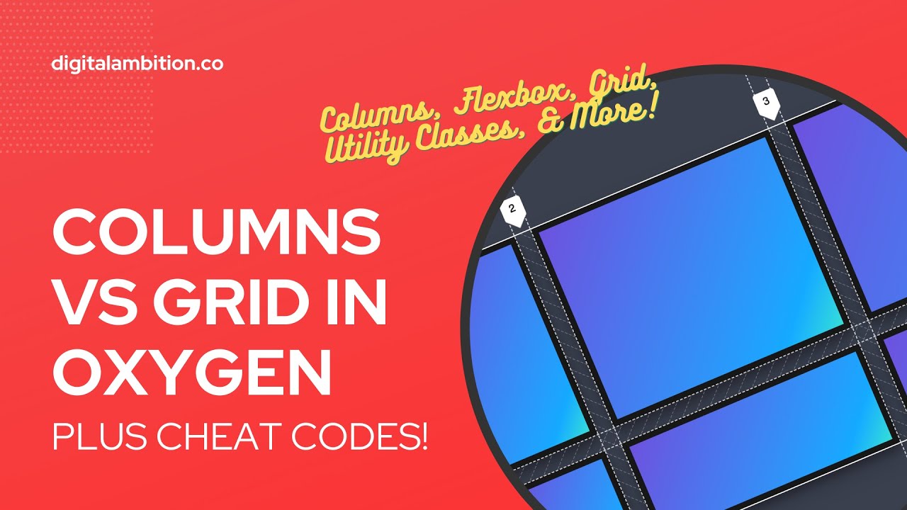
12:45 Flexbox Columns
17:05 Grid (Vanilla Oxygen)
21:45 Grid (OxyNinja Utility Classes)

When you first start out with Oxygen, you might be enticed by the Columns module. Drag it in, choose your columns layout, and boom … there’s your columns.

Unfortunately, there are a lot of downsides to using this column module.

Problem #1: It doesn’t behave as it should (and sometimes it breaks).

Problem #2: It suffers the same limitations as CSS Flexbox … because it uses Flexbox.

What are the limitations of Flexbox for creating columns?

The major problem is the lack of gap control. Flexbox gap isn’t well supported yet. So, you end up needing to use padding in your column divs (which is what the columns module does by default).

This creates new problems:

1. Left and right padding that throws off content alignment with other block level elements in your section.

2. Top and bottom padding that exists for no reason (without top/bottom padding you won’t have gaps between rows).

3. Double row padding (because the bottom of one row adds together with the top of the row below it).

4. An inability to create equal height columns (without duplicating your column rows).

5. Lots of additional DOM elements (because your content needs column wrappers).

I’m sure there’s more I’m leaving out.

The basic conclusion is this: I never use the columns module and I hardly ever use Flexbox for creating layouts.

My general rule of thumb is: Flexbox is amazing at aligning things and manipulating things and Grid is amazing for layouts.

Whether you use Oxygen’s default Grid builder controls or OxyNinjas Utility Classes (I show both in this video), Grid is the way to go for achieving columnized content.

If you enjoyed this video, I’d really appreciate a thumbs up and a comment and make sure you’re subscribed with the bell so you don’t miss more Oxygen tutorials.

PS – Just buy OxyNinja, it’s so worth it: https://go.digitalambition.co/oxyninja/

Video Transcript

0:00:00
So one of the questions I get a lot is columns versus grid in oxygen. Columns has been around for a while. Grid is relatively new inside of oxygen. They have a grid builder. But there’s also an easier and much simpler way to get grid-based layouts. And that is with oxygen-injust core grid classes, which I’m going to show you how those work as well. But we really have to talk about the old columns element and all of the problems and limitations with it because there are many. And really what the columns element is doing is just creating a CSS Flex container to put divs in. And then it’s auto choosing the column width on those divs. It’s just trying to do a lot of work for you. But it actually over-corrects. And I’ll show you how it over-corrects. And it just becomes very problematic. But even if you did the CSS Flex container yourself to make columns, you would run into a lot of troublesome issues. And I’m going to show you the main issue, which is why I don’t use the columns element in oxygen hardly ever. And I don’t use CSS Flexbox to try to create columns either. So strictly 100% grid. And I don’t use the grid builder in oxygen. But I will show you how it works. And then I’ll show you how I actually build grids in oxygen. I think I’m rambling yet again. This is a common problem. So let’s just jump into the tutorial so I can show you how it works. All right guys, we’re going to talk about columns versus grid in oxygen. And really what we’re talking about is Flexbox versus grid in general. Because the columns element in oxygen uses Flexbox for its primary control. And you’re going to see really the big downside of Flexbox. And why I hardly ever use the columns element. And that there’s actually more of a downside to the columns element in oxygen. I think than just traditional Flexbox, which I’m going to show you. And you’re going to see why I barely ever use the columns element in oxygen.

0:01:56
And then why I don’t really use Flexbox to create those columnized, that’s a word, layouts. But let’s go ahead and dive right in so that you can actually see instead of me just blabbering on and on and on. I’m going to add a section and a background color to the section just so you can see what we’re working with here. And I’m going to add some content to the section. The main reason I’m going to add the content to the section is because in order to see one of the big downsides of columns and Flexbox is you have to see content around the columns. You’ll see what I mean in just a second. So this is a heading or let’s just say these are these are our features. But wow, can’t type today. All right, we’re going to go with a text element next. This is how a basic grid kind of style section would look with like feature cards or something. All right. So we’re just going to quickly go to Laura Midsum and grab a little dummy text here. And I’m going to pop that in. And cool. And that looks terrible because it stretches all the way across. So I’m going to go ahead and go to Advanced Size and Spacing Max with 720. And I tend to say, hey, never use pixels. All right. So why don’t we just fix that real quick? 72 rim gets me the same exact thing. Cool. And now we’re going to start doing our columns and grids and things like that. First, I’m going to put some spacing between these elements. I’m going to use owl spacing for this. If you don’t know what owl spacing is, I made an entire tutorial on owl spacing. I’m going to make it pop up on the screen here. And then hopefully afterwards, you’ll remember to go click it and watch it because it’s really cool. Basically, it evenly spaces out everything in a div or everything in a container.

0:03:45
Evenly like magic. All right. Because you see spaces between these and anything else that I put in this section is going to be evenly spaced the exact same way. So I’m going to go ahead and add our columns element. Great. And you see a little gap there, right? Because we’ve got our owl spacing. And I’m going to choose the 33% the three column layout. And there you go. And what a lot of people do when they’re first using oxygen is they say, hey, I need columns and they see a column’s element and they click it. And then they say, I need three columns. And there it is. And everything looks fantastic. Right? Wrong. Like lots of lots of downsides here, lots of issues. To prove these downsides and issues, I’m going to now add a div. And we’re going to use pure CSS Flexbox. I’m going to use the oxygen controls, but we’re just going to use Flexbox from the ground up. So I’m going to put 100% with on this. And then I’m going to put another div. And this is going to be for our grid. So I’m going to go ahead and put 100% on this. Cool. All right. So there we have our columns. And why don’t we, why don’t we actually name things? Because you know, that’s, that’s always a good practice. So you can see exactly what we’re working with here. So I’m going to hit command A and this is going to be called columns. It’s kind of already called that. This is going to be called rename flex. Wow. Okay. Everything’s super laggy, by the way, when I’m screen recording. I think I need a new computer. Flex box, not flex body, flex box columns. And then this is going to be grid columns.

0:05:27
Awesome. So we can kind of go for the same exact look with all three of these things and just see what the downsides are. We’re going to start up here in the columns. And I’m going to add another div. We’re going to add a card inside if you remember these are feature cards. These are our features, right? So I’m going to add a card. I already have a utility class for this. I’ll just use C card light. And I’m going to add an icon. And I’m going to add a heading. And I’m going to change that heading quickly to age three. And then I’m going to add text. And then I’m going to add a button. Great. And then I’m just going to use owl spacing on this. I’m not going to do this the way I normally would in real life because that’s not the point of the tutorial. But I now I have a card, right? And this is a feature. And we have warm if some still loaded locked and loaded in our clipboard. I’ll make it a little smaller. And then this will be click here. So this actually looks like a real life basic icon card. Yes, we all agree. Cool. I’m going to go ahead and name it card because we want to stick with our naming stuff. So we can see what everything is over here. All right. So in order to get this to the rest of the layout, I’m going to go ahead and select this inner column here. And I’m going to paste. And I’m going to select the outer and I’m going to hit paste. And now we have our three columns. Okay. Before we talk, you already see one of the problems here. You’re like Kevin, that looks terrible. In fact, I’ll go save this. We will preview it on the front end. And there’s our cards. We have no gap. They’re all touching each other because there is no gap. Now I do want to be fair. This would not behave like this for you in a default oxygen install. If you’ve watched my tutorial on how to set up oxygen properly. If you haven’t done that, go watch it. I’m going to put a link to it. It’s going to pop up here any minute. Go watch it after this video. But we’re going to go to manage settings, global style. Oh, I’m already there. Cool. So under global styles, if you go to sections and columns, I clear out my columns padding because the reason is the default is like 20 pixels all around. Right. I think that’s the default. Don’t hold me to it. But I think that’s the default. And the problem is, you know, we see a gap now. So let’s go, let’s go reload this on the front end. You see a gap. But now we have a gap on the left and a gap on the right, which misaligns all of our content. This is not good at all. And this is the main way that you would create a gap between columns when you’re using CSS Flexbox. And the reason is, if we go to cannause.com, not canva.com, also a good resource, cannause.com and type in gap. We’re going to see that our gap property for Flexbox is not really well supported. Okay. Lots of browsers that are lagging behind in supporting the gap feature for Flexbox. And I think that’s why it’s not in there by default in oxygen. Because if you look at the structure panel, if I click on my columns wrapper, you have like these settings where I can stack columns vertically and I can reverse the column order and I can set column with the 50%. Like I can do a lot of cool stuff, but I can’t create a gap.

0:08:48
That’s like the main thing I need to be able to do with columns is create gaps because you see when you add padding, it’s not sufficient because it screws up the padding, it screws up the alignment of all the items in the section that you’re working on. Now there are other hacks that you can do where you can apply margin only to the right of columns and on and on and on and you can do stuff with pseudo classes. Like it’s just it’s hacky. It’s very very hacky. All right. And there’s no reason. We don’t have to because we have grid. But let me show you some other downsides of this. Here’s one. So oh, sorry, I didn’t even finish my thought. Right. We went to that default area in global styles. I’m going to show you exactly why I clear these out because the 1% of the time that I do use these columns, I don’t want default padding on them because if I want to change the padding and let’s say use a padding class, right, a utility class, say I want large padding. Look, nothing happened because this default padding in oxygen basically applies these at the ID level. Right. So when I add a class to change the padding, it ignores it. And so I have no control over that. So what I would have to do is go into every single div and adjust padding manually here. And that’s just not scalable. Totally impractical. Total, you know, a killer of this of using this thing. So what I say to do when you’re setting up oxygen, sorry, is to go to sections and columns and just clear this out because at least now when I do use the columns, if for some reason I want to add padding in there, I can go choose my parent div. So that’s this one right here. And I can add a padding class to it. Let’s say large. Oh, no, that’s overkill. Let’s do medium or even small. Like, you know, gaps don’t wow. Can I type? Gaps don’t have to be huge. Let’s just have a small gap, right.

0:10:42
And then let’s say these other columns didn’t exist. And now you’re also going to see one of the problems that I have with with the column play out. First of all, you can see there’s two cards now. And there’s clearly not two columns in here. There’s one column and a card inside the column. I can’t even select this. I don’t know. It’s somewhat of a bug. Like if Elijah’s watching this, you know, investigate this because when I was playing around with this earlier, this kept happening. So I’m going to duplicate that div. And now I’ve completely lost because what what the columns element in oxygen does is it dynamically changes the width of the divs that are inside it. Remember these were set to 33.33%. You didn’t see me change this to 50. It changed itself to 50, right. If I put this back at 33 and I put this one back at that one, okay, sorry. I’m making a mistake here of applying that to a class. We definitely don’t want to do that. Be careful with your classes. All right. So it’s actually at, sorry, at 100%. So it’s got me all confused because it doesn’t behave like it’s supposed to behave. Like my, it’s not, my brain’s not making sense of it. So I’m going to go back to this ID and I’m going to change this 33.33. And then I’m going to choose this one and we’re going to go back to the ID and change. Look at that. That went to 160. What is going on here? 33.33. And now we have our three columns back. But then we have that odd fourth thing, which isn’t even in our free-constructure panel because it glitched out on us, right.

0:12:18
To me, this is like, this is insanity, okay. So I’m just going to leave that there because it’s a good demonstration of why you shouldn’t use this columns element inside of oxygen, in my opinion. Okay. All right. Sorry. That’s, I know that’s a bug. I should make fun of bugs. I think it’s a bug. I mean, it looks like a bug to me. In fact, I can’t keep that there. Let me, let me just, let’s hide that for a second. That’s a, that’s a travesty. All right. So here we are. We have our flexbox columns and our grid columns. I didn’t even get to show you because this columns element broke. I was also going to show you that it doesn’t, it doesn’t respect flexbox wrap the way that it’s supposed to as well. I should be able to add three more divs in that flexbox wrapper, in that container, and it should break to a second column or a second row and have those three columns be on the second row. And it should look somewhat like a grid, but it doesn’t respect wrap either. So this does. So flexbox columns, let me show you what the columns element in oxygen is attempting to do. And it’s like columns for dummies, which is why you can’t really customize it much and why it breaks when you try to play around with it. So I’m going to take this div, and I’m going to set the layout to horizontal on flex. What that does, let me actually, let me undo that because what you really should be doing going to advanced layout and let me clear it out.

0:13:39
So we don’t have any issues in there. Okay. So layout set the display to flex, set the flex direction to row, and then you can set the align items to, excuse me, stretch. And then what I’m going to do is add a div. So this is exactly what the columns element was doing for you in oxygen, but it doesn’t do it the way that it’s supposed to do it. So if I have this div and I set the percent to 33.33, which is that’s what the others were, right? And I duplicate it twice, you’re going to see I have exactly what oxygen was trying to set up for me initially. But you’re also going to see that it doesn’t, number one, it doesn’t break the way that you just saw that columns element break. So it does work properly. And it respects, let me go back to the wrapper, it respects wrap. So if I go to layout and I choose this flex wrap wrap, then what I’m going to do is I’m going to duplicate and I’m going to duplicate and I’m going to duplicate and I can have two rows and I can have what appears to be a grid. Now this still doesn’t solve my problem. Let me unhide this real quick because I want to steal my card. And then I’m going to hide it again so we can not see that travesty up there. And I’m going to paste my card in. And I’m going to paste my card in and I’m going to paste my card in. All right. And we’re going to see what RLL out looks like here. And I want you to see that this gap problem is twofold. Not only do I not have gaps horizontally on the x-axis, I don’t have y-access gaps. I don’t have gaps top to bottom between these elements. And if you did it with padding again, you would still have a lot of alignment issues.

0:15:20
Then you would have extra spacing above and below this whole container. That’s not good. So you’re going to see why we just use grid. And my general rule of thumb is that flexbox is amazing for aligning content. And grid is amazing for laying out content. So if you want to think about it like that, think about it. Flexbox, I’ll say it again. Flexbox is good at aligning content and items. Grid is great at laying out content and items. Okay. So this is a layout, right? A three column, two row layout. That’s for grid, right? Then I can do things inside of that using flexbox. And that’s a cool thing is flexbox and grid can actually work together. And so you don’t really choose one or the other. You use the grid to control the basic the main layout. And then you can use flexbox to do a lot of other cool things. And then there’s some things, some advanced things you can do with grid. As well, like you can control individual columns and rows with grid. You can span them. So if I wanted this to take up two columns, I could have it take up two columns. I’m not getting into like the this is not a complete tutorial on CSS grid or CSS flexbox. This is just comparing the columns element to grid, which is flexbox to grid. But you see here, I got somewhat of a grid, but I still have the gap issue. So what I’m going to do is come down here. And in fact, what I’m going to do is add one more div because we’re going to do this another way after we do it the manual way.

0:16:53
And I’m just going to leave that div sitting right there just so you can see. I’m going to show you how to make your life crazy easy and crazy fast with some utility classes. We’re going to use grid utility classes. But let’s just focus on this div right here. This is where I’m going to create my grid manually using oxygen’s grid controls. So remember column count, what do we want? We want three columns. And we want a gap of let’s change this to rim. And I want a gap of 16 pixels. So that’s 1.6 rim. If you’ve reset your like just go watch my tutorial on setting up oxygen properly. All right, so I’m going to go ahead and add a div. And I’m going to add, I’m going to duplicate it. So I have two more right. And actually, let me go back to what’s actually cool about this. I don’t need and we’ll talk about one of the other downsides of this. In order to create spacing around these things, you generally you put the div card, the card wrapper div inside of the column div. And so now you’ve doubled your DOM elements, right. So you have a div inside a div. Well, when you use grid, you actually don’t need a containing element, right. I can just have because I don’t have to use padding or anything to create my gap. So what I can do is I can just paste a card in there. I think I have my card. Yeah, so there it is. Let me go ahead and let’s let’s put more owl spacing on here. Let’s do owl spacing double dash L. Like for large spacings, we can get more space between these things. Okay, so there’s my card. It doesn’t need its own wrapper. It’s just there as my card because when I duplicate it, it’s going to naturally have a gap between the items, right. So and then if here’s the cool thing about grid, right. If I just keep duplicating, I don’t have to even set a wrap. It just knows, like keep going, like just keep making the grid, right. That’s really, really cool, really, really helpful. So now you see I have perfect alignment. Let me turn off the these flex box columns. We have perfect alignment with our other content in the section. There’s no extra padding on the left, no extra padding on the right, no extra padding on the top or the bottom. It’s behaving exactly as you would expect a layout like this to behave. And all I did was a couple clicks of the mouse. I hit grid, I hit three columns, I hit 1.6, and that’s actually should be rimmed. But you can also control the gap here because we want those gaps to be even, right. So as 1.6 left and right, we want to be 1.6 top and bottom as well. And then here’s down here is where you can start getting into like how you want individual children of this grid to behave. All right, but we’re not going to mess with that for right now. I just want to show you the main thing, the main problem with the columns element. Number one is that it breaks if you start playing around with it too much. It auto changes the width of the divs that are inside it. It just goes, it’s crazy making. If you make a flex box columns wrapper on your own, it doesn’t break and it does respect the flex box wrap property. But you still have the problem of not having a gap. And you know, like I said, if you add the gap manually, you have the browser support issue. So grid fixes, that’s like the main thing that grid fixes. And it’s really, really easy. Now, the problem with grid, one problem with grid, like flex box naturally, especially if you use the columns thing is more responsive. Like grid, it’s going to have these three columns. It sets the the men width of each item in here.

0:20:22
Each child elements, you can set that to whatever you want. But what you’re going to see is that when I go down, all it does is squish them. So now it does. So now it’s going off the screen. I don’t know if you guys can see that. Yep. So now I can’t even fit all three things in here. So that’s obviously a problem. And this is one reason why people are like, I don’t really know how to use the grid thing. It’s like it’s breaking. So all you have to do really is come in here to let’s say this. All right, that looks good. So we’ll go the next break point down and we’ll say, all right, on this break point, I’m going to have the grid turned on and I’m just going to go to column count two at this break point. And that solves your problem, right? And then what I’m going to do is go down here to 768 and I’m going to say, ah, those look really squished. I’m going to go ahead grid and I’m going to go column count one. All right, this is one way of doing this. There’s other ways of doing this. This is probably the simplest way or at least the more straightforward way is going to the break points and figuring out what you want the break points to be. So here’s where I’m going to make your life super, super, super easy. Okay? Remember that little little div sitting there that we that we had? Okay. Oh, wait, hold on. Before we unhide that or before we hide that, let me steal one of my cards. Okay? Because I don’t want to have to rebuild that again. All right. And we’re going to hide this.

0:21:41
Wow. It’s getting super laggy. Anytime I’m screen sharing, super laggy. All right. So I’m going to click this div right here and I’m going to come up here and I have Oxygeninja installed and what oxy the most powerful part of Oxygeninja. See, when beginners are looking at Oxygeninja, they’re going to be looking at the layout packs. Like, ooh, look at all these layouts I can install. I’m just going to be honest, which you almost never use the Oxygeninja layout packs. The only reason I install Oxygeninja is for the core class system, all of the utility classes that it comes with. And some of the most powerful utility classes in Oxygeninja, I’m going to have a link below to Oxygeninja in the description. It is an affiliate link. So if you want to support this channel, I don’t ask you for donations or anything like that. It’s just if I show you something cool and it’s a third party tool and it costs money and you have to buy it, you can use my affiliate link. If you want to help me out, if you don’t want to help me out, if you hate me, if you don’t like my tutorials, if you just want to steal my content, whatever, that’s all finding good too. Don’t use the affiliate link. Just go to Oxygeninja.com. I think that’s their site. But if you do want to support the channel, you can click the affiliate link in the description. So watch me just make this grid, right? So how many columns do I want? Three. So I’m going to type in the word columns and I’m going to do dash three. And I’m just going to choose the three columns. Okay. And then I’m going to add a div. Actually, sorry, I’m not going to add a div because we don’t we don’t even need rappers in here. I’m just going to paste my card. And then I’m going to duplicate my card. Boom. Now I’m going to choose my parent rapper and I’m going to say, you know what? I’d like a gap between those things.

0:23:18
I’d probably like a medium gap. So I’m going to do gap dash M. And I’m going to see I see I had a lot of options there, but because I put in it’s going to take me right to M. So there’s my gap. If you want a bigger gap, let’s take away the gap M and let’s do gap L. And now I’m going to have a larger gap. There it is. Now I think that gap is a little too large. And you can adjust these, by the way, you can make them whatever you want. But I’m going to go back to gap M. And let’s say I wanted, remember, we wanted six cards initially. So I’m just going to duplicate this three more times. And so I have my cards with my gaps. Now let’s control the mobile spacing. So what I’m going to say is I’m going to come down here and look at and just to give you a reference here. In Oxygen Engine utility classes, this break point is considered XL. This is considered L, M, and S. So let’s look at how it looks on XL. Looks fine. So here’s where it starts to look squish. So that’s L. So I’m going to come to the overall. I’m just going to guess here, right? Just for now. So I’m going to type in L2, which means at the large break point, I want two columns. Okay, so I’m going to choose that. And then I’m going to say M dash one. At the medium break point, I want one column. Fam, I’m done. I have a responsive grid guaranteed. Right? I don’t even have to look at it. Right off the back. I’ve done this so many times. I already know it’s all good to go. So if I look at the XL, we still have our three. If I look at the L, we have two. And if I look at the M, we have one. And then at the S, it just adapts to the M. It keeps the M sizing. Right? So I have a fully responsive grid with controllable gaps, no extra spacing left or right, no extra spacing top or bottom. Didn’t have to touch a single control inside of the oxygen panel. Didn’t have to know anything about really how grid works.

0:25:13
I just slapped on some utility classes. I said, hey, I want three columns on large devices. I want two columns on medium devices. I want one column. And I want a gap between them that looks like this. Now you can do other stuff with utility classes. I’ll do an entire oxygen ninja grid utility class tutorial at some point. This showed you how to make fancier grids and stuff like this. But this is like this is what I do every single time when I’m creating layouts like this where I need columns and rows is I use oxygen ninja grid classes and it’s done in seconds. And I don’t have to finego with oxygen, oxygen columns thing. I don’t have to put up with all the downsides of trying to do this with flex box. I just use grid and I move on with my life. It’s that easy. Now if you are doing something like an image based grid where all you’re going to have is images or image cards, then you may want to use flex box because you can create more crazy kind of layouts where you’ve got certain rows or taller than others and on and on and on. You can do that with flex box better. I still wouldn’t use the columns element. I would just use a normal div with flex box and go from there. If you’re comfortable making those kinds of layouts. But if you just want simple two column, three column, four column, five column, two thirds column, right? Like if I grab this wrapper right here and I take off that columns three and I just say we’re going to go columns two three. Can I type?

0:26:48
Columns two. I hate this lag. I need a new computer. Columns two three. Okay. You can see that I have a this or the first part of it is small. That’s the two part and then the three part makes it longer. So it’s two columns with one short column and one wider column. Then you can make these go equal height by using stretch, which is not a problem. So if I just and there’s actually a class for that. So C stretch. So now we have equal heights. I have a different kind of layout. Now that’s not the layout I wanted initially. But like I said, you can just create other types of grid layouts very easily with oxy ninjas classes. But that should be a good breakdown for you on columns versus grid, flex box versus grid. And then the fastest easiest way to make grid layouts inside of oxygen is with oxy ninjas utility classes, the core class system. So if you have any questions on this stuff, drop a comment below. Make sure you like, subscribe, all of that good stuff. If you like this channel, obviously there’s more oxygen tutorials to come. Also more agency tutorials to come. So if you’re a freelancer, if you’re an agency owner doing web design SEO digital marketing, I’ve got a ton of great valuable content on the way. But for now, that’s it. Peace.