Bricks vs Gutenberg – Feature Section Victor From Scratch (17min)

More about this video

Two weeks ago I recorded myself trying to build this layout with default blocks in Gutenberg with the Twenty Twenty-Four theme.

It didn’t go very well, as detailed in the following video and article:

Video: https://youtu.be/g8YxdSIq-uk?si=iMdOE3sK1KiTCeFD
Article: https://geary.co/wordpress-block-editor-first-look/

A TON of people wanted to see what the workflow looks like in Bricks Builder as a comparison, so I will show you that workflow today.
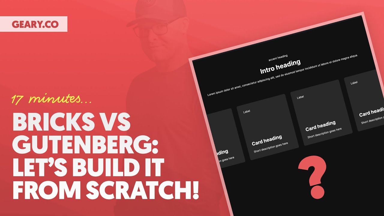
From scratch.

No Editing, No ACSS, No Add-ons, No Pre-Workout … I don’t even think I’ve had my usual amount of coffee. And I slept like shit last night because my daughter kept kicking me in her sleep.

17 minutes. And it was a relatively joyful experience.

I also talked through the whole thing, which I think added a few minutes, but there’s no need to get ticky-tacky with the time. It certainly wasn’t, say, a four-hour type situation or anything.

In any case, let me know how you think it went!

Oh, almost forgot:

Ads are off (as usual).
Here’s my zero-commission Bricks affiliate link since I only care about money: https://bricksbuilder.io.

Video Transcript

1 0:00:00 Two weeks ago, I recorded myself creating a relatively simple layout inside of the block editor using default blocks and the 2024 theme in WordPress.

I did that for a very, very specific reason. I also outlined some requirements for that layout. I wrote a detailed blog article backing up all of this and my experience in general.

And I will say a lot of really fantastic conversations came out of it, discussions, some official WordPress contributors chimed in. It’s been fantastic. We built some bridges, we’ve made some progress, really, really good stuff.

Unfortunately, some drama came out of it as well. I’m not going to address any of the drama in this video. The purpose of this video build the same layout in Bricks for comparison?

And namely because a bunch of people messaged me and said, hey, we really want to see you build that in Bricks. We don’t genuinely know what the workflow looks like in Bricks or what Bricks is capable of. So will you build it in Bricks so we can see, literally see, the difference on the exact same layout?

So that’s the purpose of this video. I’m going to go ahead and time this for us. I am going to do this from scratch.

I am not going to edit this video. So what you’re seeing is what happened and what you’re getting, okay? I do wanna share my screen real quick and just show you the install before we get started and before we start the timer.

I’m gonna go into appearance and themes and you’re gonna see that I do have Bricks installed. I have the child theme active. The child theme is a blank child theme.

It gives you nothing. There’s no tricks up its sleeve. 2024 is disabled.

Okay, we’re gonna go to plugins. This is my normal local blueprint. And I’ve already done work on this blueprint before.

But to make this as fair and vanilla as possible, I’ve turned off everything. Automatic CSS is not going to help us here. That would speed things up and make my life easier.

Not gonna use it. Not gonna use frames. You’ll see classes from these things sitting in the database.

We’re not going to use those, okay? Everything is turned off. Everything is turned off.

There’s just, this is just Bricks. That’s all it is. Now, I will say ACF Pro is still activated, and that’s because if we have time, I want to loop through these cards.

I’m going to show you the layout in just a second, but I want to loop through the cards because I think it’s important to show the power of Bricks. Bricks has got some really, really phenomenal features, one of them being a very powerful query loop, and a query loop that’s very easy to use, dynamic data that’s very easy to use. I want to try to include that if we have time.

So that’s why I’m going to leave that on. We’re going to make a post type. We’re going to do it the way it would normally be done.

All right. So that’s media gallery. Because we needed something to loop through, I did ahead of time, throw in some media here because you don’t want to watch me search for media.

And that’s not really the point of the video, right? So I’ve got some cars, we’re going to put some cars in the car, some cars in the cards, and we’re going to try to loop through those as part of this little tutorial. Okay, so I’m going to go to pages, I need to pull up the timer on my phone, and we are off to the races, my friends.

Okay, I’m going to hit edit with bricks. I’m gonna add a section. I am going to use, here’s the layout by the way, I am going to use the container that I’m already given right here to do this little intro section.

So the first thing I need here is a heading and then we need two text elements. This is going to be accent heading and we’re gonna make that a paragraph. This is going to be a paragraph as well.

I’m just gonna steal that right there and put that content in. Perfect. And I want to be able to use, potentially, this intro all over the website.

So I’m just going to give it a class of intro, and we’re going to center everything with Flexbox. We’re also going to center everything with text alignment. I’m going to come down to this breakpoint right here, and I’m going to left align all of our text, and I’m going to left align.

This is just what I prefer, you know, on mobile, like on desktop something might be centered, on mobile I like everything left aligned, I think it looks cleaner. I’m gonna go ahead and change this to an H1. I’m gonna give this a class of accent heading because it makes sense that I would wanna reuse this as well across the website and have full control over it, over every instance of it, I should say.

So I’m gonna go with style and we are just gonna go layout. I’m gonna do order of minus one. That’s perfect right there and then in my intro We’re just gonna put a little gap Between these items so we have a little row gap happening there This is I’m gonna call I like to call these a lead like a lead paragraph in journalism I’m gonna go ahead and put a width on that like 40 characters.

How about we’ll say our leads are like 50 characters All right, we’re gonna go ahead and hit save on there and basically my intro is done now I’m going to add another container which is going to auto center itself It’s going to do all the things that I needed to do because bricks is fantastic like that I’m going to put a 2m gap in here So between those two containers, and I’m going to use this container for my grid I’m going to call this a vehicle grid. This is going to have our vehicle cards in it, okay? I’m going to put a block in here and a block is just like a div But it’s set to display flex by default and 100% width by default We’re gonna call this our vehicle card and this will be our vehicle grid All right vehicle grid and I’ll show you how this is shareable as well if we have time for that Because bricks has a phenomenal Templating system remote templating system to share between websites and you can copy paste from one site to another.

It’s very fantastic. We have a vehicle grid and then we have a vehicle card. We need to give this a class of vehicle card, just like that.

Okay, so now that I can see a card and it’s inside of my grid, I’m just gonna go ahead and change the display to grid on the grid. And then we’re gonna say repeat, I need a four column grid. So if you look at our cards right here, I need a four column grid for this.

So repeat four, min max, zero, one FR, very easy to do inside of Bricks. The next thing I’m gonna do is determine the structure for my card, okay? There’s a bunch of different ways you could go about doing this.

This is the approach I am choosing to take. I’m not saying anything in this particular section of this video is like, this is the one way to do this, okay? There are definitely multiple ways to do this part of it.

So the first thing I’m gonna do is I’m gonna add a block. That’s gonna be like an inner wrapper for this card, okay? We’re gonna call that inner.

And then inside of here, I’m gonna add another block, and that is going to be for my content. That’s gonna be like my heading. We’ll just put my heading in there right now and a little bit of text.

We will change that to a paragraph tag as well. And this is something like short description. I don’t yeah short description goes here.

All right so with the heading this can be like Porsche something like that. All right that’s perfect there so I’ve got my content and then outside of my content but still in my inner I want to put a label because we need a label to go up top. I’m going to call this in my structure panel a label and it’s literally just going to say label.

We’re going to make that probably a span. Okay, that is perfect right there. Now I’m going to start giving everything.

I also need outside of the inner. We can just throw in our media. We do need an image in here and I’m just going to select, I don’t know, it doesn’t really matter.

Any of these photos right here. Awesome. Now before I can style anything up, I want to add classes to everything.

I’m a big proponent of BIM methodology, right? So I’ve got this thing called a vehicle card. I’m just gonna copy the name of that class.

Now with automatic CSS, I could auto BIM this whole thing. It’d be done in like a second, but I’m just gonna do this manually. So vehicle card inner, and I’m gonna open up the inner.

We’ve got vehicle card content. This is just a way of keeping all of your classes nice and organized. So this is gonna be a heading, vehicle card heading.

This needs to be called description right here. So we’re going to say vehicle card double underscore description. Just being careful not to make any little typos here.

This is going to be called a label and I like to call this media instead of an image. Just kind of keep everything consistent. Media excellent.

Okay. Next thing I want to do is for our label right there. I wanna go to layout.

We’re gonna order minus one on that as well. Bring that to the top. Fantastic.

I need to go to vehicle card now. And we’re gonna set our layout to position relative because we’re gonna absolutely position our media. And we need this to kind of contain that situation right there.

All right, so on our media right here, I’m gonna set this to position absolute. And we’re gonna go top right, bottom left of zero. We’re going to go 100% and 100% for width and height.

We’re going to go to content. We don’t need to wrap this in a figure. I don’t think we just leave it as a raw image.

Let’s go ahead and object fit cover this though, because we don’t want it to be all, you know, warpy and stretchy. I’m going to go ahead and save there on our vehicle card. I’m going to put like a minimum height on this.

Obviously we want it to be able to grow bigger But we want to have a minimum height on it. I’m gonna do 300 pixels 400 pixels 400 pixels looks pretty good Let’s go ahead and go to border while we’re here And we’ll just put a radius of like one rim on there And I will put that on all sides looks like we have a little bit of an overflow situation going on here So we’ll just hide all overflow and that’s going to allow us to see our rounded corners. This is all looking really good on our media.

I want to put that in the background. I should have done this while I was here. That would have been even more efficient, but it’s fine.

So order minus one, we’ll put it behind our content. That’s vehicle card media. That’s perfect.

on our vehicle grid, no, on our section. We wanna go up here and just, like, we need to get it dark. We need a dark situation happening here.

So I’m gonna just add a background color to this. And then I’m just gonna say, hey, all text in this can be this light color. That’s fantastic right there.

Okay, so I’ve got inner, I’ve got my media, vehicle card. I’m gonna set a, I think Bricks added this yeah an isolation of isolate since I’m doing some negative one type stuff I did not want order minus one. I wanted Z index of minus one that definitely went in the wrong box Okay, now I need some padding going on here.

I also am seeing that this inner is not as big as my card So should be an easy fix We’re gonna flex grow that and then we’re gonna drop some padding in here. I’m gonna go something like 2M on all sides. That should get it done.

In my inner, because my content is grouped separately from my label, I am able to just flex those apart. So I can just do some space between kind of action there. I do want this to be an H, actually a two, because this is an H1, right?

So there’s an H1, these logically need to be H2s. So we’ll make sure that H2 is done there. I also need to make that a link, right?

We need these cards to be clickable. We need the entire card to be clickable. But for better accessibility and such, I am going to link the heading, and then we’re going to extend the clickable area of that link out to the entire card.

We’re going to do that by coming over into the custom CSS area. Bricks has a very powerful dynamic root selector. We’re going to use that.

That basically selects whatever class that I’m on, and I can even branch off of that when I’m using BIM. But I’m just going to target the heading right here, and then the A, the link that’s inside of the heading. And I’m actually gonna attach a before pseudo element to that, which will just say content is blank, position that absolute, inset it of zero, give it a Z index of one.

And that should take the link on our heading and apply it to the entire card. And if we go to the front ends, we should see, look at that, we have an entire card that is clickable. The whole area of the card is clickable.

It’s really, really, really good. I do not want to open that tab. Okay.

Um, the next thing I want to do, I’m going to go to my vehicle card and I am going to hide that image back there and I can actually do this from the parent element and I’m going to put as much of the, you know, harder stuff on the parent element so that I can find it. I’m even going to label this as having custom CSS so that everybody who comes along knows, hey look in the CSS box there’s some stuff going on there. Okay so I want to do root media.

See how I can branch off that dynamic root selector? Very handy and if I ever rename any of these classes these dynamic root selectors will not break. That’s what’s fantastic.

Your CSS will not break because of how that works. So I want to target that media and say opacity of zero, that’s gonna make that go away. And then I can come down here and say, you know what, when I hover over the card, I am going to target the root media again.

And I’m gonna say, well now, we’ll change the opacity to 0. 3. And now we’re gonna get that hover effect right there.

Obviously, I wanna transition that effect. So we’re gonna transition the opacity 0. 3 seconds we’re going to ease it that’s pretty nice i’m going to go maybe 0.

4 seconds there that looks pretty good aside from opacity i would also like to scale it we’re going to start at a scale of one this is going to be a scale of 1. 1 it’s going to get like 10 bigger and you see it’s jumping right there all we’re going to do is say hey i also want to scale uh transition the scale as well that looks pretty good right there. Okay, so we’re already getting that effect that we’ve got on our main section.

The only thing I need is to set a little background color on this card and I’m probably just going to go with white and just drop the transparency a lot. We’ll still have a little bit of just very low kind of low contrast situation going on there. I think that works really, really, really well.

All right, so what are we going to do on our label here? I think the only thing really we need to do, do a line height of like one, so that the line height doesn’t mess with any of our padding. Let’s just try some Ms real quick, 0.

5 Ms. How about we do on the left and right, which I can just do opposites linked, and then I’ll do 0. 75 left and right.

I like more inline padding than block padding most of the time. And we will just give that a background color of dark, drop the transparency down on that. Kind of hard to see.

0. 2, no, no, no. We need to go something in like the neighborhood of 75%.

Okay, let’s go ahead and save that. Okay, yeah, you can definitely see that. But I also need to take our label and add a little border radius to it.

Okay, so we’re going to go to border, and we’ll go to radius and let’s do like five pixels something small something easy. Okay so let’s just see what we’ve got going on on the front end. Already we’re doing really really really well.

Now what we need if you notice on the original when I tab navigate I get the same hover style and I get this little outline effect right here. You can make that a box shadow, whatever you want to do. But we need to make our tab navigation style right now.

Look, that’s what happens when I tab is it just puts that ugly outline around the heading. Cause that’s really where the link is, right? We need that style to be around the card itself.

So what I’m going to do here, we’re going to go back to our vehicle card. 4 0:15:57

Remember I said, 1 0:15:58

we’ll put all the more complicated stuff on the parent element. That way it keeps everything nice and organized. And I’m just going to come down here.

I’m going to say, Hey, root focus within. So you have a, you have something focusable inside of you. Um, let’s target that thing and let’s just get rid of its default styling.

So I’m going to say that the outline needs to be none. And I think it’s just an outline. I think that’s all Bricks is using by default.

So let’s refresh there and now I have no focus style on that heading, which is great. I don’t want the heading to look like it’s being focused. What I do want is when there’s focus within, we’re going to come down here and we’re actually going to, this is going to target the entire card, right?

So let’s do a box shadow. Let’s do a box shadow of zero, zero, zero, and then something like two pixels. And let’s just make it red for now to see if we see it.

Look at that. Perfect, okay? I don’t want that to be red, so we’re gonna go HSL.

It’s killing me to not have tokens available to me. Everything that I’m doing, I normally have everything tokenized from automatic CSS, the whole library of tokens at my fingertips. I’m having to come up with raw values, which I hate doing, because I just drop tokens everywhere.

For colors, transparencies, everything is tokenized. It’s really, really, really fantastic. So just know this is very painful.

Having to do all this without tokens is very painful. Let’s make this like 0. 3, something like that, save.

What do we get out of that? That’s pretty good, that will do. Notice we’re not getting the hover effect though.

So what we want is when we hover, let’s just steal this entire line right here. When we hover we’re targeting root media. Well, guess what?

When we focus within, we’re going to target the root media as well. And that’s going to get us the exact same style on focus as we had on hover and voiceover on Chrome. I don’t know if you guys can hear, I was going to turn on Apple voiceover to hear how it’s announced.

I’m not wearing my headphones. I don’t know if you guys can hear anything. We’ll skip that part, but you can test the announcement and all of that.

I’ll share this layout with everybody. So everybody can have this for free basically. Cause well, I don’t want to get into the drama, but I was accused of wanting to sell this layout.

I don’t care about selling this layout. All right, let’s keep moving. All right, so I want to duplicate, duplicate, duplicate.

And then we’re, I think we’re almost done. So we’re just going to end up looping this in just a second. I want to add another container to this section right here, and I’m going to throw a button in there.

Here’s my button, and I’m just going to call this button. It’s going to look like all of our buttons, and I’m going to change the border radius on this. Border radius, normally, one class in automatic CSS is already styled, but neither here nor there.

I really don’t, the button is not a, you know, a super important part of this. So don’t need to spend a bunch of time on it. Let’s just do one M and then let’s opposite link them and go 1.

5 M on the sides. That’s good. And then we’ll just say call to action.

Awesome, call to action, awesome. And then we’re just gonna come to this container and we will center that. And then when we get down here and we’re aligning everything to the left we’re gonna go ahead and align that back to the left.

Awesome! Okay look at our grid here we need a gap in our grid I’m gonna go to M for the gap in our grid and we just need to check this to make sure it’s responsive like right there I need to change I have tokens for all this stuff too I need to change this to a two column grid at that breakpoint and then at this breakpoint I want to change it to a one column grid that looks really really really good. Our minimum height situation is working out well.

I don’t see any issues here whatsoever. Okay, let’s go back to the front end. We have, didn’t want to do that, trying to hit inspect.

All right, we’re gonna chop that and we’re just gonna check this out. Nice and responsive, looking really good. Here we are, hovers, focuses.

Ah, the list, the list situation. I almost forgot about the list situation. So the vehicle grid, we want that to be an unordered list.

And then that gives some default padding. So I’m gonna go ahead and put some zero on the left-hand side of that to bring us back to where we were. And then all of these, I should not have duplicated them.

That was dumb because I need these to be a list item, like that. So now we have proper structure. I also want to show you how clean the code is.

Okay? Let’s duplicate duplicate duplicate now and then we’re gonna loop everything. All right, so all is working Well, I’m just gonna check the time we’re effectively done, right?

Okay, 17 minutes 17 minutes to get to where we’re at now I’m gonna go ahead and inspect this just you can see our code. We have a main tag, right? We open that up.

We have a section, nice and clean. No div section, no extra wrappers, literally as if I had coded this by hand, right? Inside of our section, we’ve got that div up top, which groups our heading and our two paragraphs.

That’s really nice. Heading comes first in the DOM. I like that.

We have our unordered list of cards. I’m gonna open that. We have list items inside.

That’s fantastic. Then all the stuff that’s going on in there. Nothing has an extra wrapper that it doesn’t need.

This is very, very clean, okay? We come down here. Bricks is putting IDs on everything because I didn’t even turn that setting off, but you can even get rid of the IDs if you wanna get rid of the IDs.

That’s our button container down there. So all in all, I mean, this is our little section right here. Very, very clean code, not heavy on the DOM.

Really, really, really good stuff. I wanna just finish this up by looping through all of these cards, okay? So we are going to go out, and this is where we just need to create a custom post type kind of thing.

So I’m gonna go to post types, and we’ll just say vehicles. And then our singular label will be vehicle, vehicles. I like to make this one plural right there.

We don’t need this to be hierarchical. We don’t need a bunch of fancy stuff going on. I’m gonna go to vehicles and we are going to see what these vehicles are.

I cannot tell, that looks like a Corvette. Okay, so I’m gonna hit set featured image here. I’m gonna say Corvette.

I’m gonna go ahead and publish. We probably need a little description, okay? A great car, right?

A great, actually, I wouldn’t even do it like this. So let’s just let’s not cut corners. I’m going to go to field groups, add new vehicle, and then I’m going to assign this to vehicle down here.

And then this is going to be our vehicle description. Okay, and that all looks really good. I’m going to go ahead and hit save.

And then I’m going to refresh. Let’s publish this first. That’s fine.

Refresh. And where is my, hold on, let’s go back here. Did I post type?

Ah, there we go. Post type is vehicle. I thought I did that.

Thought I did that. Okay, refresh. There’s our vehicle description.

Okay, a fantastic car. It doesn’t really matter what this says. We can get rid of this normal Gutenberg Content, update, okay.

So we have one car in. We’re gonna add a new vehicle. And this is the tedious little boring part.

I mean, this is just, you know, this is life in WordPress, right? So I’m gonna get this out of here. All right, add title.

What is the next one? This is a Mustang. So we’re gonna set featured image.

Mustang, okay. An okay car. Sorry to all you Mustang lovers out there.

I used to own a Mustang. I used to own a Mustang. I like Mustangs.

I think they fell off for a while, but you know, it’s neither here nor there. What’s the next one? That looks like an Audi.

Is that an Audi? Looks like an Audi. I don’t know what kind of Audi it is, but we’ll just put an Audi, okay?

Am I German? I think they’re German, right? Aren’t they German cars?

All right, let’s publish this. I’m not a car guy. I’m really not that much of a car guy.

Let’s add a new vehicle here. What is that? That’s a Ferrari, looks like.

Okay, so set featured image Ferrari. Perfect. Vehicle description, super fast car.

Great. Okay, publish. We’re just putting dummy data in here.

Doesn’t really matter. Add new vehicle. What can we do here?

That looks like a Porsche. Set that, Porsche. Okay.

An even faster car. Now we’re going to get the debate started, aren’t we? Now we’re already going to have fighting.

See, I was trying to avoid the drama. Now we’re already going to have fighting and drama about what Kevin labeled the various cars. 3

0:24:36 What is this? 1

0:24:37 BMW? 2

0:24:38 Okay, BMW. 1

0:24:39 Oh, I had one of these, so I know exactly what to say about it. BMW, okay, always in the shop.

Not show, always in the shop. Okay, let’s go ahead and publish that. How many of these are we doing?

1, 2, 3, 4, 5, 6. Let’s do 8. We have a 4 column grid action here.

Alright, we are going to put in this. That’s a Lamborghini, I believe. A Lambo.

We’ll just call it a Lambo. Okay. Overdone vehicle.

See? See? I can’t, I mean, just throwing opinions out into the world.

Once again, things are going to get heated. What else do we need? Let’s go to Mercedes.

Mercedes, OK. Oh, this will get everybody. Overpriced German car.

There you go. There you go. Get lit in the comments, friends.

Get absolutely lit in the comments. I don’t know what that just did. Let’s go.

Let’s go back here. I think we’ve got enough now. Let’s go back to our Victor, edit with Bricks.

I think we can close that one. Perfect, okay. Open this, get our situation handled here.

All right, we’ve got a bunch of cards that we don’t need. See, I don’t need that one or that one or that one. We only have one master card that we actually need.

And in Bricks, I can just turn this card into a loop. I don’t have to go to a magic area. I don’t have to add a magic container.

I can literally just take the thing that I already built and I can say, Hey, I want to loop through posts. What kind of posts? I want to loop through vehicles.

I can order them however I want to order them. There’s a bunch of stuff that I can do to them. There’s a lot of options here.

It’s fantastic stuff. Thankfully for this grid, I don’t really have to do any of that. The only thing I have to do is start to insert dynamic data.

So I can take that out. I could say that’s going to be the post title. I can grab our little description here and delete that and say that this is going to be, look, I can just search for description.

It’s already going to find ACF vehicle description right there. That is phenomenal. Okay.

Where’s this going to link to? Well, it’s going to link to the post URL. That’s great.

We didn’t do a custom field for a label, but you’re going to see how easy this would have been. Media, we can just take that out and we’ll just say, hey, that’s going to be the featured image. That’s perfect right there.

I also want to come down and say, you know what, for our alt text, we’ve got featured image sources aspect ratio on here. Yeah, there it is, custom alt text. I don’t know why I wasn’t seeing it.

We can just say the post title. It’s the name of the car. That’s what it is.

Just for now. We could obviously put the alt tags in the media library on the images if we wanted to do it that way. But I mean, look at this.

Look, I’ve got Mercedes, I’ve got Lambo, I’ve got BMW, I’ve got Porsche, I’ve got the descriptions in. All of the images are being pulled in. I mean, it doesn’t really get any easier than that.

And because I use CSS Grid, we’re able to handle, I mean, four items, six items, eight items, 12 items, however many there could possibly be, we’re able to handle them without any issues, without any math, Flexbox math, real fun when you get to multi-row layouts like this. Don’t want to live that life. Don’t want to live that life.

Grid is superior to Flexbox in this situation. So is there anything else? Is there anything else?

I don’t know that there’s anything else. This is the vanilla, this isn’t even automatic CSS powered, okay? This is the vanilla workflow inside of Bricks.

We built the layout, we did the fancy stuff, everything is maintainable and scalable, okay? If I needed to change, I could use these cards on a thousand pages. And if I ever needed to change, the spacing, the colors, the whatever, the minimum height, any of this, the border radius, the transitions, any of that stuff needs to change.

All of that’s dialed on classes. So I can update them from one source of truth and they will update everywhere instantaneously. Fully maintainable, fantastic, right?

I don’t know if there’s anything else to say about this. I’m just, I’m racking my brain, making sure. I see one little thing here we could probably say this is gonna be, this, I’m noticing this is loading the large version of these.

We wanna use source set, obviously, to our advantage here. And we wanna use a scaled down version of these photos. We don’t need the full res version of the photos loading.

Guys, I think that’s it. I think that is it. I’ll probably think of something right after I turn off the recording.

That’s normally how this goes. Feel free to drop comments below. That’s it, that’s it.

There’s nothing else. I’ll see you guys very soon with more content. If you’re not subscribed to the channel and you like what you see, hit subscribe.

and you like what you see, hit subscribe. We could always use more people around here. And that’s it.

I’m out. I love you guys. Peace.