2023 was a transformative year for Bricks Builder. It’s the year Bricks undoubtedly went from “great potential” to solidifying itself as WordPress’ best all-around page builder.
The game now is to keep the momentum going. But how? Where can Bricks go from here?
It’s pretty apparent to me what needs to happen in terms of both features and marketing. But, I’m going to keep this article focused on features.
As of this publishing, the current features on the Bricks roadmap are:
- Use Dynamic Data in Code Element
- Element: Back To Top
- Password-Protect Entire Site
- SVG element: Dynamic data support
- Live AJAX Search
- Global Class Manager
- Global Components
- Element: Star Rating
- Native Sorting & Filtering
There are only two “breakthrough” features on the roadmap as of right now. They’ll be in my list below. The rest of that list is a mix of “nah,” “meh,” and “yeah, that’s helpful, but nothing of great impact.”
In my opinion, Bricks is in a unique position. It could track against a similar development roadmap to 2023, stay number one, and continue to experience solid growth. Or! Or! Bricks could put together a 2024 roadmap designed to mercilessly slay its competition and leave no doubt which tool is the future of the page builder side of WordPress.
You already know which path I’d prefer, so let’s get to it. Here’s my Bricks Builder “tour de force” roadmap for 2024 (it won’t happen and may not even be possible in a year, but we can dream).
Note: This list doesn’t include general UX improvements I would focus on making. I’ll publish a separate article focusing on key UX improvements I’d like to see in Bricks.
Global Class & Variable Manager
A global class manager has been on the roadmap for a long time now. And, unlike the global components feature, which debuted on the roadmap much more recently, we still don’t even have a sneak peek of it.
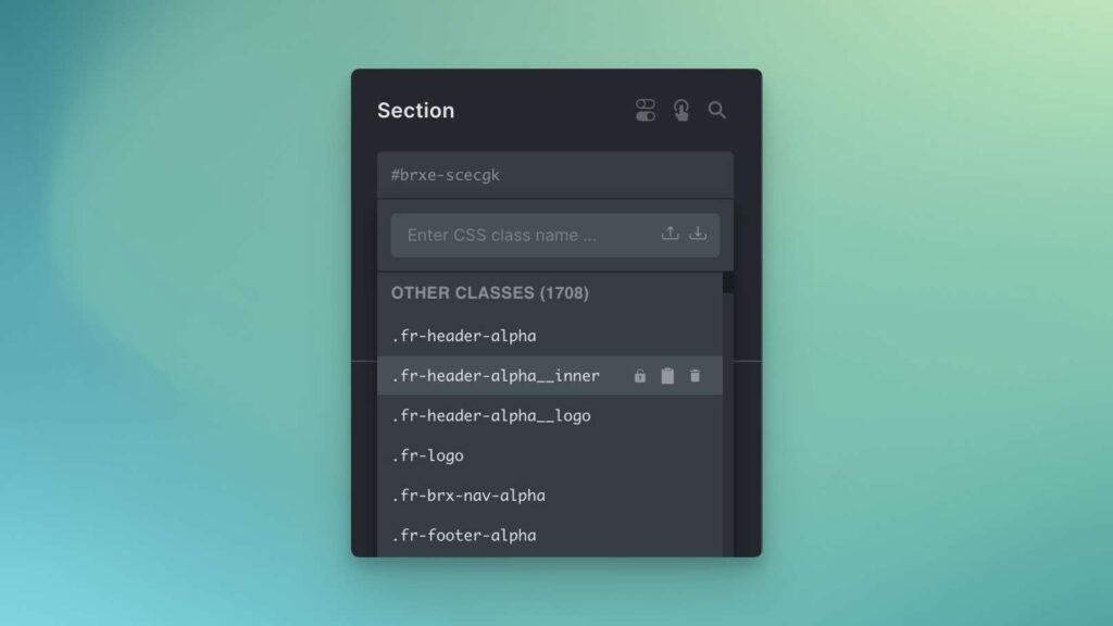
In the current iteration of Bricks, managing classes consists of searching for a class or group of classes in the class suggestion menu on an element and then clicking one of the corresponding buttons to copy styling, paste styling, rename, or delete.
The copy and rename options are only available if a class is already applied to the selected element, which isn’t always helpful.

Class management is not a good experience in Bricks, and their team knows it.
- When class names are long, you have to scroll horizontally.
- When trying to delete multiple classes at once, layout shifts often cause frustrating mis-clicks.
- Copying styles from one class to another and removing the old class is tedious.
- There’s no organization whatsoever and no way to group classes into folders.
A good class manager that allows you to rename classes, map styles, bulk delete, organize, sort, search, etc. is borderline mandatory in a class-first page builder.
Adding support and management options for variables is another must-have as well. There’s currently no way to do this without add-ons in any page builder I’m aware of. Users currently need to define custom variables via an external stylesheet, which is not ideal.
A class and variable manager must move quickly from the roadmap to real life in 2024.
“Partially Synced Patterns”
I used to refer to these as “dynamic components.” The Bricks team refers to them as “global components,” which I don’t think is a great name.
I now refer to them as “partially synced patterns” because that’s the best name I’ve heard. And I must give the Gutenberg team credit for that term and the term “patterns” to describe reusable layouts.
Nevertheless, this is a concept that I’ve been talking about for well over a year now. It’s essentially the ability to separate the content of a block, like the content in a testimonial card, from its styling and HTML. This gives you tremendous global control and maintainability.
Here’s the state of page builders and Gutenberg right now with regard to maintainability:
- Page builders/blocks that don’t offer stylable classes or partially synced patterns score a full-blown “F” for maintainability. It’s a disaster. Caution: this is *most* page builders and block systems in the WordPress ecosystem.
- Page builders or block systems that offer stylable classes score a “B” for maintainability. You can fully maintain the style of a block globally, but you still have no control over the block’s HTML structure, PHP, or JS.
- Page builders that offer partially synced patterns and stylable classes score an A+ for maintainability. Unfortunately, the only page builders or block systems that offer this as of today’s publish date (that I know of) are Cwicly and Cornerstone.
Bricks is actively working on this “partially synced patterns” concept, and Thomas has already shown a very promising sneak peek of it in action.
I expect this functionality to ship to Bricks in Q1 of 2024. It’s much needed and will immediately elevate Bricks to an even higher level.
Multi-Select (via Canvas & Structure Panel)
This is one of those “Why don’t we have it yet?” features.
I won’t sit here and pretend to your face that this is some sort of new, exciting, or innovative feature. As much as I rag on Divi, they’ve had multi-select for *years.* Let me say that again. Years!
Let me explain why this is so critical.
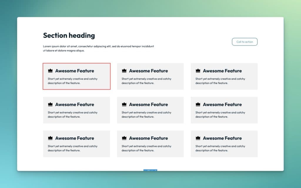
You can only select one element at a time in the Bricks canvas at the moment. So, imagine I create a grid of cards and fill out all the content details in each card, only to realize that I forgot to add something like an icon or a modifier class.
Without multi-select, I have to select each individual card one by one and paste the element in or apply the class. Then, I have to select the next instance and repeat the process. And again. And again. And forever for however many instances exist.

With multi-select, I could select every card at once and apply the missing class or paste the missing icon. Or I could delete a class from all instances at once. Or any number of other helpful “bulk” actions, like “wrap with div/block” (giving us the ability to quickly group associated elements together).
Drag-and-drop also comes into play here. The ability to multi-select elements and then drag them to a new area on the page is tremendously helpful from a workflow efficiency perspective. It can also reduce the number of grouping wrappers that might be needed.
Ideally, multi-select would work both in the canvas and the structure panel so I can multi-select from either area.
Both forms of multi-select would work, of course: shift + click as well as cmd + click. The expected behavior would be the same as in any operating or file system.
While partially synced patterns help alleviate the need for this to some degree, not everything should be a partially synced pattern, so multi-select is still a requirement.
Will this come to Bricks Builder in 2024? I don’t even think it’s under consideration. But it needs to be!
Official feature request: Multi-Select in Canvas and Structure Panel
External API Support for Query Loops
Credit for this one goes to Jason Moreau, an ACSS customer and Inner Circle member. I’ll also link to his official feature request here.
Bricks Builder already has one of the most powerful query loops of any page builder or block system, but this would easily put it in a completely different universe.
Currently, Bricks Builder can easily query any post or custom post type (which most page builders can do) and taxonomies and users (which most page builders can’t).
Additionally, Bricks Builder offers developers more power and control over how those objects are queried than almost any other page builder, thanks to a really clean UX.
But get this: what if the querying capability was extended to data outside of WordPress?
I’ll give you a prime example. For Automatic.css, we took down our public cheat sheet because it was too much manual data to transfer to our redesigned site and the accuracy failed to keep up with the framework’s evolution because it was manually maintained.
The new plan was to completely refactor the JSON in the plugin, which powers the contextual menus, class suggestions, and dashboard, and then use the JSON to redeploy the cheat sheet onto the website.
The JSON refactoring is finished, but we must build a Svelte app to deploy the data onto the website. Well, guess what? If Bricks’ query loop could query data from an external JSON file, we’d already be in business with the new cheat sheet without writing a single line of code!
A query loop that can hook into various external data sources and APIs and query that data onto a website in seconds – just as easily as you can query recipes from a custom post type – would be tremendous.
As far as I know, Cornerstone and Builderius are the only page builders or block systems doing this.
If you think querying data from external sources should happen in 2024, vote on the feature request, and let’s get it moving through the pipeline.
“Unified Canvas” and/or “Sky View”

This is an idea I’ve been kicking around for a while now but haven’t shared publicly. I kept it close to the vest in case I decided to move into the page builder space (that’s looking more and more like it won’t happen any time soon — sorry to those of you who have been asking).
Let me make the case for Unified Canvas:
- The current way of opening and editing a single web page at a time is slow, tedious, and limited.
- Navigating from page to page is time-consuming and annoying.
- There’s no birds-eye view of what each page looks like or of the domain as a whole.
- Copying content from one page to another is a terrible experience.
- Adding new pages, posts, etc. should not have to happen from the WordPress admin.
- The more we bounce between builder and admin and from individual page to individual page, the less efficient our workflow is.
Now, imagine an alternative approach. This alternative approach can be executed one of two ways (or perhaps both at the same time):
Unified Canvas
I’m calling this feature “Unified Canvas” because it transitions the page builder from a separate canvas system to a single canvas system (when desired).
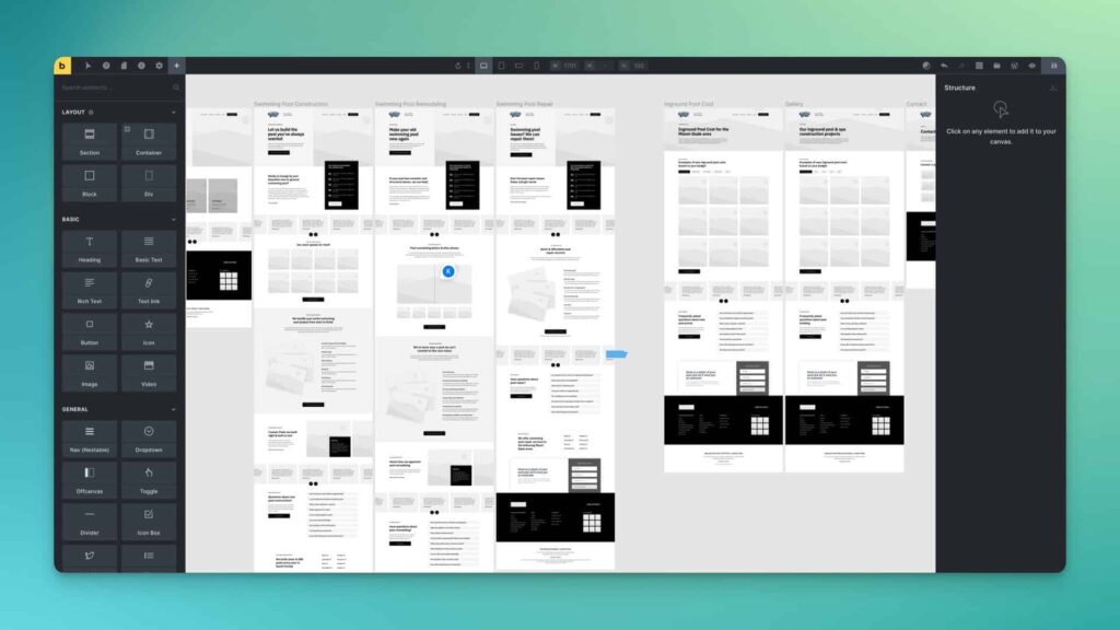
In Bricks, there’s a separate canvas per URL. In Figma, there’s a single canvas that contains all the screens. Anyone who has used Figma knows how efficient, fast, and marvelous it is to scroll around a giant canvas, see multiple screens, and interact with anything, anywhere, at any time.
Not only do you have full interaction freedom, but you can zoom in or out of the unified canvas to see a birds-eye view of everything. Or you can zoom all the way in to experience a more detail-oriented workflow.
Another powerful feature of Unified Canvas is that the canvas size exists separately from the builder interface. Since you’re free to scroll to any part of the canvas at any time, the control interface lies on top of everything rather than being influenced by the size of the screen or the size of the canvas. Unified Canvas would provide far more oversight control and make working in Bricks on smaller screens easier.
Want to edit something? Bricks knows which element is selected – the interface behavior is the same as it always is. The only difference is that Bricks also knows which page is selected. This allows you to edit any page from the same Unified Canvas.
Unified Canvas functionality could be expanded to create new pages, posts, edit slugs, etc. The sky is the limit.
Keep in mind that this would be an optional view. So, users would get the best of both worlds depending on how they prefer to work on any given day.
Bricks should be the first to introduce this type of canvas into the WordPress ecosystem.
Sky View
If Unified Canvas is too lofty of a goal, another alternative is a “Sky View” feature. This would work much like the Remote Template Library modal. Any time you want to see a “sky view” of your domain, you can activate Sky View mode, which would open a modal showing you a full-height thumbnail gallery of every published and draft page on the site.
The gallery could be organized and filterable by CPT, taxonomy, etc. Selecting a page from Sky View would swap the canvas editor to that page, and there could be additional features and functionality afforded to us from the Sky View panel.
Unified Canvas is still the way to go, but this could be another option (and perhaps an easier option we could get our hands on sooner).
Regardless, page builders have nothing like any of this. It would tremendously benefit workflow, efficiency, and general development joy.
Official feature request: “Unified Canvas” and/or “Sky View”
What about Native Filter/Sort/Facets?
I’m torn on this feature. It’s already on the roadmap so I know it’s coming, but it’s one of those features that could go either way.
Yes, it’s needed. When I think of what a page builder should be able to do, filtering, sorting, and faceting is a definite, “Yes.”
The challenge is that it’s very complex to do this really well. This is why no page builder has a faceting system as robust as GridbuilderWP or FacetWP.
If Bricks is going to do the faceting thing, they need to go all-in, and I’m just not sure that will happen.
The challenge here is that if Bricks can’t match the functionality of GridbuilderWP, I have to keep using GridbuilderWP and more or less ignore the native faceting system in Bricks. The same is already true with Bricks’ native forms system. I can’t use it. It’s far too simplistic.
I refuse to run multiple systems randomly from site to site. This breaks our processes, training, maintenance, and scalability. If you run into a limitation with a system you already knew was limited and need to switch systems, it can get very expensive in terms of labor and re-work.
So, why use a very limited system when you already have a system with practically no limitations available to you? The smart play is always to use the system with the fewest limitations. If Bricks comes out with a surface-level faceting system that exists in the shadows of GridbuilderWP, then it’s a waste of time and resources.
Wouldn’t you prefer they spend time on something like Unified Canvas or querying from an external API over a surface-level faceting system? There’s a real tradeoff in product development. They can’t give us everything all at once, so it becomes a prioritization issue. Every minute they spend diddling with “meh” forms and “meh” facets is a minute not spent on really awesome stuff that would change the game.
Like forms, the faceting feature is a “let’s solve a problem that’s already solved” thing. If they’re gonna knock it out of the park and they have a way to improve on what’s already available to us, that’s one thing. If they’re going to give us a half-assed tweener version, I’d rather that feature request get scrapped.
Get hyped for 2024!
Regardless of whether or not my dreams come true, this will undoubtedly be a fantastic year for the Bricks team and the Bricks community. As you know, I get zero affiliate commissions from Bricks – they have no affiliate program. I promote this builder for the same reason I chose it as my personal page builder and agency page builder – because I genuinely believe it’s #1 and has the brightest future.
What about you? What features would you love to see in 2024?

