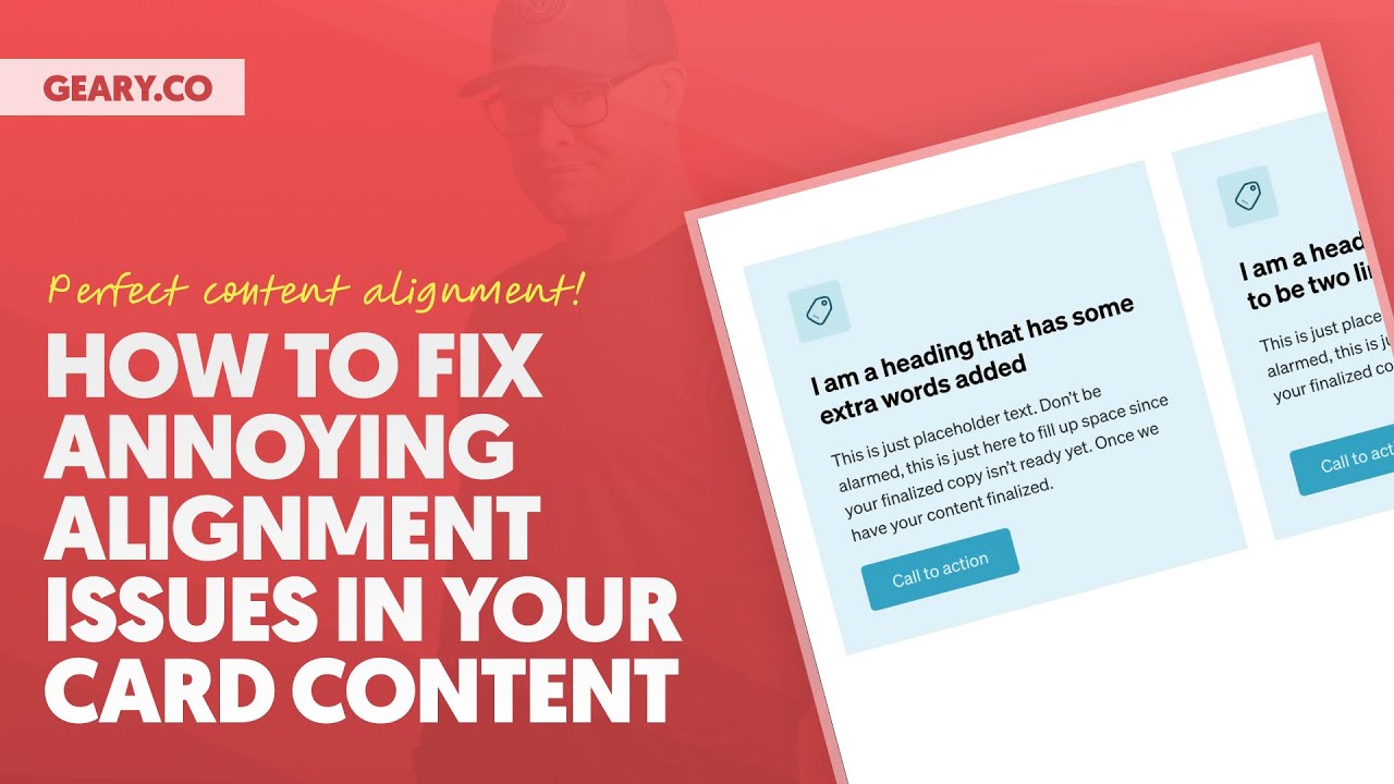
Ever struggled with misaligned content in your card layouts? You know the frustration – one card has a short title and another has a longer description, leaving your buttons and text floating at different heights. It's a common CSS headache that can make your designs look unprofessional.
In this tutorial, we'll tackle this challenge head-on by comparing two powerful CSS techniques – Flexbox and Subgrid – combined with techniques like auto margins and "content sculpting."
With this one video, you'll have everything you need to achieve perfect alignment across card components regardless of content length.
*** MY TOOLS ***
🔥 AutomaticCSS (ACSS) – https://automaticcss.com
🔥 Frames – https://getframes.io
See all my recommended tools here: https://geary.co/tools/
*** INNER CIRCLE ***
Step your design/dev game up, make more money, and get the full scoop on scaling your digital agency! When it comes to the Inner Circle, I don't hold back.
⭕ In-depth design & dev trainings
⭕ Business, sales, & marketing trainings
⭕ Agency resources & downloadables
⭕ Vibrant, quality community with zero toxicity
⭕ …and much more!
Learn more and join here: https://geary.co/inner-circle/
*** SOCIAL ***
👉 FB – https://www.facebook.com/marketingkev/
👉 X – https://www.x.com/thekevingeary/
👉 LinkedIn – https://www.linkedin.com/in/kevingeary/
*** CHAPTERS ***
0:00 – Intro
01:07 – Card Structure Philosophy Using Wrappers
06:07 – Basic Card Styling w/ Padding & Gaps
10:00 – Common Alignment Issues
17:42 – Aligning Content Perfectly with Subgrid
25:38 – #1 Alignment Technique
29:34 – Downsides of Subgrid & Upsides of Wrappers
32:43 – Conclusion