Page Builder “Global Presets” Are Weak, Limited, & Unnecessary

Scalability and maintainability of styling are two of the most essential concepts in web design. If you don’t have a good way to manage global styles, you end up with a website that’s terribly difficult to adjust, iterate, and build upon.

Modern websites are living, breathing platforms requiring constant updates and additions. Ignoring fundamental styling principles creates a situation where basic maintenance and expansion are terribly time-consuming, frustrating, and expensive.

The question is: What’s the best way to maintain global styles in web design?

CSS classes are the proven best-practice approach. Styling, after all, is done with CSS. Even when you style a website with a page builder, you generate CSS for those styles.

Thus, I would argue that CSS solved this global styling problem long ago with the class selector. Classes are a simple and elegant way to globally style elements, be it a button, heading, or multi-element component like a card.

Classes aren’t the only way to manage global styling on the modern web, though. Some page builders have introduced a new global styling workflow called “presets.”

So, I’ve done what I do with all new ideas in web design. I approached the concept of presets with an open mind to see if it offered any advantages over a proven class-first workflow.

Below is a detailed summary of my thoughts.

Global styling in page builders has always been a huge issue because page builders have long ignored web design fundamentals

Page builders are a good idea. When built correctly, they speed up workflow and remove coding monotony from the development process.

The big problem with most page builders is that they’re not built correctly, and they encourage bad practices. They output bad code, ignore fundamental principles, and prioritize “easy” and “fast” over everything else.

One of the fundamentals that most page builders have overlooked is global styling with class selectors. Many builders don’t let you add classes at all. If they do, they often don’t let you style them. And in many cases, the builder doesn’t even apply the class to the correct element.

Why is it like this?

I don’t know. It was likely decided that class selectors were too “codey” and not welcoming to the average beginner. Instead, the page builder philosophy seems to be, “Just let them quickly add and style elements (at the ID level) and move on.”

It’s easy to build a site with that philosophy, but it’s a nightmare to maintain and scale it. There’s no real global styling control over elements, so users must do a ton of inefficient copy-paste nonsense to deploy styling changes across the site.

This is not a small issue, so page builders were eventually forced to address it. The solution many of them (Divi, Breakdance, GeneratePress, etc.) came up with is “presets.”

Global styling “presets” attempt to solve a problem that was already solved long ago

Let’s not forget that the problem of global styling control has already been solved in CSS with class selectors.

“Presets” are 100% not needed.

If page builders lack global styling control, they can incorporate CSS classes and immediately solve that problem.

In fact, some of them did just that. I’m referring to Oxygen Builder and Bricks Builder.

So, if you’re going to introduce a new workflow that we don’t need, for a problem we already solved, you better make a strong case!

Spoiler alert: Presets offer no real advantages and a fairly significant list of disadvantages.

A “presets” workflow is handicapped by a page builder’s available styling options

Generate Blocks is a popular page builder with global style presets. To illustrate an example where global styling is limited by the builder’s controls, I attempted to create a radial gradient button preset.

This is easy to do with a CSS class but is impossible in Generate Blocks because a linear gradient is the only supported gradient type via the builder controls.
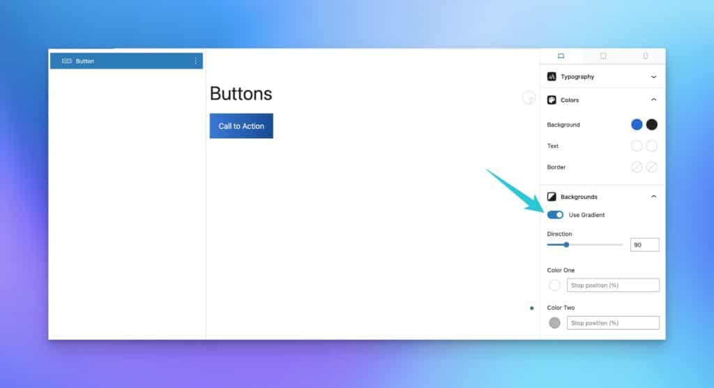
Adding a Gradient Preset to Buttons in Generate Blocks

I demonstrated this limitation within 5 minutes of being introduced to presets in a builder like this. I’m sure I’d uncover dozens of additional examples if I spent 30+ hours building an entire website with this workflow.

That’s unnecessary, though. I already know there will be many more limitations because these limitations exist in more powerful builders like Oxygen and Bricks.

In these situations, CSS is required to overcome the limitations of the builder interface. In builders like Oxygen and Bricks, this isn’t a problem because these builders are based on a proven class-based workflow. You can create a class, write custom CSS, and be done with it.

In a presets-based builder, there’s no “presets” workaround. You simply can’t move forward with the presets workflow. It falls flat on its face.

Any attempt to overcome the limitations of presets creates a major “separation of styles” issue

I know what a lot of people are screaming right now. “Kevin, you can still create a class in Generate Blocks and write custom CSS!”

That’s 100% true. Calm down and control your spittle.

I can create a class like .btn--action and then add the following CSS in a plugin like WPCodeBox to create my radial gradient:

.btn--action {
  background: radial-gradient(var(--action), var(--action-medium));
  color: white;
}Code language: CSS (css)

And then all is well in the world, right?

Wrong.

Two arguments here:

  1. The “workaround” offered here is the method I should have used from the start. The old solution can’t be the workaround for the failure of the new solution – that’s absurd.
  2. If I use CSS to create this workaround but use presets for other things, I’m creating a “separation of styles” issue.

We try to be as efficient and organized as possible when building websites. There’s already a ton of stuff to keep track of. We even use full-blown naming methodologies like BEM to keep CSS organized because it can easily get unruly.

So, let me get this straight. I’m supposed to introduce a new “presets” workflow? And when that new workflow fails, I’m supposed to retreat to the old workflow? But, I’m supposed to be okay with having many of my styles live in presets-land while others live in CSS-land?

How do I know what is where? What happens after I leave a site for 3 months and then return to it (what I call “the three-month rule”)?

It seems like the “presets” workflow is creating disorganization. And for what reason?

How about this: If you want to introduce a new workflow, it can’t have basic points of failure. We don’t need two workflows when one workflow is working just fine.

Global styling “presets” can’t be chained together

Okay, enough harping on Generate Blocks for now. Let’s train our sights on Divi.

Divi is another page builder with a “presets” workflow. I’d argue that their presets feature is more powerful than Generate Blocks, but still fails where all the presets-based builders fail: chained styles.

It’s very easy to chain styles in a class-based workflow. For example, let’s say I want to create a utility class to increase the top and bottom padding in my sections:

I’ll use very explicit class names to make it obvious.

.section-padding--large {
  padding-block: 12em;
}Code language: CSS (css)

Now, I can add this class to any section where I want the block padding increased, and it’ll happen in seconds.

That’s not the only style I want to control globally in my sections, though. What if I want to add accent design elements to certain sections with pseudo-elements?

With CSS i can create another class like .accent-elements and it’ll add my accent elements.

Here’s the critical point: I can add both classes to the same section and get both desired results. It looks like this in Bricks:
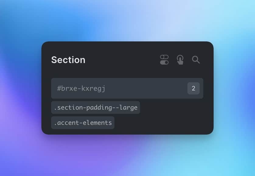
That section will have increased block padding as well as my pseudo-elements.

This is impossible in a presets workflow because you can’t chain presets. You can only select one preset at a time in all the preset-based builders I tested.

What’s the workaround?

I don’t know. Perhaps users are supposed to create a preset for each possible style combination? Or, just abandon presets altogether and re-introduce the separation of styles issue from before?

If you were to create presets for all available style combinations, it would quickly get unruly:

  • Large section padding
  • Large section padding with accent elements
  • Normal section padding with accent elements

What if you want a section with smaller block padding as another option? That would only require one additional class, but it requires two additional presets:

  • Small section padding
  • Small section padding with accent elements

Suddenly, what would require three classes now requires five presets. Even worse, you’ve now created accent elements in three separate presets. If your accent elements need to change, remember to change them in three places!

What if you want your sections to have the option of having a repeating background pattern as well? That would require one additional utility class. But, in presets-land, it requires five additional presets now.

  • Normal section padding with background pattern
  • Normal section padding with accent elements and background pattern
  • Large section padding with background pattern
  • Large section padding with accent elements and background pattern
  • Small section padding with background pattern
  • Small section padding with accent elements and background pattern

Anyone who has used Figma knows how quickly this can get out of hand. Every time a styling option is added, you must duplicate all the existing elements to have it as an option across the board. And now you have accent elements in six places with no global control over those elements.

The problem gets progressively worse as the number of style options increases.

On the other hand, classes can be chained, and styles can be shared, so this problem doesn’t exist with a class-based workflow.

The “presets” workflow is less efficient because it’s often separate from the page-building workflow

This isn’t the case in every builder, but it’s certainly the case in Generate Blocks.

I don’t want to seem like I’m picking on Generate Blocks, but their preset system is quite limited compared to other builders (even though they do other things far better).

Let’s say we’re building a service page. We add the hero, some feature cards, some testimonials, etc. And then, we get to the area where we need to add cards for each service.

In Bricks or Oxygen, of course, I can just create the cards, add classes to each element, style them up, and move on. But in Generate, I can’t do that. To create preset-based service cards, I must leave the page I’m working on and navigate to the Global Styles area.
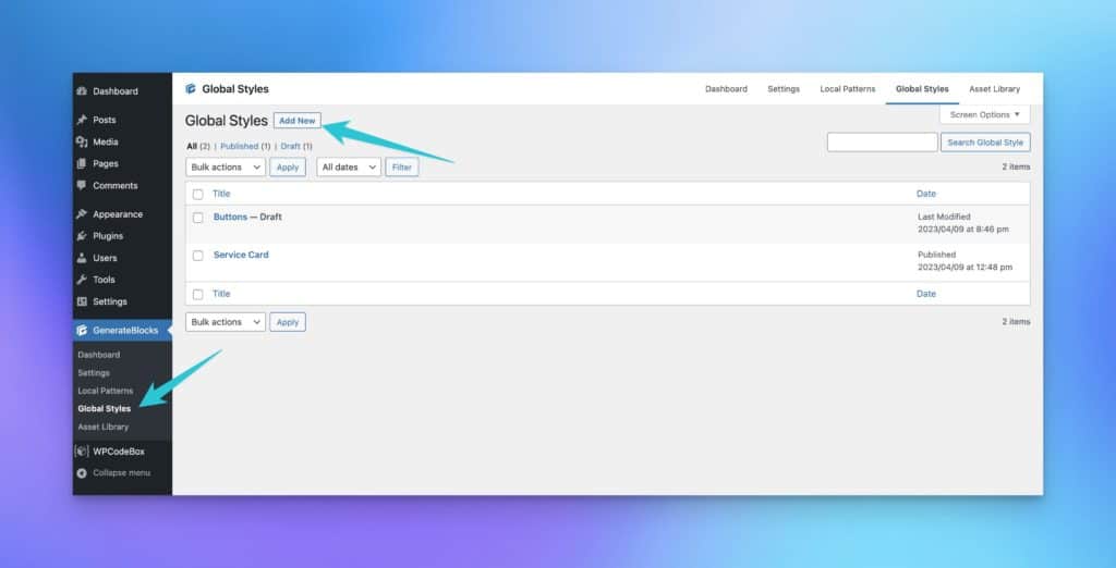
Generate Blocks Global Styles Area

I can create my service card in this Global Styles area. But, to use it, I must navigate back to the page I was working on, refresh it, and then insert it.

This dance must be repeated for anything that requires global styles, which happens to be many elements on a properly maintainable website.

That’s a bit of a workflow killer.

The story gets worse, though.

What happens when you need to edit part of the services page, including the style of a service card?

You have to open up the services page, do your edits, and then open the service card separately via the global styles area to edit it there.

Additionally, when editing the styles, you’re not seeing the styling of the service cards within the context of an actual page. All you see is a lonesome service card because you’re editing it in a standalone “global styles” area rather than on the page where it actually exists.

If this is supposed to be “better and easier,” I’m not sold.

Some things simply can’t be “preset”

Time to pick on Breakdance now.

Where I can create presets for card elements in Generate Blocks, these same presets can’t be created in Breakdance. This is because divs, for example, don’t support presets in Breakdance.

Presets in Breakdance appear to be limited to buttons, typography, etc.
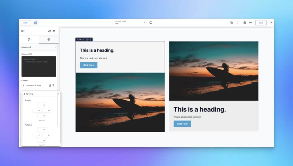
Breakdance Page Builder
Looking for preset options in Breakdance

Here comes the Breakdance Brigade: “You can create classes for those things in Breakdance!”

You’re 100% right.

But, three arguments:

  1. Doesn’t this bring us back to the “it’s absurd to use the old workflow to solve problems with the new workflow” argument?
  2. The creator of Breakdance has said multiple times that presets are better than classes and that people who want to use classes to build sites are “crazy.”
  3. Breakdance doesn’t offer a class-first workflow, so anything that requires classes requires tons of extra clicks and results in buried styling. It’s not efficient.

So, once again, we have limitations created by page builders that insist on a presets-based workflow over a class-based workflow. And again, I ask, for what?

Deviations from a true CSS-based workflow create major lags as CSS evolves

CSS Grid has been out for years, but Breakdance, Divi, and Generate (three of the most prominent presets-based builders) still don’t support it.

When Bricks was in the early stages, it didn’t offer CSS Grid via the builder interface. I could still use CSS Grid easily because Bricks uses a class-based CSS workflow. That’s the power of sticking to the core language of web design – we don’t have to rely on the builder to do everything perfectly.

Container queries are on the horizon, and they’re quite complex. I can’t wait to see how builders like Bricks and Oxygen incorporate container queries.

Am I worried about it, though? Not in the slightest. Because I can use container queries in any CSS class-based workflow as soon as they’re supported without any help from the builder.

How about Cascade Layers? Those should be fun, too, but only in serious builders with a class-based workflow.

CSS is constantly evolving. Page builders that use a class-based workflow have no problem keeping up. Page builders that use an unproven, limited, presets-based workflow will have major years-long gaps in functionality.

Final thoughts: Should web designers embrace a “presets” workflow offered by select page builders?

Classes are fundamental to CSS and web design. They can be used without limitation relative to any other option for styling elements globally.

Presets are an abstraction layer added by certain builders. And as far as I can tell, this abstraction layer offers no real benefit other than possibly being easier for beginners to understand. After all, things with built-in limitations often feel easier to learn because there’s less to know.

Apart from the inherent limitations of the presets workflow, beginners face the problem of fundamental skill development and application.

I’ve said this repeatedly: If you aspire to do this work for clients and want to consider yourself a professional, you should learn the language of web design.

Don’t learn the language of a specific page builder! Learn the language of actual web design and development. Then you’re free to use any builder that leverages a CSS, class-based workflow without limitation.

There are no “presets” in web design and development. This is a proprietary concept introduced explicitly by certain page builders, and it requires learning a completely different workflow.

Will this new workflow help you when you leave a presets-based builder in the future? Absolutely not. In fact, the longer you use a presets-based workflow, the more out of touch you’ll become with actual web design fundamentals.

Does this new workflow provide additional functionality and advantages over the tried and true workflow? Absolutely not. In fact, it creates significant limitations.

While I can see how people can “get by” using a presets-based workflow, I can’t recommend it as a professional option. “Getting by” with a limited tool is what I would expect a professional to be able to do if they were forced to do it, but it’s not something I would expect them to choose willingly.

And for that reason, I’m out.

join the conversation

36 comments

  • Trevor Robertson

    Thanks for doing this analysis and writing this post. Always good to read something well thought out, rather than a poorly researched rant. I personally feel GenerateBlocks sits in a little different class than things like Bricks and Divi, since it’s really just building on what the WP Block Editor gives you. But I agree regardless that the original Global Styles system in GenerateBlocks was frustrating.

    Have you had a chance though to take a look at the totally revamped Global Styles setup in the recently released GenerateBlocks Pro 1.7.0? I’d be very interested to hear you take on it. I need more time myself to experiment with it, but one huge improvement is the ability to have multiple styles added to your block, and they are pure CSS class powered. Might be a good sign the lessons are being learned? Thereby, when Kadence Blocks also adds “global styles” (apparently it’s in the pipeline) they’ll do it right from the start.

  • Marius Günter

    A combination of both concepts is the winner. When it comes to styling, yes, classes are better. But you compress presets only to styling. Predefined JS or dom structure by a single preset can also be a part of presets 😉 .

  • Chris Beattie

    Just incase you didn’t know, there is text in your footer that’s causing your mobile vw to be over 100% and is causing horizontal scroll. Also your mobile menu opens off screen, a little sloppy designing, and it seems you haven’t tested properly.

    • Right of Sand

      Everyone makes mistakes. Hopefully your observation will have them make corrections thereby improving user experience for everyone

  • Are presets meant to force you into an proprietary “walled” ecosystem that can’t easily be migrated into something more universal like classes? So there’s more to lose from switching between builders?

  • Charlie

    A little off the subject, but what are your thoughts on child themes vs WPCodeBox or Code Snippets for custom CSS? Also in a future episode of PB101 could you give an example of how bad presets are? I am just starting to use Kadence (which I think is similar to GeneratePress) and they have the concept of “defaults”. Is this similar to presets?

    • A

      Defaults and presets probably aren’t the same thing. I’m not familiar with Kadence, but defaults are just global styles, which also exist in CSS. Presets are separate from true global styles / defaults. But yes, I’ll do an episode in the course on classes vs presets.

  • Kevin,

    I searched this article and the conversation in the FakeBook group 😛 and I didn’t notice any mention of Frames. I find it a bit curious. Do you think it would cloud the issue, incorrectly influence your argument, in some way to mention Frames as something kinda’ in between Purely a “preset” (I know Frames in not a literal preset), but a way to have some “template like” starting points while maintaining the advantages of using CSS and classes?

    • A

      Templates and presets are two very different things, especially since templates can properly use classes (like Frames does).

      • “Templates and presets are two very different things, especially since templates can properly use classes (like Frames does).”

        Yes I fully realize that but what I am saying is Frames, because it does use classes, is possibly the best of both worlds in functionality, not in technical implementation.

        I thought it would be worth mentioning as a “better approach” to address some of the same concerns presets are trying to achieve.

  • Alan Blair

    Hey Kevin, thought provoking as always.

    I think the role of page builders has changed over time. They have evolved from a way for unskilled users to create sites and content, to tools suitable for professional usage. Remember when the WordPress editor was just TinyMCE and “Visual Composer” came along and changed the WordPress world?

    Some users still just want simple premade layouts, lots of widgets and an easy-to-understand UI. Like Powerpoint for websites. They don’t want to learn the fundamentals, they just want easy and quick. Presets and abstracted CSS properties do work for these users. The most obvious drawback being a lack of control and getting stuck with “how things are done”.

    As you have pointed out on many occasions, if you want to be a professional you have to think and act like a professional, and unfortunately that does eliminate most current page builders.

    Personally, I think being a professional requires constant learning and application of proven principals. It also requires being prepared to change your thinking when you discover better ways, i.e. remain open minded.

    I do feel for the builder developers though, it appears to make money they have to find a balance between both. In my oppinion Bricks Builder has found a decent balance (I love Bricks). Yet even they rename/abstract some CSS properties in the UI, and work on Widgets and Features while there are many core improvements to be done.

    So using a CSS framework based “presets/classes” the next challenge is where and how to apply them. Using Bricks as an example, they can be used in Settings inputs or Custom CSS. Using both on an element can also get messy. So where I have come to with this;

    * If the element class only has a few basic settings (color, border, spacing etc.) just put them in the settings inputs.
    * If you need CSS properties that does not have a “setting” you have to use Custom CSS.
    * If you put anything in Custom CSS, put everything there, don’t use the settings inputs as well.
    * If you are using a BEM structure, put all CSS for the block, elements and modifiers in one elements “Custom CSS” input

    • A

      Yep, I remember the Visual Composer days, for sure. It always comes down to professional (web design for $$) and non-professional (hobbyist/one website/etc.). If someone wants to be a professional and charge money, they must learn fundamentals and use professional tools. That’s it. If they’re not gonna live in the realm of professional, they can do whatever they want. That’s not going to happen, of course, but it’s how it should be, IMO.

  • Solid article. I am just wondering how you were building wordpress websites before the class-based builders 😅.
    Thanks for your time to write this article.

    • A

      Slogging through with horrible page builders, no global control, etc. It’s why I can confidently point out various builders’ atrocities. I have first-hand experience with their nonsense.

      • Right of Sand

        If they were helpful in the past, “nonsense” might be too strong a sentiment.

        The way the pros did it in the past was with custom themes before good page builders came along.

        Some purists still do (some pinegrow users) and they also laugh at people using page builders.

  • Calling yourself a web developer when you are stuck relying on the presets on a pretend website builder is akin to thinking you are a musician when you play a Guitar Hero toy guitar controller. You can press all the buttons you like – maybe even convince yourself you’re a legend – but you are stuck in some virtual world, not playing the real thing. In the end, it’s much more satisfying and rewarding to build real skills and continue to grow and improve with real tools instead of toys.

  • Coming from cwcily, they have pretty powerful presets, they are useful for typography, but it is getting a bit confusing with the later offers. After knowing how nice custom classes work in Bricks, I would prefer some css frame for these “presets” in cwicly. And instead a easier to use custom class system. Right now cwicly has some page-wide class-system extra on top, that is quite a nightmare after 6-month.

    • A

      Some people refer to global styling as presets, but they aren’t the same thing. CSS has global element styling as well. It’s a separate concept from presets. Cwicly uses classes, not presets, so it’s fine.

  • I’ve learned a ton over the last few months through your content. I 100% agree with this. I am first and foremost a designer, primarily in print and brand strategy, but started learning web (at 44) to help out a friend. I have used elementor on several sites, but once I started learning CSS, I realized there were some things that were missing. I am wrapping up a site now, that is a learning site built on Elementor and Learndash. I have used quite a bit of custom CSS on this site, and managing it has been a challenge. Each course has some CSS variables for some of my presets for things like button colors, progress bar gradients, course navigation icons, etc., so all of this has to be added individually in each custom course templates advanced CSS box. Not to mention, the realization that if I wasnt paying attention, I would end up with 20 containers, when one or two containers should do the trick. At this point, I am too close to launch to go back and rebuild everything in Bricks, so I am currently going back through adding /* comments */ to my CSS and trying to minimize my container count. I have come to realize that builders like Elementor are the Canva’s of web world. Just because it’s available and may give you the end result you want, doesnt mean it is the best or correct tool for the job. Keep the content coming. I’m about to dive into building my first Bricks based site for a client using BEM methodology & AutomaticCSS. Cheers!

  • In Bricks, we can style elements:
    1. Through the settings panel on the left, which is very similar to the settings panels found in themes like GeneratePress
    2. By adding CSS in the code box in the settings panel
    3. In a separate CSS editor like WPCodeBox

    Should we always use a separate CSS editor?
    When do we use options 1 and 2?
    Thank you!

    • A

      Ultimately what matters most is that you’re using classes and not styling at the ID level. The left panel styles at the ID level by default unless you add a class. You want to avoid doing that. If you add a class, you can still use the panel. Or you can write CSS yourself. Doesn’t matter either way – it’s the use of classes that matters.

  • I love truth tellers. Can’t wait for the Breakdance Breakdown.

  • Fundamentally, I’m 100% with Kevin, I’m not a fan of presets or global blocks. I’ve built over 175+ divi sites and learned how they work and how to maximize my return – Time vs Effort. My heart is with class based builders. Oxygen + Bricks but I feel like Breakdance (in my case) isn’t for us, its for my clients (The people that can’t code). After the build is complete, I hand off the site. I feel 100% confidence they can use Breakdance with ease. There is a reason why WIX, SQUARESPACE are so popular, people don’t have time to learn this stuff. They want a simple solution. For my complex builts, i’m 10000% using a class based builder with ACSS 🙂

  • Nice article, great points. Thanks!
    I do want to add an argument for ‘presets’ though.

    Take headings, I can give every heading a css class with it’s font. But by adding the font settings as a preset I don’t have to give every heading a class manually.

    If it deviates from the norm, I use a class. But most of the site is done with the preset.

    Say you do it by class.

    .heading—large
    .heading—small
    .preheading
    .colored-header
    .heading-for a-special-case

    Dark background: all the above.
    .heading-on-dark

    Especially without a class manager that’s not really nice to maintain either.

    So I set the font-size, family, weight, font-style and type (h2) per breakpoint in the presets – and go from there.


    Sections & Containers get basic presets too. (Again classes if different from preset)

    • A

      This is already possible with CSS. You can style all heading levels with default styling. This way, you don’t need to add a class to all of them. This covers 90% of use cases. For the 10% where you need a heading to look different, you can use a utility class.

      Doing this with presets requires the same amount of work as with CSS and classes. Every time you add a heading, you still need to select the preset you want. That’s the same as adding a class. I don’t see any real advantage here. But with classes, I can also mix and match styles which isn’t possible with presets.

      • Hmm guess I’m not talking about the same thing then. Bricks ‘theme styles’ and ‘presets’ are two different things then?

        • I think you mean what Divi and others call “Global Defaults”, which lets you set a default styling for a certain element. With that, when you add a new instance of that element, it will have the styling you’ve set by default, without having to select a class (or preset) first.

          But since most builders add the same class to a certain element anyway, you can do that with CSS too.

          For example, Divi adds the et_pb_row class to every row, and the et_pb_text class to every text module.

        • A

          No, those are different from presets.

  • Perri Arnold

    Hi there
    I’m new to web design and have started out using WordPress with Divi. Now it was a huge learning curve for me. I have now started a course using Webflow and also dabbling in Oxygen, I must say I find Webflow and Oxygen wayyyy easier to use than Divi. I will never go back to Divi as I prefer to use classes. It’s made my life way less hectic and no more headaches trying to make Divi do what I want. Thanks for all your great knowledge.

    • A

      This sentiment is quite common! Once people learn how to use classes, they start to detest builders that don’t use them. There are a few people who have gone from classes to presets and I’m not sure why – perhaps they’ll offer some counter arguments.

  • When I look back, I wish I had a “Kevin” to explain about Wordpress builders. This article explains why we need to understand the basics of good web design, before purchasing a builder for Wordpress.

    Kevin’s article clearly explains the difference between presets, which seemed a good idea, with classes and best practices.

    Another excellent article on best practices from Kevin.

  • Well-reasoned rebuttal of an ineffective system that seems to be a band-aid. I am not a professional website expert, but I can see the logic that Kevin uses. I will be interested to see the responses to his take on presets.

  • 💯 I’d like to disable global preset options and only use what is needed… or remove altogether! They’re usually just in the way and confuse newcomers.

    In Bricks, using classes is far superior to global presets.

    Great article!

    • A

      I think the concept of presets is friendlier to beginners than explaining classes, specificity, etc. Of course, what is friendlier in the beginning is often a major handicap in the long run. And that’s certainly true for presets. Beginners are better off learning a class-based workflow, even if the learning curve is slightly steeper.

Leave your comment

Kevin Geary

Kevin is the CEO of Digital Gravy, creator of Automatic.css, creator of Frames, and a passionate WordPress educator. If you're interested in learning directly from Kevin, you can join his 1500+ member Inner Circle.

More articles like this

related posts