
We’re well over 90% browser support for container size queries, which means we’ve officially entered a new era of responsive web design. The problem is that very few people have gotten the memo.
So … consider this the memo!
If you’re still clinging to media queries for dear life, it’s time to let go! From here on out, using container queries 85% of the time (and media queries only when absolutely necessary) is the new standard. Otherwise, you’re officially “old school”—and not in the retro-cool way.
This week, I’m making the leap to a container-query-first workflow. This article, and its companion video, will help you do the same.
Media Queries Are Mostly Irrelevant on the Modern Web
For decades, media queries were the backbone of responsive development. They let us target device widths, tweak layouts, and manipulate design based on screen size.
That was then. Let’s talk about now.
In the modern era, container queries are the most relevant approach and media queries are going to quickly become the MySpace of responsive development.
To prove this, let me ask you a question: What should the breakpoints be for a typical new website project and why?
You might be able to give some random answer for the first half of that question but you certainly can’t given an answer for the second half — the “why” part.
There’s simply no way to answer the question accurately because there’s no longer any rhyme or reason as to why various breakpoints would be chosen.
Let’s walk through the logic:
- You choose three to six standard global breakpoints for your project, typically based on “standard device sizes” or classic frameworks like Bootstrap or Tailwind. These are usually something like 1168px, 992px, 767px, 480px, etc.
- These breakpoints are referenced in media queries throughout the projects to change layouts in an attempt to make the website “responsive” to various “device sizes.”
- You pretend that this makes the website “responsive.”
This process worked very well when there were like three types of mobile devices on the market and a very narrow set of resolutions because your breakpoints actually lined up with the devices that people were using.
Additionally, it worked okay in an era where layouts were very simple and developers weren’t heavily involved in modular, component-based development.
In other words, media queries worked great in 2012!
We don’t live in 2012 anymore, though. There aren’t six to twelve devices that we’re trying to optimize for and we’re trying to build components that can be dropped into any layout and still look great (something that’s not even possible with media queries).
Do you know how many unique device sizes there are on the modern web? Over 2300.
Do you know how many developers are using Atomic Design thinking and need their “atoms,” “molecules,” and “organisms” to adapt to any layout they’re dropped into?
Media queries have no possible or practical way of keeping up. This isn’t “Kevin’s opinion,” it’s objective reality.
And no, this is not a challenge that’s solved by “more breakpoints” or even “customizable breakpoints.” It’s a challenge that’s only solved by a completely different way of thinking and a brand new approach to development.
How Container Queries Are Different (And Way Better)
Media queries want to know, “How big is the screen?”
Container queries ask, “How much room do I have right here, right now?”
It sounds like a subtle shift, but it’s a massive and mission critical difference.
Let’s break down why this matters (and why it’s way better), using these card design variations as an illustration:
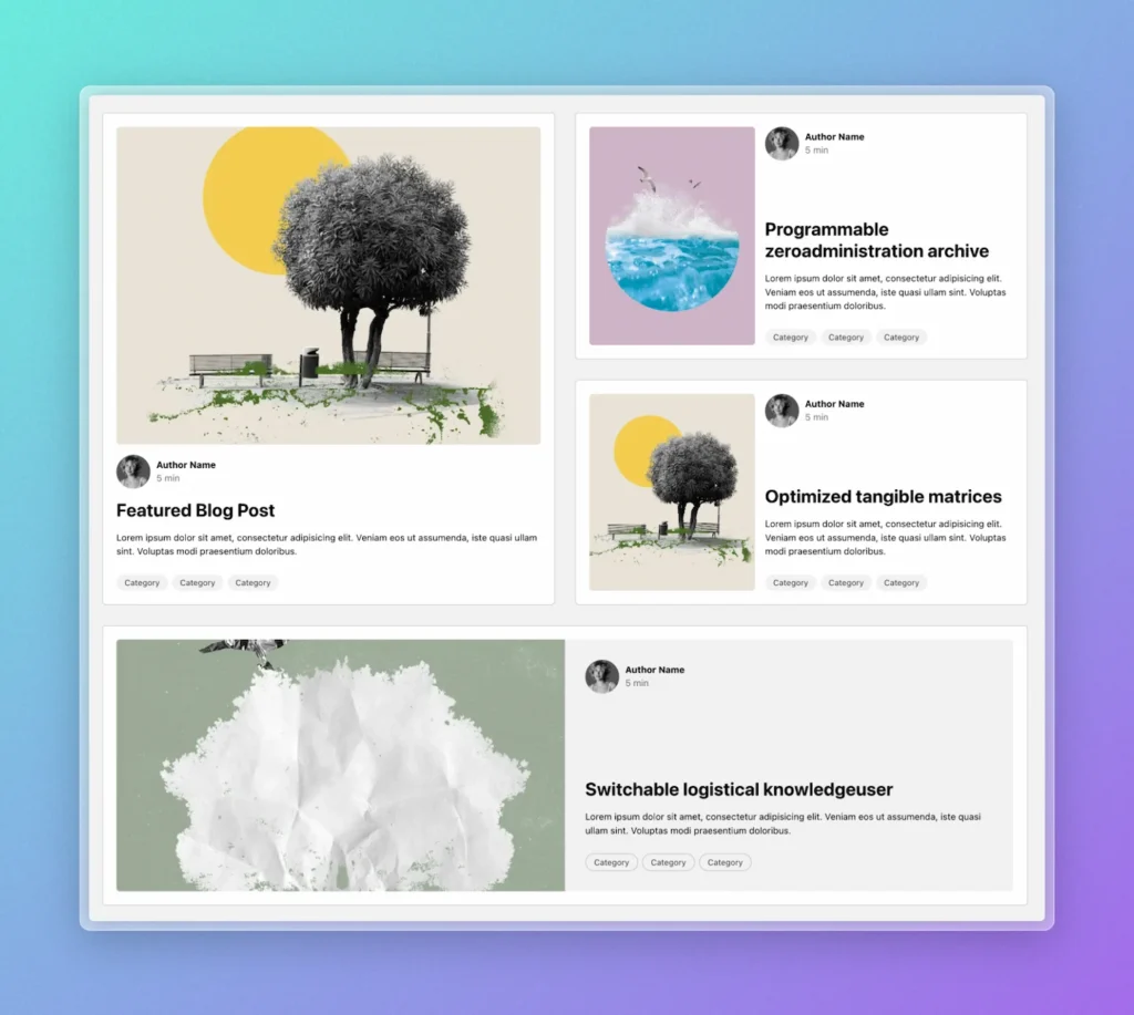
In a confined space or tall space, the “stacked” variation (media above text) should be used because this preserves the most inline space for the written content without fear of it being too “squished.”
If a little more inline space is available, we can break the card into two columns, but we need to keep the media more of a “tall or square”portrait” aspect ratio to maximize space for the text content. This is shown in the top right column where two cards can fit as siblings.
If a lot more space is available, we’re free to give maximum space to the card itself with the media and content both achieving a much wider aspect ratio. This is what you see in the bottom variation.
So, what actually determines how much space a component gets?
Media queries point to the device — that’s all that exists in the world of media queries.
Container queries shrug and say, “Anything goes.” That’s the magic—they’re ready for whatever layout shenanigans you throw their way.
On the modern web, it’s not just the device that changes the available space. Drop a card into a sidebar, a grid, or a footer, and suddenly its world is completely different—even if you’re still on the same desktop screen.
Thus, using media queries to decide when the card should change to a different variation is completely and utterly useless.
When you define variation styles with container queries, your card will automagically change from one variation to the next based on the amount of available space the card has, completely independent of the device the user is on.
It’s the most logical, accurate, and truly responsive methodology for modern web design. And guess what? It’s still responsive to device size in the same exact way!
So why don’t more people use them? I think it’s three big reasons:
- They only recently surpassed 92% browser support (small reason).
- Most people haven’t had them explained or taught to them in a way that makes practical sense (biggest reason).
- There’s an annoying “gotcha,” that they probably don’t have a good solution for (but I do).
With full browser support, great teaching, and innovative workarounds for the “gotchas,” there’s no room for excuses anymore.
Today, we ride!
A Practical Container Query Example
The above video demonstrates the key differences between container queries and media queries with visual analysis.
I’ll be doing additional videos, including a full “from scratch” walkthrough of container queries in a modern development environment, very soon. Make sure you subscribe to @gearyco on YouTube so you don’t miss out!
The Two “Gotchas” of Container Queries
If Container Queries seem too good to be true, you’re right to question them. On the one hand, they solve major issues with responsiveness in modern web design. On the other hand, they create two new problems.
These new problems are very solvable, but you still need to know they exist.
Gotcha #1: Container Queries rely on a parent element declaring itself as a “container.”
For container queries to work, the browser needs to calculate the size of the containing element when a container query is used.
Apparently the CSS team felt this was going to be too resource-heavy to do at all times for all “containers,” so they created a new property called container-type that must be manually declared on the parent of the element that uses container queries.
As you can probably guess, I hate this. I hate it more than it’s possible to hate it. Why? Because it creates tons of opportunities for container queries to fail.
If you place a card in some new area of the layout and forget to declare that area as a container, your container queries won’t work.
To ensure that container queries can never fail, we need a programmatic way to declare the parent as a container any time we use container queries.
After trying a bunch of different tactics for this, I came up with what I think is the best and most efficient. I call it the “Has Me” selector.
You can read more about the Has Me selector here.
Gotcha #2: Container Query items in a grid must have a parent wrapper that is not the grid itself.
Grids create implicit “cells” that confine items into a grid-based layout. The keyword here is “implicit.” In other words, the cells don’t actually exist — they’re not elements.
Since the grid cells don’t actually exist, their dimensions can’t be “checked” by container queries. This means that elements using container queries end up checking the dimensions of the entire grid and not the cell the item is actually in.
The simple solution for this to wrap your grid items in an additional wrapper. By giving items a wrapper, you essentially create a physical “cell” that can be calculated.
Note: When you’re using proper list structure, this often ends up happening automatically without ever needing an “extra” or non-useful wrapper:
<ul class="grid">
  <li> <!-- Becomes the physical cell -->
    <article class="card"></article>
  </li>
<ul>
See! When you use semantic HTML structure, good things happen.
If it’s not appropriate for your grid items to be in a list, then just add a generic <div> wrapper to them and you’re good to go.
When to Use Container Queries and When to Use Media Queries
I’ve put a lot of thought into a possible “rule of thumb” for when to use container queries vs media queries. I’m going to give one to you, but there could be exceptions and adjustments in the future.
Since Container Query workflows are relatively new, there could be edge-case exceptions that we run into which call for adjustments to this advice.
The rule of thumb: If the responsive “block” of elements that you’re building could possibly be used in other formats, use container queries instead of media queries.
Note that the rule doesn’t say, “is definitely used in other formats in this particular project.”
- We’re not concerned with “just this project” anymore. A lot of blocks and components we build are used across multiple projects, so we want them to be as flexible as possible.
- We should be actively looking to create flexibility and resilience where possible, not limitations and potential for breakages. Since container queries are more flexible and logical, they should be the default. “When it doubt, container query it out” doesn’t exactly roll of the tongue, but it’s a good rule of thumb.
This essentially means that all cards, grids with responsive items, Call to Action areas, forms, galleries, sliders, carousels, tables, alerts, breadcrumbs, widgets, facets, timelines, players, headers, navigations, footers, etc. should all use container queries instead of media queries.
Basically, anything that qualifies as a “block” in BEM methodology should be considered for container queries and we should be thinking in terms of a “CQ-first workflow” instead of an “MQ-first” workflow.
The only things that should continue to use media queries are things that are only ever related to the device size: modals, off canvas, fixed position elements, etc.
A secondary benefit of this should be that we can define intelligent media queries for a project instead of using a bunch of “standard” and seemingly random media queries that no longer apply to most devices.
Imagine for a moment that you’ve used container queries for everything. This means that you don’t have any media queries, which means you don’t need any defined “breakpoints.”
Now imagine that you add one single element — a modal — that requires a breakpoint. You can create a breakpoint that exactly applies to that use case, which means your site now has one declared breakpoint and it’s 100% accurate for the content that uses it.
How Page Builders Should Handle the New Era of Responsiveness
To align with the modern era of responsive development, page builders need make some changes:
- Put less focus on media queries and breakpoints. Consider having no defined media queries to start a project, suggesting that media queries should be chosen intelligently and not at random.
- Make responsive canvas previewing more flexible and fluid.
- Provide shortcuts for measuring elements and inserting container queries.
- Provide some semblance of custom naming and tokenization for both media queries and container queries since CSS doesn’t offer this natively.
- Let users easily choose whether styles apply to
@mediaor@container. - Sync styling between CSS and styling panels.
- Let users take advantage of CSS nesting.
- Use and encourage the new range syntax for both media queries and container queries.
- Enable a proper component-based workflow.
- Use element-based CSS so that styles live with elements instead of in a separate stylesheet.
I’ll be honest, though. Users of traditional and/or beginner-focused page builders are going to have to wait forever for these types of changes to come.
As of right now, Etch is the only visual development environment currently innovating a container-query-first workflow for users, which is why it pays off to use innovative and forward-thinking tools.
Good luck!